Landing page design made easy in three simple steps
Discover how to create a landing page from scratch that will become users’ favorite, illustrated with real-world examples.
Trying to design a landing page that truly resonates with your audience? Check out our easy 3-step guide for landing page design. We'll start by setting clear goals, then dive into crafting a structure to figure out which items are essential for an optimal landing, and finally, master A/B testing.
Step 1. Set clear objectives: It’s the foundation
Why set goals
Launching a landing page without a goal is like setting sail without a destination. You might catch some wind, yet the direction remains uncertain. Goals create this direction—they transform your landing page from a static brochure into a dynamic tool that engages, converts, and drives your business forward.
Which goal framework to use
The SMART framework is a solid tool to anchor your strategy. It helps to clarify your ideas, focus your efforts, and use your resources productively. Using SMART, make sure your goal is:
- Specific. Narrow down your goal: instead of "increase traffic," aim for "increase traffic by 20% with targeted ads".
- Measurable. Quantify your goal. For instance, tracking a 20% increase through analytics tools.
- Achievable. The goal should be realistic with the resources and time you have. Ask yourself if it’s really possible to boost traffic by 20%.
- Relevant. Align your goal with broader objectives. Does this traffic increase support your overall business strategy?
- Time-bound. Set a deadline, like "achieve a 20% increase in three months".
Example: Let's say you're developing a landing page structure for a new fitness app. A SMART goal could be, "Increase app downloads by 25% over the next three months through targeted promotional content and user reviews on the landing page".
This goal is specific (increase app downloads), measurable (by 25%), achievable (with realistic expectations), relevant (to your business objectives), and time-bound (within three months).
While we love using SMART for a clear and effective approach, there are other methods like CLEAR, OKRs, and BHAG that can be really handy in different situations or for different types of teams.
Step 2. Craft landing page structure: Do's and Don'ts
Here, we'll navigate through common pains and problems designers face, providing practical do's and don't's to guide you through the landing page design process.
How to overcome the fear of the blank page
Don't: Let the blank page intimidate you. It's easy to feel overwhelmed by endless possibilities or fear making the wrong choice.
Do: Start with a basic outline—it doesn't have to be perfect. Or, use Readymag templates as a starting point. These templates provide a structured layout that you can customize, making the initial steps less daunting.
How to create compelling content
Don't: Settle for bland, uninspiring text. Weak content can turn a stunning page into an ineffective one.
Do: Write content that resonates with your audience. Use storytelling techniques as well as concise language that speaks directly to your audience's needs and desires.
Discover visual storytelling—this article is packed with practical tips and real project examples to spark your creativity.
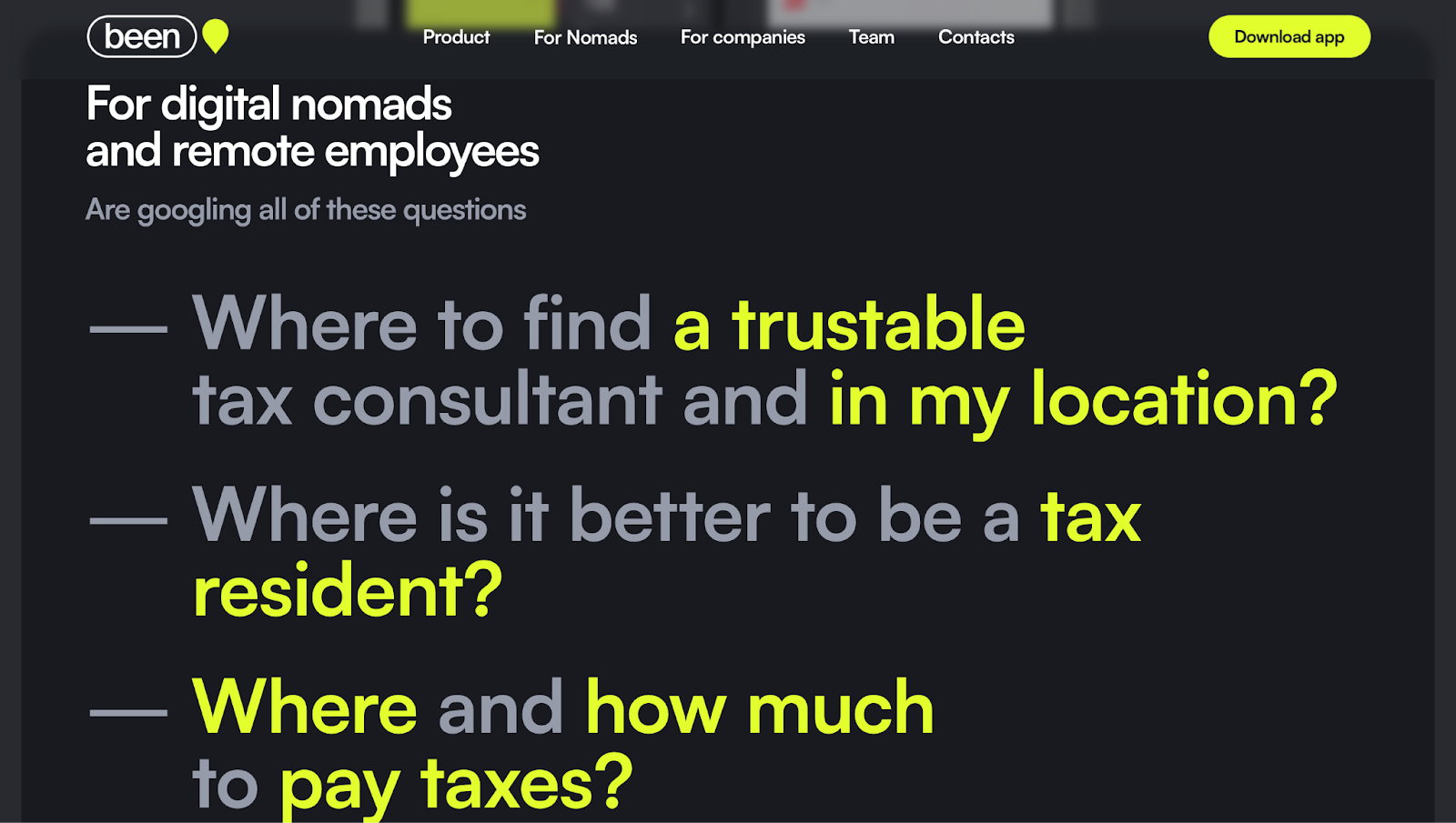
Takeaway to remember: Instead of typical key messages, Been directly addresses user pain points, presented as Google search queries. This creative strategy instantly connects with visitors, mirroring their real-life challenges and questions, making the site highly relatable.
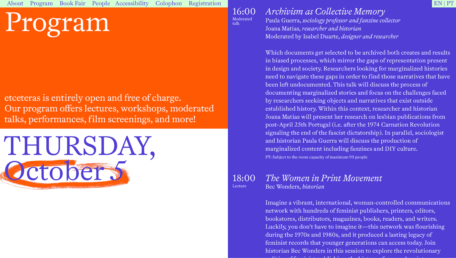
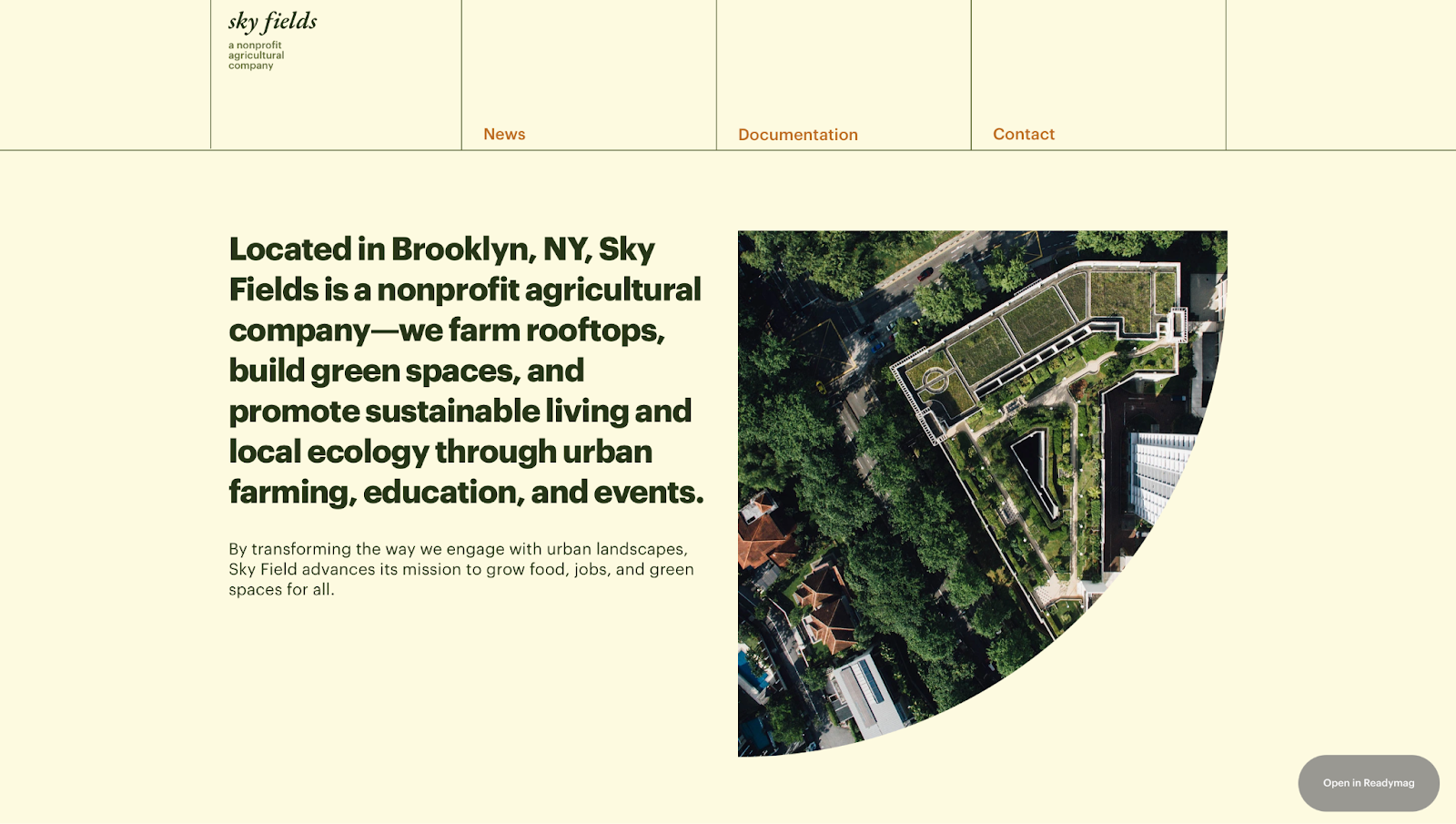
Takeaway to remember: the website for the Feminist Festival of Design and Publishing employs storytelling across various sections. A standout example is how they weave a story around the festival program, which not only informs, but also connects with the audience on a deeper level.
How to streamline information flow
Don't: Overwhelm your visitors with too much information at once.
Do: Prioritize and organize content. Use headings and bullet points for clarity, and segment your content into digestible sections. Imagine guiding your visitor through a story, with each segment building upon the last.
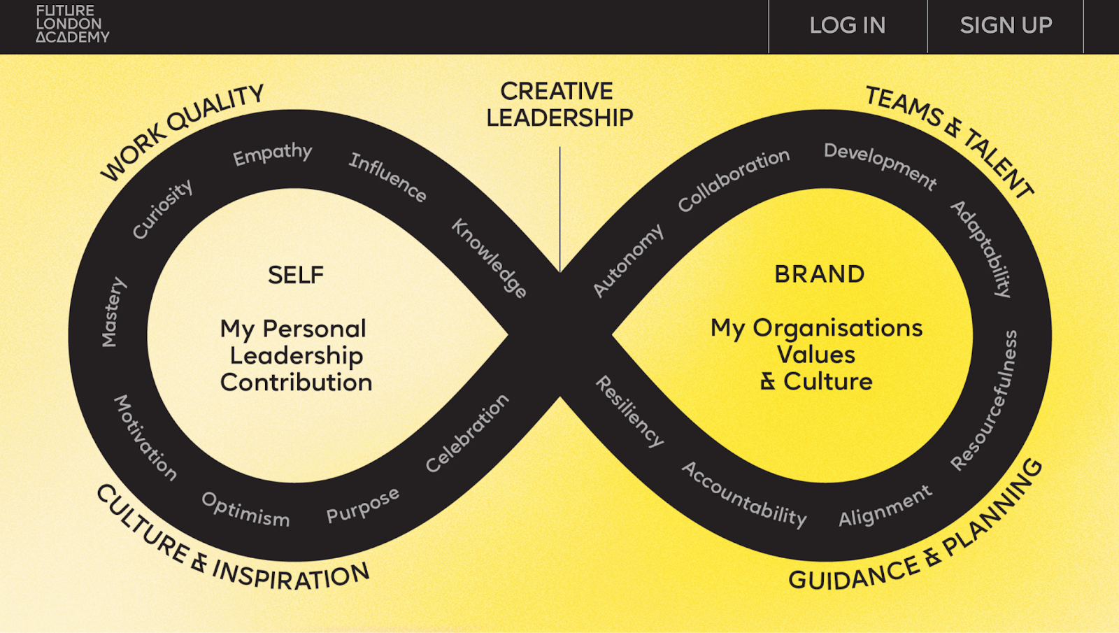
Takeaway to remember: This visually appealing and informative infographic at the Future London Academy's website simplifies complex information, making it easily digestible and engaging for visitors.
Find more tips to attract visitors and improve your marketing funnel in this piece "Strategies to design your website as an effective marketing tool"—It's packed with useful tools and strategies to make your website a stronger marketing asset.
How to balance creativity with usability
Don't: Let creative flair overshadow user experience. Overdesign can lead to confusion and high bounce rates.
Do: Avoid clutter to improve user experience. Less is more. A clean, minimalist design can work wonders.
If you want to dive deeper into the world of minimalist web design, you can learn more in our article, "Less is more: The power of minimalist web design".
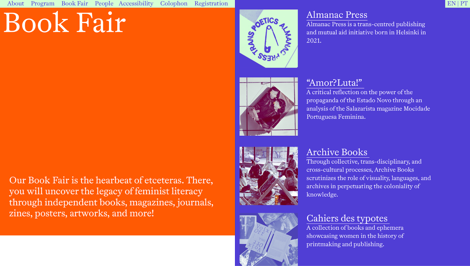
Takeaway to remember: Through skillful layout design and a strong visual language, Feminist Festival of Design and Publishing makes the content not only easy to digest, but also aesthetically pleasing.
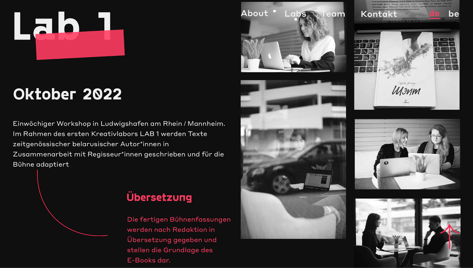
Takeaway to remember: The Kupalaucy theater project combines simple yet effective elements—photos and text. This blend creates an engaging, memorable experience where each photo tells a story and the text adds just the right amount of detail.
How to craft effective CTAs
Don't: Be vague with your calls-to-action. Unclear CTAs can lead to lost conversion opportunities.
Do: Make your CTAs pop. Use whitespace effectively to direct attention to your CTA and key messages.
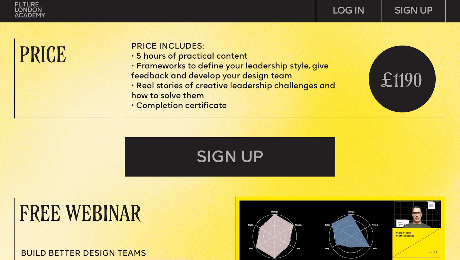
Takeaway to remember: The "Sign Up" button on the Future London Academy's website pops against the yellow background. It's dark, big, and easy to spot, and they've smartly placed another one in the header for extra convenience.
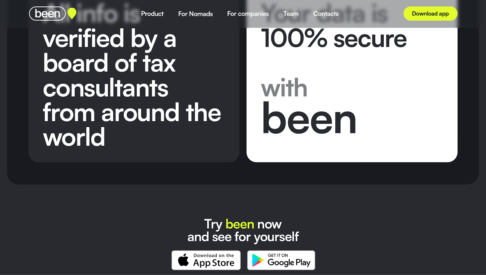
Takeaway to remember: On Been's website, the main goal is getting visitors to download the app. They've got clear buttons for different app stores right on the landing page, making it super easy to spot and click on your preferred store.
For more insights, be sure to check out our article, "Basic do’s and don’ts: 5 things to remember when designing the web". It's filled with tips and rules that every web designer should keep in mind.
Step 3. Master A/B testing to optimize a landing page structure
Why it matters
A/B testing removes the guesswork from website optimization. By testing different elements, you can understand what resonates with your audience and make data-driven decisions.
What to test
You can test virtually any element on your landing page, including:
- Headlines and subheadlines: does a more direct headline work better, or a more creative one? For a fitness app, you might test "Get fit in 30 days" against "Start your fitness journey today" to see which headline drives more sign-ups.
- CTAs: test different colors, wording, or positions to see which CTA button gets more clicks.
- Images and videos or photos and illustrations: compare different visuals to see which are more effective in engaging users.
- Layout and design: test different layouts to find the most intuitive and effective design.
Best practices to use
Always stick to these three rules:
- Test one thing at a time: change just one feature per test to see what really makes a difference. For example, if you're testing a headline, don't change the CTA at the same time.
- Run tests together: test both versions at the same time to get fair results.
- Get enough data: It's important to run your test long enough to collect solid info. A good starting point is about 1,000 visitors for each version. But remember, this can change depending on how much traffic your site gets and what your usual conversion rates are.
As for tools, Optimizely is a pretty handy choice for A/B testing. Plus, it's integrated with Readymag, making it a breeze to run tests right in your landing page designs. If you're on the hunt for more tools like this, don't miss our article on the best landing page tools made for designers.
Making a landing page is really about mixing creativity with a bit of know-how. You start with easy templates, sprinkle in some good content, make sure it works well, and keep tweaking it. And Readymag makes it easier—everything you need is right there to help you make a landing page that not only catches the eye but also does the job. Sign up and let Readymag be your canvas for digital storytelling.