Basic dos and don’ts: 5 things to remember when designing the web
In this piece, based on our educational pop-it Debris of Attention, we offer some rules of modern etiquette for people designing the web.
Every design decision is made on behalf of end users. Designing the web — a medium for communication and a social space at the same time — it is our responsibility to think carefully about how our choices impact the person on the other end of the conversation. Even small and seemingly insignificant moves can have far-reaching consequences, and good etiquette can help us carve paths to better futures for everyone.
Ethical design communication refers to the practice of conveying honest information, in a manner not intended to be misleading. In this piece, based on our educational pop-it Debris of Attention, we offer some rules of modern etiquette for people designing the web.
Make it clean
If the goal of a web page is to convey information (brand stories, special offers, announcements, etc.), it should be assessed according to the clarity of its message. Thus, we should always help users focus on relevant information instead of distracting them. Some of the most common examples of ignorant or malicious attempts to shift your flow include: intrusive pop-ups and sidebars, floating menu bars, splash pages, and hidden elements.
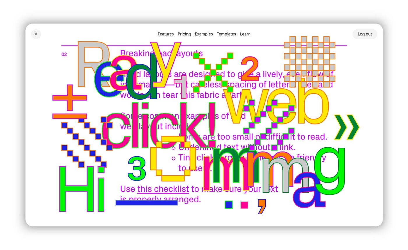
Keep it neat
A good web layout should provide a lively, even flow of information — but careless spacing of letters, lines and words can tear this fabric apart. Some common examples of bad web layout include:
- Fonts are too small or difficult to read.
- Text is underlined without a link.
- Tiny click targets — please, be friendly to users.
Use this checklist to make sure your text is properly arranged.
Choose user-friendly fonts
Using too many fonts on the same website decreases cognitive fluency. This means users will find it difficult to understand what they’re looking at. Cursive or otherwise “hand drawn” looking fonts are hard to read, decreasing ease of use for visitors and potentially pushing them away.
Avoid animation hell
More often than not, online junk attacks are backed up with a significant amount of dark pattern firepower — including nudity, flashy animations and hidden close buttons. Flickering lights may trigger seizures in users with epilepsy. Web content can avoid this risk by not blinking or flashing too rapidly. The defined threshold is no more than three flashes per second. Here you’ll find more tips on how to make your website more accessible.
Be navigable
Make your page a clean and navigable river, instead of a swamp. A common example of bad navigation includes stepped menus: options can quickly become overwhelming, making users frustrated and motivating them to go elsewhere.