Less is more: The power of minimalist web design
Exploring minimalism's journey, principles, and future with Carl Barenbrug, Director of Minimalissimo
Origins and history of minimalism
Minimalism as an art form originated in the United States in the 1960s. It continued ideas of abstractionism, suggesting that art should belong to its own reality, rather than depict and imitate an external one. Minimalist painter and sculptor Frank Stella expressed this idea in his famous phrase, “What you see is what you see.”
Minimalism has many forerunners and influences. These include Bauhaus in Germany, De Stijl in the Netherlands, and architectural modernism. In fact, the famous “Less is More” mantra is often linked to Mies van der Rohe. The 1920s avant-garde in the USSR and Japanese traditional art, with its concepts of ma (negative space) and wabi-sabi (imperfect beauty), also played a role. In essence, minimalist design is more than a simple aesthetic choice: it reflects a broader philosophy that art should be truthful and not imitate other realities.
The modern evolution of minimalism in design began with the rise of the digital age after the turn of the millenium. The early days of the internet were characterized by chaotic and cluttered website interfaces, but as technology evolved, the user experience became increasingly emphasized, and the principles of minimalism—clarity, simplicity and functionality—perfectly suited the new digital environment and the demand for intuitive, user-friendly interfaces.
To gather insights into minimalism, we reached out to Carl Barenbrug, director of Minimalissimo, one of the leading online resources specializing in minimalist design. Here, Barenbrug shares his story and the origins of his interest in this approach:
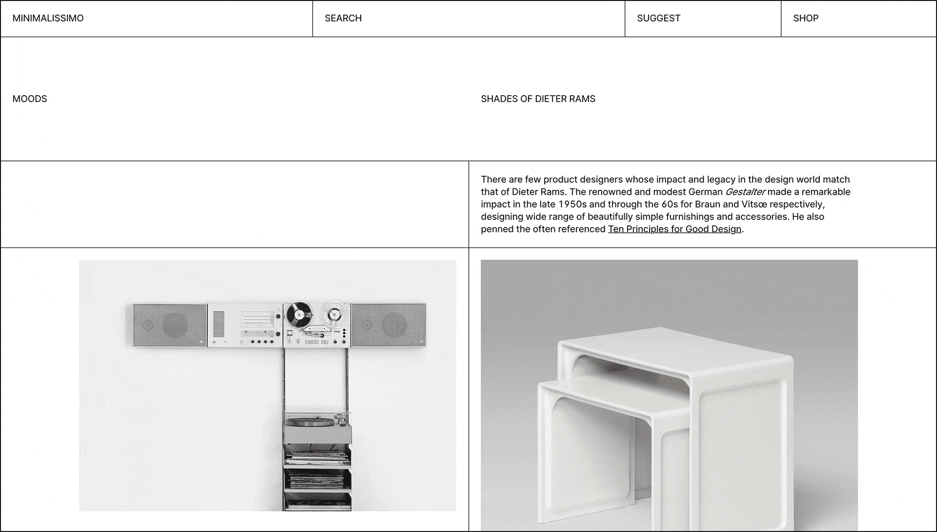
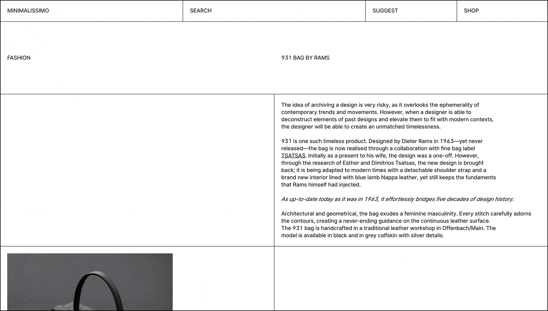
“I was initially inspired by the product and furniture design of Dieter Rams; notably his work for Braun and Vitsœ in the 50s and 60s. That introduction to simple design took me down a path of discovering many other designers such as Naoto Fukasawa and John Pawson among others. And at a time, around 2010, when the world seemed to be over-consuming and design became more about mass production and quick profits rather than sustainability and timelessness, there was a desire to defy the throwaway culture and increasingly ugly design and instead create a digital showcase of work we considered the benchmark of good design. It just so happens that good design is also simple design. And the idea of Minimalissimo was to fly the flag of honest, reductive, and aesthetic design in the face of mediocracy.”
Minimalist design principles and meaning
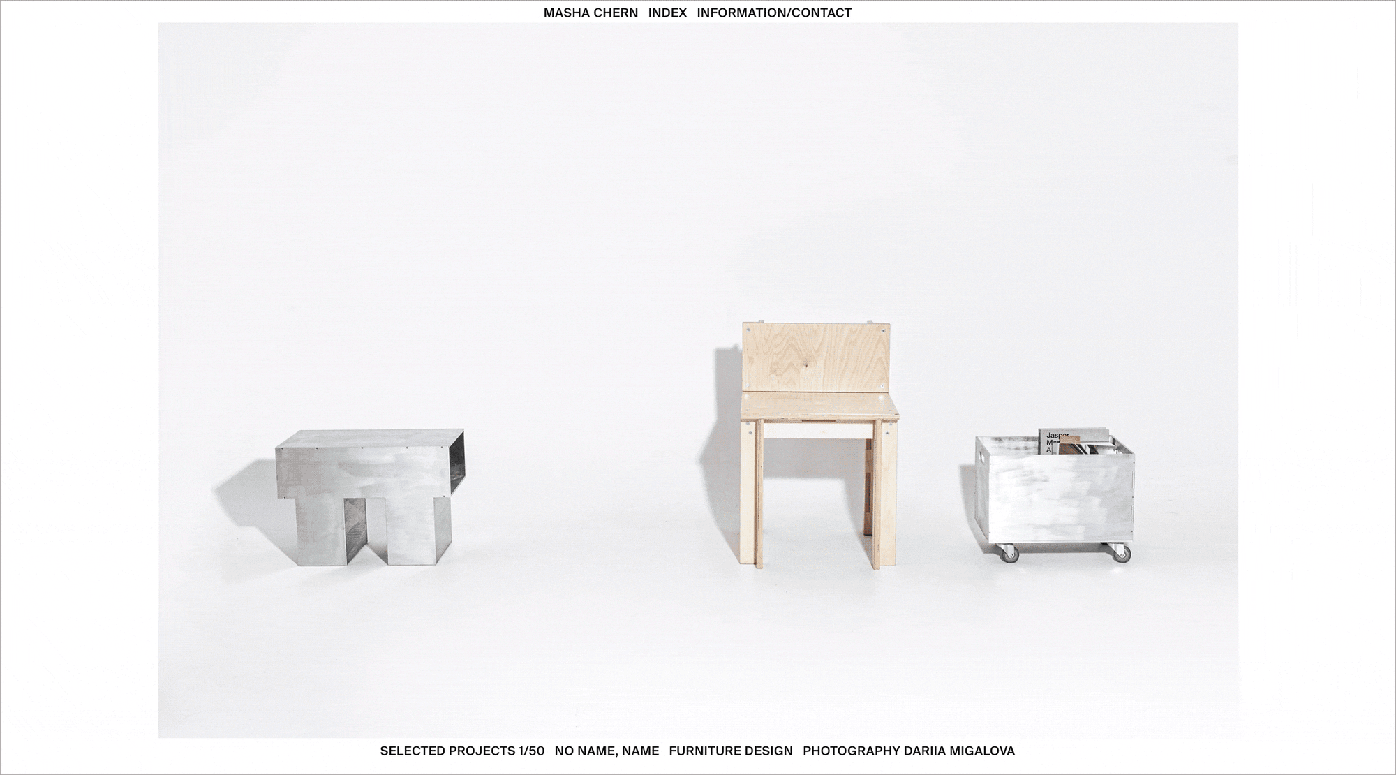
Minimalism in web design isn’t just about looks: it’s a philosophy and set of principles that emphasize functionality and simplicity. Barenbrug describes minimal design as a combination of the following:
“A byproduct of simple design: Simplicity is at the core of anything that represents minimalism. A simple approach to design is the only way to find its purest form.
Understated: It is quiet, restrained, and modest yet expresses elegance and refinement through detail.
Exposes its essence to communicate its value: For a design to be appreciated, it must focus on the essential aspects. It must be devoid of unnecessary features to make it as clear and understandable as possible.
Geometric: Its composition reflects pure and well-structured forms to emphasize the precision and intentionality of its development.
A balance of form and function: By means of a well-executed build, it demonstrates the importance of aesthetics without compromising its core functionality and usefulness.”
As Barenbrug further emphasizes: “Minimalism is about stripping back a design—inside and out—to find the lightest solution. From the code to the visual design. The code should focus on performance and essential functionality, eliminating bloat and unnecessary packages, although there are no restrictions on what frameworks or codebase you might choose to use. The visual design should be focused on clarity and utility, but with finesse applied to the design details. Those details might be the use of typography, white space, navigation, animation, and interaction.”
The benefits and drawbacks of going minimal
Improved UX vs Lack of distinctive design
Minimalist websites reduce cognitive load. Because users don’t need to process excessive amounts of information, this speeds up and facilitates decision-making. Minimalist payment design in an online store can lead to increased sales. A clear CTA without distractions encourages users to take desired actions, whether that's signing up for a newsletter or buying a product. As Barenbrug points out, “Design needs utility otherwise it ceases to be design. A utilitarian approach puts user experience first. This involves understanding the target audience, their tasks, and their expectations by means of research, and then designing interfaces that facilitate the success of those tasks and iterating on them.” However, the challenge is to make sure your minimalist design stands out among dozens of similar ones. The issue can be solved with unique branded elements or a standout color palette.
Fast load vs Limited flexibility
Fewer elements on a page means less data is needed to load it. This is especially important for mobile users who may not always have access to fast internet. Minimalist design reduces the likelihood that they’ll leave the site in annoyance before seeing the results. On the other hand, minimalism might not be a good fit for every brand or concept. An entertainment site for kids or a fun festival site may require more lively, dynamic elements. “You could fall into the trap of thinking minimalist design equals minimal content. It doesn't. Be sure to provide enough information and context for users to understand the purpose of the design and take the desired actions.”
Timeless vs Risk of being monotonous
By avoiding extra trendy elements that can quickly go out of fashion, you make sure the design stays relevant longer. But you need to make sure that while adhering to the principles of minimalism, the site remains engaging for users. Sometimes simple interactive elements can be used for this—but remember that less is more.
Easy adaptability across devices vs Difficulty communicating complex information
The fewer elements on a page, the easier it is to make a responsive design. A minimalist site means that the user experience will be more consistent across desktops, tablets, or phones. At the same time, if a site delivers complex information with a lot of detail, such as technological or scientific information, minimalism can cause difficulties, the key being balancing simplicity and completeness.
The future of minimalism
Minimalism in web design is firmly rooted, but it’s not immune to change. What does the future hold? Barenbrug says:
“I reckon there will be an inevitable focus on sustainability and tech integration to adapt to environmental and societal landscapes. For instance, minimalist spaces and products will prioritize functionality and durability, with a focus on reducing waste and energy consumption. Minimalism is likely to become more intertwined with technology as smart homes and digital interfaces continue to advance. Designers will seamlessly integrate tech into living and working environments while maintaining a clean and uncluttered aesthetic.
As for digital design, I'm more hopeful than anything else. I'd love to see a greater reduction in carbon impact within the web. The fact of the matter is that the Internet consumes a huge amount of electricity. And when it comes to web design, there is a lot that can be done to make the web far more energy efficient in future. Both design and content have a big impact on that.”
Case studies: Digital and physical minimalism
Learning from practice is often more impactful than theory alone. So we asked Barenbrug to examine two products he considers minimalist benchmarks.
“Probably the best application of minimalism to any [digital] product in recent years is iA Writer. It's an unobtrusive, versatile, and user-friendly Markdown writing interface that gives you the essence of pure writing by enhancing focus. It heightens your writing experience by removing distractions and highlighting essential elements, complemented with beautiful typography. And who doesn't love a clean writing environment?
The second [physical] example is the Apple AirPods. Yes, it's a highly commercial product, but this only justifies how successful minimalist design can be—when it revolutionizes an industry. The application of minimalism in this instance and the beneficial outcome is so clear to see in terms of user experience. The simple and compact form alone eliminates any unnecessary components such as buttons and wires. And the wireless connectivity removes the frustration of tangled or caught wires or complicated pairing processes. The charging case itself is a testament to minimalism. Its compact size and minimalist design make it easy to carry in a pocket or bag, ensuring that users always have a convenient way to charge their AirPods.”

Further reading and inspiration
As recommended by Carl Barenbrug.
Books:
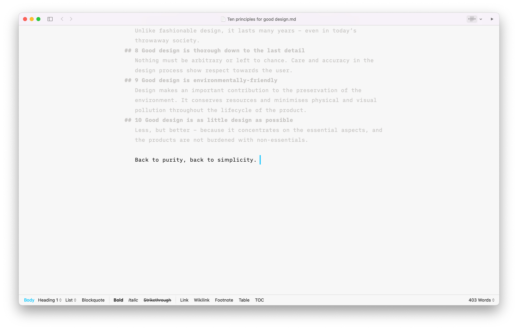
- As Little Design as Possible by Dieter Rams
- White by Kenya Hara
- A Lesson with A G Fronzoni by Ester Manitto
- Embodiment by Naoto Fukasawa
- Anatomy of Minimum by John Pawson
- The Colours of Light Vol.1 by Tadao Ando
- The Laws of Simplicity by John Maeda
- Selection: Architecture by Minimalissimo
Online sources: