A smaller screen needs a different story
Why adapting a website for mobile is rarely just about making things smaller.

For designers, mobile layout often becomes a second project altogether. That’s because a smaller screen rarely asks for a smaller version of the same story, and what feels cinematic on desktop can become overwhelming on mobile. That’s why adapting a website for mobile is rarely just about making things smaller.
This article includes insights from Readymag’s marketing designer Francisco Pires reflecting on his recent sites made with Readymag.
Shrinking vs. Restructuring
Back in the day, designing for mobile largely meant making things smaller. A desktop layout would be compressed into narrower proportions, with columns stacked and images resized. Responsive systems made this feel almost automatic. But for designers working on more expressive or editorial projects, mobile adaptation rarely feels this simple. If desktop can be compared to a stage, mobile is more akin to a flow, where simultaneity gives way to sequence. Mobile asks for different priorities: clarity, sequencing, timing, and focus.
“There’s a mantra a teacher once told me that I always keep in my head,” says Francisco Pires. “‘Adapt the content to mobile.’ Sometimes you don’t need to show the full text on mobile because people don’t want to read huge amounts of text on a very small screen. It’s completely okay to have a slightly different version across formats. Even some studios do this—on mobile they simplify things and use a different mix of images, then on desktop they show a lot more information.”
A good example of that almost editorial approach to mobile is Readymag’s UNLEARNED project, which was designed by Francisco.
“On desktop, we had a huge amount of space, so we could feature columns on the left and right, with the text sitting in the middle. But I was convinced we simply couldn’t do this in the same way on mobile,” Francisco shares. “Interaction is different there. You don’t really have clicks in the same sense—you mostly have taps. You don’t have hover, so you need to make certain decisions. In the end, we adapted the three-column desktop layout into something more single-column and vertical. And on the animation side, we made things flatter and less interactive, because that’s just how mobile works.”
A more radical approach would be designing mobile first, if you can be sure that most of your audience is mobile-native. An example of this is one of Readymag’s landing pages that’s only promoted to TikTok users.
“We designed this landing page in a very mobile-friendly way, almost mimicking a TikTok-style interface, so the central part stays consistent throughout screen sizes,” shares Francisco. “But to respect the desktop layout as well, we expanded the canvas around the central column. We had to treat the background differently simply because there’s more space on desktop, so we used some pictures. Sometimes you can keep the mobile experience intact, but use the extra desktop space in a smarter way.”
Mobile layouts in Readymag
In Readymag, mobile works through adaptive layouts—separate versions for desktop, tablet, and mobile. Where responsive systems prioritize continuity, adaptivity allows for interpretation. There are several ways to approach this.
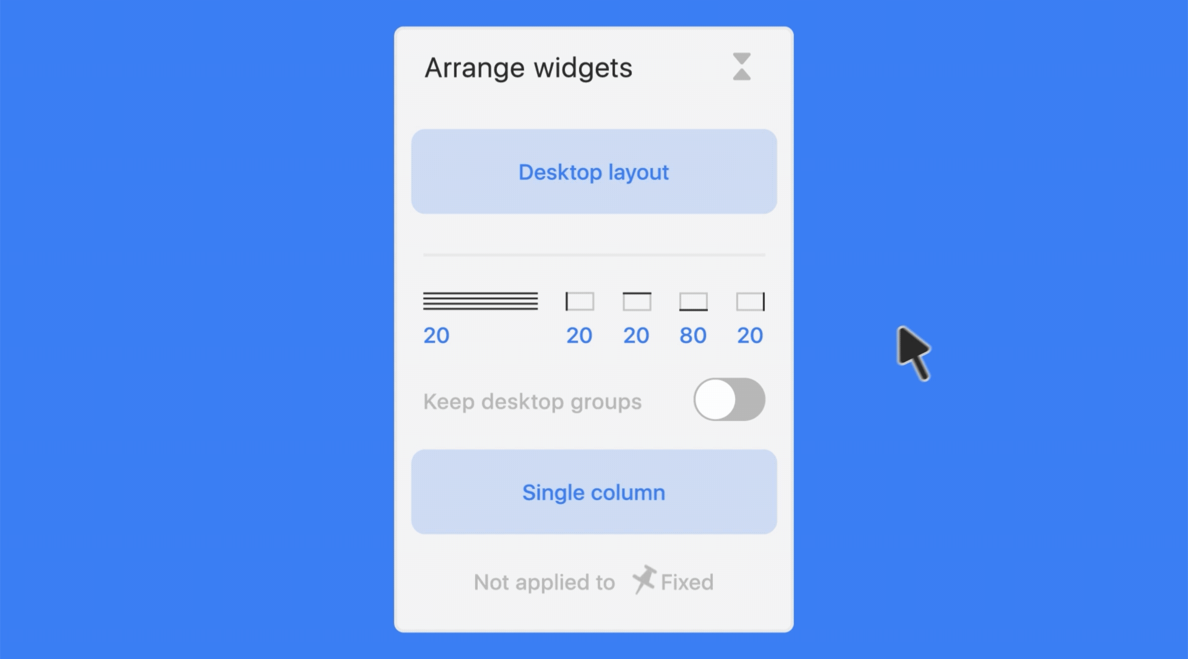
“Single column” provides the fastest path for more structured layouts. That way, widgets automatically stack into a vertical flow, making it especially useful for projects already built around systems and predictable hierarchy. But like most automatic approaches, it struggles with highly expressive compositions.
This is how "Single column" works
“Desktop layout” offers more control, copying the desktop composition into mobile for manual refinement. This tends to suit less conventional websites like editorial projects, portfolios, animation-heavy layouts, and typography-led experiments, where preserving intent matters more than speed.
“Fit desktop to mobile” allows creators to rethink particular sections or widgets selectively. This option can be found in the Arrange settings when multiple widgets are selected.
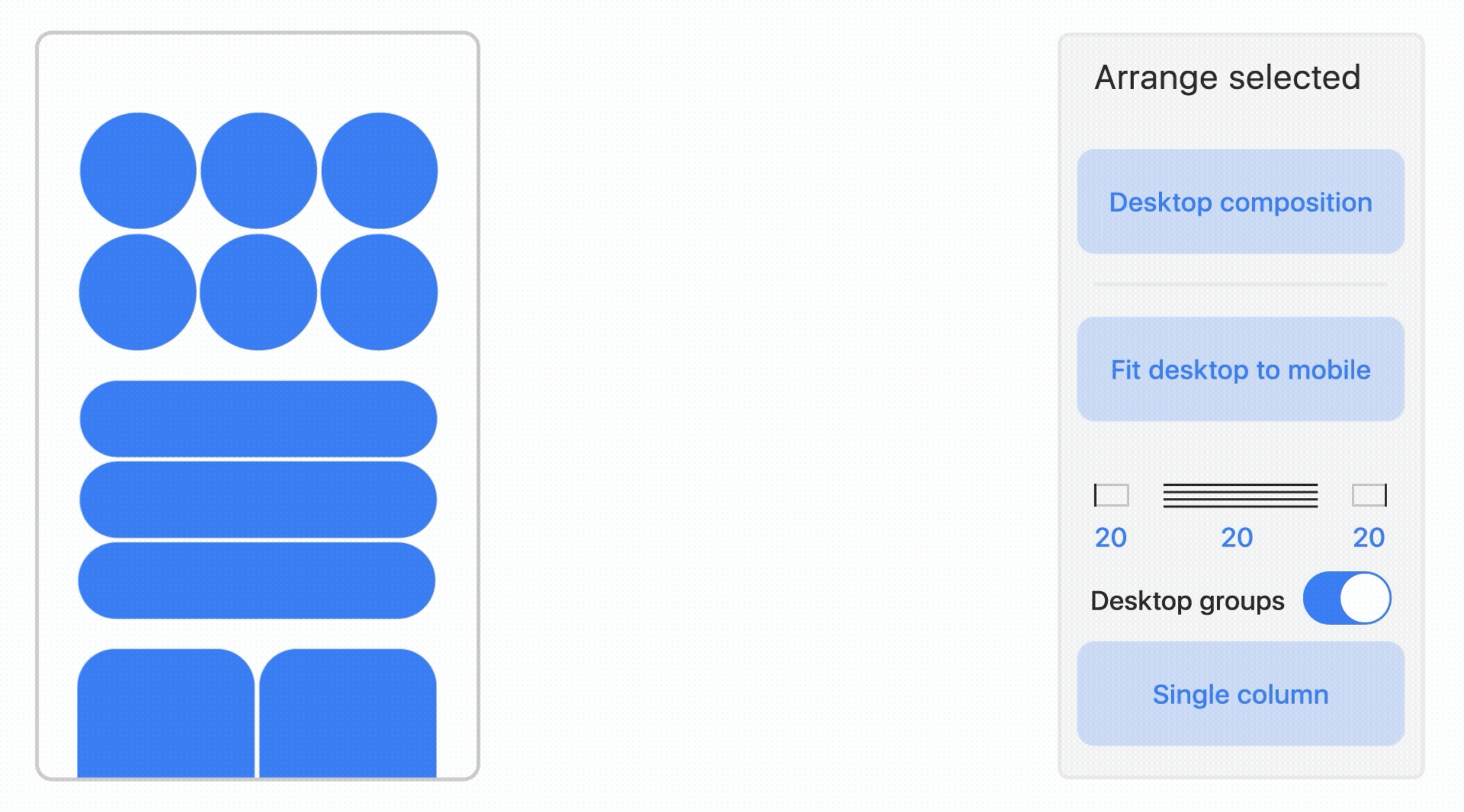
In practice, most cases use a mix of approaches. “I would definitely work on both sides,” Francisco says. “Mobile is normally a single-column format, so I’d let most of the page adapt automatically with ‘Single column’ first—usually, you can get maybe 80% of the page already working like that. Then I go section by section, using the ‘Fit desktop to mobile’ function to individually rearrange things the way I want.
For example, if you have two or even four columns on desktop, you don’t necessarily have to turn everything into one long column on mobile. You can still keep two columns, or rearrange four columns into something like two columns and two rows—so you still have a grid of four, just in a different arrangement.”
Practical hacks from Francisco
- Think about mobile from the beginning, treating it as part of the same creative process rather than an afterthought.
- Duplicate widgets specifically for smaller screens, labeling them with suffixes like “_mob” and hiding desktop-specific versions when needed.
- Groups created on desktop remain grouped on mobile, which makes early organization all the more valuable.
- Use Keyhole—a feature that allows you to preview desktop while editing mobile, making it easier to control how widgets change across layouts.
- Watch out for fixed widgets: “Single column” doesn’t work for them, as these are typically used for navigation and are intended to be configured manually. The same goes for widgets with “On all pages” setting on.
- If you need to restart, clicking “Desktop layout” brings everything back to square one.