Shortcuts in use: principles of Readymag product designer Stas Aki
Shortcuts — keyboard combinations that perform certain actions when pressed simultaneously — save us seconds, months, hours, and, in the long run, even years. Stas Aki, a product designer at Readymag, recently published his musings on the topic called Shrtcts.
Shortcuts — keyboard combinations that perform certain actions when pressed simultaneously — save us seconds, months, hours, and, in the long run, even years. Stas Aki, a product designer at Readymag, recently published his musings on the topic called Shrtcts. He explains why shortcuts are so useful and how he tried to highlight their peculiarities in the design of his project.
I created Shrtcts to emphasize three points. First, shortcuts are extremely useful and, simultaneously, underappreciated. They definitely deserve more attention.
Second, I wanted my readers to notice how many shortcuts we actually remember by heart. Say, Cmd-S to save your work, or Cmd-Q to quit a program are something everyone knows, already part of our cultural code.
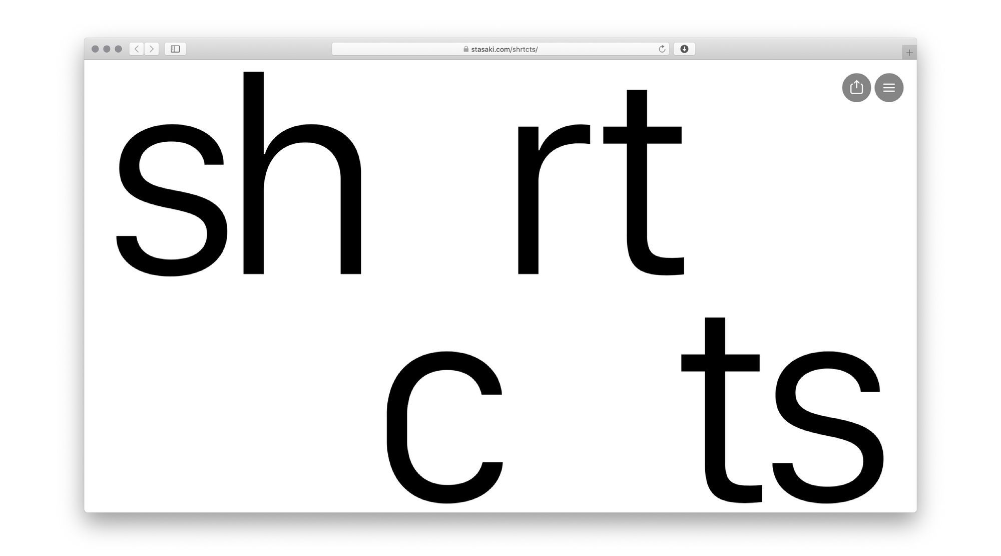
Third, shortcuts are interesting from a graphic design perspective, since they introduce a certain typographic gimmick: words nearly without vowels. To experiment with the look of these words, I typed all the text in this way.
It’s also important to remember that shortcuts are actually fairly old: some of the shortcuts we use today were invented even before the computer mouse came into being. Some are even older: the Shift button saves as many as 26 buttons for capital letters and dates back to typewriters.

Shortcuts are especially useful for jobs that require people to use a keyboard in an unusual way. For example, software engineers heavily rely on shortcuts because it’s inconvenient to switch to a mouse while coding. Designers like shortcuts, too, but for slightly different reasons: they use graphics tablets, and tend to do as much as possible with their free hand.
I decided to use San Francisco as my font for the project because it’s one of the macOS system fonts, and reminds me of the environment where I encounter shortcuts most often. Also, the letters on my notebook keyboard are typed in San Francisco.

There’s a four-column layout for text, and then there are larger text bits above to make the overall look more interesting. Some of these bits are animated, appearing and disappearing in a quasi-random order — I did this by changing the Delay parameter for the applied on-scroll animation.
It might be a little subtle to notice but you can click on +kbrd signs throughout the project: the keyboard image will appear to display the shortcut visually.
