Exploring Readymag’s marketing design philosophy with illustrative examples
We don't have a brand book or strict guidelines, allowing our imagery to remain fresh and flexible. Discover how this unique approach sets us apart.
Readymag’s philosophy is rooted in simplicity, individual creativity, and intuitive creation. Since we make a tool for designers, we often hear people saying they like our style and asking about our creative process. So, we’re opening up about how we do our brand and communication design. Let’s explore how we apply our principles to different visuals, featuring insights from our marketing designers Tanya Egoshina and Varya Fomicheva.
Articulating the core design principles
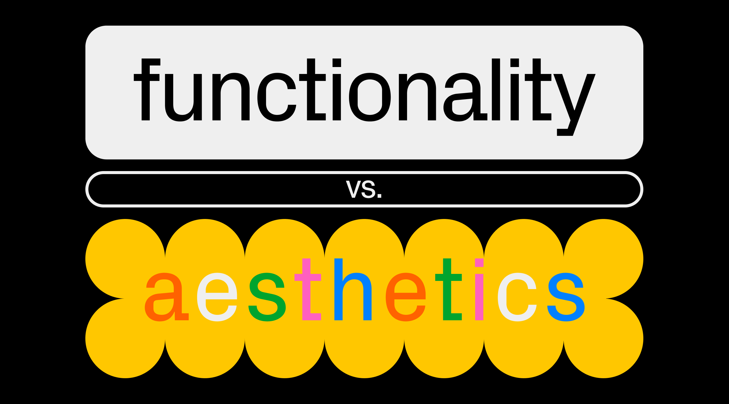
Simplicity is at the core of everything Readymag does. The design team leans on simple typography, geometric shapes, and vivid colors. This style evolved naturally, and is rooted in individual creativity rather than strict guidelines. “It all started with Stas Aki’s style, who worked his way up at Readymag from Product Designer to Head of Design. The style resonated with us, and we’ve simply continued in that direction,” both Tanya and Varya share.
Rather than relying on a formal brandbook, Readymag’s consistency is maintained through its people. New team members are chosen for their natural fit with the existing style, ensuring a cohesive look and feel across projects. “Our style is a collective effort, blending our personal designs into what’s recognizably Readymag,” Tanya notes.
We value creative freedom, with minimal restrictions on design. Our design briefs focus on the project’s essence, leaving room for creativity. This freedom has become a natural part of our design workflow.
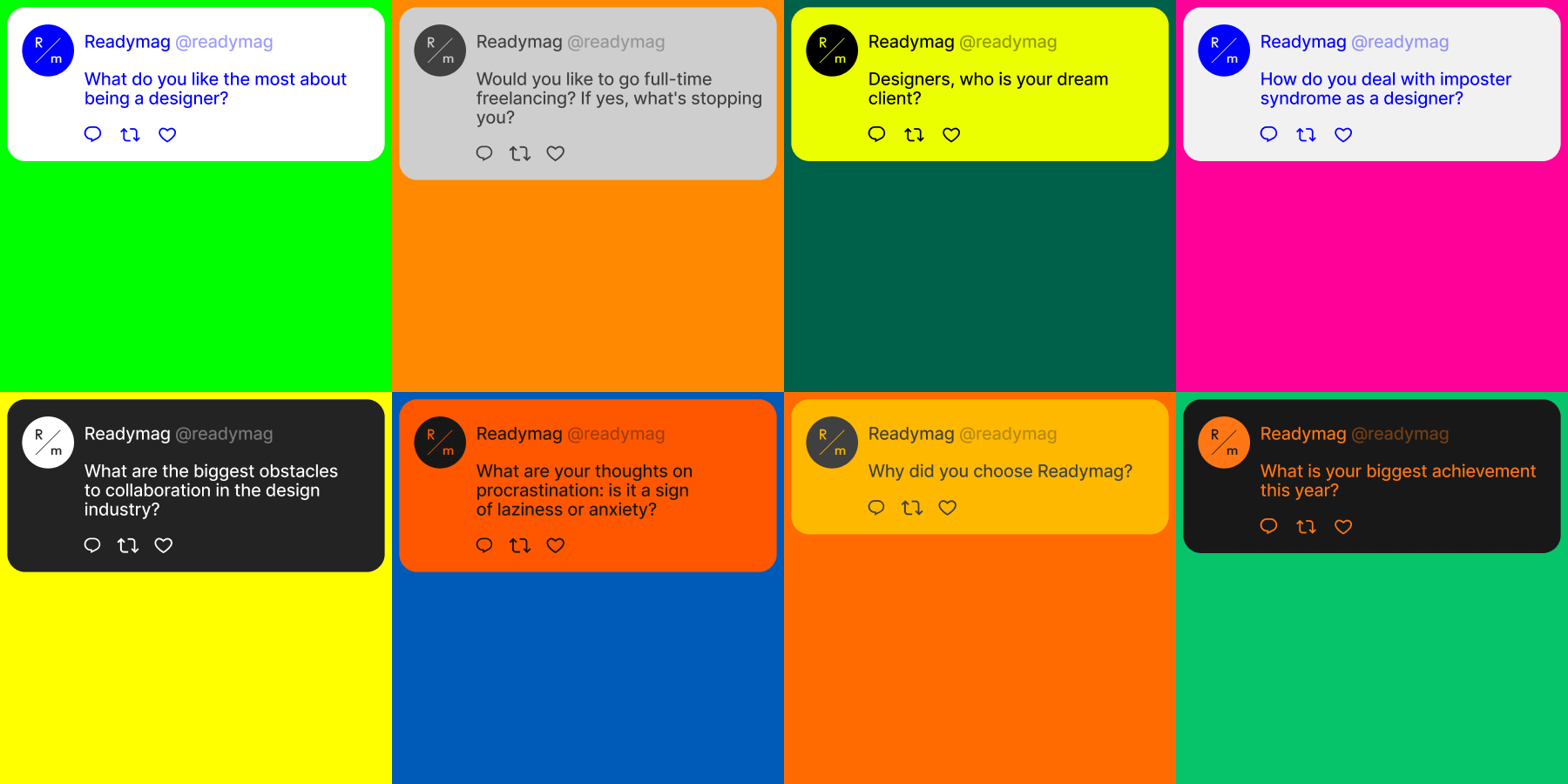
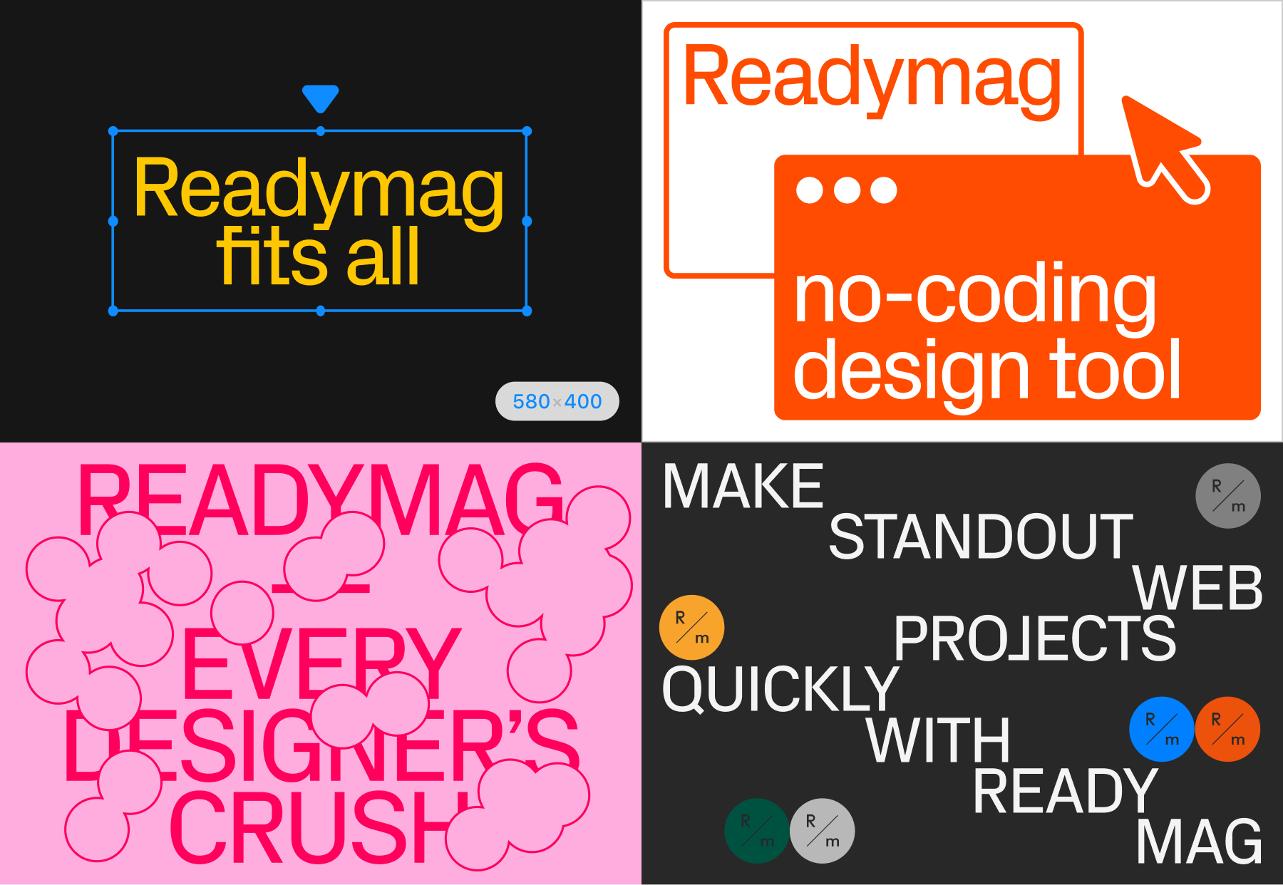
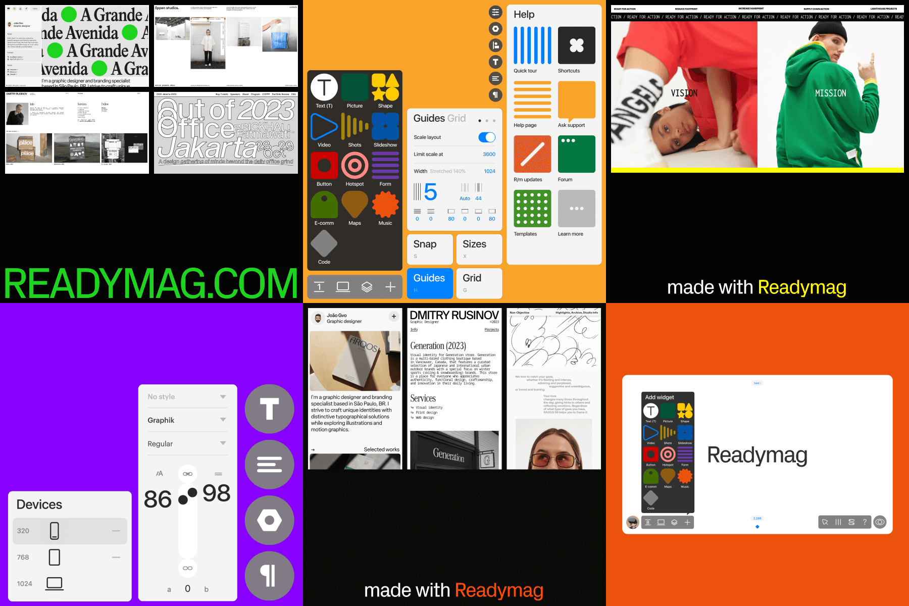
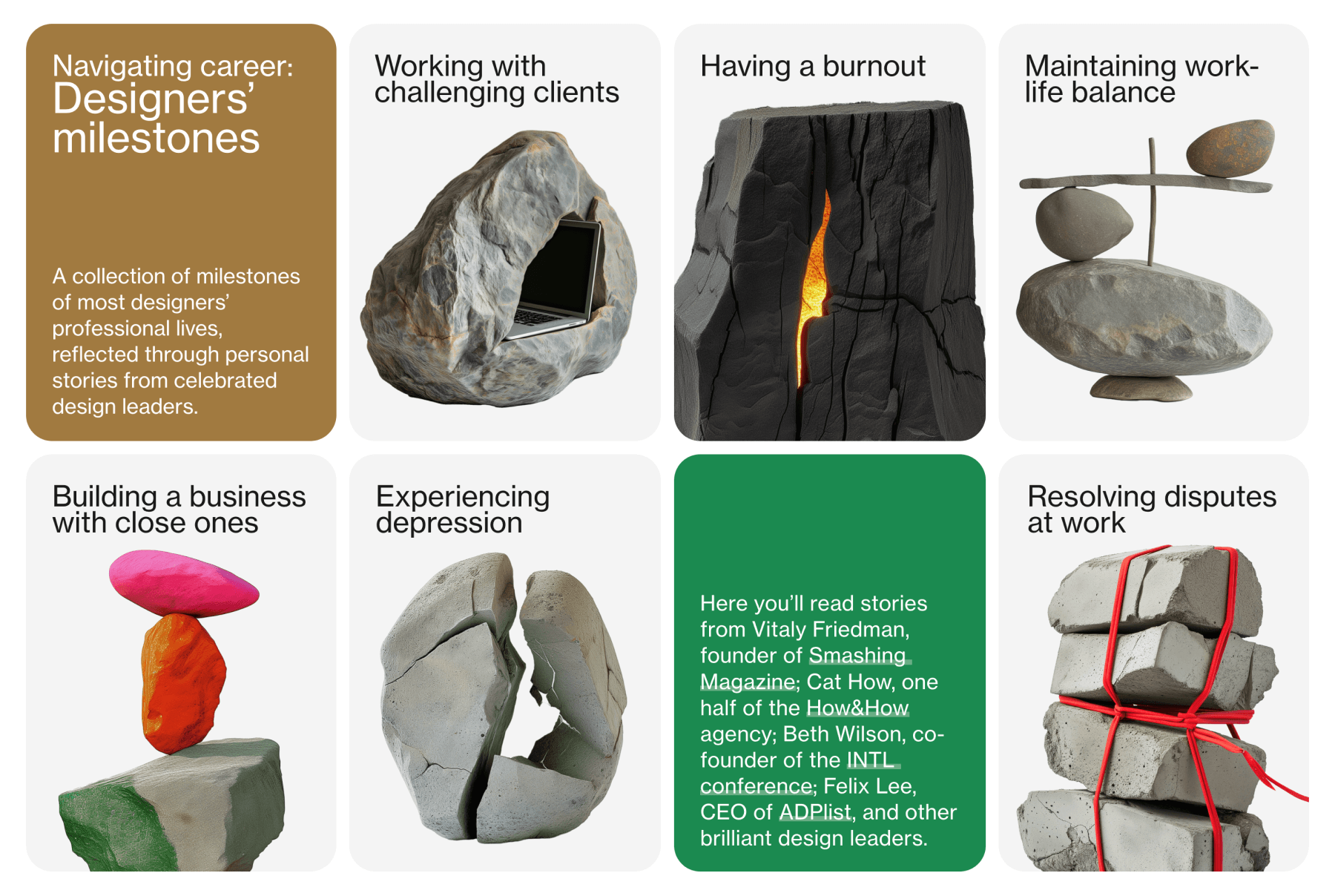
Visual storytelling in blog posts
Each story we publish on our blog is accompanied by visuals that should enhance the content and embody Readymag’s design values. We don’t follow any ready-made guidelines; each image is crafted from scratch. All the illustrations below are commented on by Varya.
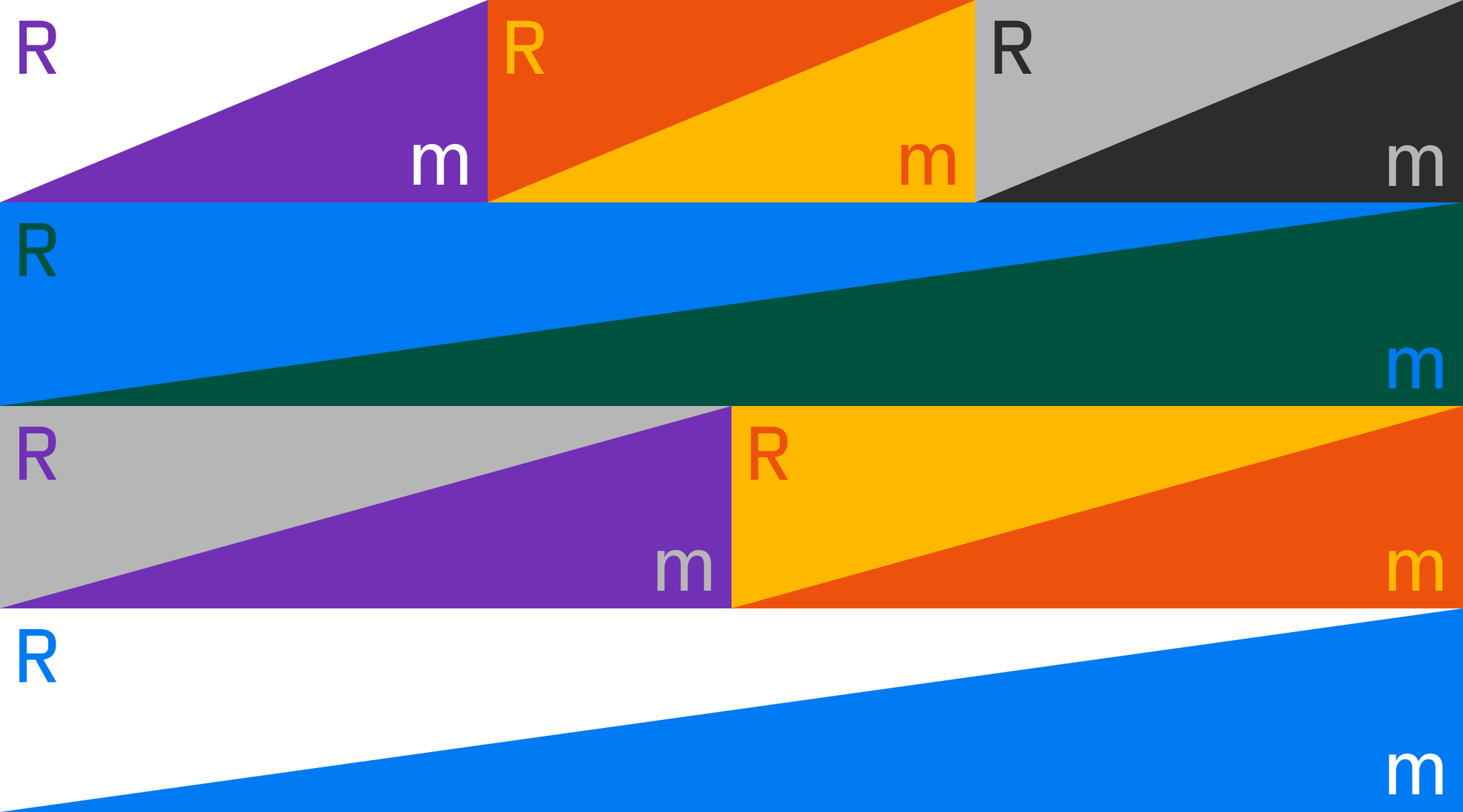
“This visual perfectly captures our message, enhanced by our signature shapes and colors. While black isn’t our primary color, its strategic use as a secondary color adds depth and contrast, making the other colors pop. It’s essential for variety and visual impact.”
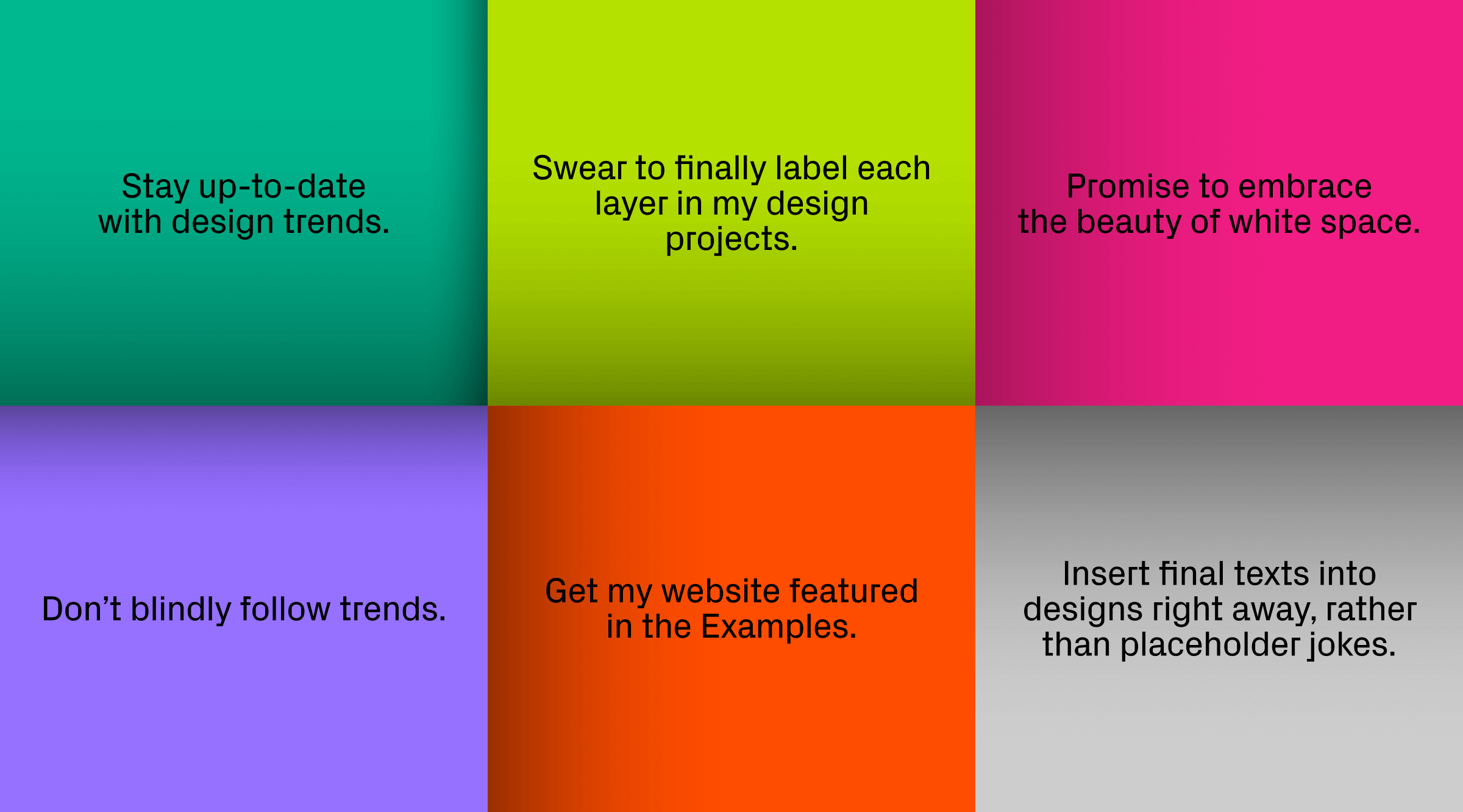
“For this piece, I embraced more creative freedom to match the festive spirit of the end of the year. I experimented with gradients, a less common choice for us, while still drawing from our palette of frequently used colors. The result is unique, pairing full phrases on cards with visuals to succinctly highlight key points from the article.”

“For product updates, we create covers that reflect what’s in the popups, focusing on interface elements. The product team designs these popups early, so our announcements across social media tell a unified story. Look at the fine lines here—again, they show the unique style of the designer behind the popups, making them stand out from other marketing materials. It’s all about individual flair.”
Communicating the brand through newsletters
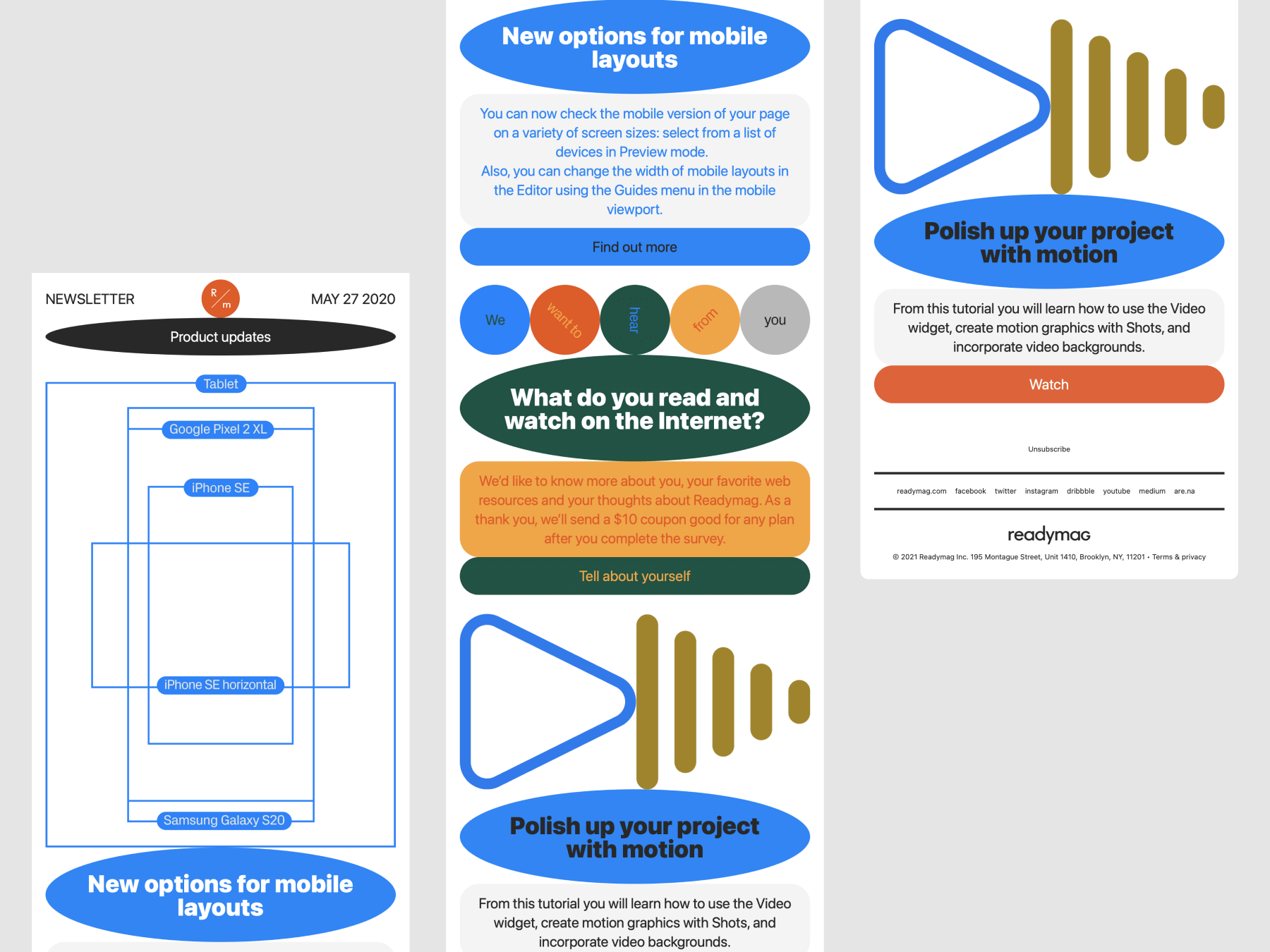
Stas Aki created our newsletter template a few years ago, and it hasn’t changed much since. The design focuses on how font sizes, oval headings, and text on a gray bar are arranged. Despite the consistent template, the look of each newsletter can vary significantly thanks to different illustrations, some of which are also used in our social media. This mix of common elements creates a range of vibes, from serious to quirky. “We don’t use all templates all the time; it’s more about what feels right for each message,” Tanya comments.
Refreshing visuals for social media
For social media, templates are designed from scratch for a series of posts and are periodically refreshed to maintain engagement. “This area allows us the most freedom. We’re not just bound by our style, but can explore shapes and colors creatively within that framework,” Varya says. Despite the variations, all social media visuals maintain a cohesive style, ensuring brand recognition across platforms.
Designing impactful ad banners
The design process for ad banners often starts with existing visuals, reimagined to fit new dimensions, but new designs are also created from scratch to ensure freshness. “Our ads primarily feature the interface—what users see is what they get. This approach keeps our ads grounded in the user experience,” Tanya explains.
The selection of screenshots for banners should be particularly thoughtful, focusing on minimalist yet attractive elements that promise to catch the eye within the constraints of banner sizes.
Innovating with web specials
Special projects, like the latest one featuring AI-generated realistic illustrations, offer a chance to experiment with new styles. “These projects give us a chance to step out of our comfort zone, exploring new ideas and styles," Tanya says. This experimentation is vital for keeping the brand’s visual language fresh and engaging.
Collaboration is key when venturing into new styles. In this case the design team worked closely with AI artists to ensure that the final illustrations made with Midjourney fit within Readymag’s minimalist aesthetic. “We share ideas and references, striving for simplicity and clarity in our illustrations,” Tanya mentions.
Embracing creative evolution
How far can this fluidity go? “While certain things, like serif fonts, are rare, there’s always space for new ideas,” shares Tanya. The focus is on making sure everything fits together without overpowering the overall design. As Readymag grows, the design will too, shaped by the people who work on it. This means the look and feel of Readymag evolve, showing that design rules are meant to be reimagined.