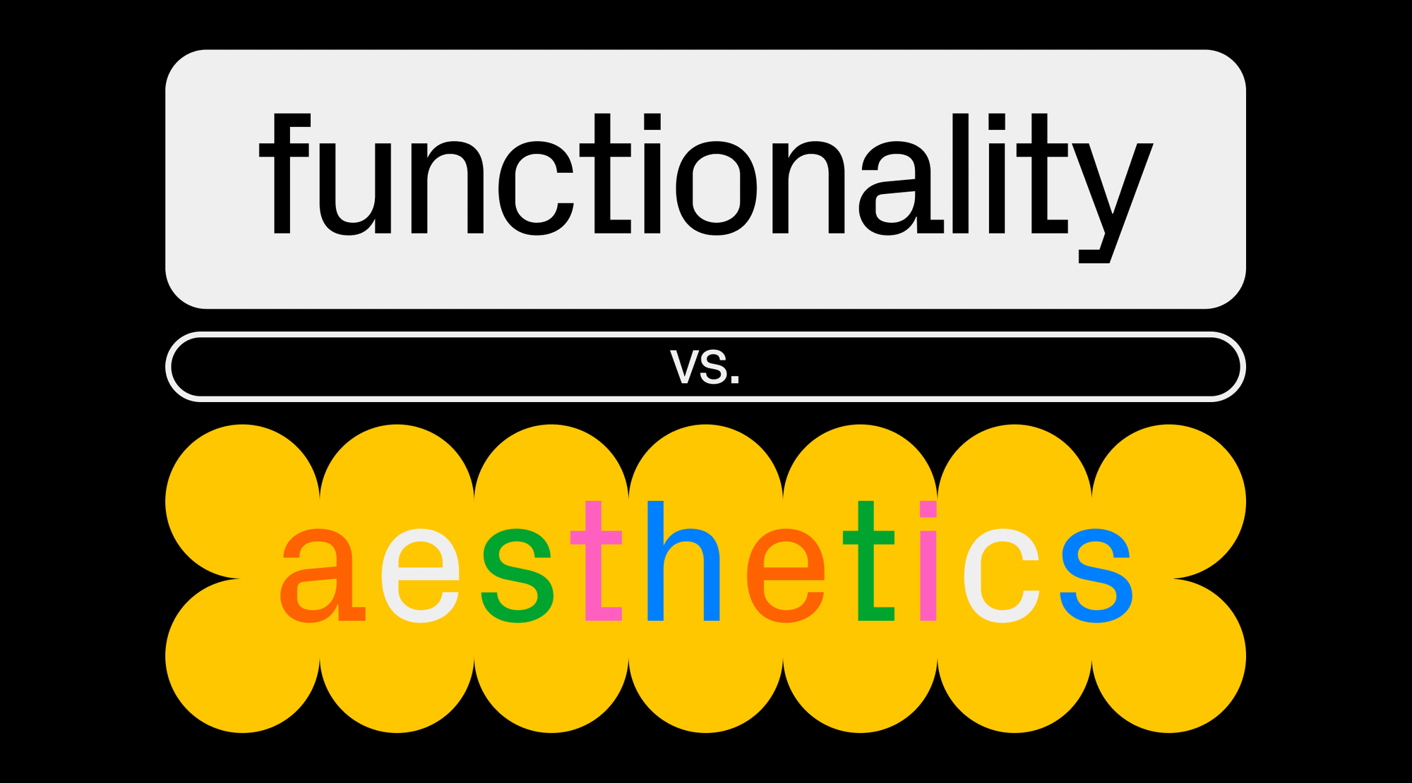
Q&A with designers: Functionality and aesthetics in design
Three web designers speak up about the notion of beauty in design and the trend for “ugly” websites and share their way to balance functionality and visual appeal.
If you Google “functionality vs. aesthetics in design” you’ll get around 108 million results, most of them vague. For a more in-depth look at the topic, we asked three designers to share their practical thoughts. Dive into this article to see if there’s a notion of beauty, whether a design can be ugly, and learn to balance functionality and visual appeal in your work.

Marina Meyer is a designer, visual editor and teacher currently working in Madrid. She’s interested in building concepts and visual narratives that help tell stories and defines herself as a concept designer of narratives.
Gabriela Basta is a web designer at Huncwot, a creative agency focusing on interactive design, clever technology, and branded content production. Occasionally she freelances as a no-code developer and designer of everything from print to web and beyond, mainly for art and culture.
Alexander Moskovsky is a multifunctional designer who currently works as a product designer at Readymag. He studied the design of digital products and has a practice in web development in addition to his design command and background in calligraphy and lettering.
Is one man’s trash another man’s treasure, or is there a universal aesthetic for all humans?
Alexander Moskovsky: Only nature is universally beautiful to people. And the thing here is the subjective essence of beauty. All utilitarian categories related to design are objective criteria. A designer can run user tests or interviews to measure usability, whereas some parameters can be evaluated with the help of software. The originality and the level of interest cannot be objective because there will always be a context. Different people find different things unusual and exciting: their cultural environment, habits, level of education, etc., play a role. A designer’s task is getting to know and understand their audience to make things appealing and aesthetically pleasing for them.
Marina Meyer: We can define three levels of a visual message: the figurative, the abstract, and the symbolic. The figurative and the abstract deal with the physical capacity of the human being when it comes to seeing and the perceptive capacity when it comes to psychologically interpreting a message. If we take our physiology—mainly the eye, brain, and nervous system—and the principles of visual perception explained by the Gestalt theory, these two levels are the same for any human being. The third, symbolic, level, refers to the connotative meaning we give to the things we see according to the socio-cultural space and time in which we’re situated. In this third level, the semiotics of the image and anthropology have a lot to say.
What can be called an ugly web design, and can it be created deliberately?
Marina Meyer: Often, people separate the form and content and believe that form is a decoration, and that it doesn’t communicate but only makes products “beautiful” or “ugly”. For me, a form communicates as it adds meaning, and the meaning must be in line with what is to be expressed. The appearance will be more beautiful and pleasing to the eye in a given socio-cultural context if what the product wants is to please, but it can be messy, and even ugly if what is intended is to be uncomfortable.
Gabriela Basta: When by “ugly” we mean unconventional and experimental design—I love it.
There is a trend called “brutalism” in design, or the “new ugly”, which deliberately opposes what is usually considered beautiful. In this sense, an “ugly” website is one that is unconventional, experimental, or simply breaking the status quo, and I find this a very valuable approach in today’s design. This way, design is no longer just a product encapsulated in a service-based designer-client relationship, but a value in itself, a dialogue, a manifesto.
For me, visiting such websites is a bit like going to an art gallery or browsing through an artist’s book, whose main purpose is not only to be readable or to inform but to reinvent and amaze.
Alexander Moskovsky: For me, there’s no such thing as ugly designs, but there are definitely non-interesting or inconvenient ones. All websites are, in fact, similar. It’s just that the design decisions for some were great, and for others were poor.
A “bad” design is something of substandard quality: difficult to use, overdone, or something that simply doesn’t meet the audience aesthetically or doesn’t evoke curiosity. There can still be objectively wrong typography or colors selected for a given scenario, but one can consciously choose that awkward combination, which then becomes a trope.
For me, the trendy “ugly” websites are incredibly cool, provided that a designer created them this way deliberately and with an understanding of how and whom it is for. High fashion works the same way.
How does visual appeal impact user engagement in web design?
Marina Meyer: I don’t believe in form as mere decoration. It will always be linked to user experience in terms of interaction and generating engagement. If a designer keeps a concept in their head when defining a form—color, typography, location of the elements in the layout, etc.—that matches the message, their website will surely have an impact on the user. However, if the form only responds to what’s fashionable and trendy but isn’t in line with the message, the result won’t have any impact, even if it’s visually appealing.
Alexander Moskovsky: We have rational and irrational perceptions. The irrational works faster and is responsible for making basic decisions at lightning speed, then the rational kicks in and assesses whether what we saw was a good experience. Visuals are what a person reads with the irrational, so the first visual contact with a site is essential.
Moreover, conventional beauty creates additional value because something convenient and functional is now a given. For example, if a designer creates a website for an event, they need to tell people exactly when the event will take place and where they can buy tickets. Without this information, the design doesn’t serve its function. But to make the message pop, they need to visually indicate to the audience that the event will be interesting for them.
Gabriela Basta: The task of a designer is not only to give a visual hierarchy to the core structure provided by the UX process, but also to complement it with a unique character. After all, each site has its own special audience with particular interests and tastes. We hardly want every site on the web to look the same, do we? I believe that if we know who we’re reaching out to, we should also know exactly what we can allow ourselves to do. Different rules will govern the design of a complex online platform and others of an experimental microsite. The role of the versatile designer is to be able to adapt the design process to each of these situations.
How do you balance two concepts—the beautiful and the functional—in your design?
Marina Meyer: I try to always keep the balance in mind. On the one hand, I listen to the client until we both have a clear idea of the message we want to convey. Once the message is clear, all UX and UI decisions must work in parallel to make that message clearer and more powerful. But this doesn’t just happen in interaction design: the UX must also be clear to avoid user frustration. This process is the same when designing a website, a book, or an exhibition. Also, we shouldn’t underestimate users. We can get creative in the UX: there are patterns that already work, but we don’t always have to repeat them 100%. Instead, we can trust the user’s creativity in exploration.
Alexander Moskovsky: There’s a standard flow of work on a project: first, a designer researches what and for whom they’re going to create, then they build a positioning of the design. Next, the design thinking framework comes in: idea, hypothesis, prototype, and test. Apart from the framework, designers are limited by the tool, which means that whatever technology they use, they must understand what’s easier to build and what’s harder, what’s smoother to maintain and enhance, and what’s not. Then, they only have to match what the website’s about and what technologies can be actually used.
Ideally, when a designer creates a standalone website from scratch, they first design a prototype and understand what buttons are needed, where people go, and how they interact with the page, then start embodying that skeleton into the design. But I can’t divide the process into stages, as the two compounds are interlaced for me. When a designer draws a prototype, they don’t think about the emotions it brings out, but mostly about how it would work technically, and add emotions afterward. It’s not honest to pull the emotion on the function, which is why I build a very basic part, then get to devising and embodying the user experience.
Gabriela Basta: I’m a big fan of grids in design: probably due to my formal education, where I was strongly drawn towards editorial design. Even though my practice now focuses mainly on web design, books are still a great source of inspiration for me. I like to think of a website as a book—after all, they have a lot in common: the use of grids, the composition, and the hierarchy of typography. If used properly, all of those notions already “set up” the layout for me, making it both functional and beautiful.
Bonus: Enforce your knowledge with a good read
Marina Meyer:
Daniel Bühler—Universal, Intuitive, and Permanent Pictograms
Jean Baudrillard—The System of Objects
Alexander Moskovsky:
Vladislav Golovach—The Culture of Design
type.today—Typography in Figma: How-to
Gabriela Basta: