Mobile-first design: Making websites that everyone loves
Tap into the principles of mobile design strategy and see how it measures up against responsive design.

If you're reading this, chances are you're doing it through a smartphone or tablet. Back in May 2023, mobile devices generated 66% of global website traffic. It's a sign of the times: most of us are browsing, shopping, and interacting on gadgets we can hold in one hand. Put simply, mobile-first design is essential.
Let's dive into mobile-first design strategy and make sure your digital presence is ready to meet your audience where they are—on the go.
Key principles for mastering mobile-first design
Here's the basis to keep your website simple, user-friendly, and delightful for mobile users.
Simplicity
Start with the essential features. Mobile screens are small—there's no room for clutter. Navigation should be clear, concise, and lead users straight to the spot. For example, instead of a complex menu that requires users to dig deep, opt for a streamlined, bottom navigation bar that’s within easy reach of thumbs. That way, users can hop between sections without a hitch.
Touch-friendly design
Make buttons and links easy to tap. The Android rule of thumb is to make sure that touch targets are at least 48 pixels in size, with ample space around them to avoid accidental taps.
Fast loading times
Mobile users are on the go—they won’t wait for slow-loading pages. Optimize images and avoid complex animation to keep your site speedy.
Easy-to-read content
Text should be easy to read without zooming in. Test the size of your text on mobile screens and use high-contrast colors for text and backgrounds to make reading effortless.
Focus on user needs
Understand what your mobile users are looking for and make it front and center. If your site is a concert venue, mobile users are likely after show times, ticket availability, and directions. Place this info prominently on the home page, like the headliner on a concert poster: impossible to miss.
Evolution of mobile-first design: A responsive reality
As smartphones got better, how we use websites and apps changed too. Mobile-first design turned into responsive design, which makes sure websites work great on any device, big or small. It's all about making sure everyone can use the site, no matter what the device they have.
Mobile-first design strategy
This approach puts mobile first, starting with the smallest screens. It's like building up, making things better for mobile and then making them fit bigger screens too.
Responsive design strategy
Responsive design reacts and changes to fit all screen sizes, but it doesn't always focus on mobile users first. Even though it works on any device, it doesn't make mobile the top priority like mobile-first design does.
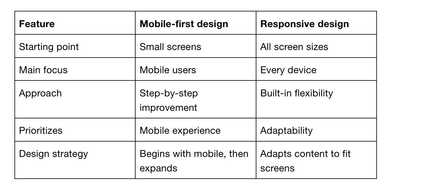
Even though they're different, mobile-first and responsive design can work together well. Mobile-first always adjusts to fit any device, but you can have a responsive site that isn't made with mobile in mind first.
How to make a website mobile friendly with ease
Diving into Readymag for your mobile website needs is like finding a tool that makes mobile-first design a whole lot easier. Readymag has some options that help you effortlessly manage different versions of your pages.
Flexible automatic creation of mobile layouts: This feature tweaks your content to fit mobile screens just right. But here’s the kicker: while your widget content stays consistent across layouts, you can fiddle with certain attributes separately. So, if you want to adjust the font size or button placement for mobile without messing up your desktop layout, you’re golden.
Independent viewer settings for mobile and desktop: This feature allows you to toggle navigation arrows, page counts, a page menu and progressive images for each of your layout formats. For example, navigation arrows can be toggled on for the mobile version without being activated for desktop.