Visual identity essentials: brand designs that stand out
How to increase brand awareness using design elements such as logo, color, typography, etc.
Visual branding is powerful—just think about Apple's logo. It's known worldwide and screams innovative tech. Studies show that colorful logos stick in our minds better than plain ones, and keeping your brand's look the same everywhere, like in ads or social media, helps people trust and recognize it more.
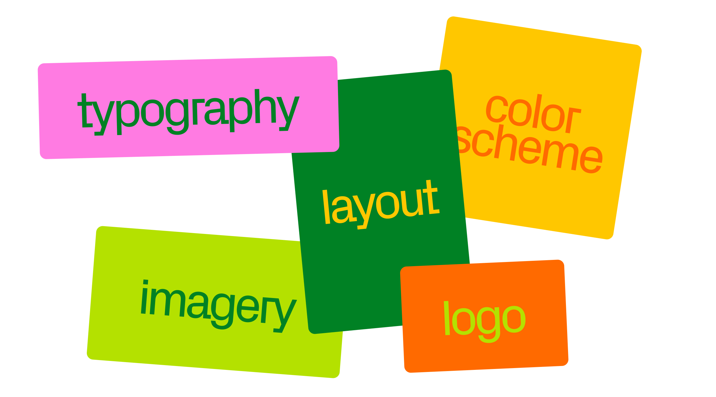
What visual identity is made of
Logo
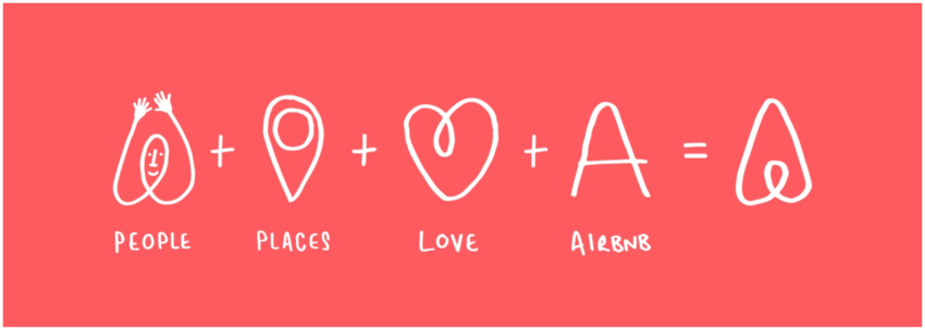
Spot on: a great logo mixes text and pictures to catch your eye, each with unique flair—it takes around 5-7 impressions for consumers to recognize your company logo. Airbnb's "Belo" is a prime example: its simplicity and iconic design stand for unity and belonging, echoing Airbnb's aim to make everyone feel at home, and proving that a clean, versatile design can deeply convey a brand's essence and goals.
Off the mark: logos that are too complex or juggle too many ideas can confuse rather than captivate. Trend-dependent logos may also quickly fade in relevance.
Color palette
Spot on: Color increases brand recognition by up to 80%. Orange, for example, spreads pure positivity by echoing sunshine and warmth, making it a top choice for brands looking to shine on a global stage.

Off the mark: a mishmash of colors or clashing hues can scramble your brand image. Choosing colors that gel well together and reflect your brand's core is crucial.
Typography
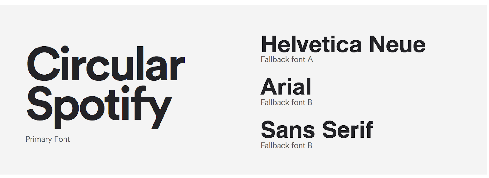
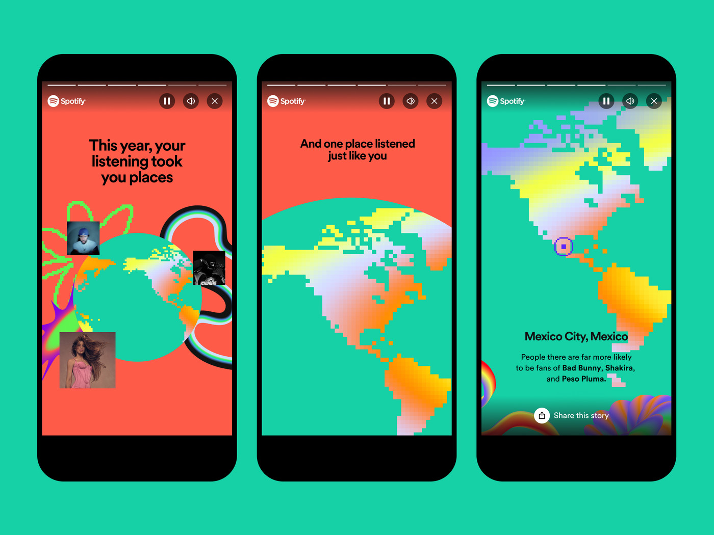
Spot on: consistent use of font pairing that aligns with your brand's character. Spotify nails this by using circular, clean fonts that reflect its easygoing yet futuristic vibe, mirroring the brand's innovative edge in the music streaming industry.
Off the mark: mixing multiple fonts without a clear hierarchy or relationship can make your brand look unattractive.
Imagery
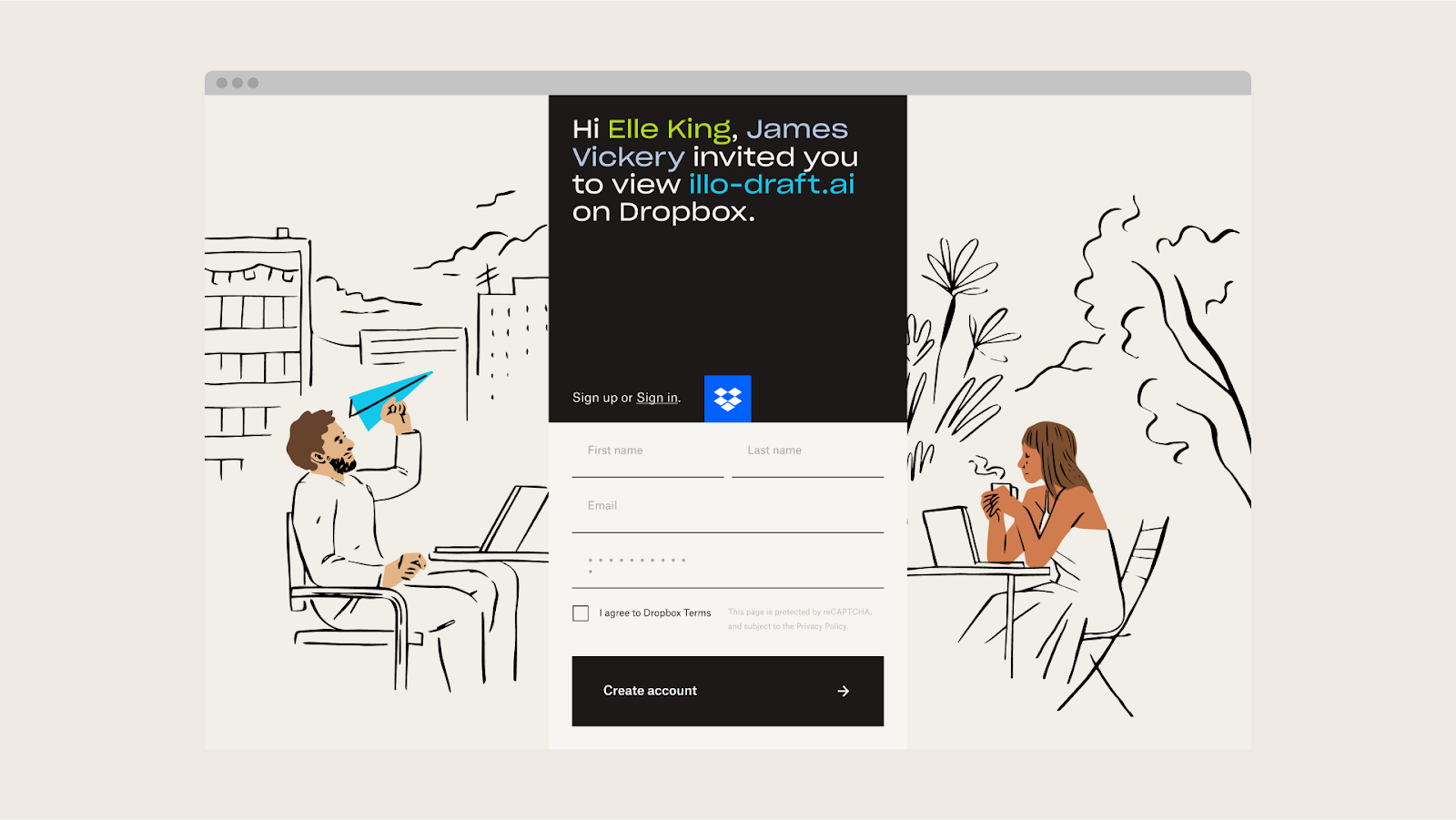
Spot on: high-quality, consistent imagery that tells your brand’s story. Authentic photos or illustrations tend to resonate well. Brands like Dropbox do a great job with their pictures and drawings, using a fun but smart style that makes their tech stuff feel friendly. Their special drawings help show how creative and simple using Dropbox can be, making them stand out.
Off the mark: using common stock photos or drawings that don't match what your brand is about can make it feel less personal. It’s important to choose images that fit your brand's story and values so people get the right idea.
Voice and tone
Spot on: your brand's voice (what you say) and tone (how you say it) in written content should align with your visual identity. For example, Spotify language is all about sharing the joy of discovery and the personal connection we all have with music. This matches their brand's look and feel, making every Spotify experience feel like a chat with a good friend about your favorite tunes.
Off the mark: a mismatch between voice, tone, and visual brand identity can create confusion. If a brand looks sleek and premium but uses a casual, slang-filled tone, it can feel off, leaving customers unsure what the brand stands for.
Brand messaging
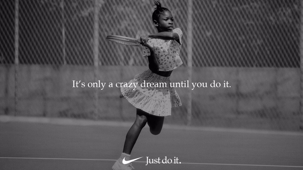
Spot on: the core messages you consistently push should mirror your brand's values and promises. Nike’s "Just Do It" is more than a slogan—it's a message of empowerment and motivation, perfectly aligned with their bold visuals and strong typography. This message has made Nike an iconic brand that speaks to pushing limits and overcoming challenges.
Off the mark: if your brand messaging is out of sync with your visual identity, it can dilute your brand's effect. A brand that looks futuristic but sticks to outdated messages won’t resonate properly with the target audience.
Packaging
Spot on: for physical products, packaging is an extension of your visual identity. Unique shapes, textures, and interactive elements can also increase brand awareness. For example, the moment you see a Tiffany blue box, you know you’re in for something special.
Off the mark: packaging that misses the mark on reflecting your brand's visual identity or values can lessen the overall brand journey. Luxury items in plain packaging can disappoint, making customers question their value and authenticity.
Digital presence
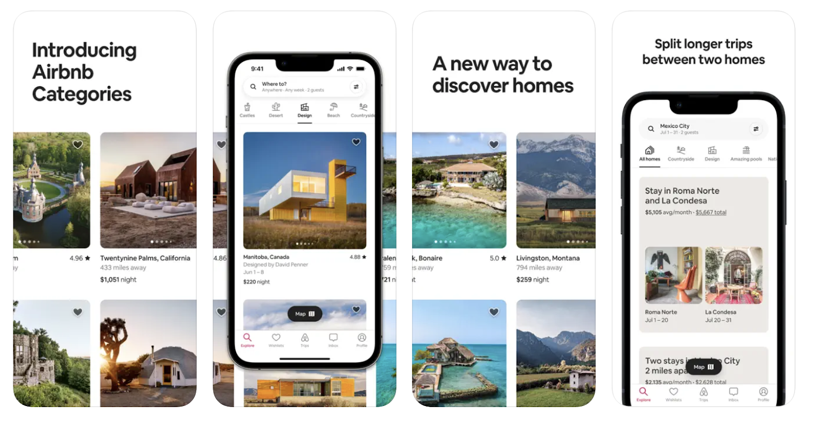
Spot on: your online stuff should look like part of the same family. A good example is Airbnb. Their website and app are super user-friendly, with easy-to-follow layouts and nice photos that make you feel like you belong.
Whether to make a brand book
All these elements—logos, colors, fonts, and more—form your brand's unique style, which is usually unified in a brand book. A brand book is like a cheat sheet that helps make sure your brand looks the same everywhere, from your ads to your website. It tells you how to show off your logo, what colors to pick, and lots more.
But, not everyone sticks to a brand book, and that's okay. For example, we at Readymag don't use one. We like to keep our pictures and designs fresh and ever-changing. This way of doing things helps us stand out, showing that being a bit different can be a good thing too. In this piece, we tell how our ever-changing identity reflects our values.
What brands to look up to
It's always smart to peek at some standout brands. Their bold, unmistakable branding, spot-on positioning, and unique voice offer great tips for everything we've talked about. Here are a few shining examples to get ideas from.
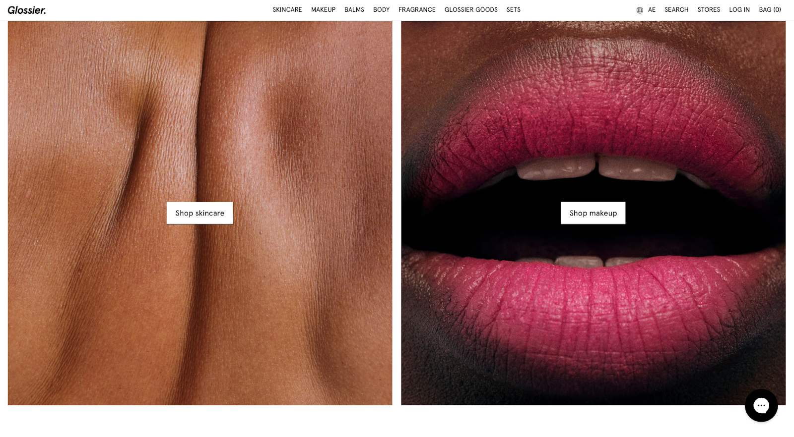
Glossier: a beauty brand that's all about celebrating real beauty, Glossier uses a soft, pastel color scheme that evokes a sense of calm and inclusivity. Their straightforward typography and clean product design communicate transparency and simplicity, resonating with a younger audience.
Mailchimp shines in branding with yellow and black colors, fun drawings, and a catchy monkey mascot. It makes email marketing easy and friendly, aiming to help all kinds of businesses get their message out there.

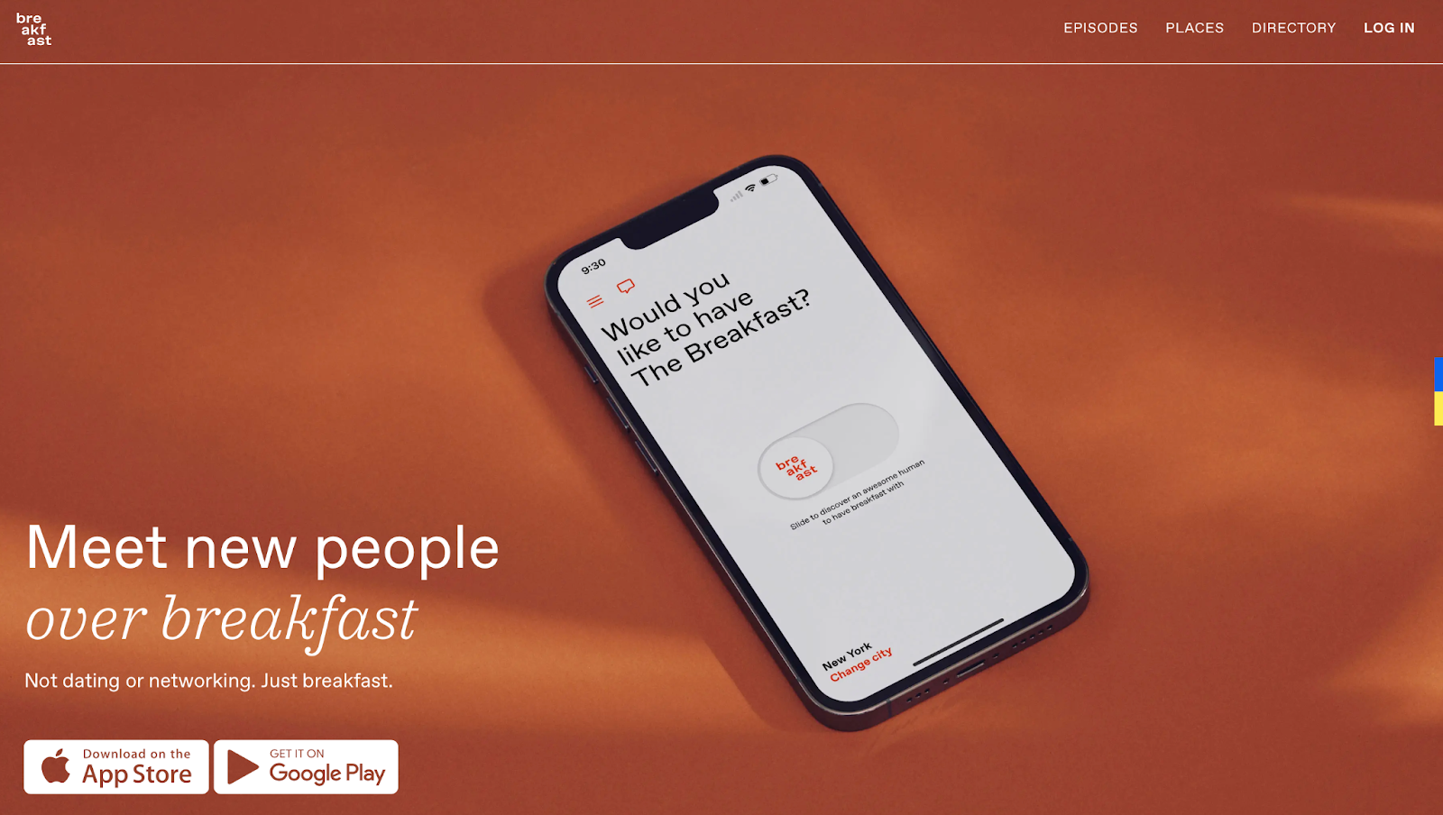
The Breakfast app, with its motto "Meet new people over breakfast," boasts a bright, recognizable orange color in its logo, vibrant typography, and strong positioning. The app's identity is all about starting your day positively by connecting with others, and a sunny orange vibe perfectly captures the warmth and energy of morning meetups.
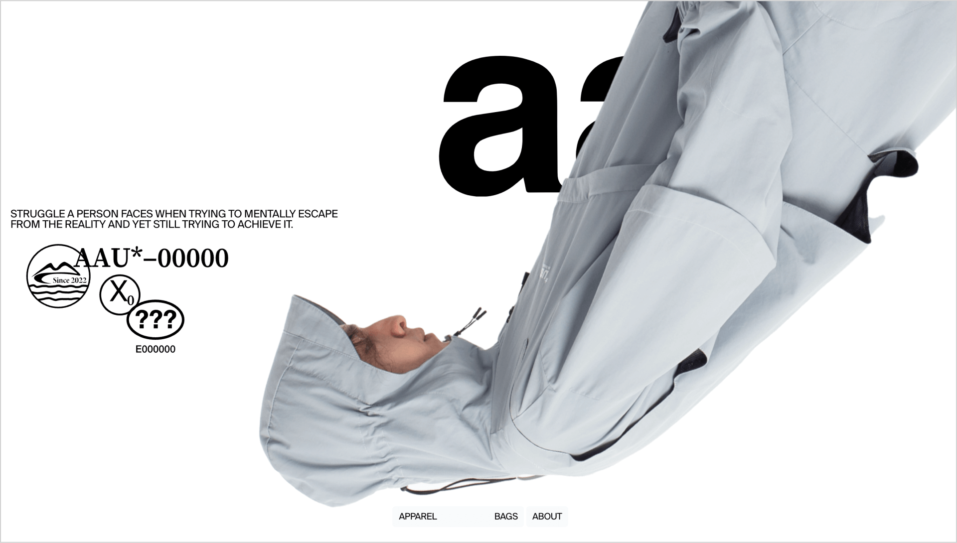
All around us impresses with minimalist black-and-white website design highlighted by dynamic typography and animated photos. Each image leads to detailed product insights, making the website not just a shop, but an experience. This striking approach earned it the title of Website of the Year 2023 by Readymag, showcasing the brand's standout presence in the digital fashion space.
When looking at inspiring brands, a strong digital presence matters. Here's where Readymag comes in. It's a tool for building outstanding websites that help you elevate your brand to new heights, much like those we’ve admired above. If you create digital spaces, give Readymag a whirl.