How we sustain Readymag’s visual identity without a style guide
Readymag designers explain how our ever-changing identity reflects our values.
Along with the functionality of Readymag, we constantly expand and update our visual language to inspire customers and attract new like-minded people. In this piece, we tell how our ever-changing identity reflects our values.
Evident, yet largely unwritten
Stas Aki took the role of Readymag product designer in 2016. Since then, we’ve made hundreds of updates, released scores of newsletters and posters, made T-shirts, hoodies, and pins. Yet we don’t have a brand-guide summing up our style or at least spelling out its core features. “And will never have it,” Stas says — the style is very dynamic and fluid, yet largely unwritten. That’s a conscious decision: we don’t want to limit ourselves, because the key values we stand for are freedom, creativity, and versatility. “There are some preferences, like bright, juicy colors and good fonts — Avenir, Helvetica, Nobel, Graphik — but we do not hesitate to change them once in several years,” he adds.

We strive to push the web forward, and that also determines our style. “In the center of Readymag is its interface — when working on it, I keep in mind that it should be not only handy and functional but also visually pleasing, so that it inspires users to make good designs,” Stas explains.
Play with key design notions
We aim to make work on the web simple and comfortable for graphic designers and offer them familiar instruments like the grid, vast font collection and options to control maximum font parameters. Sometimes we get inspired by these things and give them a central role in our designs. In 2018, for instance, Stas made a set of bookmarks in which people can connect dots and draw something on their own. “I tried to play with empty spaces and grid — the key notions of graphic design,” Stas says.

Let’s take for instance the user profile, which he redesigned in 2019. It has no shadows, no volume, and almost no animations.
Quick demo of the new user profile
Also, this year Stas redesigned the main page, making it very simple and uncluttered, yet offering several playful animations that draw visitors’ attention to Readymag key functionality.

Simple geometries
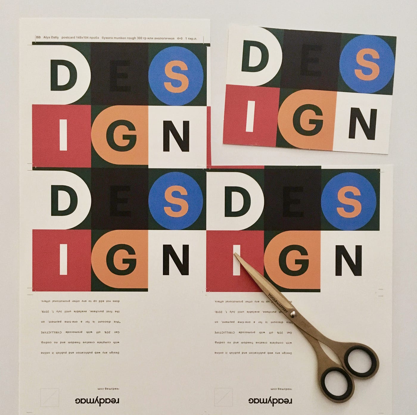

Sometimes we use simple geometric forms like square, triangle, circle, and romb. They quote the forms of widgets’ icons and at the same time symbolize pieces of kids constructor that allow you to make everything you want.

Bringing the main features to the maximum is, perhaps, one of our articulated design principles. See how it was implemented in our hoodies with ‘ready’ on the front and ‘mag’ on the back. “I just wanted to put “Readymag” as big as possible, so that it reads bold,” Stas explains.

Joyful and bright
In 2019, Tanya Egoshina joined our team as a communication designer. “I love Readymag and I am joyful when I make any kind of design for it — that’s the feeling that I aim to convey through my work,” Tanya says. “My key principle is thorough attention to details on all stages of work because every little thing like a button or a sidebar makes for the total look and feel of the product”. Below are some of Tanya’s visual ads for Readymag — currently, that’s our most experimental design format.

This ad emphasizes that Readymag could be used both by solo designers and team players — the same goes for the orange basketball ball. “I hope the metaphor reads easily”, Tanya says.

This ad highlights our Code Export feature — the shape turns into rows of symbols.

Here we emphasize that Readymag boosts designers’ workflow and help them create versatile things: we give total unlimited freedom.

This video promotes our Sandbox tutorial and quotes the interface of the Editor. “I aimed to show that it’s so easy to understand how everything works”, Tanya sums up.
