Font pairing: go-to tips on combining typefaces
Explore font pairing basics, balance tips, pitfalls to avoid, and tools for finding the right typefaces.
Finding the perfect font duo is a mix of art and science. Designers might lean on instinct, a gut feeling, draw from a set of tried-and-true rules based on experience, or even take inspiration from successful projects. What else can help? We've shared the answers in this piece.
Basic principles for font pairing
There are no hard and fast rules for combining typefaces. When pairing fonts, consider some basic principles below.
Compatibility. Compatibility means making sure your fonts don’t clash but also don't mimic one another too closely. Each font should complement the other without losing its individual character. Think about pairing a bold, assertive font with a more laid-back, readable one for body text. They should get along like old pals, and each bring something unique to the table.
Purpose. Always ask yourself: "Why am I pairing these fonts?" Each font has its own vibe, from formal and trustworthy to casual and friendly. Your font pairing should reflect the purpose of your text. Are you creating a high-end restaurant menu, or a flyer for a rock concert? The purpose will guide your font choices, making sure they're not only beautiful, but meaningful and appropriate.
Readability. Font pairing should never sacrifice readability for style. After all, the primary job of text is to be read. Pay attention to how your fonts perform in different sizes and mediums. A font that looks fabulous in a headline might not be your best friend in fine print. So, is your text layout properly arranged? Check here.
Emotional сonnection. Fonts carry emotions. A font can make you feel relaxed, excited, sophisticated, or even nostalgic. When pairing fonts, think about the emotional message you want to convey.
Experimentation. Sometimes, the most unexpected pairings create the most dynamic results. Mix and match, play around with different combinations, and see what speaks to you. Remember, every project is an opportunity to try something new.
Font families
Each font family sets your project's tone:
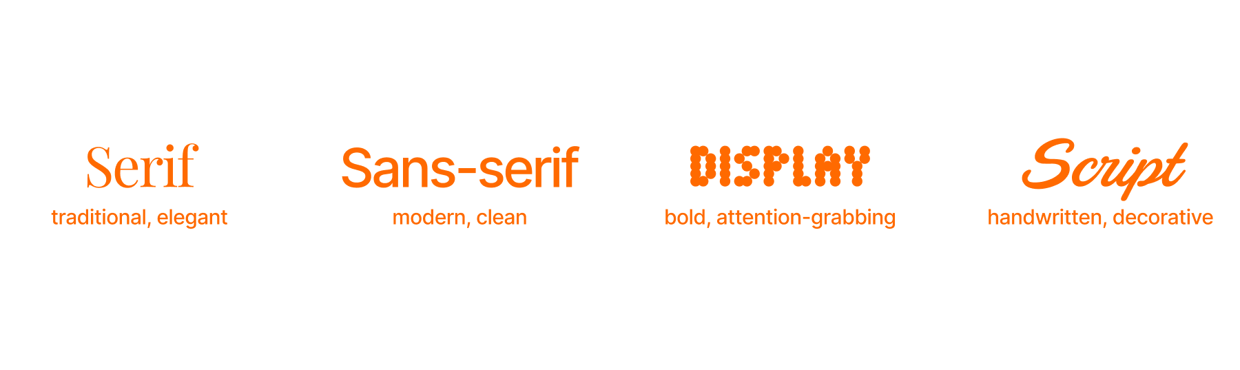
- Serif fonts: These fonts have little "feet" or strokes at the ends of their letters. Think of them as the classic suit and tie—they’re perfect for more traditional or formal projects. Examples: Times New Roman, Garamond, Georgia, Montserrat.
- Sans-serif fonts: Sans-serif means "without serifs." These fonts are sleek and modern. They’re versatile and read well on digital screens. Examples: Helvetica, Arial, Roboto, Merriweather.
- Display fonts: These are the show-stoppers, designed to grab attention. Examples: Impact, Lobster, Alfa Slab One.
- Script fonts: Script fonts mimic handwriting, ranging from elegant calligraphy to casual brush strokes. They’re best used for accents. Examples: Brush Script, Pacifico.
Balance and hierarchy
Pairing fonts is an art that requires a balance between contrast and harmony. Striking that balance is key.
Contrast. Combining a serif with a sans-serif can create an appealing contrast while maintaining readability.
Hierarchy. Use different weights (bold, regular, light) and sizes to establish a visual hierarchy. This guides the reader's eye and helps organize information.
One of the best font pairings: according to trending Google Font combos, Montserrat and Merriweather are like the dynamic duo of design—like the Batman and Robin of the font universe.
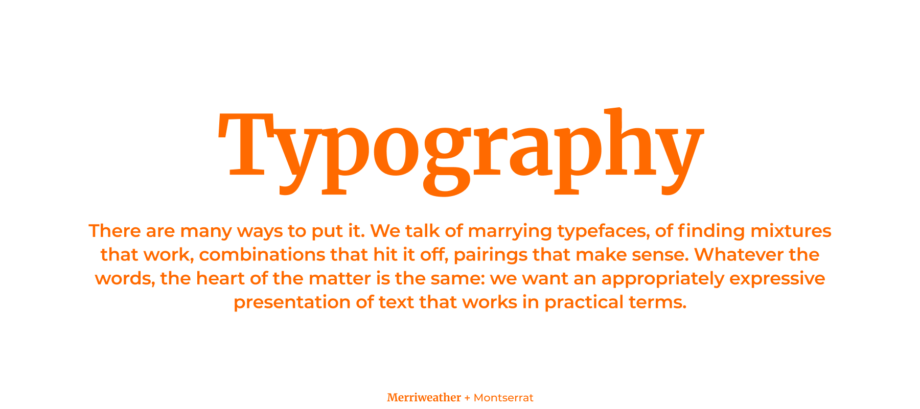
Montserrat, with sleek, modern curves, is all about grabbing attention, making it perfect for headlines that pop. Merriweather, on the other hand, brings a classic serif warmth to the mix so your body text is as comfy to read. Together they strike the perfect balance between eye-catching and easy on the eyes, making them a hot pick for designers looking to spice up their projects with some font-tastic harmony.
Common pairing pitfalls
Here are a few common mistakes to avoid.
Overcrowding. Too many fonts can make your design look chaotic. Pick up to two fonts: one for your headers, another for your body text or calls to action. This will keep your design cohesive and digestible.
Similarity trap. Fonts that are too similar can compete and cause visual confusion. Opposites attract: mix serif with sans-serif, or a script with a blocky display font. If your header is in a bold, attention-grabbing display font like Impact, pair it with a more subdued sans-serif like Roboto for the body text.
Ignoring context. Always tailor your font choices to the context and objective of your design. Just as a whimsical script font can feel out of place in a formal presentation, a stern, serious typeface could clash with the vibrant, playful atmosphere of a children's store website. It's all about striking the right tone that aligns with your project's purpose and audience.
Tools to find the best font pairings
Here are some resources to help you find and test the perfect font pairings:
- Readymag font pairing almanac will guide you through the reasoning behind combining two different typefaces on one page. The pairs we discuss are Futura + Garamond, Benton Sans + Farnham, Century Old Style + Sweet Sans, and Proxima Nova + Chaparral.
- Typography resources and favorite fonts of the Readymag design team.
- Google Fonts is a source of free fonts that you can easily pair and test on your website.
- Fontpair is a website that will help you discover and test font pairings.
- Adobe Fonts offers a vast collection of high-quality fonts and the ability to test out pairings within your Adobe projects.