Rethinking what’s possible with Readymag
How does a creative tool change when designers stop treating its features as fixed answers and start seeing them as creative material?
Every creative tool comes with its own logic: familiar interactions, intended uses, and established ways of working. But occasionally, a designer looks at an everyday feature and sees the possibility for something entirely different.
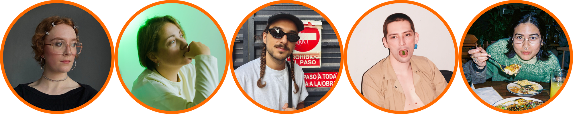
What happens when a designer approaches a tool as something flexible, malleable, and open-ended, rather than a fixed set of capabilities? We spoke with designer Mo Jardinico, design student Nele Neumann, artist and designer Dima Maikovich, digital designer Elena Saharova, and Readymag designer Denis Deviatko about always starting with an idea first and letting the tool adapt to it, rather than the other way around.
Concept is king
When Nele Neumann began working on her editorial project, The Void Between the Lines (Die Leere zwischen den Zeilen), she wanted every design decision to reinforce the project’s central theme: loneliness in Gen Z. The website unfolds almost like an architectural space. Sparse typography drifts across a white canvas—at times overlapping, at others slightly off kilter—while a custom-coded cursor leaves temporary marks behind, making the visitor’s presence visible.
The Void Between the Lines (Die Leere zwischen den Zeilen), Nele Neumann's editorial project
“I wanted to create a specific feeling and atmosphere with the custom cursor that wasn’t possible using standard tools,” says Nele. “Its purpose was to communicate that you leave a trace. It gives the feeling that you’ve been there.”
A live visitor count strengthens that sense of presence, as do the slowly drifting ghost lines. “The ghost lines represent the people who are currently active on the website,” adds Nele. “It’s meant to create a feeling of togetherness—the opposite of loneliness.” Here, the custom cursor and the wandering ghost lines exist entirely in service of the idea, turning an otherwise solitary experience into one that feels quietly shared.
The same instinct—to reshape familiar interactions around the needs of an idea—appears in Elena Saharova’s website, Kira Muratova’s Vers Libre. While turning her essay on Kira Muratova’s filmmaking principles into an interactive website, Elena questioned one of the web’s most instinctive behaviors: scrolling.
Elena Saharova’s website, Kira Muratova’s Vers Libre
Each chapter explores a different period of Muratova’s work and could be read independently. Rather than pulling readers into a predetermined path, Elena wanted them to choose their own point of entry. The homepage therefore resists scrolling altogether, functioning instead as an interactive index—a foyer where one can pause before stepping into the exhibition itself.
“We’re so conditioned to scroll today. Landing pages taught us to do it, and social media reinforced it,” says Elena. “I wanted to interrupt that habit for just a few seconds. Before asking people to read, I first wanted them to stop.”
Kira Muratova’s Vers Libre
Working within Readymag’s free-form canvas allowed Elena to shape those interactions around the logic of the essay, rather than the conventions of the web. As visitors move through the site, the visual language evolves alongside Muratova’s films: the early chapters unfold in black and white before giving way to color, Dada-inspired patterns, absurdity, and kitsch, mirroring the evolution of the filmmaker’s cinematic language.
“I wasn’t asking, ‘What can Readymag do?’ I was asking, ‘How do I make the visitor feel a Muratova film?’”—Elena Saharova
For Elena, the value of the tool lay less in any individual feature than in the freedom to shape interactions around meaning. “Readymag treats a page as a free canvas. I could pin every element, decide what reacts on hover, and design the interaction around the meaning of the essay rather than around a default template.”
Familiar interface, new meaning
If interactions can shape the way a story unfolds, interface elements can dictate how a place feels. In Mo Jardinico’s portfolio, navigation becomes part of the site’s atmosphere, turning a functional layer into something expressive and deeply personal.
Drawing on the personality of early web interfaces—from VHS menus and desktop operating systems to the handcrafted spirit of GeoCities and MySpace—Mo used Readymag’s positioning and layout tools alongside custom code to turn navigation into part of the site’s visual language. A live timestamp quietly updates along the edge of the page, while a VHS-inspired sidebar and toolbar frame the experience, making the portfolio feel like a place that’s alive and inhabited.
Mo Jardinico's portfolio
“I never really saw navigation as something that should disappear into the background,” says Mo. “It becomes part of the site’s identity. The sidebar, toolbar, and timestamp weren’t just ways to move around the portfolio; they helped establish the world it lives in. I wanted visitors to feel like they were interacting with a living interface rather than simply clicking through pages. So, the navigation becomes a huge part of the storytelling.”
The custom cursor—which leaves a trail of randomized colorful boxes—adds another layer of personality, making the portfolio feel like a small, lived-in corner of the internet. It’s a reminder that even the most overlooked interaction can become part of a website’s identity when it’s treated as creative material.
“Pushing a platform beyond its intended use isn’t always about making something technically complicated. Sometimes it’s just about looking at a feature that’s meant for one thing and asking, ‘What else can this become?’”—Mo Jardinico
As they say, beauty—and ideas—often hide in plain sight. Sometimes the most interesting creative possibilities emerge from looking at familiar things differently. When designing the Websites of the Year 2025 campaign, Denis Deviatko found inspiration in an unlikely place: the Readymag editor’s layout grids, translucent shapes, and interface behaviors that became a part of the final identity, arriving at a visual language that feels instantly familiar to designers.
Denis Deviatko's design for Websites of the Year 2025
“I used colored grids with opacity because they’re something designers normally only see while they’re building a project,” says Denis. “I liked the idea of making that part of the finished identity—like turning the design process itself into a metaphor.”
Pushing that idea further, Denis found inspiration in one of the web’s most familiar interactions: text selection. He echoed that visual language throughout the website to highlight texts and links, using repetition to turn a small interaction into a defining part of the campaign’s identity.
Knowing when to go further
While some ideas surface from looking at familiar features differently, others take shape by bringing several creative tools into conversation. Land on Dima Maikovich’s portfolio and you’re greeted by a 3D sculpture of his face. It follows your cursor, distorts with every click, and immediately sets the tone for the experience that follows.
Dima Maikovich's portfolio
Built in Spline and embedded into Readymag, the sculpture lends the site a playful, slightly surreal quality. Elsewhere, stretched, distorted typography—created with custom code—becomes a visual signature of Dima’s work, signalling a designer who’s unafraid to push form in unexpected directions.
“I love mixing different technologies, creating this feeling of a layered, textured environment where all the elements are different, but they’re aware of each other and interacting.”—Dima Maikovich
For Dima, combining tools isn’t about adding complexity for its own sake. It’s about creating the conditions for experimentation—for following ideas wherever they lead and letting them land naturally. “The most interesting things aren’t meticulously planned out,” he says. “They happen during this really strange, emotional process. And when a viewer can actually feel that emotion in the design, that’s what makes it memorable.”
Perhaps, as Dima suggests, the most unexpected creative outcomes reveal themselves only when designers trust instinct as much as intention, reshaping a tool until it serves the idea. That often means questioning familiar behaviors, discarding default solutions, and staying open to discoveries that unfold through the creative process. “Building directly in Readymag felt like making a collage rather than doing standard web development,” he says. “The whole process felt like playing a game, and it completely redefined how I look at the web.”
For Mo, that openness begins with a simple shift in perspective. “Instead of asking whether a feature can do exactly what I imagined,” they say, “I start asking what happens if I use it differently.”