Mastering color combinations: theory and practical tips
Make your websites pop using color combos that work
Up to 90% of first impressions are influenced by color. However, not every color works well—context, region, and even gender can impact how a person perceives a color. In this piece, we'll look at how to pick winning color combinations with tips from seasoned designers.
Сolor theory in web design
At the heart of color theory is the color wheel, a tool that organizes colors in a circular format showing relationships between primary colors (red, blue, yellow), secondary colors (orange, green, purple), and tertiary colors (those in between).

Best color combos
Using the color wheel, you can play with these relationships to find the perfect palette for your project.
Complementary сolors that are directly opposite each other on the color wheel, like blue and orange, create high contrast and can make the other appear more vibrant when used together.
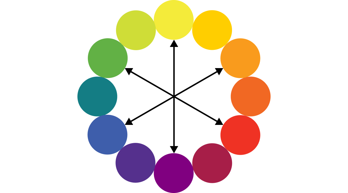
Triadic harmony involves three colors spaced evenly around the color wheel, forming a triangle. This setup is ideal for creating a colorful, balanced look. For example, red, blue, and yellow together can be both striking and harmonious.

In square harmony, four colors are arranged into two complementary pairs, forming a square on the wheel. This combination offers a variety of hues and can be vibrant when balanced well.

An Analogous color scheme uses colors that sit next to one another on the wheel, creating serene, comfortable designs. A good example is a sunset, which might blend various shades of oranges and reds.
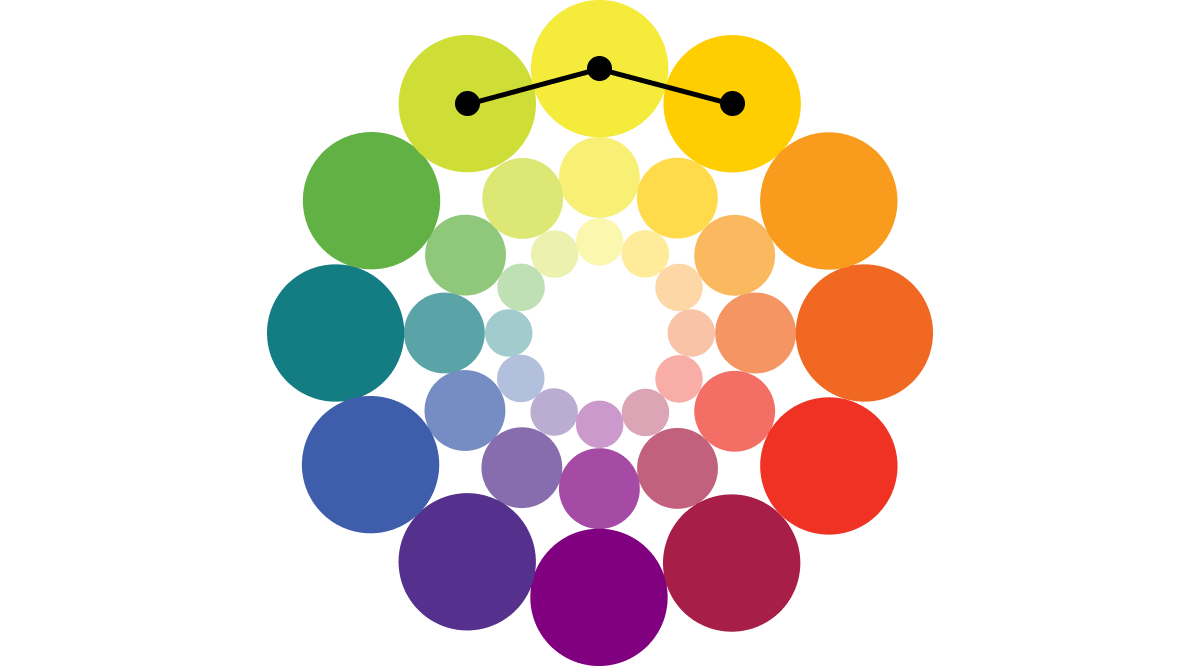
Monochromatic schemes focus on different shades, tints, and tones of a single color. This can give depth to your design and is guaranteed to be harmonious.
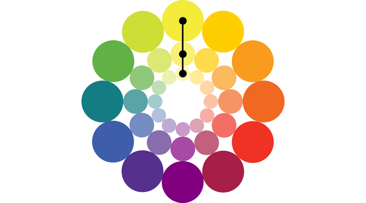
Split-complementary colors include a base color and two adjacent tertiary colors of its complement. This offers high contrast like a complementary scheme but with less tension.

Basic strategies for multiple colors
Besides using the Itten color wheel, you can follow some basic percentage rules for combining colors. This will make your design deeper and more memorable:
- The 80/20 rule: use 80% of one dominant color and add up to 20% of a complementary color. This balance makes your design visually appealing, like a field of green grass with yellow dandelions.
- The 60/40 rule: mix 60% of one color with 40% of another to soften the overall look. This is like an egg, where the shell and the inside have contrasting colors.
- The 50/50 rule: combine two colors in equal parts to neutralize each other. This mix can create a balanced, neutral effect.
- The 60/30/10 rule: if you have three main colors, use 60% of your primary color, 30% of your secondary color, and 10% of an accent color. It helps achieve well-balanced design.
The rule of odd numbers: when adding colors, using an odd number of colors can make the design more dynamic. This rule is based on the principle that odd numbers create more natural interaction and engagement.
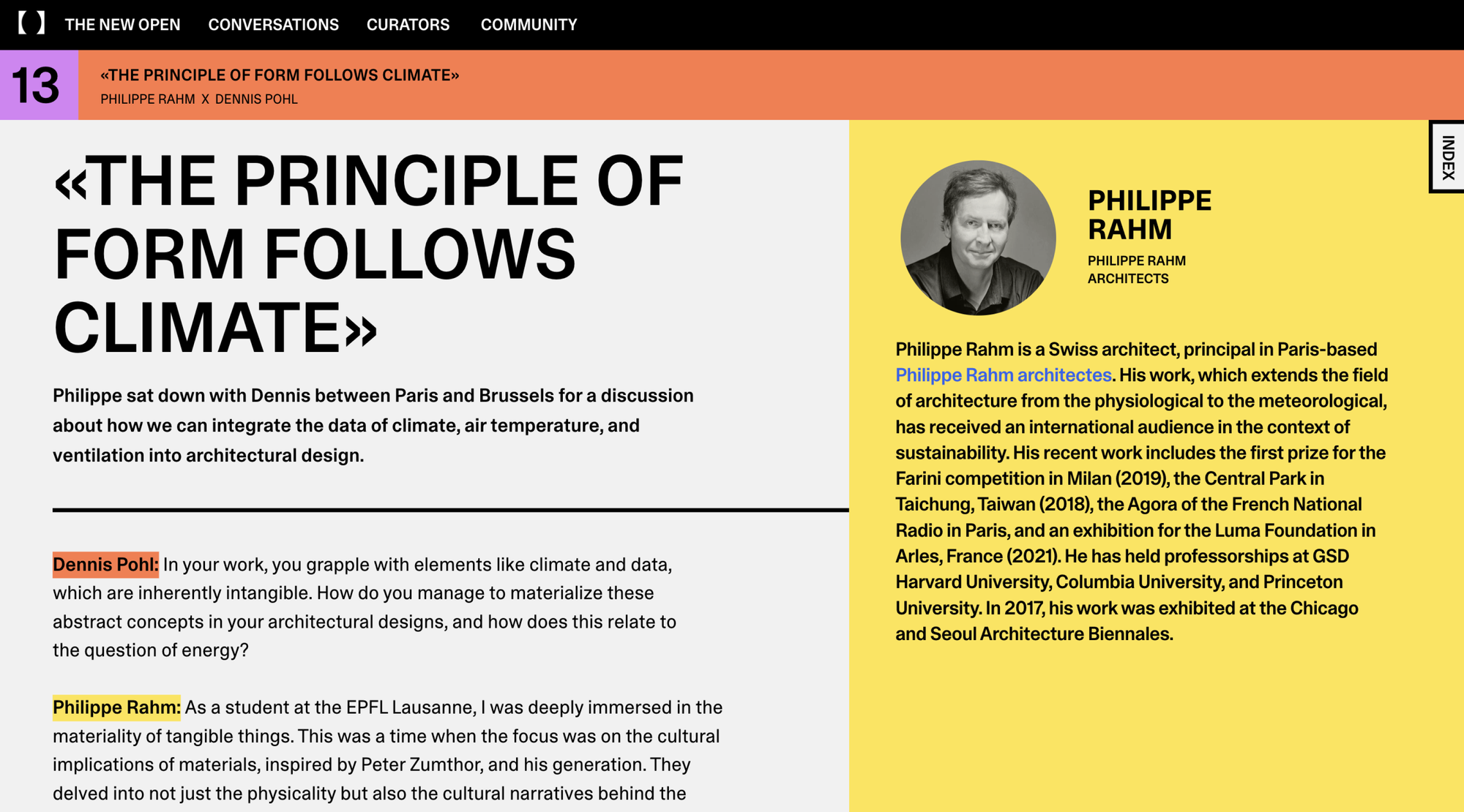
One more tip: you can find colors that look good together using color palette generators like Adobe Color, Khroma, Coolors, and Color Space.
Tips on color combinations from designers
Here are some insights from renowned designers and artists mentioned in our Design Almanac. They talk about how they use color in their work and give tips on improving your designs with color.
Research before you choose
Before deciding on a palette, study the prevalent colors within your project’s industry to strategically pick hues that align with or stand out from the competition.
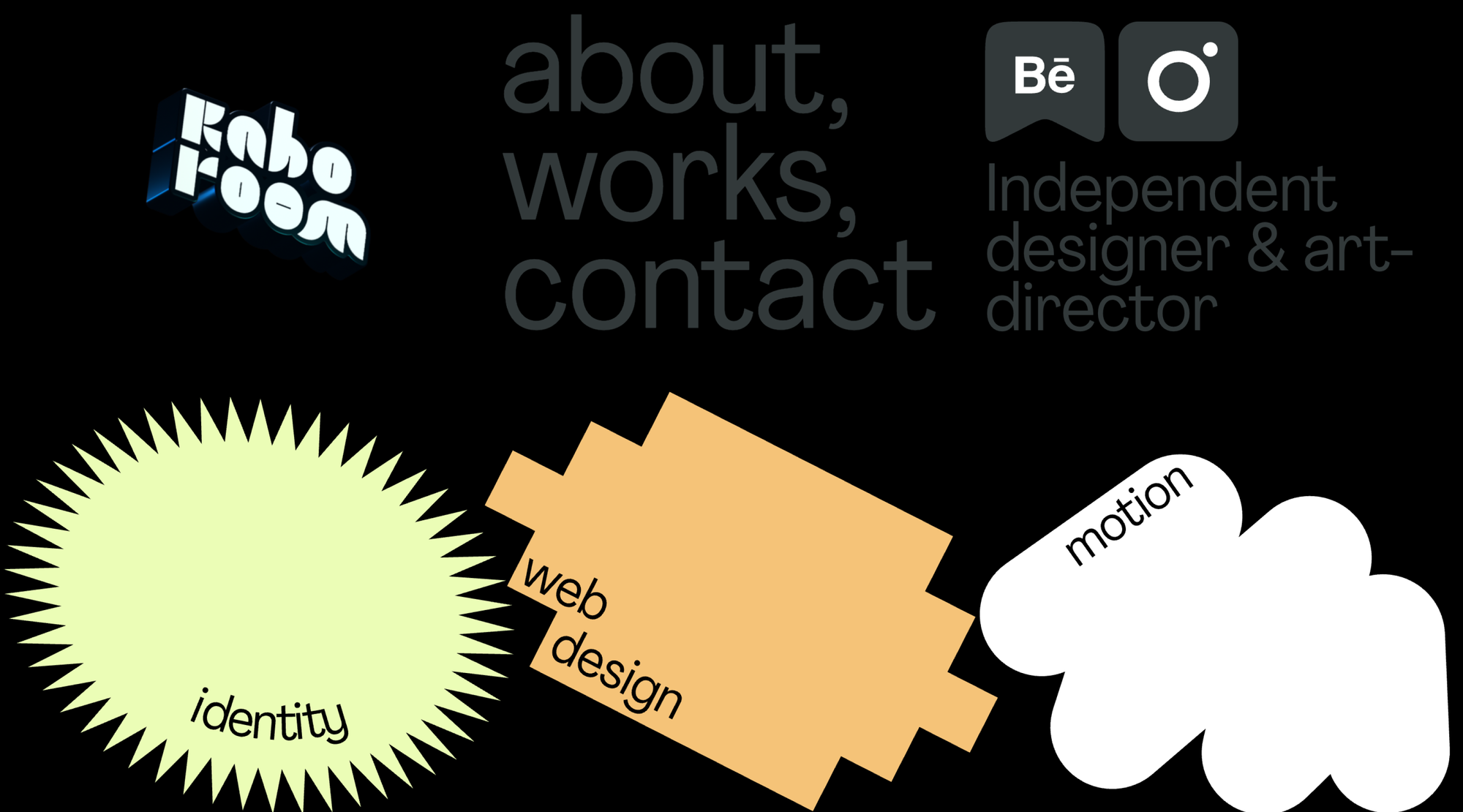
First, we investigate what colors are used in that niche, then choose between typical colors and color combinations (so as to remain in the category) and very atypical colors. Each choice has its advantages and drawbacks. In general, choices depend on the brand’s communication strategy.—Max Orlov, art director
Be mindful of cultural color perceptions
Colors carry different meanings in different contexts and cultures. For example, while North Americans might see yellow as cheerful and purple as calming, other cultures might view these colors differently.
Mentality affects the national style and national color preferences. Japanese people love interesting, assertive combinations of acid colors (as in Asian movies) for their interiors; Americans love harsh color combinations (for example, black, white and fuchsia), and Belgians and most other Northern Europeans love sophisticated, often barely distinguishable shades of gray mixed with pale blue, beige or violet.—Julien Coquentin, photographer

Pick colors that convey the right emotion
Colors evoke emotional responses. For example, blue is the most popular color. It’s the top choice for 57% of men and 35% of women. It's also a favorite for brands, with 33% of top brands using blue in their logos. Blue is associated with security, wisdom, and trust, which is why social media companies like Facebook and Twitter chose it for their logos. They want to appear reliable since they handle a lot of user data.
Black is always popular, and monochromatic combinations of black, gray and white are now often used in both the fashion industry and graphic design. The electro blue #003DFF has stayed popular over many years—it has the right energetic vibe. The natural and fresh yellow #FFEE2E is constantly used because it allows designers to come up with a shade that works for their particular project, conveying the proper emotions, and saying the right thing.—Max Orlov, art director

Find the balance to influence perception
Adjust the number of bold colors like orange to suit the product’s market position—minimal use for luxury appeal, or more for a budget-friendly look.
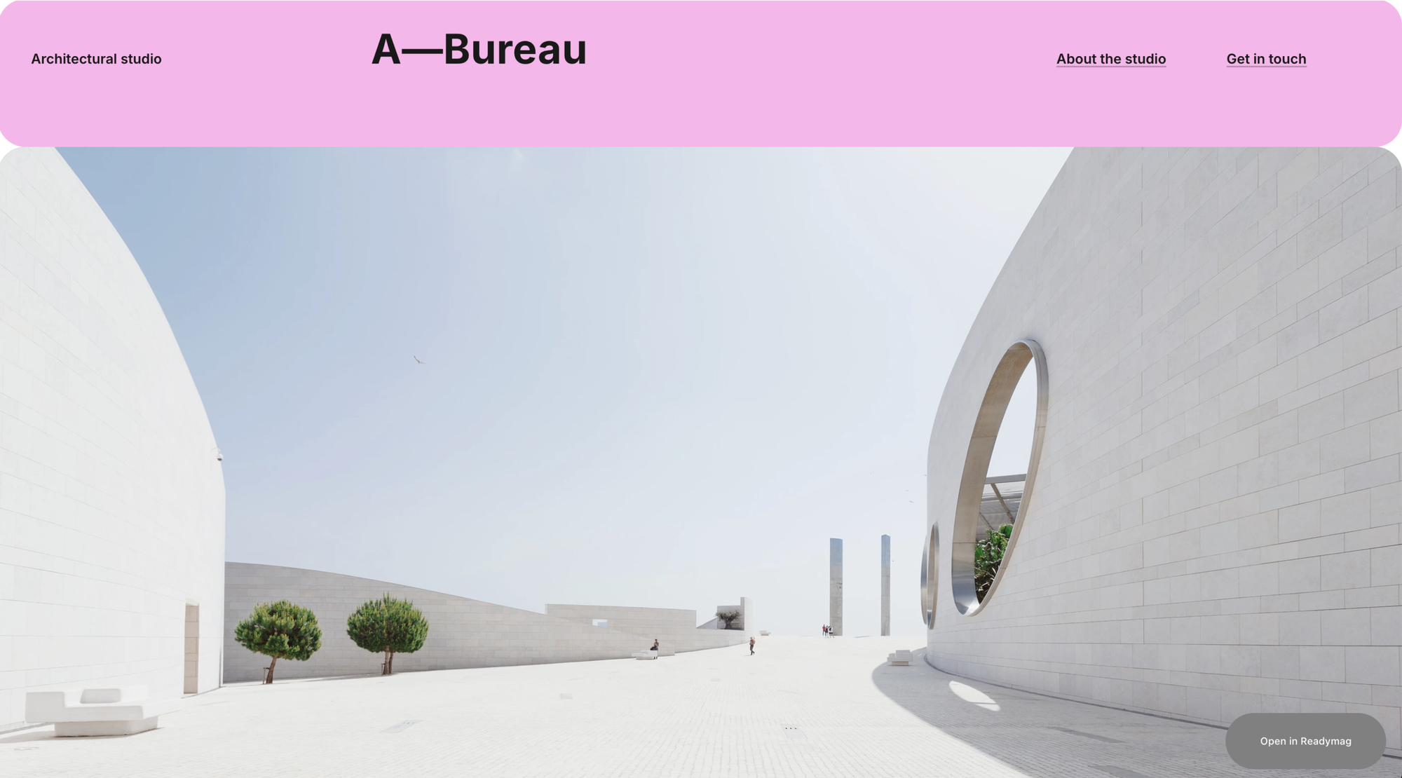
Crucial here is the amount of orange. If there’s not much of it, the product looks high-end, but a large amount of orange in combination with plain, chunky fonts makes the product a discount offering. If you employ delicate highlights with orange and choose the right shades and color combinations, your orange identity will look high-end.—Max Orlov, art director
Consider color behavior online and offline
Always test how your colors translate across different media to create consistency in your visual messaging.
Don’t forget that there’s often a big difference in the same color online and offline. The screen emits light, and that makes the difference. In addition, different materials and textures also make the same color look different. Colors and textures substantially shift the shade of the color, depending on the reflective properties and the white balance.—Max Orlov, art director
Train your color perception
Regularly explore different colors in your daily life to help you better notice and use subtle color differences in your designs. Here are some exercises to give a try.
If you order vanilla ice cream in a cafe, you may not notice its color, but there are many colors of vanilla ice cream. Just to go out in the street is sometimes amazing. There’s always a dog or a cat whose color you’ve never seen before, or somebody’s thrown away a tin and it’s shining in the sun. Color is everywhere, and the only question is how much you notice it.—Michael Wolff, designer and co-founder of Wolff Olins

All the website examples featured here were crafted using Readymag. You can also create your own stylish website from scratch or by choosing from various ready-made templates—give it a go for free.