Visual prowess: A showcase of 12 exceptional websites built with Readymag
A hand-picked selection of websites that wow with the used crown jewel features spotted.
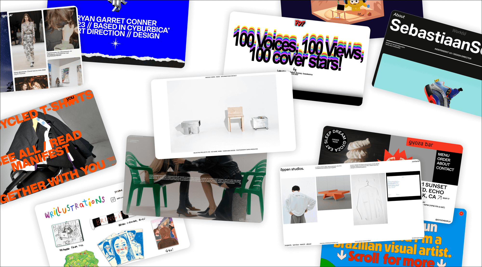
This blog article is here for your visual pleasure and intense creative inspiration: just sit back and scroll through the concise, curated collection of websites designed with Readymag. Below, you’ll find a compelling example of an online media feed, creative ways to organize page space, masterful typography experiments, hand-drawn website elements, and many more.
Druk.press
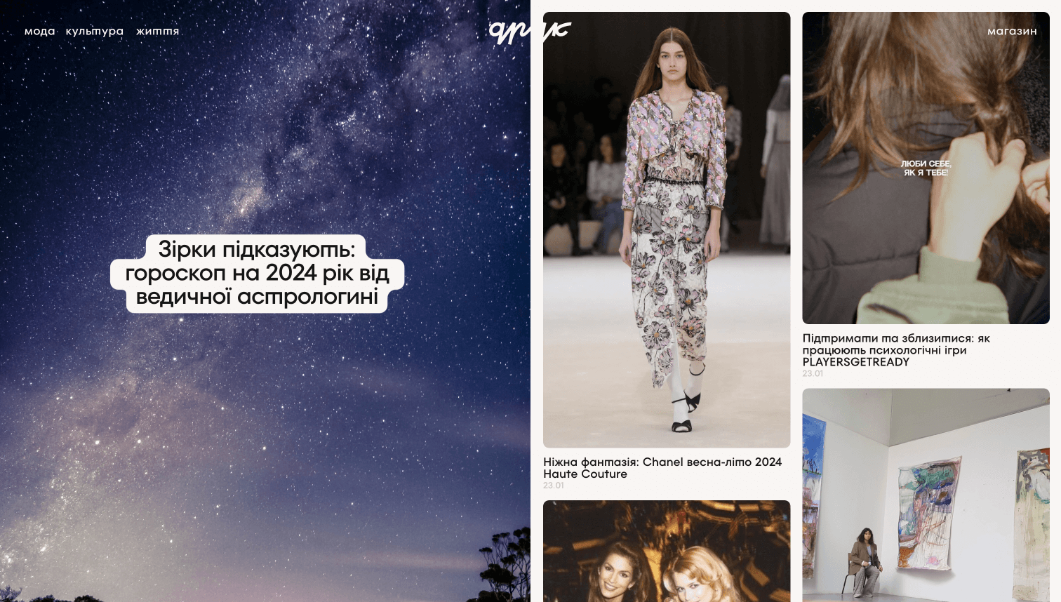
Druk is a lifestyle media entirely crafted with Readymag. The design artfully divides space to highlight the featured article and give a smooth on-scroll overview of the whole feed. The header and footer are minimalistic, with just a concise newsletter form and a piece of custom typography.
PDF mag
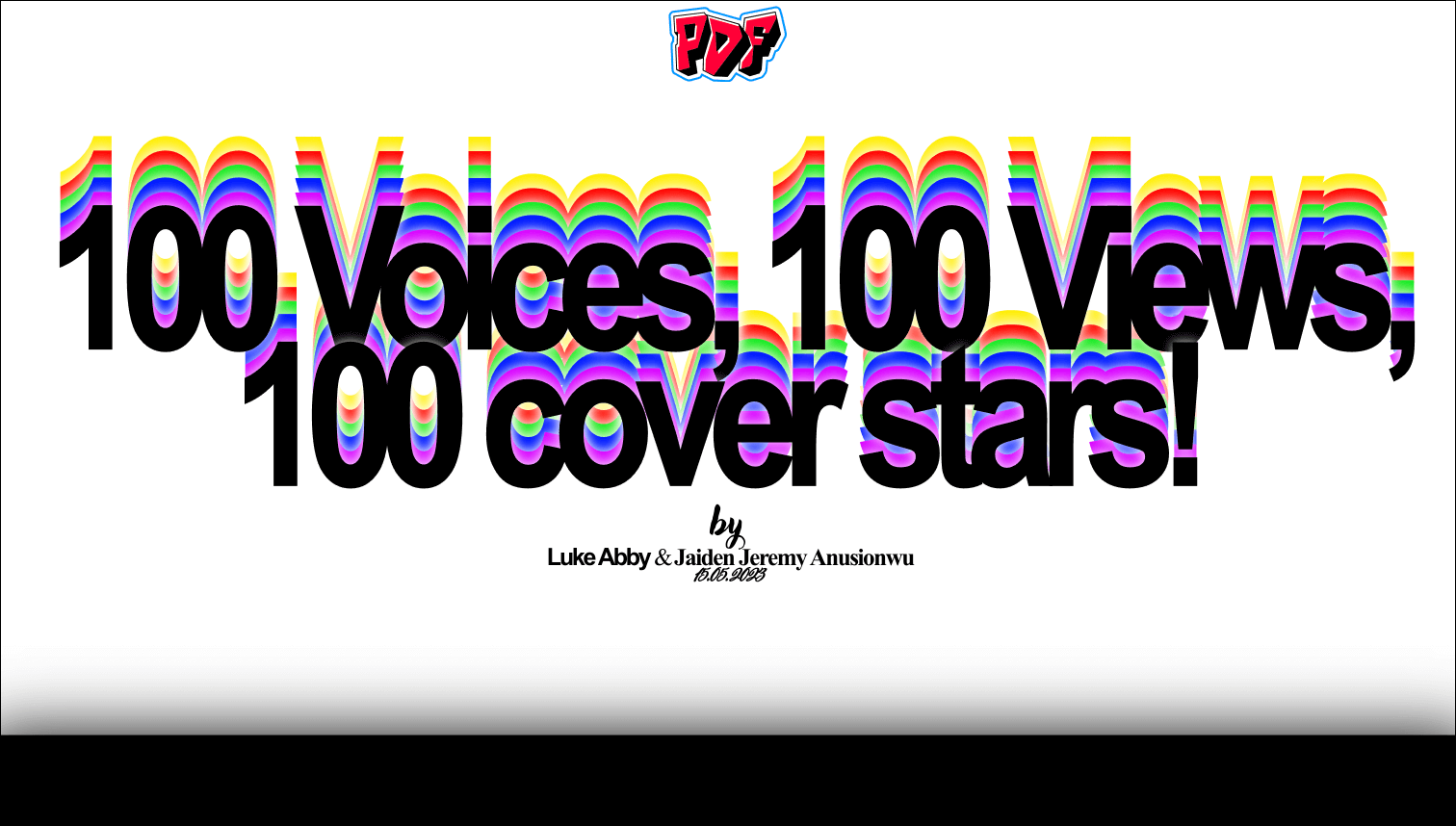
Explore the bold project exploring people’s lives. You can scroll it down to access photos and stories or use the somewhat hidden artsy menu by clicking on the PDF header. Custom fonts over the sticker-like background take you to the desired section or return you to the top. Also, there are multiple rows of clickable names that become highlighted on hover.
Öppen studios
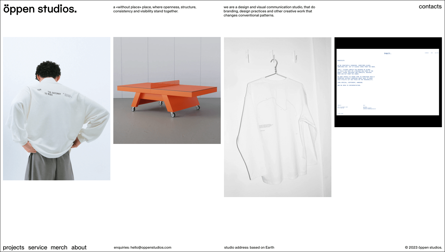
There are no frills, just a nice mix of horizontal scroll and project previews slightly sliding down as you point at them. Inside the projects, you’ll find subtly animated visuals you can expand by clicking on them and orderly arranged texts.
Sebastiaan Scheer’s portfolio
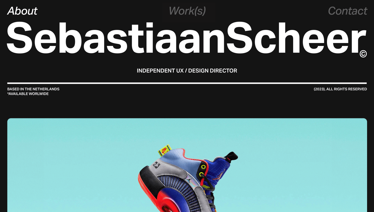
Two jaw-dropping things to notice in this portfolio website: the opening on-scroll animation transforming an image sequence into a text and the running line with clickable life photos.
Jun Ioneda’s portfolio
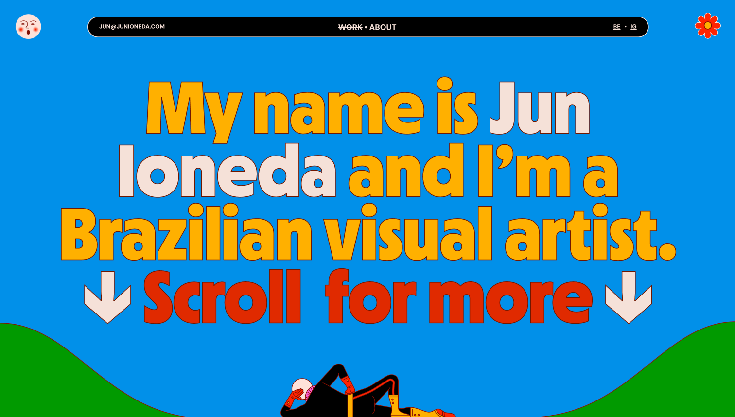
If you miss bright colors, that’s your today’s dose of multicolor inspiration. The maximalist visual artist’s portfolio drips with vivid shades. It can boast a wide array of animations on the scroll: a running line, over-the-fringe typography, and an above-all-pages rotating pic in the upper right corner.
Masha Chern’s personal website
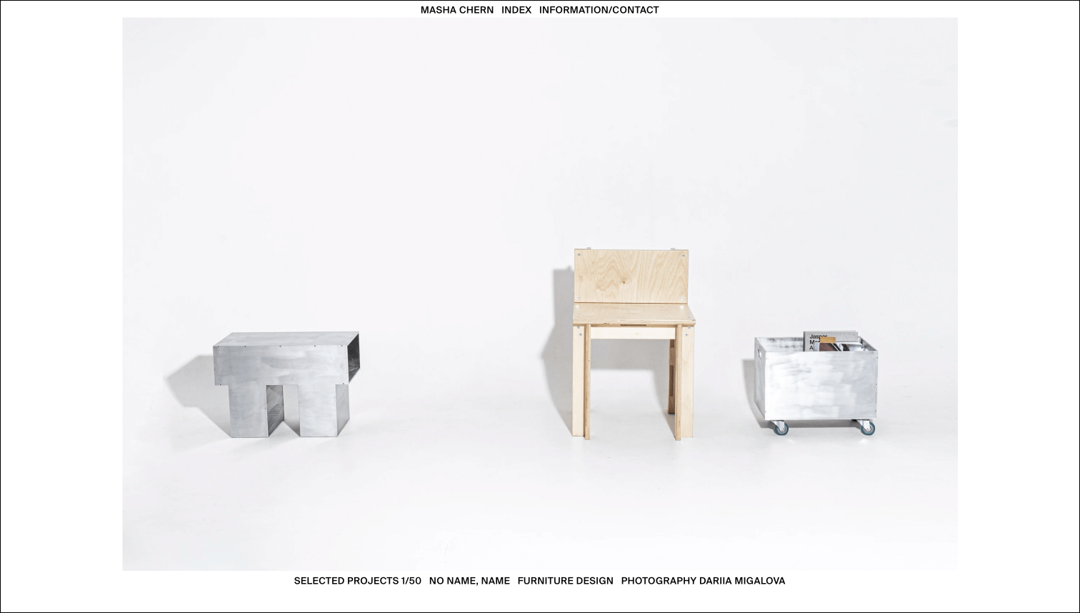
This portfolio website is one big slideshow where the only thing you can do is just click and observe. It also features an index sheet and the ‘About’ section, where the sole design decision lies within typography and grids.
Together with you
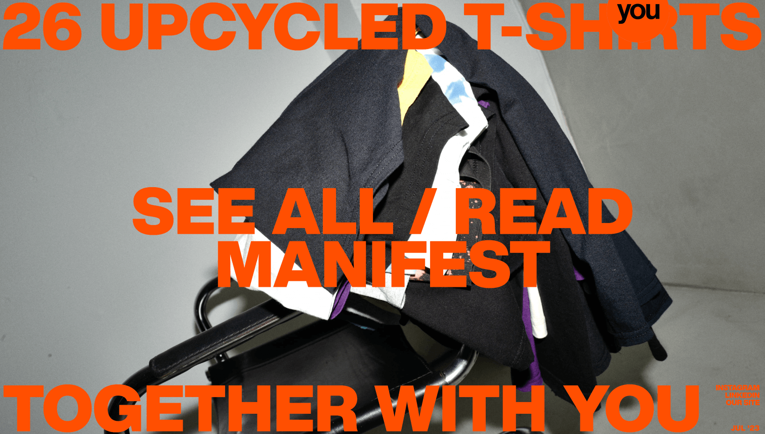
The statements on this landing page are merely yelling at you, and they do it gracefully. If you hover over the middle piece, the background will go wild with a flickering gallery, and if you go through the sections, you’ll probably be surprised by the neutral colors and thought-out animation accents.
Maria Barbayanova’s personal website
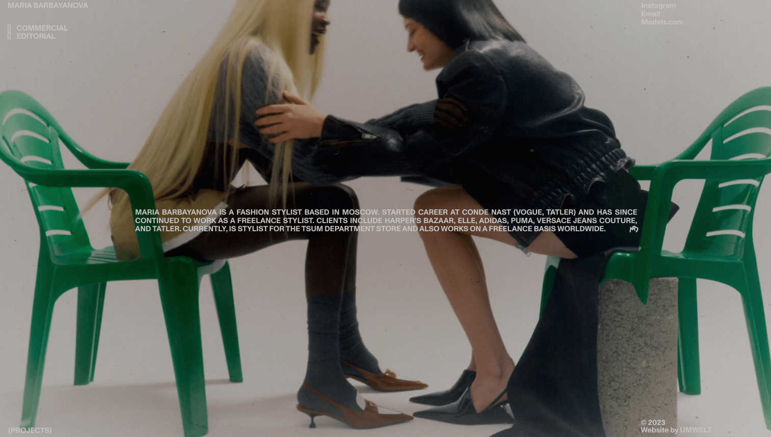
Get a different scrolling experience navigating this page. It opens with a fullscreen slideshow but then seamlessly transforms into a showcase of tiny previews sticking to the left fringe. You can click on them once to enter the projects and multiple times to see the whole gallery it carries.
Chizzy’s tips
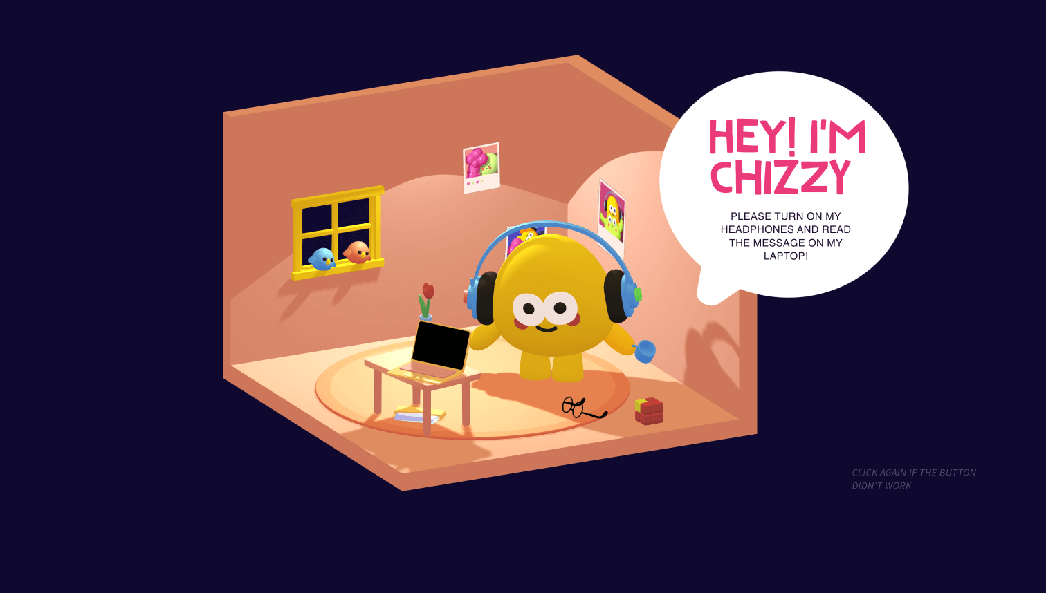
This landing is just so fun to play with. It’s tightly packed with 3D objects that move, change, twinkle, and even make sounds, but only if you allow them to. On the scroll, animation controls the storytelling here, becoming its integral part. Also, the animations are combined with Shots, which lets you control the overall composition and explore its parts with a click.
Wrillustrations
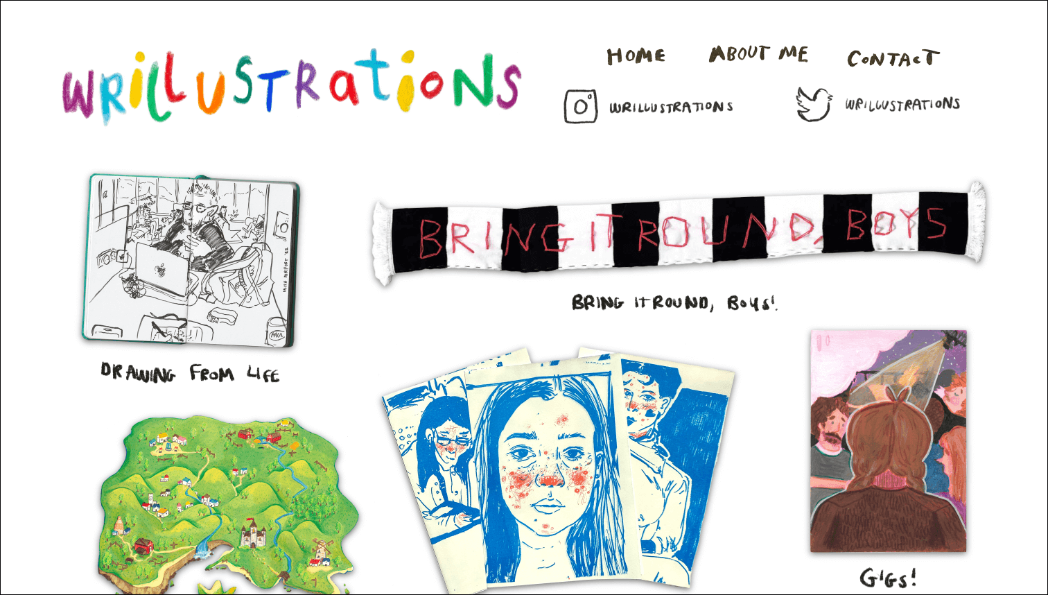
Almost all elements on this simple page are naive, hand-drawn illustrations downloaded as PNGs and made clickable. It doesn’t have many animations and other power features, but it’s all customized and conveys the author’s artistic approach.
Gyoza bar
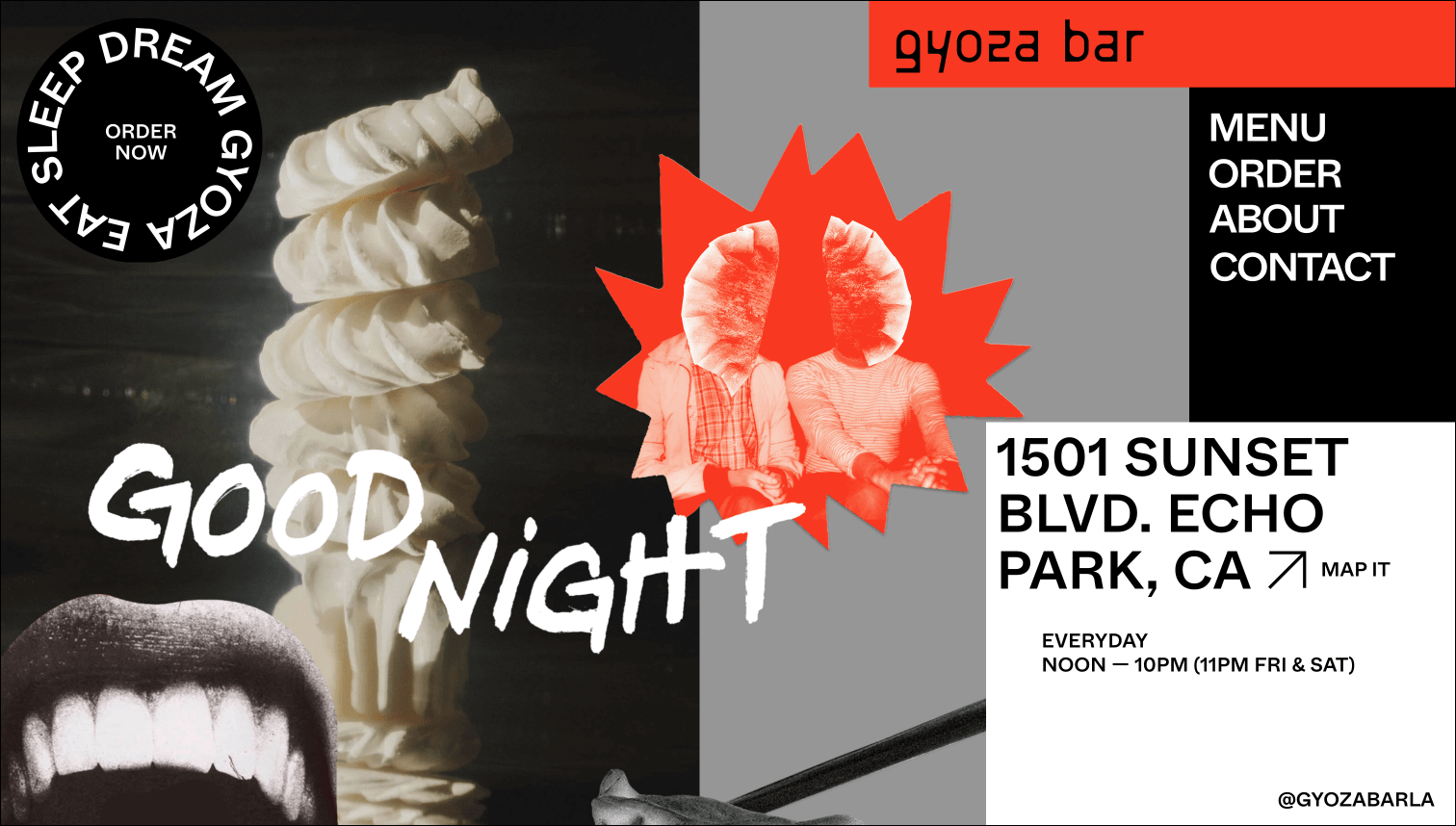
A thing as simple as a fast-food restaurant menu can be a piece of art. The custom cursor in the form of a gyoza dumpling sets the page mood right off and is then joined by a highlighted navigation panel and a rotating element hinting to order the delicacies.
Ryan Garreth Conner’s portfolio
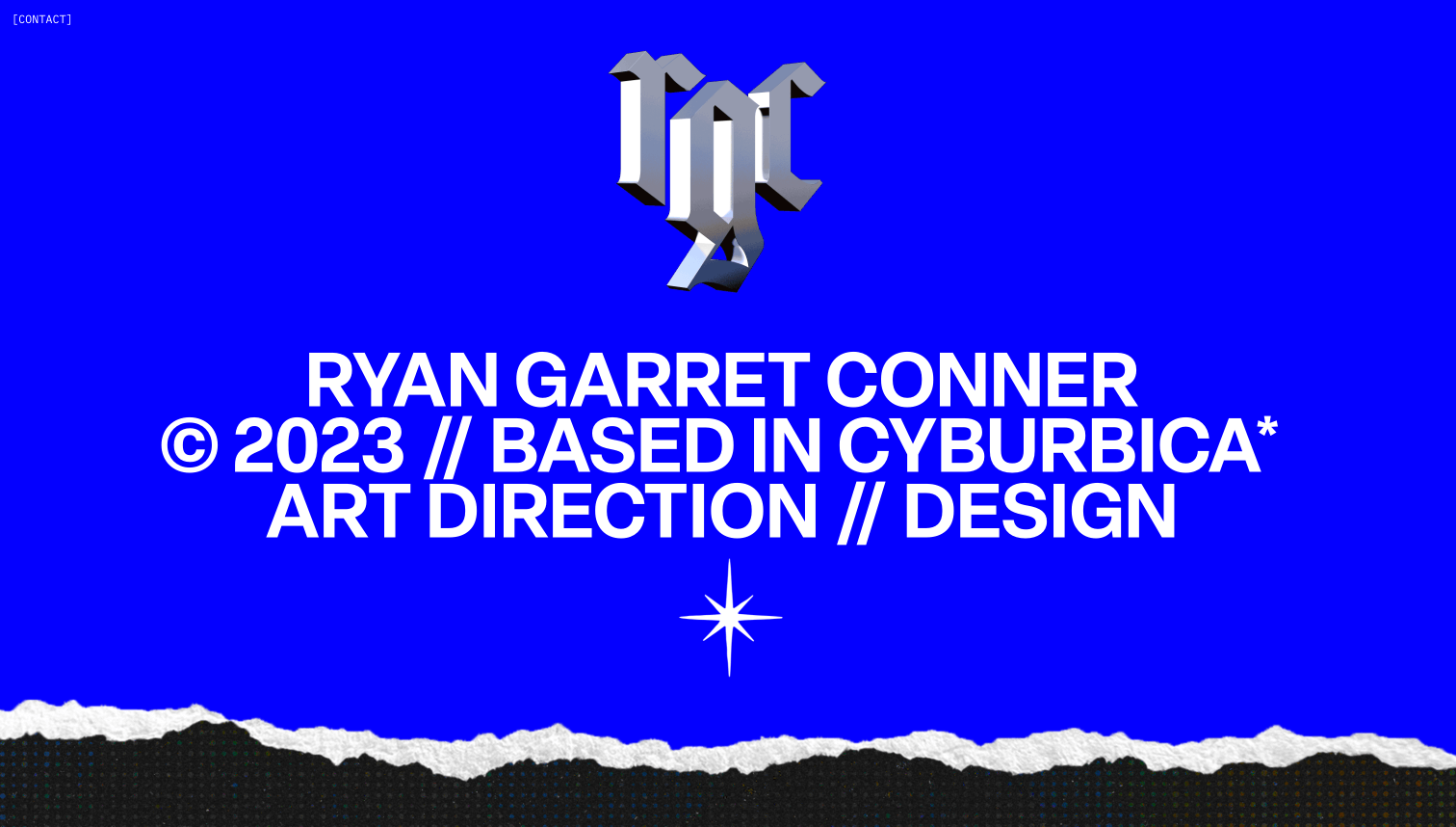
Downloading with the color of the Windows death screen, the website invites you into the head—or a computer—of the author. The design effortlessly combines the animated 3D object on the top, textured videos, custom pixel font and clickable folders in the middle, and a hoverable switcher on the bottom into one canvas.