Make your website move: simple animation techniques for designers
A no-сode guide on animation in web design with real examples.
If you’re a designer working in tools like Figma, you know how static layouts can sometimes feel limited. Moving elements, like bouncing buttons or shifting backgrounds, really catch the eye. But what should you animate, and how can you do it easily, without code? Tools like Webflow have made no-code design mainstream, and this article shows how Readymag takes website design animation a step further, making it simple to bring your site to life.
Why should you use animation in your website design?
When we add website animation to a project, we’re not just doing it for the sake of aesthetics. According to the Nielsen Norman Group, there are clear objectives behind these choices:
- Highlighting changes: animations are perfect for guiding users' attention to changes on a page, like when content appears or shifts. This helps to make transitions smooth.
- Adding fun: who said websites have to be boring? Motion can add a layer of fun, making your design pop.
Staying modern: using the latest website animation design techniques shows that you’re up-to-date with current trends. It's a signal to visitors that your brand is contemporary and in the know.
How to boost your web design with motion
Here are some inspiring website animation examples made with Readymag that show how motion can transform design.
Make your hero section pop. Your hero section is the first thing visitors see, so the animations here really set the stage for your site, making it instantly engaging.
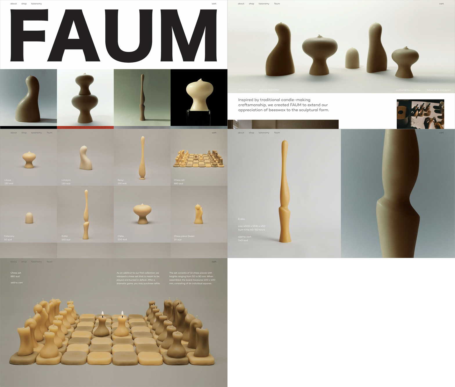
Take the candle shop “Faum”, for example. When you hover over a photo, it changes, allowing users to start interacting with the product right from the get-go.
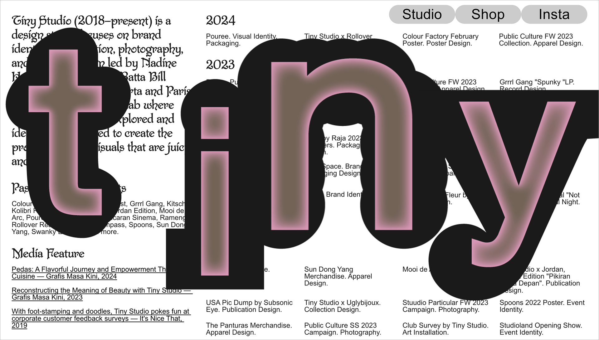
Another example is “Tiny Studio”. Visit their site, and you'll be greeted by huge letters filling the screen that, after a moment, slide apart. It's a simple yet impressive way to grab your attention and make a memorable first impression.
Keep things moving with scroll animation. Scrolling down your site should feel like unfolding a story, with each scroll revealing something new. This approach is common in the best website animation examples.
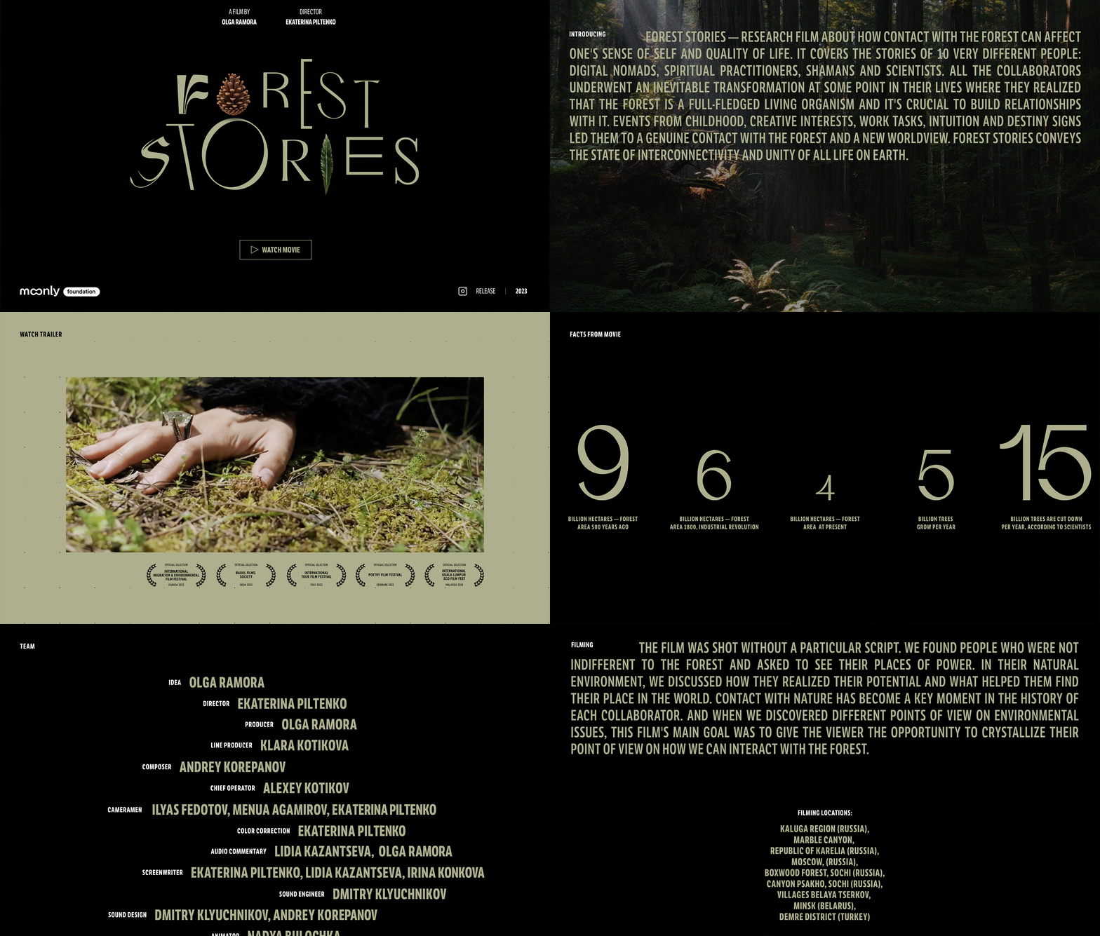
Take “Forest Stories”, a film about how forests influence our lives. The website feels like you're in a movie, especially when you scroll down and see the creators' names roll like end credits. It ties you more closely to the film's vibe. These website animation examples highlight how scrolling effects can turn a site into an unfolding story.
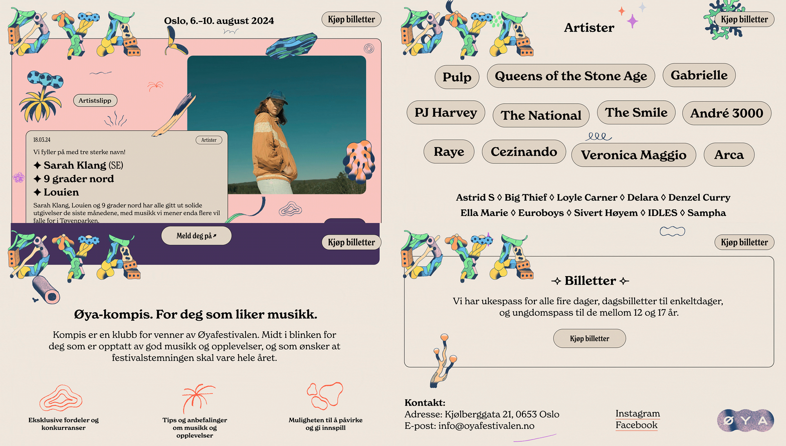
Then there's the “Oya Festivalen” website. It's full of life, with tiny animations that make the page sparkle. But the real magic lies in how scrolling through the site feels like leafing through a fun book. Each scroll invites you to see more, making the whole experience inviting and exciting.
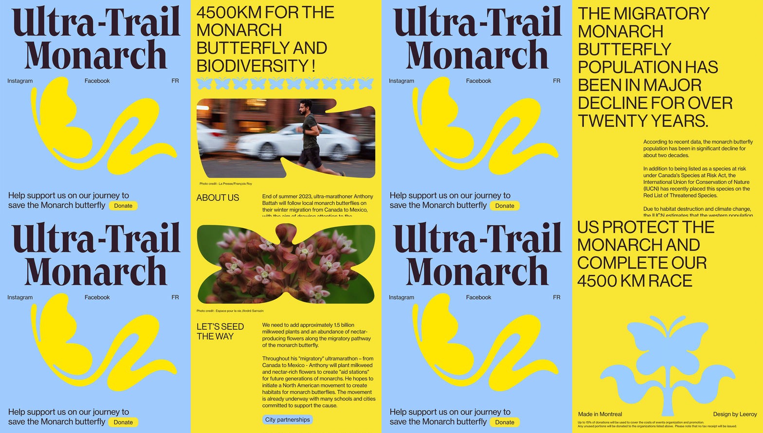
Make your buttons wiggle. CTA buttons are crucial—they guide users on what to do next. Subtle website animation effects, like a soft wiggle or gentle growth, can catch the eye and spur people into action—like on this site that's all about saving the Monarch butterfly, where the buttons gently move to grab your attention.
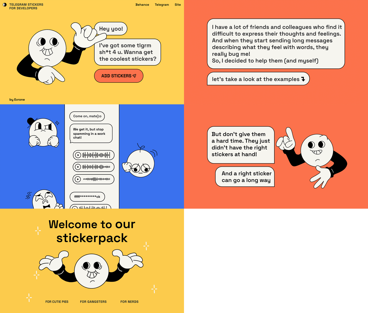
Bring icons to life. Animated icons stand out—they add a layer of interaction that boosts the user experience. It's a way to sprinkle in some joy and playfulness, adding emotion to your site. Take the “Evrone” website, for instance. It showcases animated stickers that not only grab your attention but also make the whole experience more enjoyable and memorable.
Play around with interactive stuff. Engagement goes beyond just viewing. You might create a loading animation for website transitions, create animated video for website storytelling, or even create animation video for website product reveals. Introduce elements that users can interact with, like 3D rotations or puzzles. Tools like Spline make it easy to design 3D objects, which you can then bring into Readymag for interactive experiences. They can transform your site into an interactive space where every click and scroll offers a new discovery.
For example, on the “Post 1945 design” site, you can twist and turn objects around to see them from all angles.
And on this special Readymag project, you can piece together bits of a broken heart to see a secret message.
How to create animation and motion without coding
You don't need to know code to add engaging website animation effects. Of course, advanced tools like GSAP or any website animation library give developers fine-grained control, but Readymag makes animation accessible to any designer, no coding required. Whether you’re used to building prototypes in Figma, crafting sites in Webflow, or experimenting with 3D in Spline, Readymag makes it easy to animate and combine everything. Here's how it helps any designer create animations with ease.
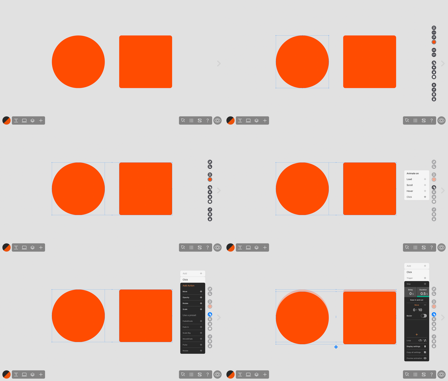
Bring any widget to life. In Readymag, animating widgets—like text, pictures, or buttons—is a breeze. You can animate any widget with four triggers: on load, on scroll, on hover, and on click. Use these alone or mix them to create сomplex effects.
Use lottie animations. Lottie animations can make your web designs snappier and more fun. They're super light, so they load fast, and they stay crisp no matter how big or small you go. You can whip up anything from cool animated buttons to lively icons, and even story-like animations without the heavy load or fuzziness of videos and GIFs. All you need to do is add Lottie as a widget in your Readymag project.
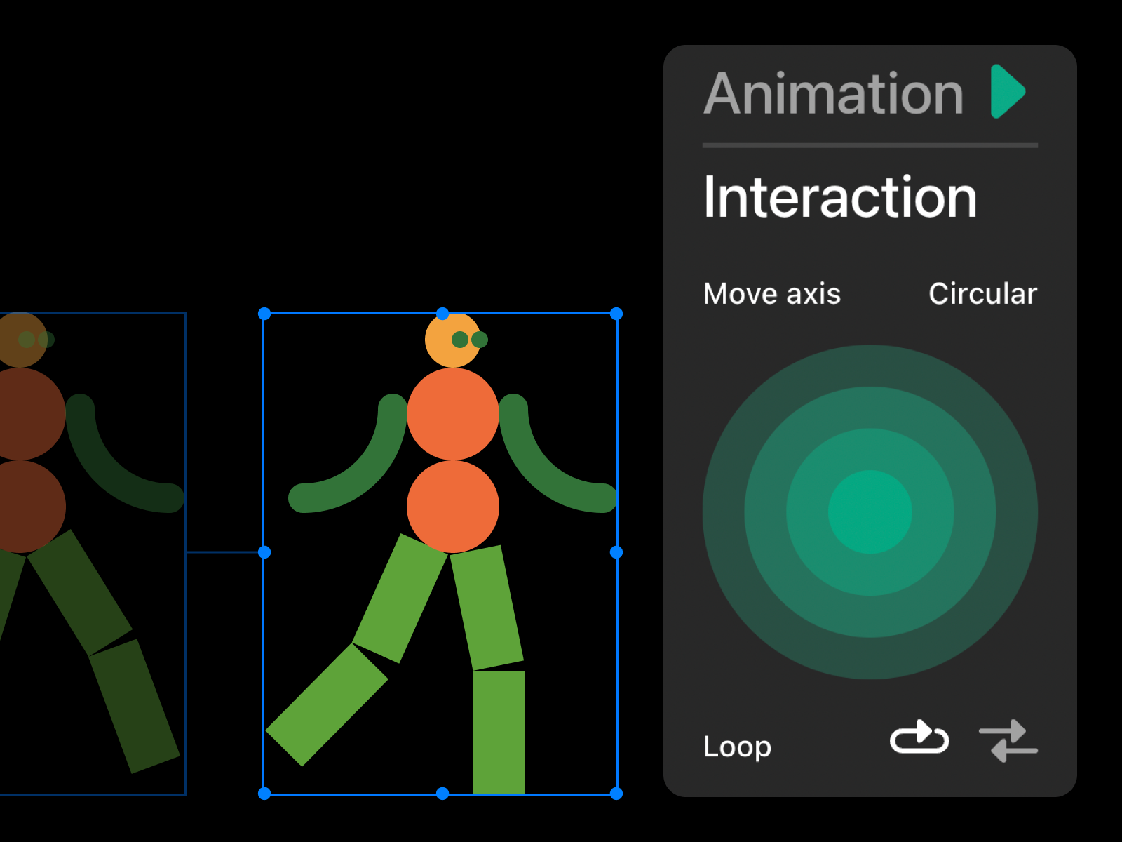
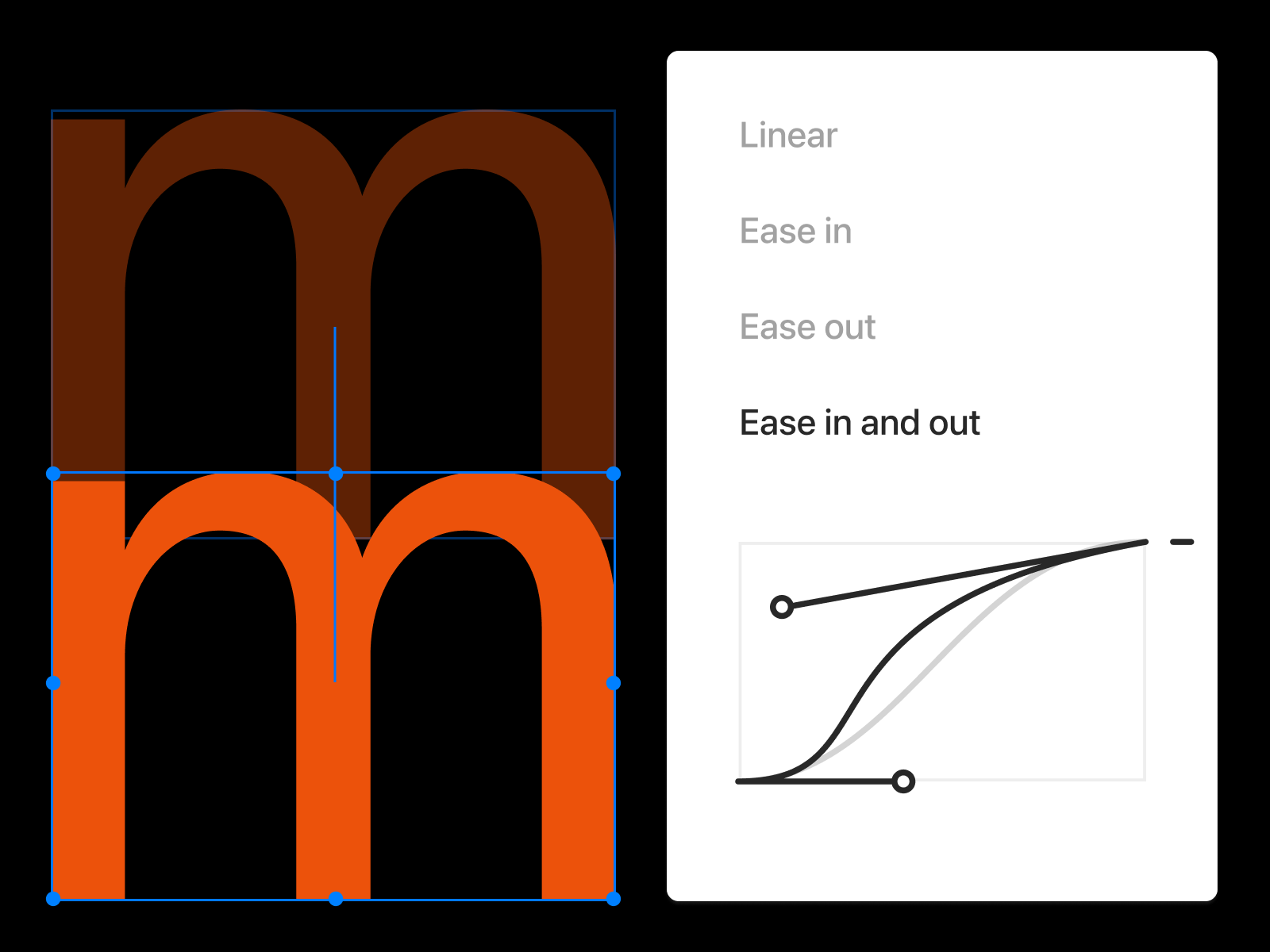
Animation and interaction controls for Lottie widget.
Customize movements with Bézier curves. Imagine making objects on your site move just like they would in the real world, or breaking the grid with paths that draw the eye. With Readymag you can customize these paths visually—no scripting needed. For those familiar with GSAP, it’s a similar idea, but simplified and code-free, all done by simply adjusting curves.
Utilize presets and website animation templates. Beyond just animations, Readymag offers a variety of presets that work almost like a built-in website animation library. Presets are combinations of motions, headers, footers, and more that are designed to improve your workflow. Think of presets and website animation templates as both shortcuts to key website elements and sources of visual inspiration. These presets can save time, spark inspiration, and help bridge the gap between tools like Figma, where you plan layouts, and Readymag, where you bring them to life.
Website animation can turn a simple design into something special. With Readymag, it’s easy to add fun, interactive touches without writing code—whether you’re coming from Figma, Webflow, or any other design tool. Curious about how to create a loading animation for website or the best website animation practices? Give Readymag a whirl and see what you can create.