Is there still room to get lost online?
The early web was all about discovering things you weren’t looking for. Some designers are bringing that spirit back.
The web has increasingly prioritized instant clarity, favoring speed, utility, and efficiency. But a growing number of digital experiences seem more interested in rewarding curiosity, exploration, and unhurried engagement.
What shifts when designers think beyond capturing attention and start guiding visitors toward unexpected discoveries? Does efficiency always have to come at the cost of experimentation? We took our questions to a group of creatives who are thinking differently about the web:
Claire Gustavson and Lana Z Porter, co-founders and editors-in-chief of digital publication Tractor Beam.
Elana Schlenker and Mark Pernice, co-founders of design studio Out of Office.
Justus Smith, marketing manager at creative studio Resn.
Clara Rodés, head of strategy at Codea Studio.
Minh-Anh Nguyen, multidisciplinary designer.
Noemie Le Coz and Jeremy Elliot, co-founders of creative studio Little Troop.

Designing for detours
When conceptualizing their digital magazine, the team at Tractor Beam—a speculative and science fiction publication imagining hopeful futures on Earth through the lens of “soilpunk”—put questions of attention and discovery front and center. Through short fiction, essays, and graphic novellas, Tractor Beam offers its readers a connected ecosystem where one story naturally leads to another and visitors are invited to wander. “We want the experience of reading Tractor Beam to feel like turning over a log: you’re not sure what you’re going to find, but it’ll always be alive,” says co-founder and editor-in-chief, Lana Z Porter.
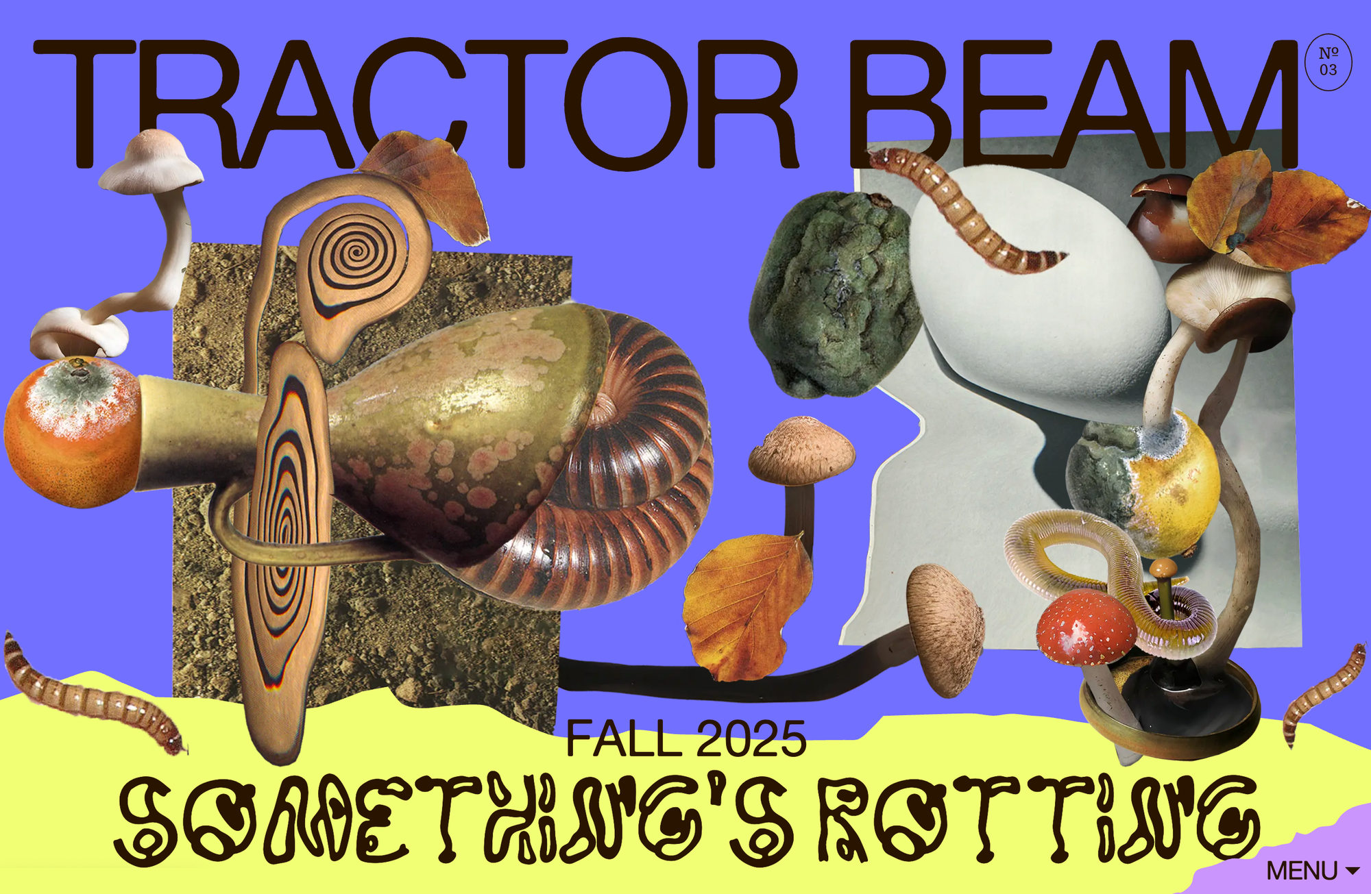
As a publication rooted in ideas of the Earth, its visual identity and web design—by creative studio Out of Office—take notes from geological strata, with the act of scrolling mirroring the process of digging through layers of soil. “We wanted to treat each story as a slice of a different world waiting to be unearthed,” says Claire Gustavson, co-founder and editor-in-chief. The website’s behavior echoed this theme. “Vertical navigation turned into part of the metaphor instead of just the default experience,” adds Mark Pernice, co-founder of Out of Office.
The annotation system on Tractor Beam can be turned on or off
The design itself encourages meandering and detours. An optional annotation system that provides additional context within stories allows readers to go down rabbit holes, stirring curiosity instead of forcing it. It offers a clever twist on traditional digital publishing, introducing an element of surprise baked into the design.
It’s a quality that Resn—a creative studio based in Wellington and Amsterdam—also values in its own work. “Familiarity helps people navigate an experience, but it’s the unexpected that makes them sit up and pay attention,” says Justus Smith, marketing manager at Resn.
One of the "webtoys" on Resn's website
Less direction, more discovery
Creating room for exploration means designing multiple paths through a website, allowing visitors to find their own way. As a publication made of conceptual networks, Tractor Beam uses issues, themes, and disciplines as a navigation system. “A lot of online publications treat the archive as this obligatory list you scroll past to get to the new thing, but Tractor Beam’s archive is designed to be an entry point of its own,” says Elana Schlenker, co-founder of Out of Office. “Someone who came for one story should leave with three more they want to read.”
Letting visitors find their way into a website rather than following a predetermined path was something Codea Studio considered when designing its portfolio. The homepage opens with a floating layer of objects that act as portals into different corners of Codea’s world.
The floating layer of objects on Codea Studio's website
A cloud, for instance, takes you to the weather forecast of Barcelona, a nod to “the almost absurdly Catalan obsession with knowing what the weather is going to do at any given moment,” says Clara Rodés, head of strategy at Codea Studio. Elsewhere, a tennis ball leads to their campaign for Wilson Tennis.
At first glance, some of these objects might seem obscure to the visitor, removed from their context—and that’s intentional. This lets visitors follow the particular threads that tug at their interest. “We’ve become accustomed to digital environments constantly competing for our attention: advertising banners, pop-ups, recommendations, offers, notifications, and countless little interruptions designed to make us do something,” says Clara.
“There’s a peculiar contradiction in how much effort goes into capturing our attention and how little room we’re given to decide what we’d actually like to pay attention to.”—Clara Rodés
For Codea, giving up control over the visitor’s journey through the website is a point in itself. “We don’t necessarily know what someone will find interesting or where they’ll end up, and we don’t think we need to,” says Clara. “Not every visit has to follow the same logic or lead to the same destination.”
That questioning of control cuts both ways—just as Codea loosens its grip on the experience, designer Minh-Anh Nguyen sees handing autonomy back to the audience as an ethical responsibility. “If everything is built for instant comprehension, we get used to being handed answers, and we lose the habit of looking, wandering, and following our own interest,” says Minh-Anh. “A slower experience gives some of that agency back to the visitor.”
The rearrangeable room in Minh-Anh Nguyen's website for Inside a Home: Inside a Body
On her website for Inside a Home: Inside a Body—an exhibition by an all-women ensemble of artists—Minh-Anh invites visitors into a room strewn with objects, evoking the idea of home at the heart of the exhibition. “The visual is a girl’s room: messy, real, and raw, where things don’t quite make sense but everything is there in its entirety,” she says. The space itself is an interactive playground: each artist’s work is represented by an object, from a balloon to a power strip. Visitors can click on each object to read a note about the corresponding artist, or drag it around to rearrange the room and shape the space themselves.
“A lot of the web is designed so you understand something in a second and move on. That’s useful for finding a train time, but it treats attention as something to capture and spend as quickly as possible.”—Minh-Anh Nguyen
“There’s real value in digital experiences that ask for a bit more: they treat attention as something visitors choose to give and trust them to be curious,” she adds.
It takes two to tango: character and clarity
This subtle challenge begs the question—are efficiency and experimentation always opposing forces? Or can they meet halfway, shaping an experience as a whole? “I wonder whether efficiency should always be the primary measure of a good experience,” says Clara. “There are plenty of instances where getting somewhere as quickly as possible is precisely what you want, and others where the things you encounter along the way are part of the reason for being there in the first place.”
The creative decisions depend, as always, on the context. For a brand’s website, for example, its design needs to make space for the commercial mechanics, but that shouldn’t mean sacrificing character. A business, after all, needs to sell its product, but that, in turn, depends on how effectively it expresses its personality and values.
On Little Troop's website for Rick Barry
Little Troop understands this tension. Case in point: their website for creative agency Rick Barry, where hovering over each letter plays a sound clip from one of their campaigns. Zany and playful, the interplay of sound and typography immediately sets the tone for an agency that isn’t afraid to question conventions or do things differently.
“A website can be clear and restrained on a first impression, then reveal more personality as you spend time with it. We like giving someone a part in making something happen, or feeling like they’re in on the joke,” says Noemie Le Coz, co-founder of Little Troop. “Discovering that a logo makes a sound or that a character responds to you gives you a different connection to it. These small moments of surprise can become what you remember most about an experience, brand, or product.”
Little Troop's website for Le Puzz featuring the brand's mascot, Scotty
Their website for puzzle maker Le Puzz shows how elegantly the studio walks the fine line between expression and function. From Scotty—the brand’s mascot—following your cursor with his eyes to the rotating puzzle boxes and the random objects flying across the screen, each detail tells you something about the brand’s irreverent spirit while hopefully leading you to add one of their puzzles to your cart. “We like websites where you can arrive with one thing in mind and find something else that makes you want to stay,” says Jeremy Elliot, co-founder of the studio.
“There’s value in being able to wander a bit.”—Jeremy Elliot
The trick, then, is identifying the fitting solution to a design challenge, reconciling both efficiency and expression in a delicate dance. As Minh-Anh succinctly says, “The skill lies in balancing creative freedom with clarity while keeping practical information easy to find so curiosity doesn’t become an obstacle.”
Ideas don’t always start on a blank page. See how others approach the web with Readymag’s Websites of the Year shortlist: 20 projects to refresh your references and inspire new approaches. Explore and vote for your favorite by November 30.