Is reference culture changing how designers think?
When every idea is a search away, how do you move beyond the reference?
Visual referencing has become an integral part of everyday design practice: Pinterest, Instagram, Are.na, image searches, saved folders, and screenshots. A designer can find almost any visual precedent immediately, and one reference automatically leads to another.
What has this abundance changed about the way designers look and think? Does endless inspiration expand creative possibilities, or make design more referential? We took our questions to designers and creative directors across editorial, branding, and independent practice: Jessi Brattengeier of The New York Times, Roy Fleeman of Vacation®, Matthew Roop of Studio Freight, Rotterdam-based design studio From Form, and Readymag Ambassadors Omar Careaga and Vanya Issar.

The faster we look, the less we see
Before the internet became so abundant, references were limited and accessing them took time. There was a certain physicality attached to the act of sifting through a book or an archive of posters. The increasing accessibility of visual material has changed not only how quickly we look at something but also how deeply we engage with it.
“We’re so inundated with new images all day long that we spend very little time deeply investigating any single one of them,” says Matthew Roop, design director at Studio Freight. “As a result, what grabs our attention isn’t necessarily something highly detailed that requires deep investigation to appreciate, but rather what stands out quickly.”
“The abundance, in my opinion, discourages deeper exploration. It makes it incredibly easy to just keep moving from one image to the next.”—Matthew Roop
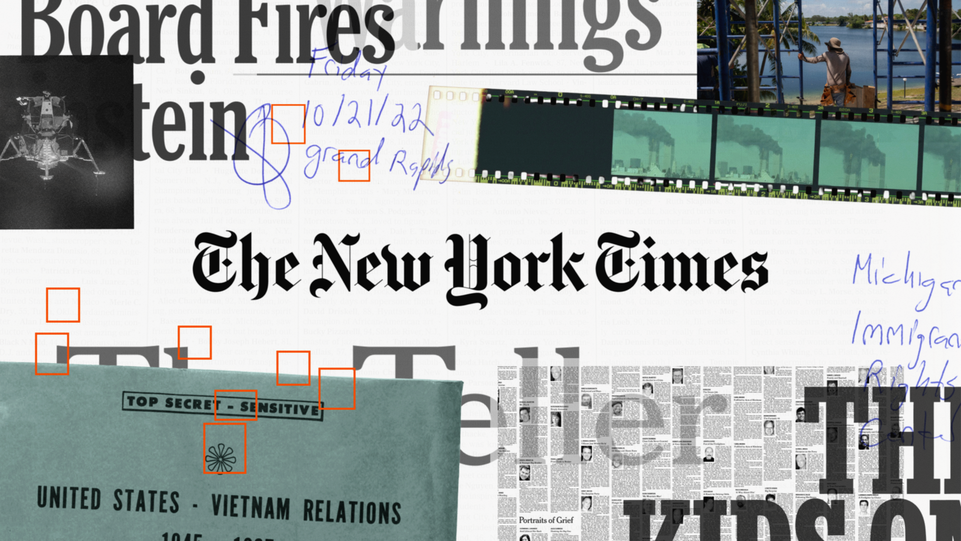
With this, the designer’s methodology has shifted too, shaped in part by the way we discover references. Jessi Brattengeier, creative director at The New York Times, sees the swipe as a new kind of looking: “When there’s always another image one swipe away, you look at something just long enough to react to it, not long enough to really understand it. So depth and thoughtful research have become choices designers make, rather than necessary steps built into their creative process.”
From Form's 2023 campaign for Amsterdam Museum Night
When a reference is discovered in a sea of lookalikes, it can often be stripped of its context, making it harder to grasp the research and creative thinking that led to the visual. When From Form noticed their flipbook campaign for Amsterdam Museum Night on Pinterest alongside other flipbook-related visuals, they realized how every piece of work is now reduced to a “vibe” and how the endless cycle of scrolling through them can push designers down what they call a “style tunnel.” “The best design work is always a harmony of concept (or narrative) and craft (or visual style). Removing that storytelling element reduces it to just a style,” says Ashley Govers, co-founder of From Form.
Almost counterintuitively, the sweeping availability of reference imagery can limit creative thinking, where more references don’t necessarily lead to more possibilities. “With so many images available, it’s easy to fall into a spiral—searching for that one perfect reference that feels like it’s going to unlock the best idea,” says Roy Fleeman, head of design at Vacation®. “It can be a real trap, especially when you’re working on a project that doesn’t have a clear point of view yet.”
Put the idea before the reference
Recommendation systems on referencing platforms tend to serve us more of what we already like, reinforcing existing tastes while steering designers toward the same visual material. Great design, by contrast, has always depended on differentiation: finding something ownable, specific, and true to the idea at hand. “We have access to more, but we’re mostly accessing the same things on the same platforms. The same algorithms serve the same images to everyone, so you see mood boards across completely different briefs that look nearly identical,” says Jessi. “Adventurousness comes from where you look, not how much you look at. The most interesting references usually come from a personal, often unusual, connection rather than a generic search on a design platform.”
The speed at which we can now discover references has directly impacted the pace of the creative process itself, and by extension, the ideas it leads to. “Before the internet, there was a lot less ‘NEW. NOW.’ and a lot more old and slow,” says Matthew. “This meant that if you wanted to create something new, you had to do it yourself. The exploratory phase of a design project was much longer, because it takes time to come up with new ways of speaking visually. Now we can go and find something online in a day and then remix it into our own idea.”
That shift also raises a question about where the idea itself enters the process. The difference lies in what comes first: the reference or the idea. At Studio Freight, the team starts with a direction and uses references to test, stretch, and refine it—not to find the idea in the first place. “I’d recommend this approach because you’re still relying on your own critical thinking to solve problems for the client instead of hoping the internet will give you answers,” says Matthew.
References as raw material
A reference becomes more than a visual cue when a designer takes the time to unpack where it comes from, what it means, and the context that shaped it, then reinterprets those qualities through their own cultural lens. “As much as I love talking about taste and aesthetics, I think there’s a big difference between that and ideas,” says Jessi. “One of my favorite quotes is from Barnett Newman, who famously quipped that ‘aesthetics is for the artist as ornithology is for the birds.’”
“An aesthetic is a surface: you can borrow it, and it’ll look good, but it doesn’t belong to you. An idea is a structure, the foundation for all else.”—Jessi Brattengeier
As Jessi says, the most useful references often point to a creative principle or a play of techniques, instead of just a visual style. “If I can describe what I love about a reference without describing how it looks, it’s probably giving me an idea that’s really worth something,” she adds.

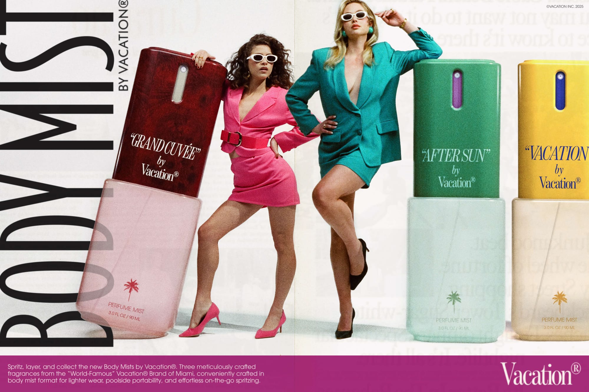
For Roy, that way of looking at visual material means always starting with a feeling. At Vacation®—a sunscreen brand with an almost cult following in the design community—the team approaches each product launch through an emotion and lets that guide them to a visual language. The brand’s distinctly ’80s- and ’90s-inflected world has grown through this kind of loose interpretation, treating an era as a rich field of references rather than a fixed visual vocabulary. “Vacation® has always had a very specific point of view about the world it occupies, and that clarity has allowed us to be more flexible with our sources of inspiration,” says Roy. “By not being too literal in our interpretation of the ’80s and ’90s, we’ve been able to expand the brand beyond what people might initially imagine for a retro sunscreen company.”
As Roy explains, references can play different roles at different points through the creative process—at the get-go, they can help chase an emotion or an idea and define it, and later, they can inform the visual world that idea can occupy.
“A reference that gives you an idea can open up an entirely new direction; a reference that gives you an aesthetic helps define how that direction should actually look and feel.”—Roy Fleeman
That interpretive distance comes from what we choose to reference. Physical objects in particular leave more room for discovery. For the 2025 campaign for Amsterdam Museum Night, From Form leaned on the idea of the city’s many museums being a “collection of collections,” which naturally led them to collecting culture of the ’90s and early 2000s: Tamagochis, football cards, keyrings, sticker sheets and pin badges. To flesh out the visual world, they looked at not just the objects, but how they were collected and stored: in plastic sleeves, little cardboard toy boxes, and old folders, lending the project a materiality that could only be achieved by encountering the objects up close.
“There’s something refreshing about the finality of finding inspiration in a physical object,” says Roy. “You can respond to the object itself without immediately being shown a hundred adjacent versions of it. That limitation can lead you somewhere more personal and unexpected.”
A physical object can give you an association, a feeling, or a starting point—but it can’t offer a visual solution. The connection between the reference and the brief is still the designer’s to make. “Another designer’s work has already solved a problem specific to their brief, so when you look at a finished project, you’re looking at the culmination of their research and there’s less left for you to interpret,” says Jessi. “A solution you didn’t search for yourself is never really yours. On the other hand, a photograph, a film, a piece of music, or an object gives you a feeling you still have to translate to your brief and interpret as your own.”
Looking beyond the surface
That separation between inspiration and a piece of creative work is increasingly collapsing in the digital world. Instagram, for instance, has become not only a place where designers publish finished work, but a platform where work is discovered, saved, and fed back into the creative process. The same image can move from someone’s portfolio into a feed, then a saved folder, then a moodboard—most often, without the original context travelling with it. “Especially on social media, the lines between reference, imitation, and copying can become blurred because so much of the language is trend-driven,” says Readymag Ambassador Vanya Issar.
When visual language becomes this easy to circulate and reproduce, trends can start to function as shortcuts: a familiar type treatment, color palette, or composition already signals that something belongs to the right cultural moment. The risk is that the reference starts dictating the work without leaving more room for interpretation.
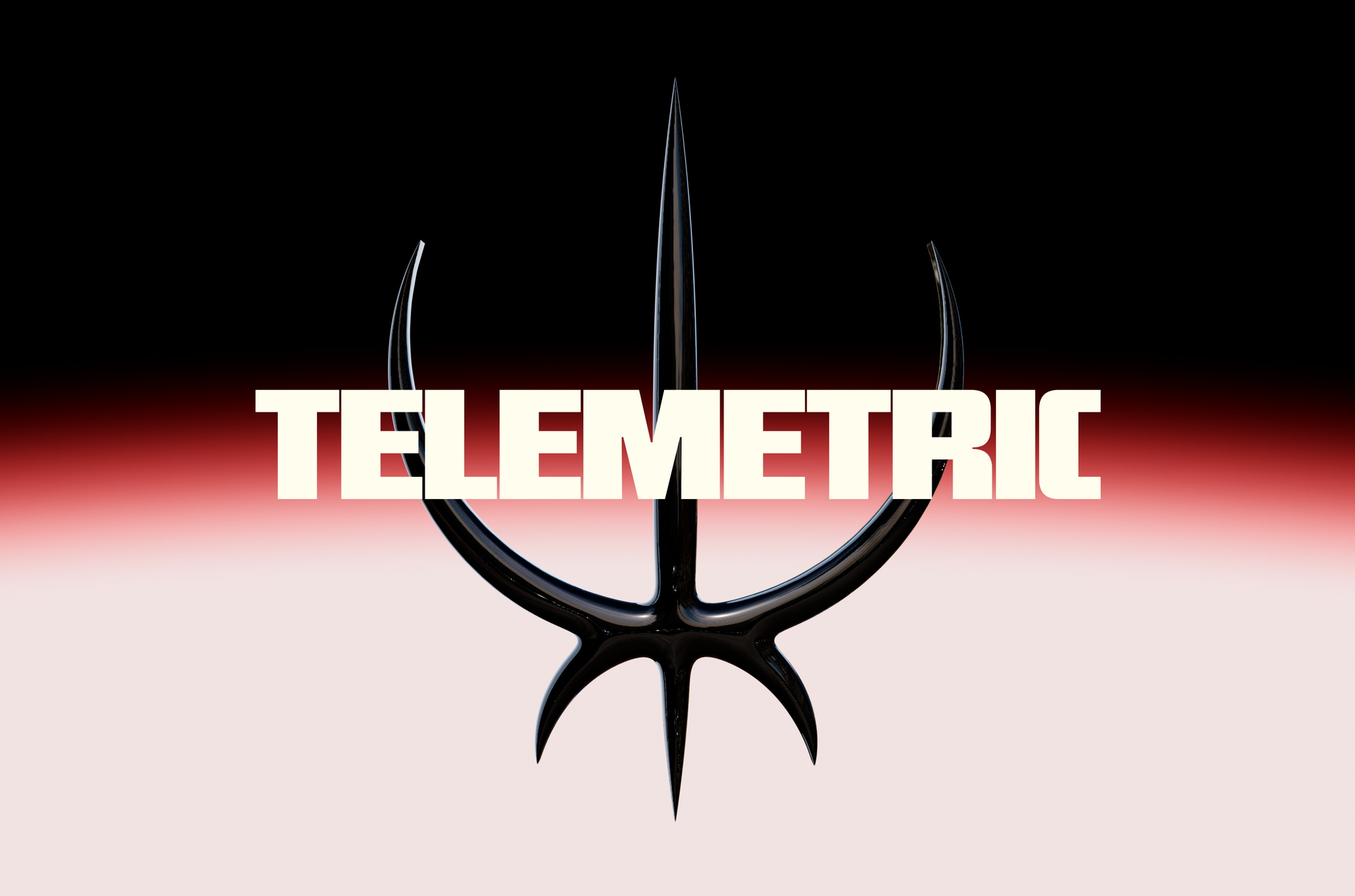
Readymag Ambassador Omar Careaga takes a different approach, intentionally keeping references at a distance. “If I decide a project needs big, bold type, that’s the idea I hold on to,” he explains. “But I won’t pin examples of bold type next to the work, because then it just gets boring. I treat myself like a sponge, and I keep the references away from the work itself.”
That kind of restraint may also explain why designers are becoming more attentive about the history of their references. “I think people are now becoming more conscious of where things come from,” says Vanya. “There’s more dissection involved. You’re not just looking at whether something looks good anymore; you’re looking at the words, the feelings, the references, and the decisions behind it.”
In a world brimming with visual material, finding meaning may depend less on how much we look at and more on how deeply we look.
Curiosity—the willingness to dig beneath what’s visible and ask where something originated, what informed it, and why it looks the way it does—becomes a creative tool in itself.
“We’ve learned to look at images in grids, cropped and stripped of context, with no sense of who made them, when, or why. That trains you to only see the surface,” says Jessi. “The antidote is curiosity about history and source: where did this come from, what was it for, and what constraints shaped it?”