Interactive websites still need creative judgment: Designing with Readymag
As creative tools become more powerful, where does creative judgment come in?
A tool can make an idea possible, but it can’t make the creative decisions for you. While it can remove technical barriers—giving designers more freedom to translate concepts into motion and interaction—it can’t decide what deserves attention, when it appears, or how a story unfolds.
We spoke to designers Marina Meyer, Artem Militonian, Shelby Temples, and visual artist and art director Khoren Matevosyan about the making of their interactive websites and why, when tools become easier to use, creative judgment becomes more important.

Interaction unlocks storytelling
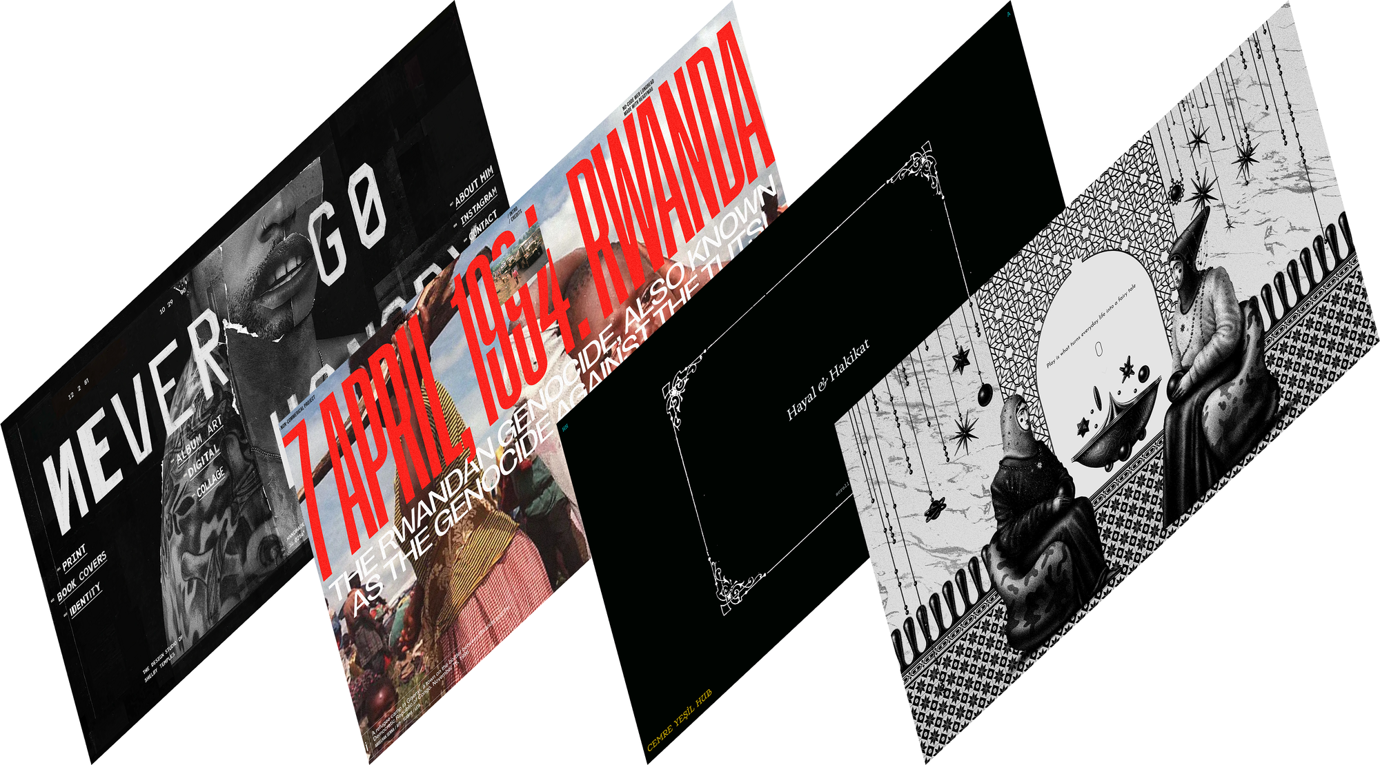
Almost immediately after you land on the website of Hayal & Hakikat, an illustration of a hand asks you to measure your thumb and index finger before you continue. Designed by Marina Meyer, the website translates photographer Cemre Yeşil’s book Hayal & Hakikat into an interactive digital experience, revisiting photographs of prisoners in early-20th-century Turkey who were classified by the length of their fingers.
Hayal & Hakikat designed by Marina Meyer
Scroll further, and a sudden, blinding flash of an old-fashioned camera reveals these archival photographs, allowing the scroll to mimic the act of taking a photograph. “It puts the reader in two bodies at once,” says Marina. “The sudden flash of white light places them, for a brief moment, both behind and in front of the camera: as the person taking the photograph, but also as the person being photographed.”
This momentary interaction carries a lot of narrative weight, and Marina treats it almost like choreography. She points out that scrolling has become so intuitive that it’s now an automatic gesture, much like turning a page. But when a flash of light crosses the screen and the visual content responds to that movement, “the reader suddenly becomes conscious of their own gesture. The scroll stops being a way of moving through the website and becomes part of the story,” she says, turning the reader into a participant.
30 Years of the Rwandan Genocide by Artem Militonian
Narrative, sequencing, and pacing shape how a website is experienced, determining what we see, when we see it, and how long we stay with it. For Artem Militonian, these decisions became particularly important when designing 30 Years of the Rwandan Genocide, a website documenting a history that can be difficult to look at, let alone navigate.
In Artem’s hands, each interaction had to carry the emotional tension of the subject, giving readers time and space to process the history. “I wanted to create an experience that would make history feel immediate rather than archival,” he says.
“I didn’t want visitors to simply read a collection of dates and facts and then move on—I wanted them to feel the scale, speed, and human weight of what happened.”—Artem Militonian
The way the reader moves through the material sets the stage for the experience. Images surface, hold the reader’s attention, and disappear in ways that mirror the fleeting nature of memory. “It was important to carefully control when the reader saw a photograph, when they saw text, and when the two appeared together,” says Artem. “I wanted the images to emerge gradually rather than simply appear. When they melt away, it creates a sense that the moment is disappearing, but its emotional trace remains. The transitions also give visitors time to absorb each image before moving on to the next part of the story.”
Authorship isn’t the same as control
If interaction lets designers choreograph a reader’s journey through a website, carefully tuning every last detail, it might follow that more control would lead to better creative outcomes—but not always. When designing the website for his creative practice, Never Go Hungry, Shelby Temples understood this distinction.
In many ways, Shelby’s portfolio is an extension of his work. On the homepage, a full-screen movie glitches for a moment, then gives way to the main collage in the background, with flickering, changing typography and strange, stuttering animations—each interaction pointing to a designer who believes in the beauty of imperfection, letting mistakes happen, and then learning from them.
The website for Never Go Hungry, Shelby Temples' creative practice
As Shelby says, “Stories aren’t linear. There are mistakes, decisions, second decisions, happy accidents. My work doesn’t exist in isolation from any of that, so the site shouldn’t either.” His website was meant to feel as alive and unpredictable as his practice and to hold a mirror to his work. “I wanted my portfolio to reflect who I am as a designer. I don’t think rules are sacred,” says Shelby. “I’m interested in experimentation and breaking things and seeing what happens.”
To create his website, he also had to unlearn certain expectations. “It meant silencing some of the noise around what we think websites should be, including so-called built for SEO, ‘best practices,’ and what you’re ‘supposed’ to show to immediately impress someone,” he adds. “I wanted to make a site for designers! Come see the work, of course, but hopefully you’ll leave wanting to experiment yourself. The site is really about freedom.”
The website never feels too perfect or obvious. Throughout the pages, Shelby tucks in evidence of the human hand: things slightly misaligned, blipping animations, or “elements that repeat on a set rhythm but are timed in a way that keeps the pattern from feeling obvious,” he says. Some of those behaviors only emerged from experiments gone wrong, which revealed something interesting in the mistake. “I was surprised by how organically the site started coming together once I stopped trying to control every outcome,” says Shelby. “So the framework is designed, but what happens inside it has room to misbehave.”
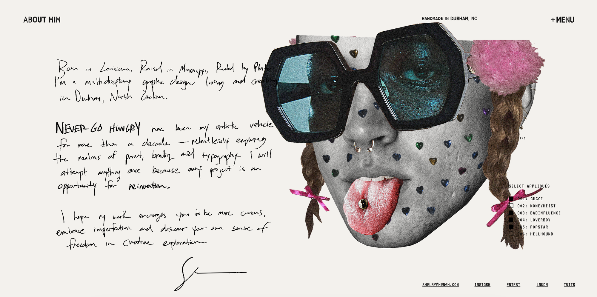
Creating the space for such unpredictability also meant embracing surprise, and in turn, storytelling. Hovering over his birthdate on the homepage reveals a childhood photo, and on the ‘About Him’ page, you can dress him up in sunglasses, Britney Spears-inspired pigtails, or even give him a tongue piercing—a playful reminder that the most interesting work often requires a bit of irreverence.
That looseness was difficult to find within the conventions of a portfolio website. “I struggled with my own site for years because I kept trying to force my ideas into templates and tools designed around predictability and format,” says Shelby. “Readymag gave me enough freedom to stop thinking about what a portfolio website was supposed to do and start thinking about what mine could do.”
The tool is only the beginning
A creative tool opens up possibilities, but turning them into something meaningful comes down to creative judgement. After wrapping up an exhibition of Emergence—a collection of tapestries, sculptures and artworks—Khoren Matevosyan set out to create a website about the project that he could share with galleries and festivals. However, he soon scrapped the idea of a “conventional website.” “Once I saw what was possible with Readymag, I wanted to turn it into a space of its own,” he says. The result is a website akin to an exhibition space—an online gallery where visitors can move through the work, interact with it, and discover it for themselves.
Emergence by Khoren Matevosyan
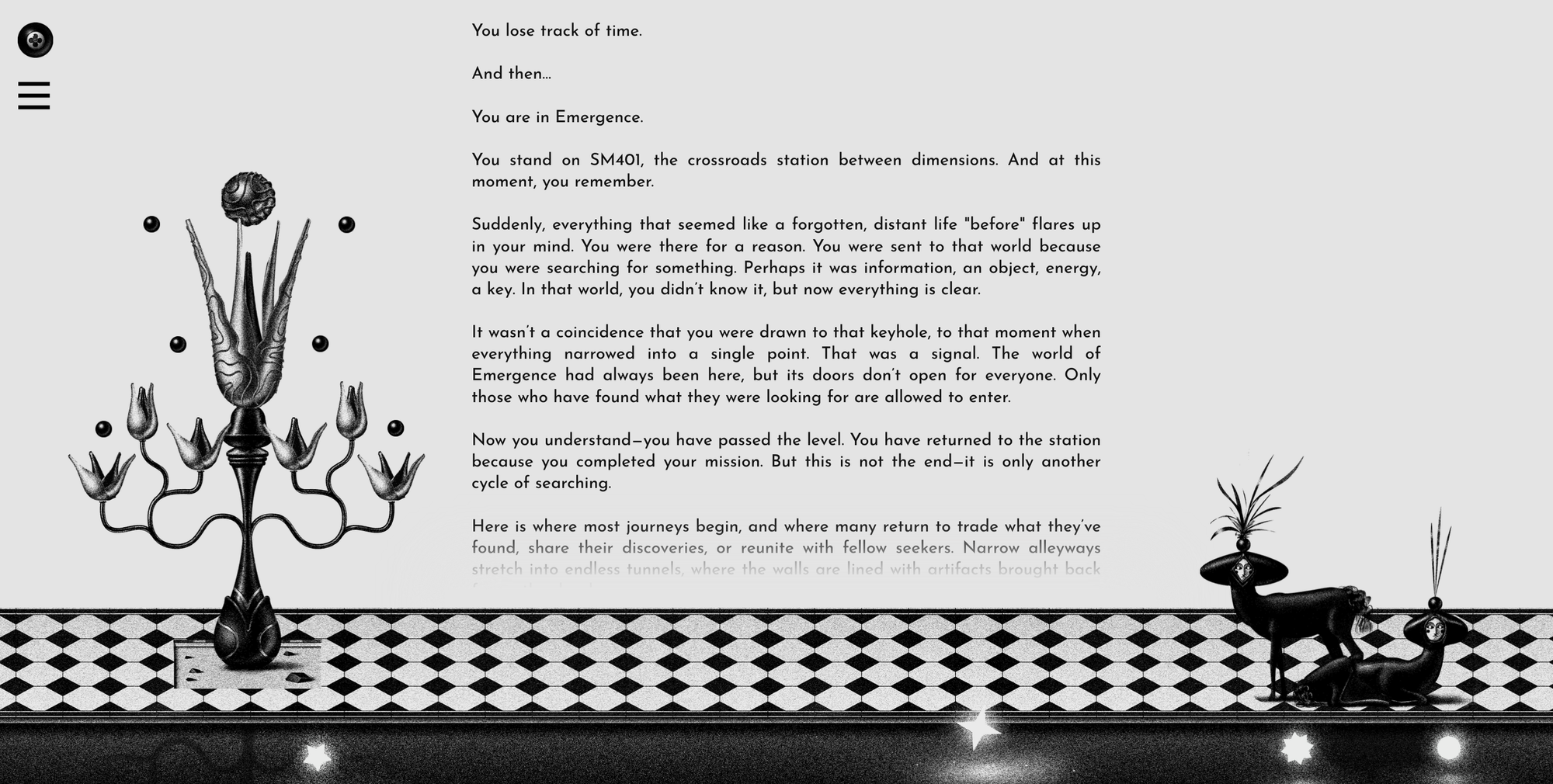
In Emergence, the interactions give the website a certain physicality. On the homepage, the visitor encounters a menu reminiscent of a game interface, allowing them to choose where to go next. The visitor’s presence activates the website: they click, scroll, move deeper into it, and discover new layers.
“Animation was included not only for visual effect, but to maintain a sense of movement, discovery, and curiosity.”—Khoren Matevosyan
In the ‘Story’ section, as a visitor scrolls, a tree gradually opens, seeds emerge from it, and stars slowly drift away on the river below. “The animation develops at the pace of the reader, connecting the rhythm of the text with the movement of the image,” he adds. “The tree opens as though an idea is growing within both the story and the visitor.” While the tool makes these interactions possible, it’s Khoren’s choices that give them meaning.
As creative tools make increasingly complex effects accessible, technical capability alone becomes less of a distinction. What matters is the thinking behind the interaction. Khoren puts it simply, “Technology alone is no longer enough.” The tools, he says, need to “serve an individual and honest idea” rather than simply demonstrate technical complexity.
And perhaps that’s where authorship still resides: not in controlling every possibility, but in knowing which ones to pursue and when to let the unexpected in. As Shelby says, “Authorship isn’t about controlling every pixel or outcome. It’s about creating the conditions for something interesting to happen and having the taste to recognize it when it does.”
Have an idea worth bringing to life? Sign up for Readymag and see where it takes you.