Website examples: How foundries and creatives showcase their typefaces
Learn how independent type foundries and designers promote their typefaces with dedicated landing pages—and check out 9 cool examples.
A font is never just a set of glyphs—it’s a voice, and like any voice, it needs context to resonate. Check out this article on how independent type foundries and designers showcase and promote their typefaces on separate websites, and how Readymag can help convey the essence of the type.
We’ve added 9 examples of websites with defined personalities and asked our designers, Denis Deviatko and Masha Chupina, to share their thoughts on the typefaces’ character, the design of the promo pages, and the best use cases for the fonts.

Storytelling as a way to promote typefaces
A dedicated website allows you to frame your typeface’s voice. This way, you’re not just showing them, you’re shaping how people feel about them, since a well-crafted page tells a story and conveys the attitude and ideal use cases in ways a static specimen can’t.
Storytelling for typefaces sometimes makes a difference in outreach and sales, especially for indie foundries. They’re not backed by a big brand and can’t usually afford just to be on the selling list, so their typeface needs to stand out and speak for itself to be sold. The page becomes both a showcase and a mood board: when the audience sees a typeface presented that way, they don’t just download it — they envision it in their work.
Readymag toolkit to wrap typefaces’ presence
Here’s a set of tools you can use to give your font the spotlight it deserves:
Flexible layout
Readymag projects start with a blank page, so you’re never boxed in on an idea unless you want to—for that, we have a library of templates in different formats and styles. Whatever the character of your typeface, you can reflect it in full while playing around with the composition.
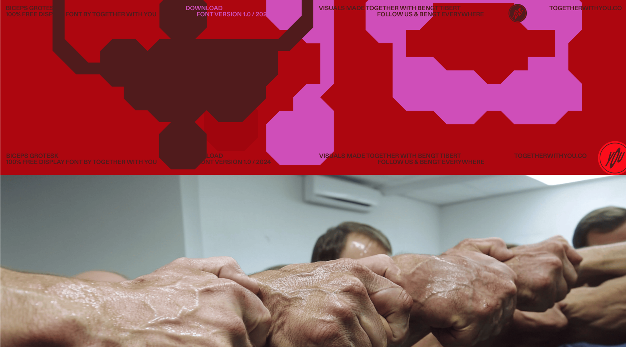
Masha Chupina: I love this typeface and the website for it: self-ironic and almost unreadable, yet it brilliantly responds to the AI-generated muscles of sweaty bodybuilders. The color and scale of the letters resemble veins popping from strain—a funny and awkward take on masculinity.
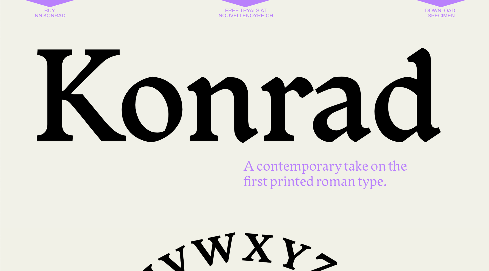
Denis Deviatko: The Gothic tradition in art and design still holds some of the most unique and powerful forms waiting to be reinvented. NN Konrad is a Roman typeface crafted with careful attention to detail and history. It could be an unexpected and original choice for a variety of design cases, from business pages to editorials. This website not only presents the typeface with beautiful imagery but also reflects its historical roots in a “nerd section” that dives deep into its background.
Custom font uploading and advanced typography settings
You can upload your fonts as TTF, OTF, WOFF, or WOFF2 files straight to your font library and use them across your project as they are. However, sometimes showcasing a font means going beyond its basic character set—you want to highlight its versatility and depth. Readymag gives you full control over how your type looks with ligatures, stylistic sets, tabular figures, fractions, and small caps. If you’re working with variable fonts, you can easily adjust boldness and proportions right on the page. Also, Readymag supports right-to-left arrangement for convenient work with right-to-left typography.
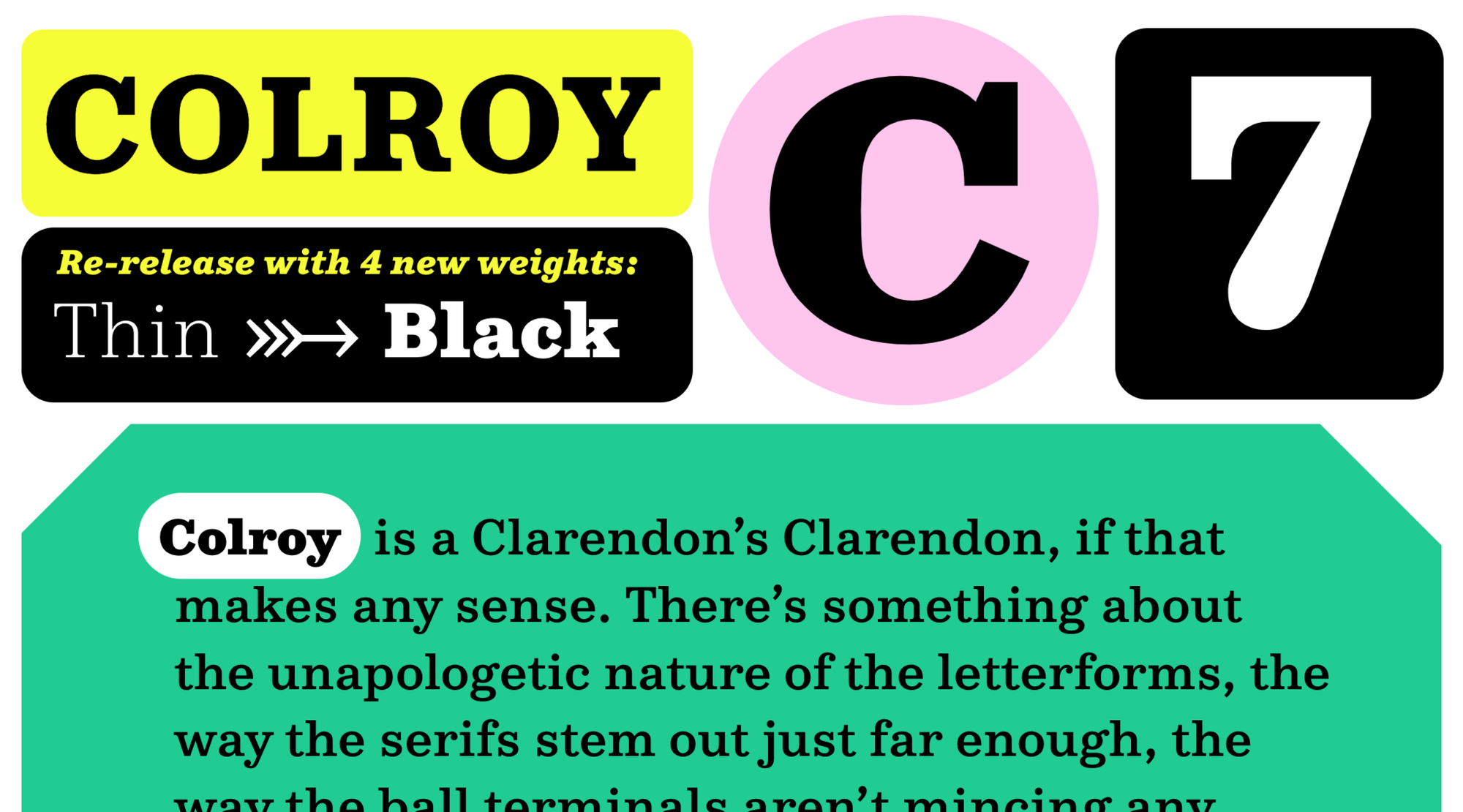
Denis Deviatko: NN Colroy is a highly versatile and perfectly balanced geometric slab serif with a range of weights from elegant Thin to bright, confident Black. It features a solid collection of useful glyphs and charming numerals. With its clarity and character, the typeface is well-suited for both editorial work and branding. The website reflects NN Colroy’s tone in a clean, minimal, and playful way, complete with smooth animations and a touch of humorous storytelling.
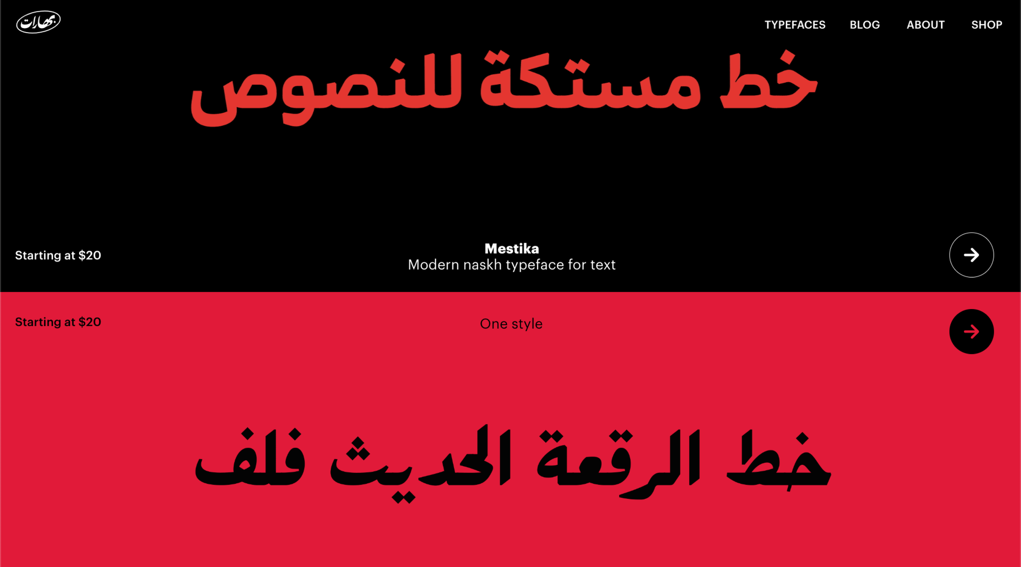
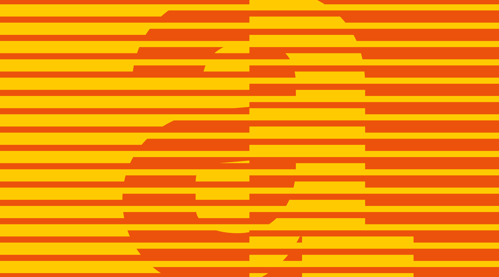
Denis Deviatko: Boharat Type Foundry stands out with its distinctive approach to Arabic type design. Each letterform feels carefully crafted and visually striking on its own, full of rhythm, structure, and character. When combined into words and extended strokes, the compositions become even more dynamic and expressive. The Boharat website beautifully blends the soul of traditional calligraphy with the clarity and precision of contemporary industrial aesthetics.
Animation
Movement helps bring a typeface to life in many ways, so there’s a wide array of animation options for you to choose: native Readymag animations with Bézier curves, Lottie animations, and Shots. You can start with Readymag’s scroll-based or time-triggered object animations to build rhythm into your storytelling, then explore the rest for more precise interactions.
Studio Garonzi's type design portfolio
Masha Chupina: A very neat and structured portfolio—each project follows the same format and maintains consistency throughout. Everything is easy to scroll through, creating a sense of control over the landing page experience. The design doesn’t distract, but instead directs all the focus to the studio’s work. Note how the on-click animation works here, showing yet another variation of each typeface on each click.
You can also use Shots—frame-by-frame animations made out of images—to reveal the concept or construction behind your font. Lottie animations are another option for showing tiny details. They’re lightweight and allow for precise motion graphics that won’t slow your page down.
Pivot Grotesk by Nouvelle Noire Type Foundry
Masha Chupina: This landing page highlights the typeface’s features and potential through interactivity and detail. It showcases construction principles and references, examples in body text, and even lists all the glyphs along with their corresponding keyboard codes. It’s like real documentation, but playful and eye-catching.
Knit Grotesk by Nouvelle Noire Type Foundry
Masha Chupina: Knitgrotesk is a great example of how real-life objects can be connected to the digital. Knitting is quite mathematical and follows a grid, and its patterns resemble pixels. Even the most recognizable font, when tied with yarn, acquires a completely new form and translates into a new visual language.
Custom cursor
Even small details—like custom cursors—can add personality, whether you’re applying them site-wide or just on certain widgets. Do change the default cursor, upload two PNG or SVG images, and set them as the new default and pointer cursors.
Isolation Grotesque by Elias Tinchon
Masha Chupina: A kindhearted irony toward classic grotesque typefaces and boring modular grids. The landing page is interactive and playful—for example, it shows what day it is and how much time you’ve spent looking at exponential graphs. It’s clean, high-contrast, and easy to read, with examples and explanations throughout.
NN Swinton by Nouvelle Noire Type Foundry
Denis Deviatko: NN Swinton is a grotesque typeface with a wide range of weights, including an extra black option—it feels like they were made to have fun. The variety of weights and matching italics make it super versatile for bold, expressive typographic compositions. The website captures the mood perfectly: modern, loud, and playful. The on-hover and on-scroll animations are especially impressive.
E-shop for your fonts
If you want your page to also be your store, you can sell fonts by embedding e-commerce platforms—Stripe or Ecwid—directly into your project. That way, your audience can move from admiring your type work to buying the type for themselves.
In this article, you’ve seen the typefaces from the foundries we love, but we’d be happy to see yours come to life through landing pages and dedicated editorials. More inspiration for your design endeavours is here.