5 business websites that shape visual identity with Readymag
From an ad agency to a tax tracker—here's a dose of aesthetic inspo.
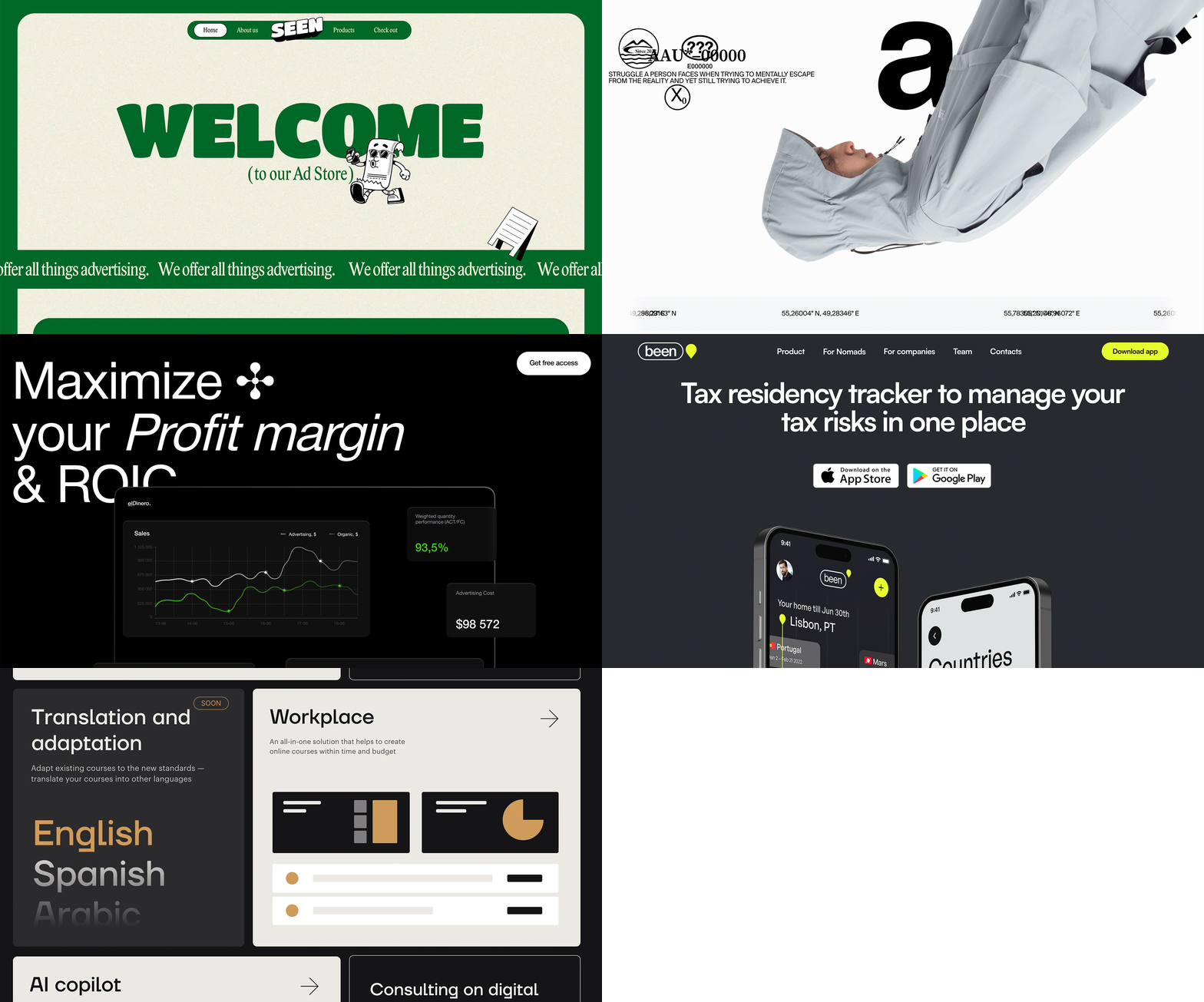
In just 0.05 seconds, users decide how they feel about a website. That's quicker than a single heartbeat. But it's not just about speed—authenticity is the name of the game. 88% of people really care about a site's authenticity when choosing their favorite brands. By diving into this article, you'll gain insights and inspiration to boost your web design game.
Ad agency in fancy style
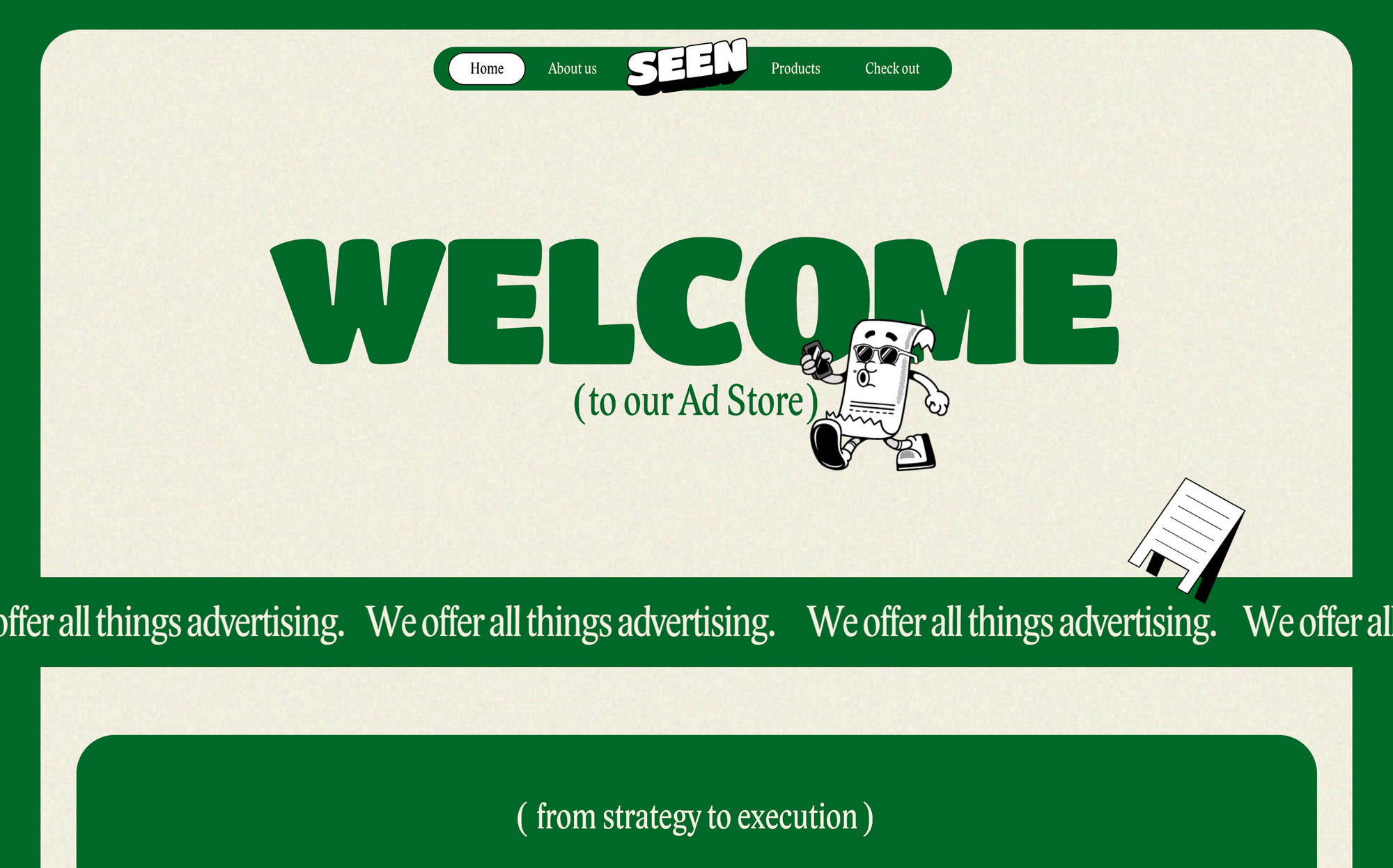
Right from the get-go, the Seen Ad Agency's website grabs the eye thanks to its smooth design and unique concept. Seen wraps everything around the idea of a "store with creative goods."
Here's what really stands out:
- The ticker effect with animations is a dynamic and engaging way to present content.
- Draggable objects and fancy additions—such as a mascot in the form of a cartoon character and floating paper elements—all add to Seen's charm.
- The Shots widget for 3D products provides an additional layer of engagement.
The calming green and beige color palette further enhances the website's appeal, so everything feels thought out without seeming excessive.
Online store blending design with usability
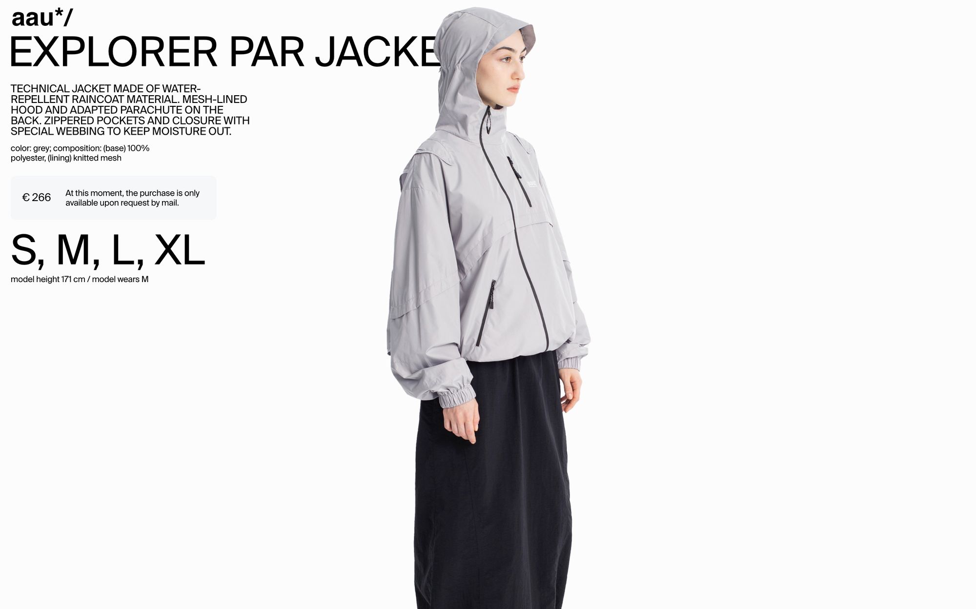
The Aau’s website is a delight to navigate, embodying all the beauty, charm, and user-friendliness one would expect from a 2023 clothing store.
What's making waves:
- Dynamic animations breathe life into the apparel displays.
- Video content gives a more immersive and tactile sense of the clothing's texture and fit.
- The custom cursor adds a layer of sophistication, ensuring every mouse movement is a unique experience.
- The seamless slideshow allows for a visual journey through the brand's collections.
- The plain and bite-sized menu makes it easy for users to find what they want.
All these pieces make Aau's site fashion-forward, both in clothes and digital presentation.
B2B platform design with Apple-inspired elegance

The elDinero B2B platform helps businesses boost sales and simplify their operations. Its design shows that complex things don't have to be complicated. With a clean black-and-white design inspired by Apple's iconic style, elDinero looks simple and elegant.
Some bits to spotlight:
- Video background. Although they don't go into much detail, videos are attention-grabbing and hold the viewer's interest.
- Animation effects spice things up.
- Unique design elements, such as the roadmap-inspired section with the workflow.
Just like that, elDinero uses a visual language that attracts potential clients, making it clear that using this platform will be a breeze.
Tax tracker app made easy and stylish
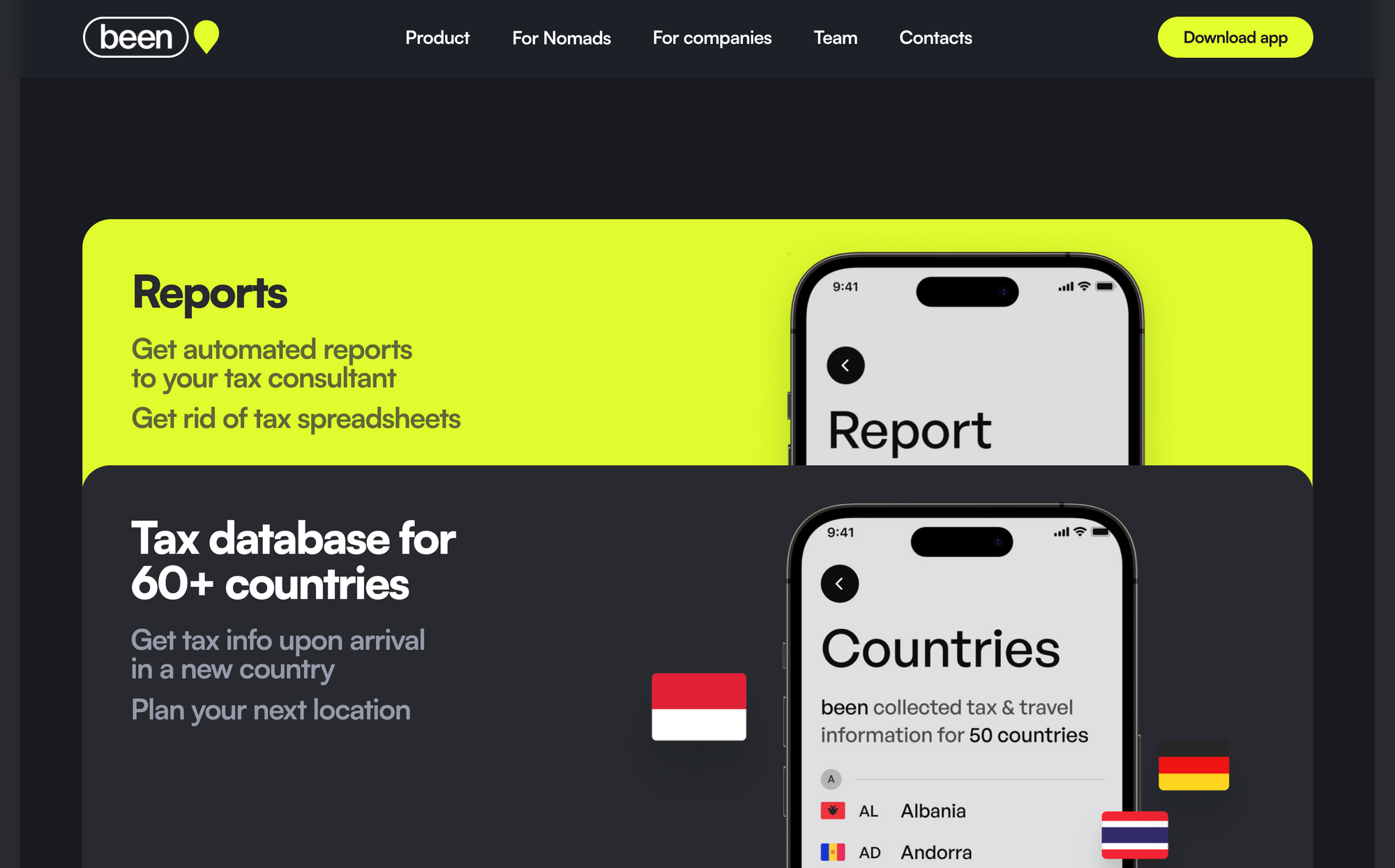
Been is the go-to app for tracking tax residency and managing tax risks. From the outset, the platform conveys a sense of trustworthiness thanks to typography and a well-chosen color palette. Every piece of content stands out, ensuring that users can easily digest vital messages at a glance.
What popped out to us:
- Smooth animations provide a smooth user experience, guiding users through their tax process without problems.
- Been uses the modern design feature of rounded corners, popular among fintech apps, with an organic beauty that feels both fresh and visually appealing.
All of these elements combine to make Been not just a tool, but a visually pleasing companion for managing tax obligations.
E-learning with a modern curve
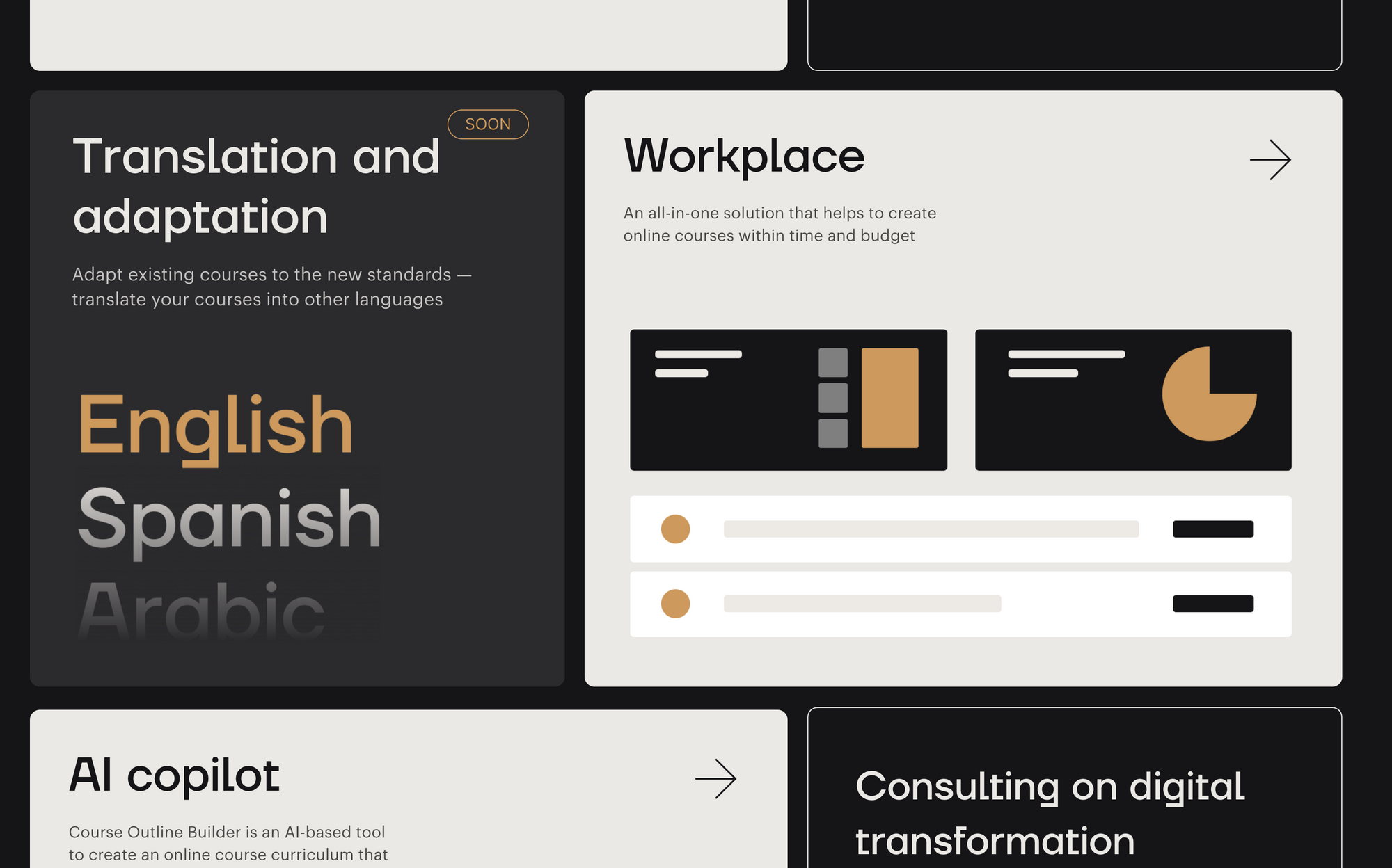
Course Factory is a platform for producing online courses. The website's clean beige and dark color scheme seamlessly combines modern aesthetics with expertise in the field. The platform's bold graphics aren’t just for show—they help make marketing messages clear. Every element was carefully created to ensure that potential course creators quickly understand the platform's value proposition.
What stands out:
- Interactive cards float, subtly lifting when hovered over, making the platform more engaging and adding a touch of elegance to the user experience.
- Rounded forms that feel modern and impart a gentle, accessible feel to the overall design.
Design and content come together to make sure that Course Factory creates a unique experience for online courses.