6 stunningly fresh design studio websites for your inspiration
Mark down some fresh ideas for yourself.
Give an eye to this curated selection of design studio websites made with Readymag: their authors freely experiment to present themselves, manifesting trends for the broader design community. Enjoy them, and mark down some fresh ideas for yourself.
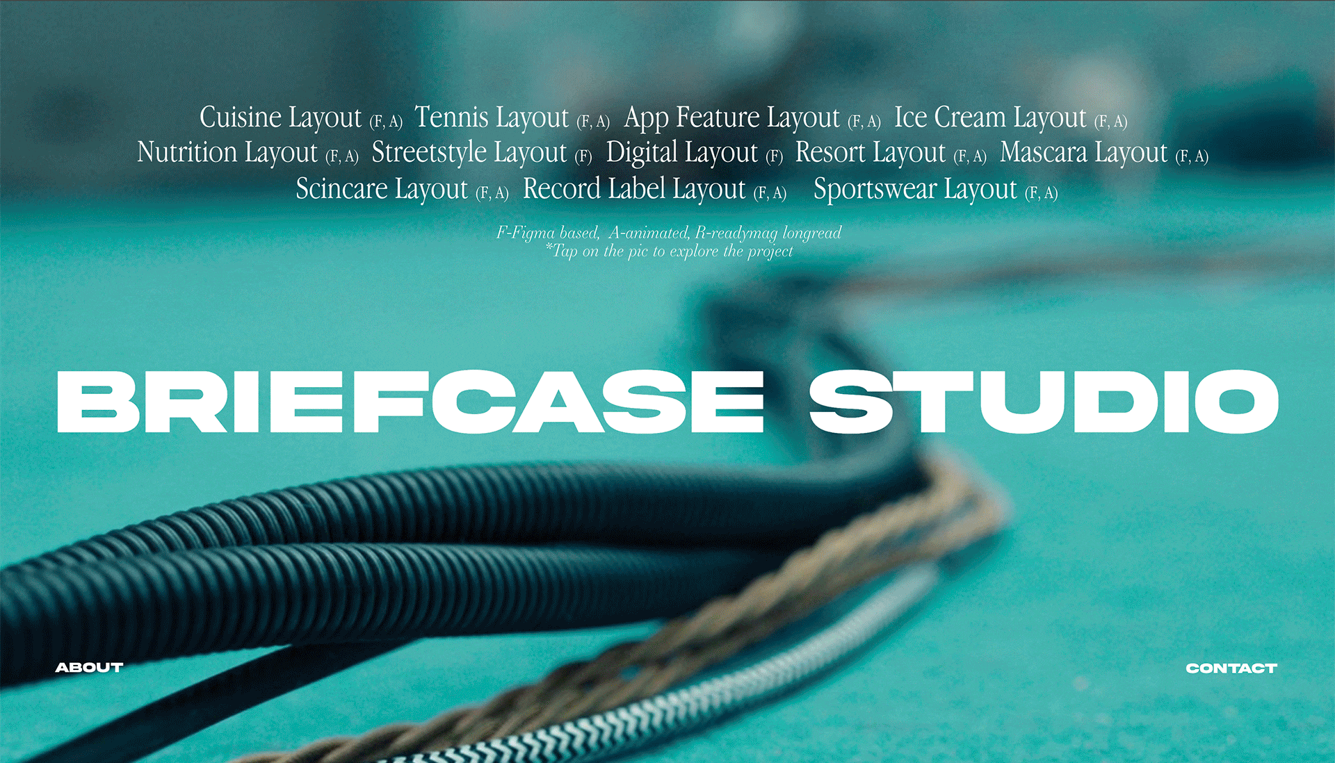
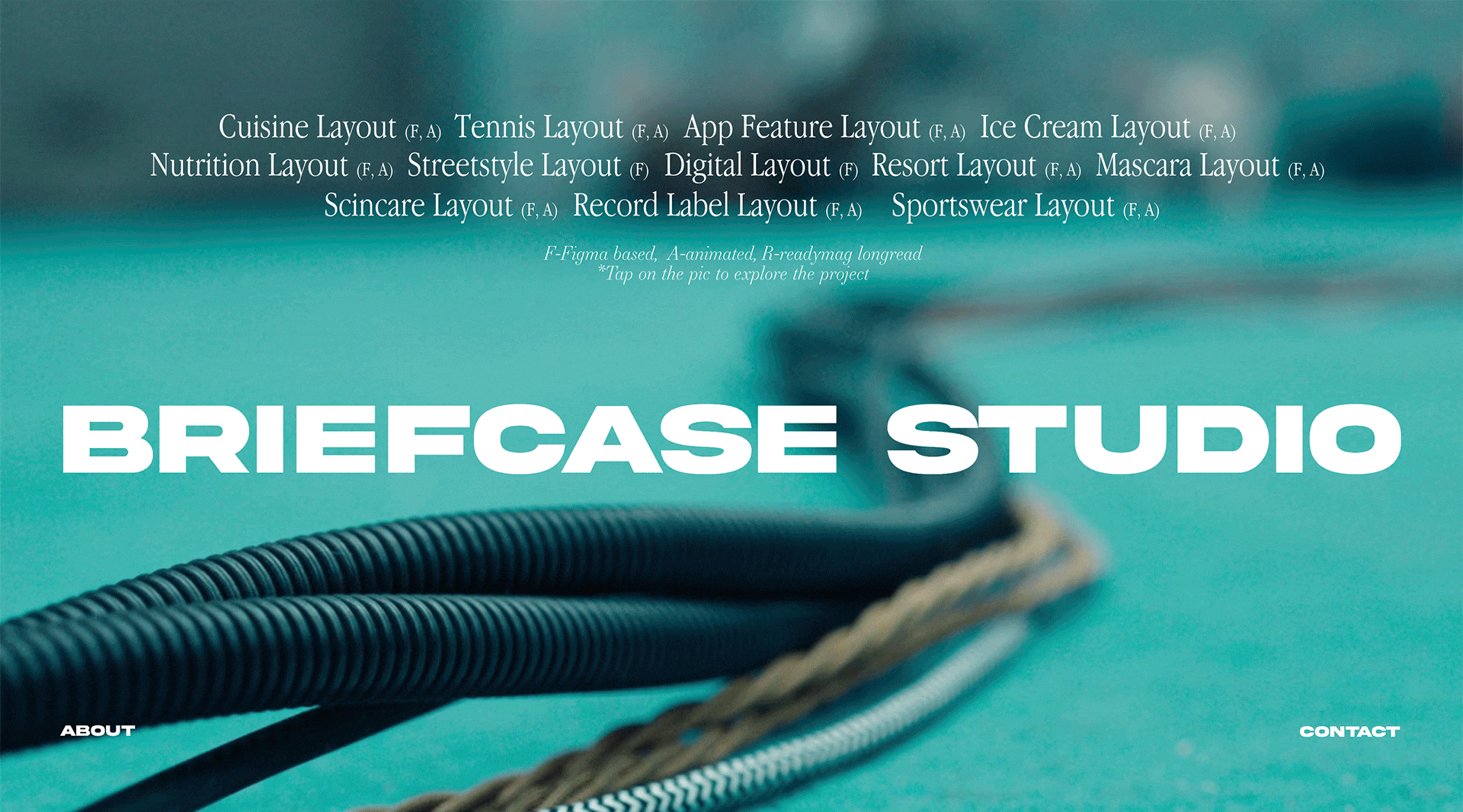
Briefcase studio works with filmmakers to create memorable visuals for TV commercials, films and branded content. The main screen of their website grabs you right off the bat, offering plenty of eye-candy: a playful custom cursor changing its states, images appearing on hover and switching backgrounds. These small but impactful interactions add delight and engagement, creating a more immersive and enjoyable viewing experience. Also, they create a feeling of depth, making each page multi-layered. The ‘About’ page wisely works with typography, animation and layout: the description text is organized into several paragraphs that slide up and down, attracting viewers’ attention, while the other part of the page features project images and interactive 3D draggable objects.
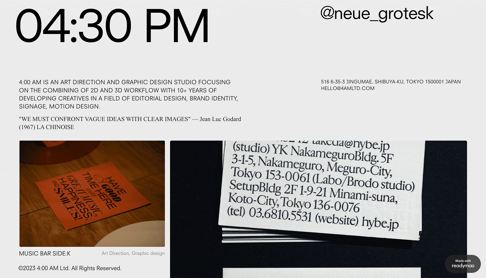
4:00 am is an art direction and graphic design studio that mostly works in the fields of editorial design, brand identity, signage and motion. Its motto is the quote “We must confront vague ideas with clear images” from film director Jean-Luc Godard. The website comes with a handful of mighty gimmicks that make it stand out from the crowd. On top of the page there’s a digital clock widget that stays fixed while you’re scrolling but changes its color when overlapping other graphic objects that come in view: this all is implemented with custom code. The link to the agency’s Instagram account is also always in view, and the custom cursor changes its appearance when viewers hover over it, inviting you to click. Project photos are organized into slideshows that are navigated with interactive arrows. This is a good way to put more content on a page and keep its layout uncluttered.
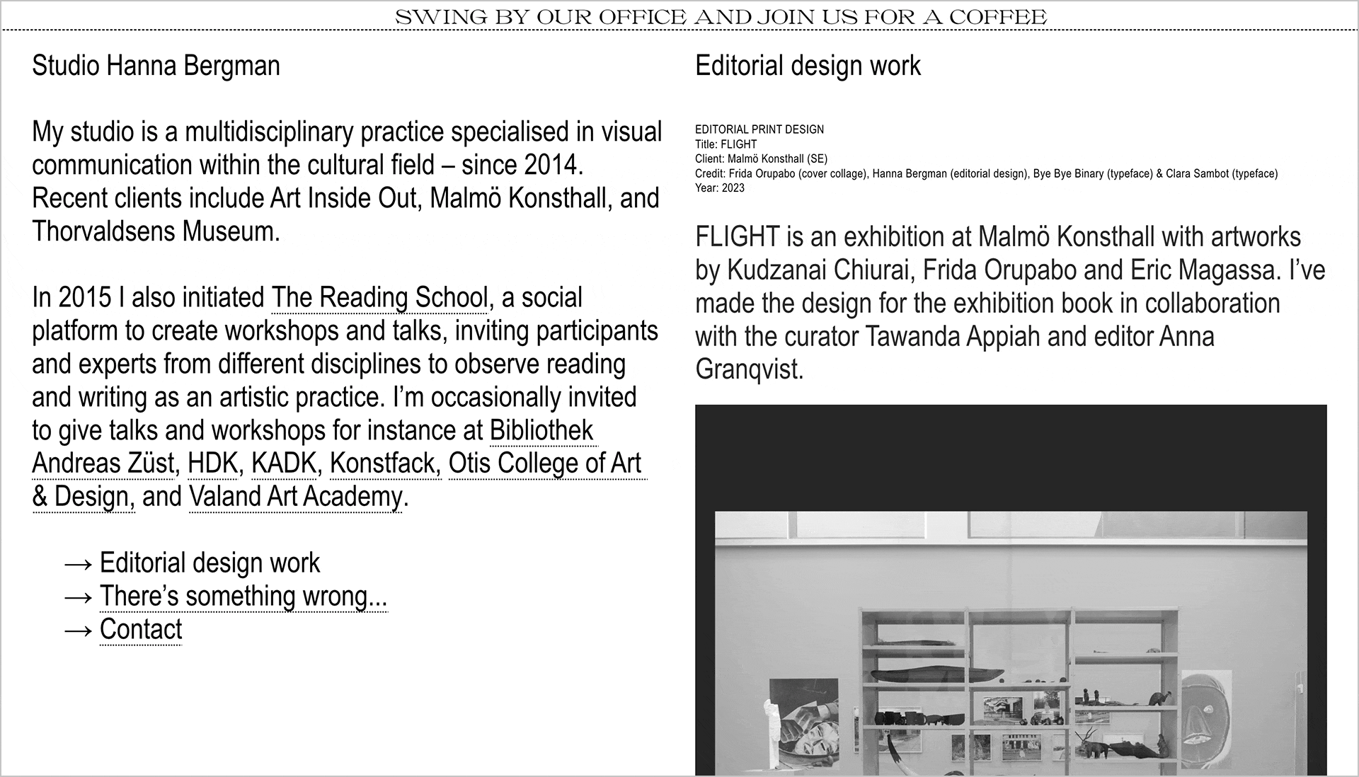
Studio Hanna Bergman is a multidisciplinary practice specializing in visual communication within the cultural field. The website layout is separated into two equal parts that behave differently: the main contact information and essential links (they are the only color accent in the whole project) are fixed and always remain in view, while project images and short descriptions change as viewers scroll down. The top of the website welcomes visitors with a tickertape, saying “Swing by our office and join us for coffee,” immediately adding a warm, personal touch.
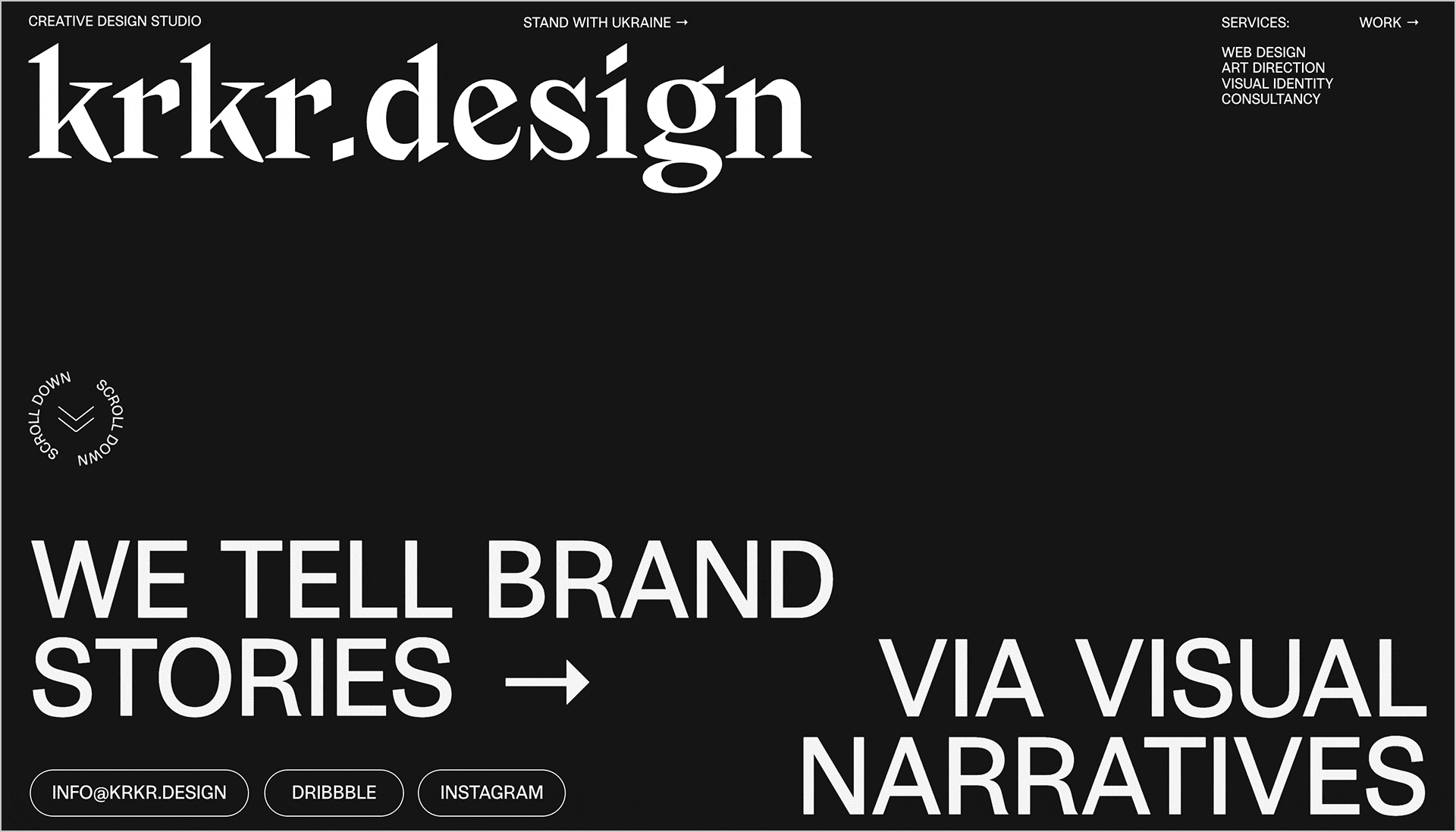
Krkr is a creative studio that tells brand stories through visual narratives. They not only create websites for their clients, but also masterfully showcase their own expertise and creativity through their online presence. Start scrolling down its first screen to see texts moving in opposite directions and the page splitting into two equal spaces: one black, and the other white. This massive animation creates a sense of seamless flow that guides you through the website and makes the next step inevitable: checking krkr’s Instagram and getting in touch via email.
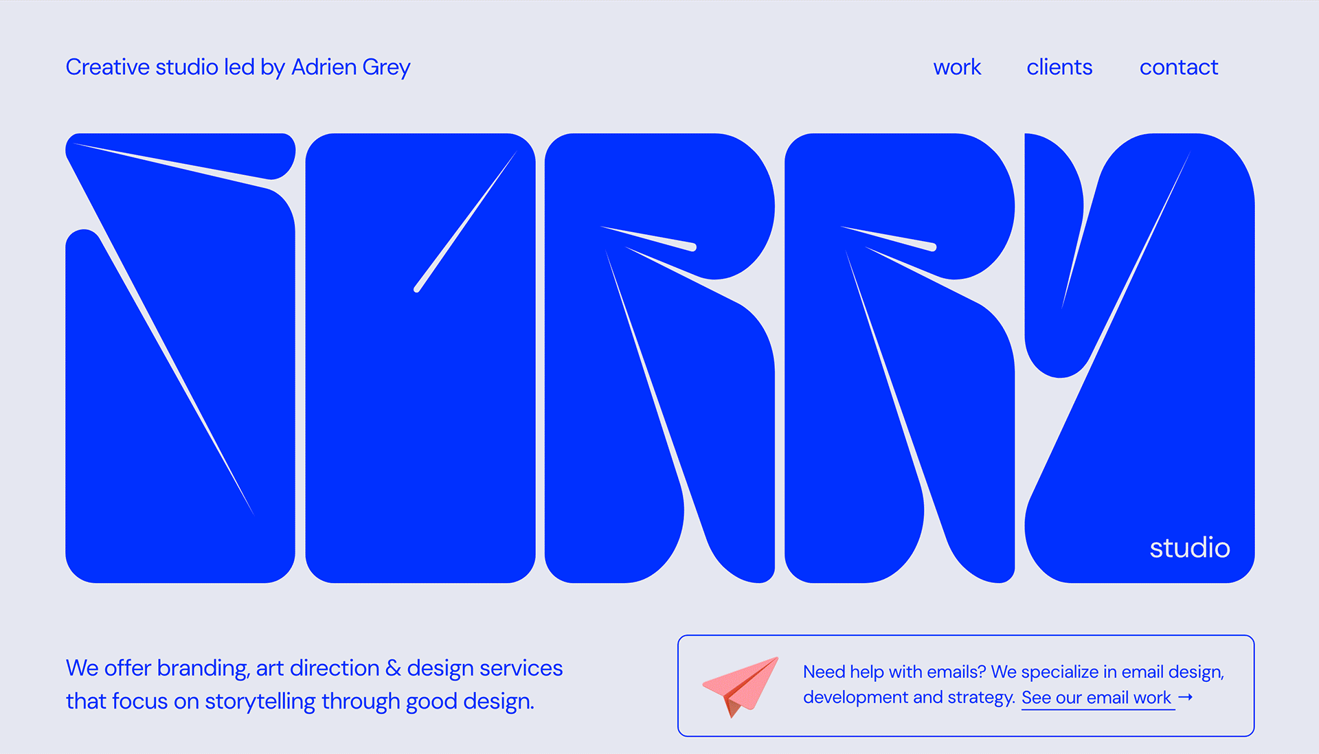
Imsorry is a creative studio that offers branding, art direction and design services. Clean and simply organized, its website lays accents discreetly: the name of the studio set in a fun, inflated font takes up almost all of the first screen. Its mood harmoniously pairs up with the rest of the imagery in the site, which features project thumbnails.
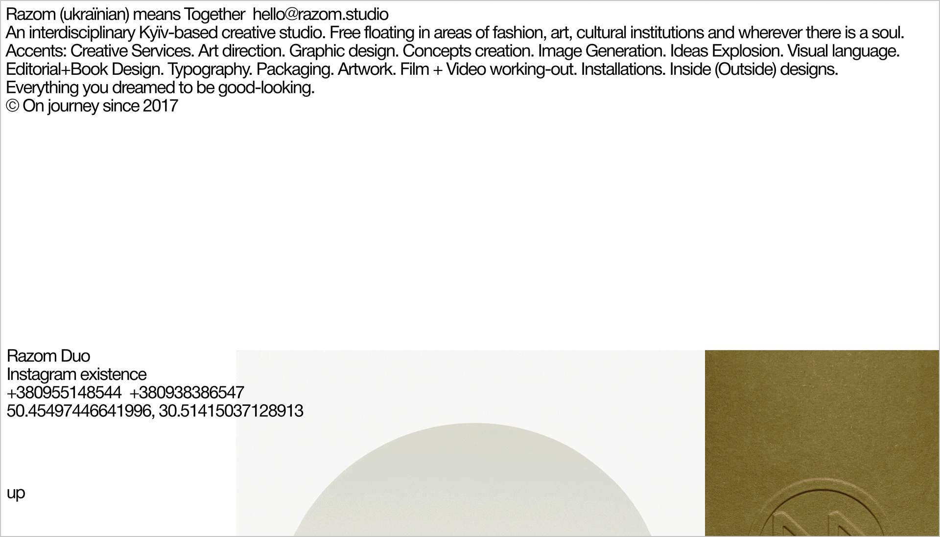
Razom was an interdisciplinary Kyїv-based creative studio that closed in 2023 because the designer duo behind it came to an end. However, its prolific heritage is still presented on the web, free floating in areas of fashion, art, culture and everything you dream to be good-looking. “The fresh thing about this website is that it’s organized as a moodboard, rather than a classical portfolio. You scroll through one long page with large images and headlines set in big size. The navigation is minimized to one tiny ‘Up’ in the lower-right corner of the screen.” While also being visually stunning, this cutting-edge example of web design embraces minimalism and simplicity.