Versatile layout & tricky animations: anatomy of award-winning Readymag portfolio
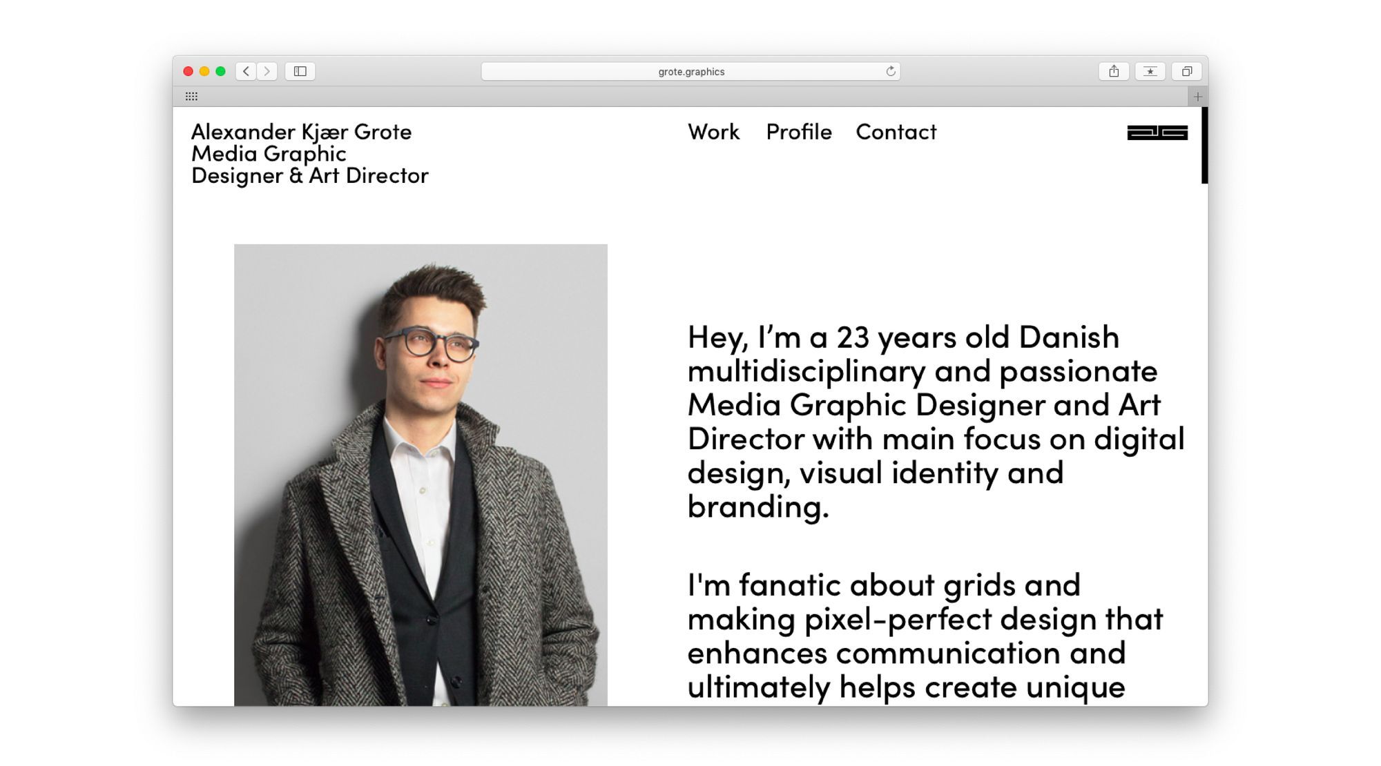
Alexander Kjær Grote, 23, is a Media Graphic Designer currently interning at a digital agency in Aarhus, Denmark. His portfolio won in Readymag's annual competition Projects of the Year, so we asked Alexander about this work and the principles that fuelled it.
Alexander Kjær Grote, 23, is a Media Graphic Designer currently interning at a digital agency in Aarhus, Denmark. His portfolio won in Readymag's annual competition Projects of the Year, so we asked Alexander about this work and the principles that fuelled it.
Student & aspiring designer
I received a 4-year vocational education at Aarhus Tech in graphic design and the craft behind it, then two years ago I started on a Bachelor's degree at the School of Visual Communication. I'm in the last year now, doing an internship at Creuna, a customer experience agency.
Last year, someone from the class above me made his portfolio with Readymag, he showed me his page, and I was like "Wow, that is amazing! How did you make it?" He told me about Readymag, now students from the entire school are using it for their portfolios.
Having fun with code
When designing a portfolio, it's important to present your work in a way that represents you as a creative designer. As a potential employer or client may judge you on thought process, it's important to show not only the final outcome but also how you generate ideas. That's why for each of my works I show some steps I went through in the process of making them.
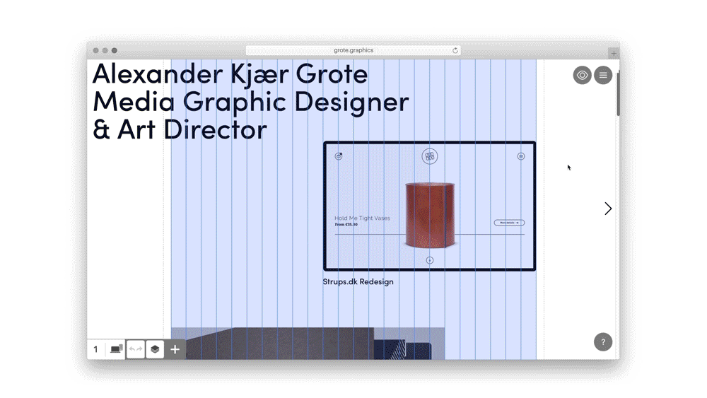
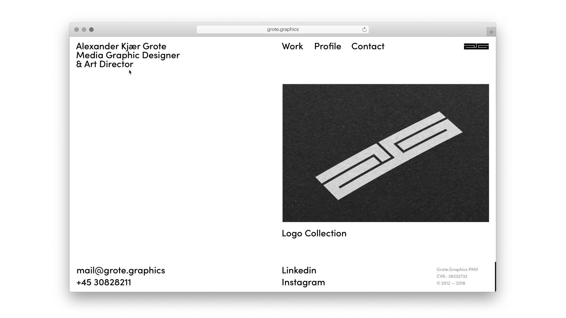
Alexander Kjær Grote portfolio, view from Readymag EditorI use a grid with 12 columns because it's extremely versatile and allows me to divide the layout in many ways. I purposefully made the layout of several pages look little bit messy. For example, in the ANTI Analogue Movie Poster case, I placed images so that they look pretty random with the intention to create a playful yet welcoming flow.
Along with simple layouts, animation plays a key role in my portfolio. It begins with a preloader — a black rectangle inspired by my logo shapes, which fills the screen from the left to the right. When you scroll down, my name and job title remain in view (the text widget is fixed) and if you hover the cursor over it, you'll see a rectangle wipe out the letters just like the preloader (this is implemented with code injection). I don't think this causes trouble for the UI, usually when you hover over a small text, you remember it. Yet, this simple stunt helps me look different from the rest portfolios and presents a part of my visual identity.
I found most of the code at CodePen — a front-end, open source website where enthusiasts upload nice things they've developed. Actually, the same trick could have been implemented with Readymag's on hover animation feature. Yet from the viewpoint of project performance and presence on mobile devices, code injection works better.
When my name and job title display over an image or another text, the color of the letters inverts - that's also implemented with code injection, which I integrated myself. We had a special course on the basics of coding during my vocational education. Since then I've been practicing and experimenting with code for fun.
Yes man
In my portfolio, I set forth my core principles. I believe in pixel-perfect design. Even if people don't see the subtle mistakes introduced by non-pixel-perfect design, you can still feel it in your gut. That's why I do everything as well as I can.
I believe insights into other people and cultures can help you gain a greater understanding of yourself and make you cooler in this business. I guess it's a way of thinking — it definitely changes the way you develop campaigns and communicate in general. By being super open-minded, taking the time to listen to people, and just being curious all the time. You never know how or from where you might get your next idea for a campaign or poster.
I prefer being honest about who I am. So in the Profile page, I used animated images and gifs from my personal life. For example, I'm a huge fan of cats and skateboarding. That might be totally irrelevant to the portfolio itself, but if I hire someone I would rather read about them as a person, as opposed to education and grades.