The minimal portfolio: How to do more with less?
How to stand out without clutter and let your work speak louder than the design around it—with real-life examples.
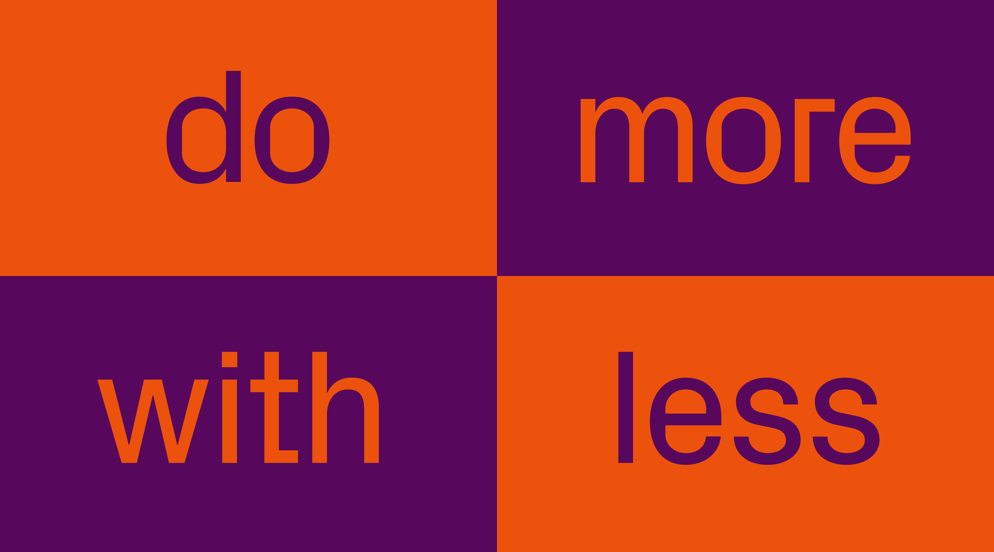
A minimalist portfolio is timeless, simple, and robust. Minimalist sites tend to perform better, offer improved usability, and rank higher in search engines—and while SEO may not seem crucial for a portfolio, minimalism comes with undeniable advantages.
That's why we've put together this mini-guide—to show how to stand out without clutter and let your work speak louder than the design around it. We also handpicked some great examples of minimalist portfolios with help from our designers Masha Chupina, Alexandra Golubeva, and Denis Deviatko.
Principles and common traits of minimalism
Minimalism is about clarity, simplicity, and functionality. It fits with today’s preference for clean interfaces and focus on user experience over theatrics (though, hey—sometimes it’s okay to impress). Many believe good design is simple design.
At its core, minimalism means removing everything unnecessary and leaving only what matters. It's about discipline—and being able to say “Here's my work” without needing fireworks or carousels.
Common traits of minimalist design include:
- Flat elements.
- Limited or monochrome color palettes.
- Lots of negative space.
- Clear, logical grids.
We dove deeper into the origins of this approach here.
Why choose minimalism for your portfolio?
- Minimalism reduces cognitive load and speeds up decision making—which is exactly what you want when someone’s quickly judging your work. The clearer the experience, the more likely they’ll keep scrolling (or reach out).
- A clean portfolio loads faster, which helps with first impressions—which are crucial when someone opens your portfolio for the first time.
- Minimalism helps your portfolio stay relevant longer. Of course, your work should be updated regularly, but the overall presentation can remain mostly unchanged—and still look good.
- Minimal layouts work well across devices, saving you design time and reducing bugs when clients browse on their phones.
A breakdown of minimalist portfolios made with Readymag
Masha: This website uses clear and intuitive navigation—for example, a custom cursor suggests when to scroll, and at the bottom of the page there's a quick navigation menu with project previews on hover. Here, minimalism works by keeping the focus on one thing at a time, so you don’t have to search with your eyes. Project descriptions are gray and don’t draw too much attention, but when you want to read them, they highlight in black on hover.
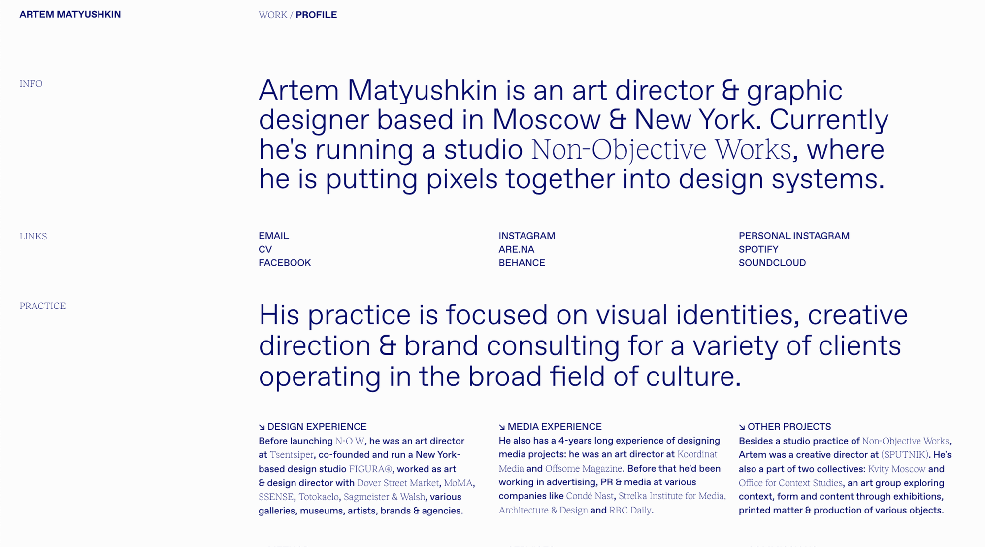
Alexandra: In minimalist sites, working with text and font plays a key role due to the lack of a large variety of visual tools. Using a font pair to highlight important elements becomes a strong technique that can define the character of a site made entirely of letters. And just a reminder—minimalism isn’t always about black and white; you can stay minimal within different color palettes.
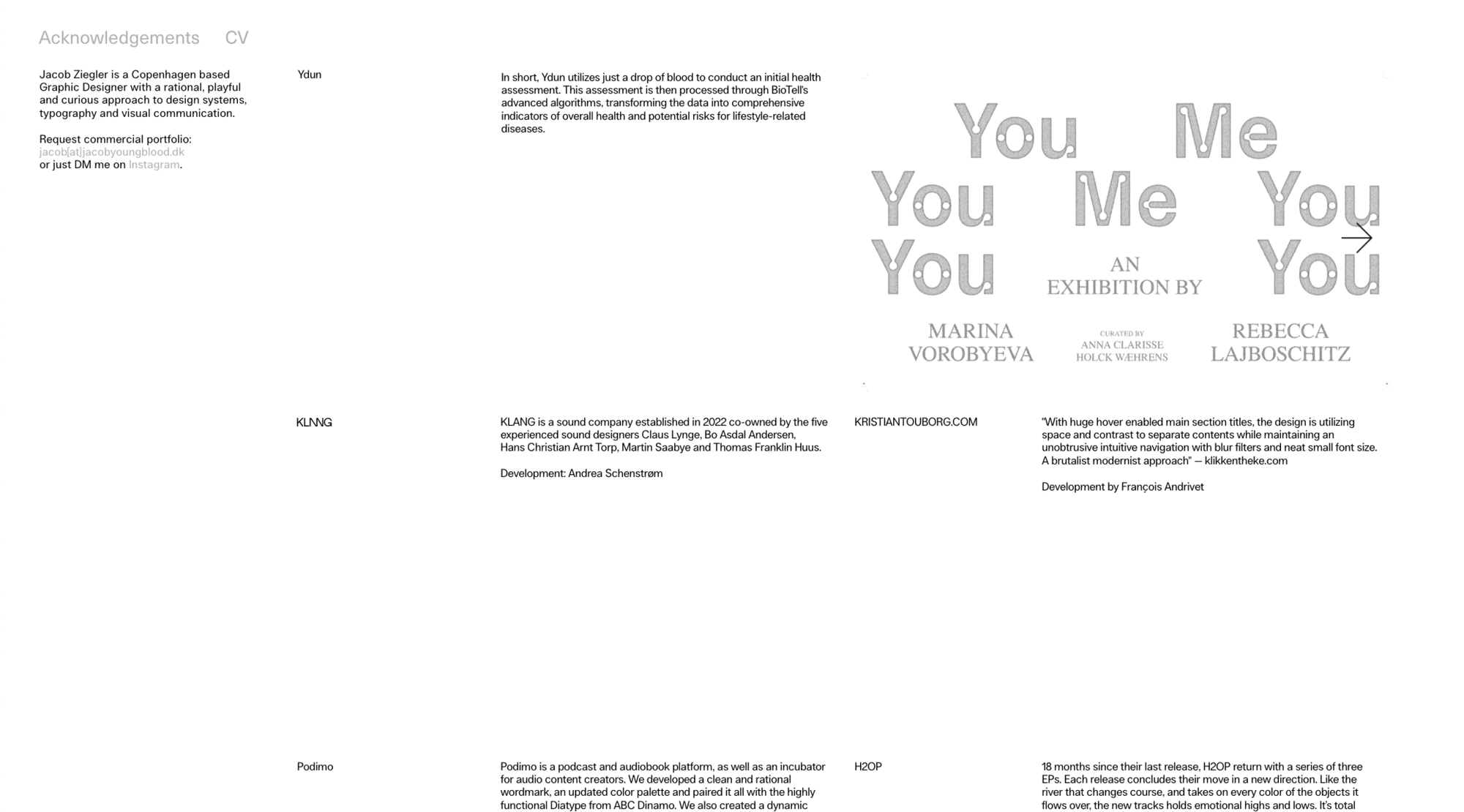
Denis: Jacob Ziegler’s website shows a smart use of interaction and detail, especially on desktop. At first, it looks very clean—just text blocks aligned to a grid, using only two text styles and a black-and-white color palette. But once you start interacting, things get more interesting. When you hover over project descriptions, images appear—sometimes as slideshows, single images, or transparent PNGs. Hovering over the top menu makes the headlines rotate and reveals an awards list. The bright green text selection adds a fun, surprising twist to the otherwise minimal layout.
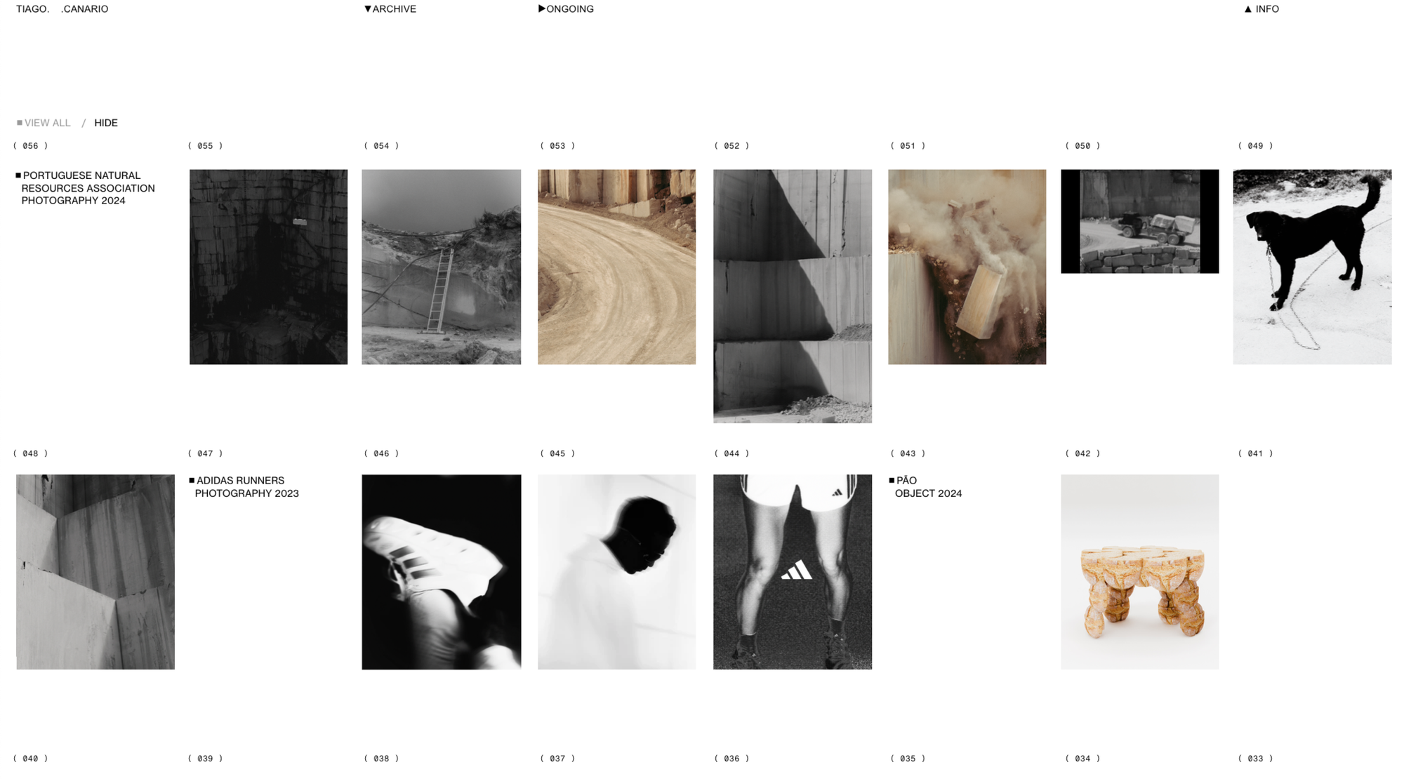
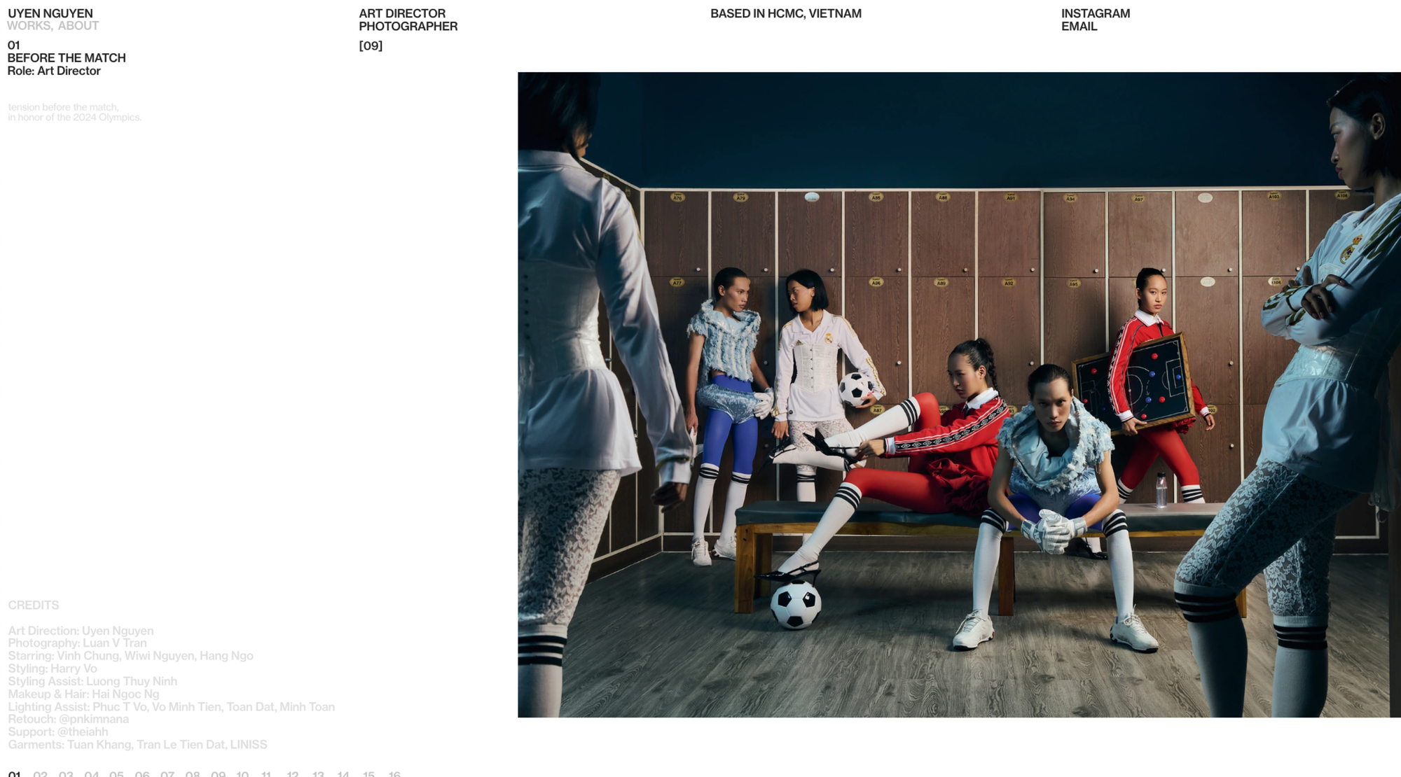
Masha: The main advantage of this portfolio is the ability to control how much content is displayed on screen. There are several archive view modes—you can choose to show or hide all images, and in hidden mode, you can preview individual photos or projects on hover. The image numbering remains static, acting like a framework or grid for the page, anchoring the viewer’s attention and creating a sense of predictability. Generous white space allows the eye to rest and helps deliver content in a more measured, digestible way.
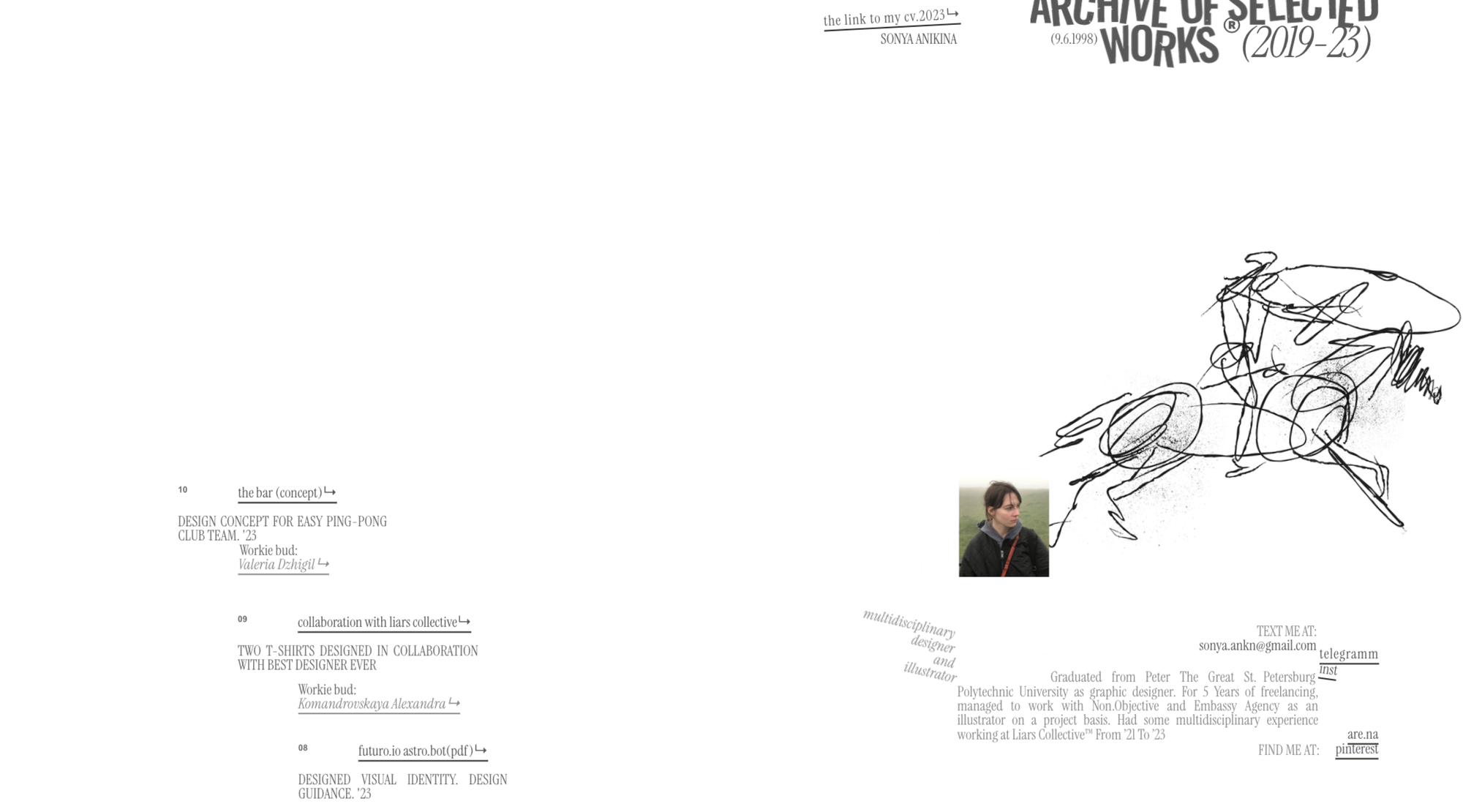
Alexandra: Minimalism isn’t always about absence—sometimes it's about how to convey character with minimal means. This portfolio is a great example. In fact, many techniques used here aren’t strictly minimalistic—illustrations, different text styles, slanted text and letters, and cropping. But thanks to the large white space and careful work with typography, the project creates a feeling of lightness and calmness that defines the design as minimalistic.
Portfolio by Nassima Badjelmane
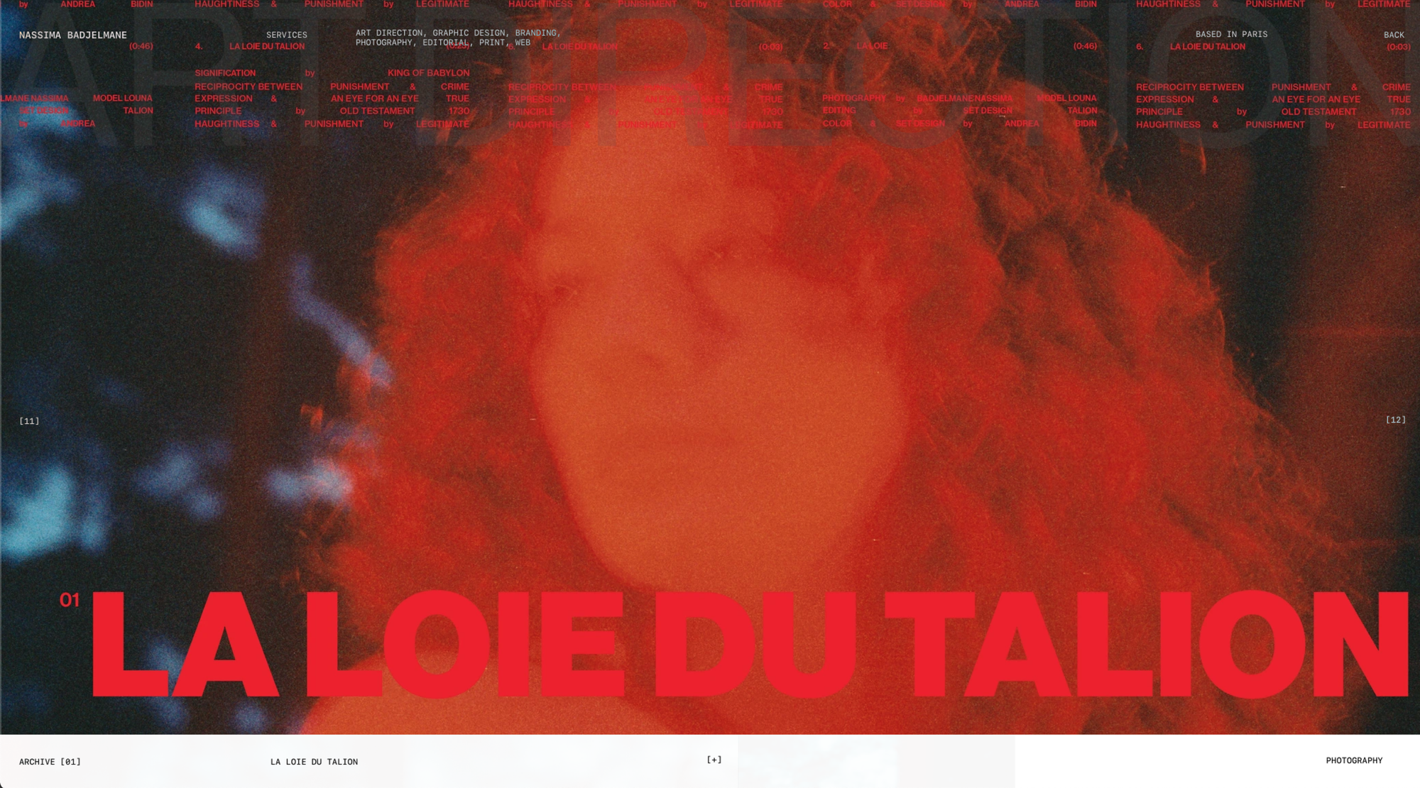
Masha: This portfolio emphasizes scale contrast—the empty space on the index page allows all projects to be viewed at a glance, while full-screen images invite detailed exploration. The site includes several visual layers: a semi-transparent grotesque headline, menu text with an inversion effect on overlap, and the images themselves. These layers are cleanly interwoven, separating and organizing information without overwhelming the viewer.
You can learn more about how minimalist design can improve site speed and boost organic traffic here.