Russian spleen goes digital
How to create a digital editorial with an interactive map, meaningful animations, and wild fonts without coding? We discussed the topic with Readymag ambassador Pavel Kedich, who recently created Russian Spleen.
How to create a digital editorial with an interactive map, meaningful animations, and wild fonts without coding? We discussed the topic with Readymag ambassador Pavel Kedich, who recently created Russian Spleen, a picturesque web project exploring how Russian landscape painter Isaac Levitan impacted the 20th-century cinematography.
It might be useful to open the original project and compare it with the following commentary side by side.
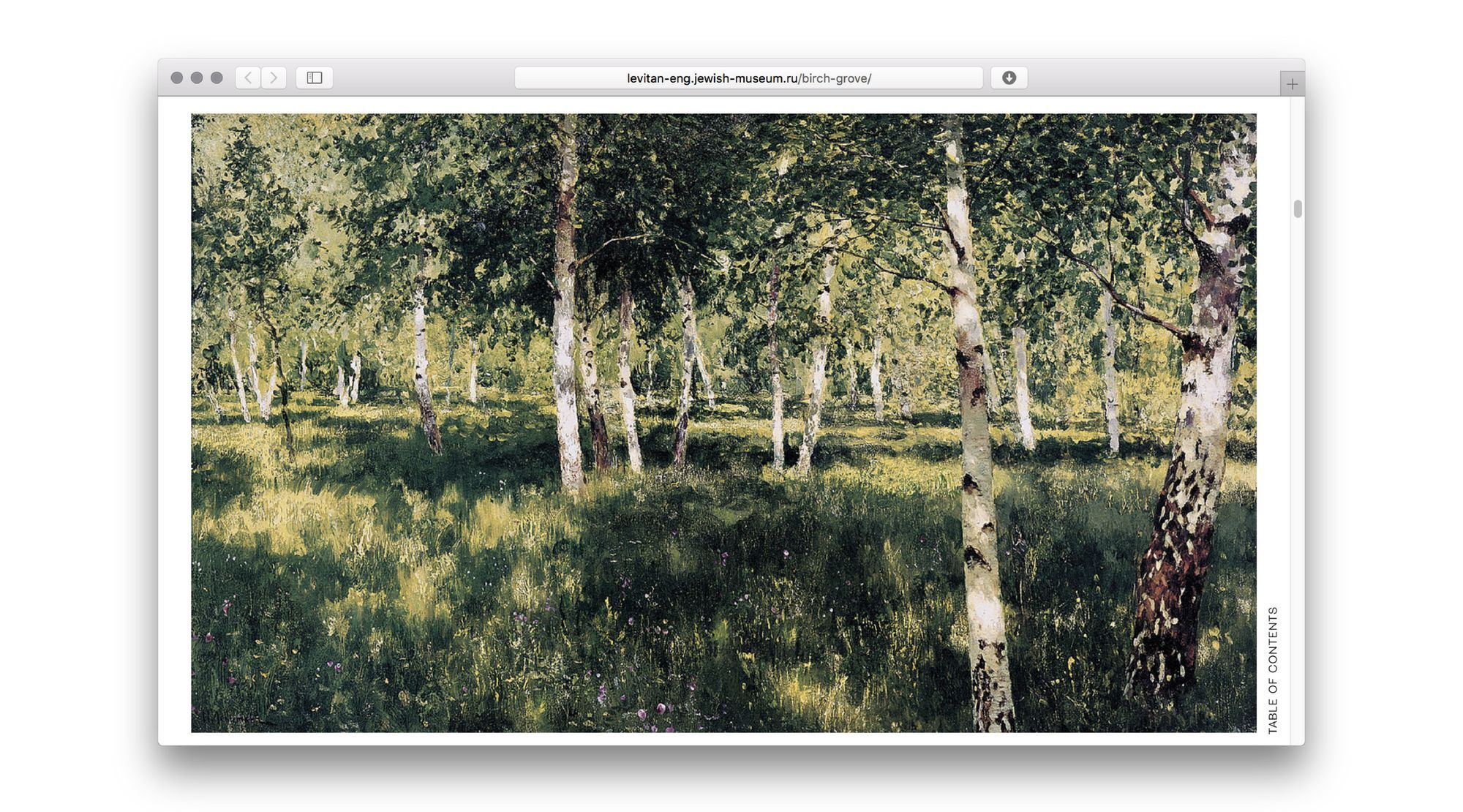
The cover image
The cover image depicts a birch grove moving with the wind
Black and white stripes are meant to depict birch trunks. The birch tree is the most “Russian” of all trees, a symbol of Russian rural life. It’s also an example of stylish black and white alteration, making it really striking from a designer’s point of view. Also, our editorial begins with the story of a painting called “Birch Grove.”
Animation helped us bring this metaphor to life, putting an abstract birch grove in motion. To make it more realistic we designed the stripes to move with different starting times, speeds, and amplitude.

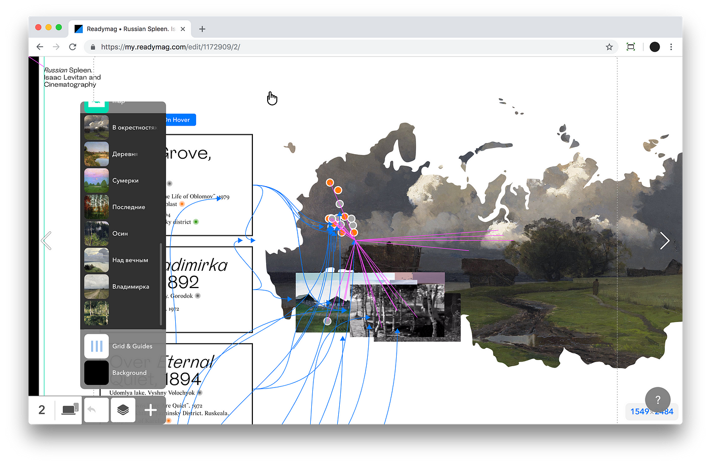
The map
The central feature of the exposition is side by side comparisons between the Isaac Levitan’s paintings and stills from Russian films. We emphasized their connection by showing on the same map locations where a particular painting was made and places where a comparable scene was shot. This map serves as a table of contents of sorts.
This part of the editorial is designed as follows: the left column is built from a series of text blocks that are put on the top layers. Underneath there’s an SVG mask in the shape of a Russian map, in a fixed position. Then there are points depicting places where both a scene was filmed and a picture was painted. Short clips of movies are arranged on the same layer. On the background level we’ve placed the paintings, also with their position fixed.
This layout might seem cumbersome but in fact its logic is quite simple. When you hover the mouse over the title of the picture it triggers three simultaneous changes on the right side:
- A painting appears in the shape of a map.
- Points of interest show up on the map.
- A short GIF from a movie displays next to the map.
This conveys every meaningful connection to the reader at the very beginning of the editorial.
The blocks of text on the left are framed with rectangles that animate when the mouse hovers above them.
The main part
As noted, Russian Spleen is mostly a series of side by side comparisons between paintings and movie stills.
Paintings that initially occupy almost the entire screen shrink using on-scroll animation, yet still remain in the visual field of the viewer. Thus when scrolling down to the movie still a viewer can compare it with the painted image.

From a technical perspective it works like this: first the painting shifts diagonally to the bottom right corner. At the same time, its dimensions shrink.

Then the painting moves up until it reaches the level of the video player with the corresponding movie still.
For the editorial we also incorporated commentary on Levitan’s life and work written by prominent writers, journalists, artists, and philosophers. It helps make the material feel rhythmic. As a background color for each quote we used the “average” color of the picture that preceded it.

The texts vary significantly in size and not all of them were available before the design process began, which is why we utilized a universal structure of text block that would help make them visually equal. Two decisions came to mind:
- To place the pull-out quote before the full commentary text.
- To enlarge the font size of the commentary text.
We also made this section of the editorial more dynamic by animating the portrait of the author in question; as a viewer scrolls it becomes slightly smaller, eventually merging with their name.
Fonts
We selected two fonts authored by Roman Gornitsky for this editorial: Steinbeck for headers and text, and Wremena for captions. We chose Steinbeck not only because it’s an elegant font but because it helps convey the story of Levitan as a uniquely Russian painter.

For example, notice this italic lowercase “я” in Cyrillic script. This handwritten shape evokes something distinctly Russian.
A piece of advice
As a final thought I tried to list some things I learned from designing this editorial.
- Non-breaking space — that recently became visible in Readymag editor — helps in working with widowed words and syllables, as it’s now indicated by a special^symbol. To insert non-breaking space use Opt+Space for Mac or Alt+Ctrl+Space for Win. Note: you can only see this symbol while in editing mode.

- Scalable Layout is an excellent new feature that helped a lot to highlight the beautiful paintings. I suggest using Scalable Layout to attract viewers’ attention to high-resolution images. Keep in mind that when working with this feature you have to double-check your project in Safari and other web browsers: different browsers offer different font smoothing technology that can influence Scalable Layout behavior. It also helps to make the borders of your text containers slightly wider.

- When editing a text block in a mobile version it’s wise to copy it in advance. This helps you to not accidentally ruin your desktop version. Just copy the text in a mobile mode, make the one you copied invisible, and edit the copy.
- Layer palette is often extremely useful in projects like these. However, always name your layers from the beginning so as to not to mix them up.
- Use Readymag text styles when working on text blocks. I didn’t do that in this project until the very end and I realized too late how much time that would have saved me.
Enjoy the Russian Spleen editorial here.