Readymag rolls out redesigned Widget Bar
Readymag team explains the interface redesign aimed to ease the creation of complex web pages.
Our happiness has always been seeing Readymag users making more and more sophisticated projects using our toolkit. But while we have steadily expanded its creative capacity, up to now the interface of Readymag had been left untouched. This year, we realized, the time was ripe for an interface redesign aimed to ease and make more efficient the creation of complex web pages.
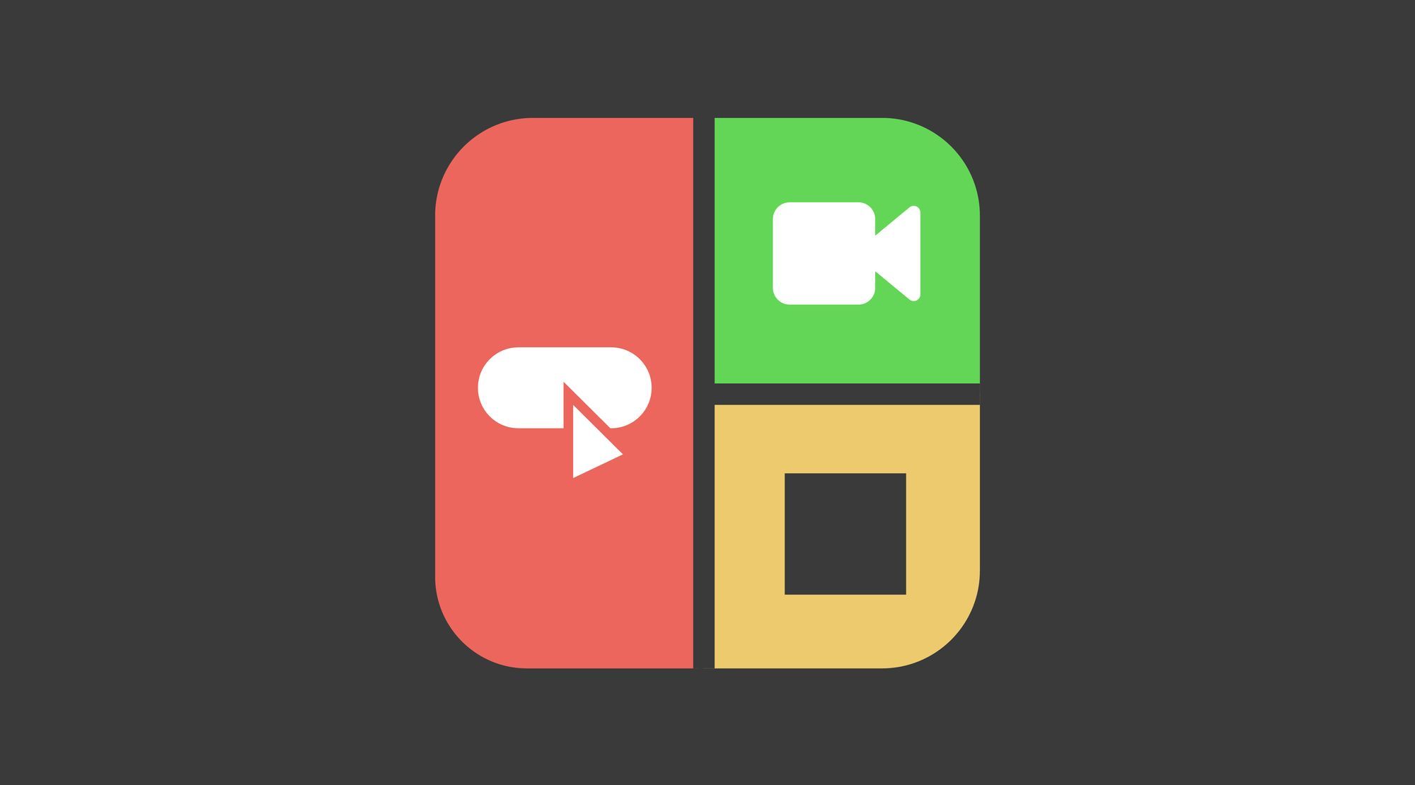
Here’s what we’ve done and some background: In designing with Readymag, all the elements that constitute a page — texts, shapes, pictures, video, buttons, Google Maps, etc. — are called widgets. The more widgets, the more complex the project. With the old interface, after a widget was added, its icon went to the bottom of the Editor’s workspace and was kept there in the so-called Widget Bar. The widgets were stored horizontally from left to right as they were added to a page. Done this way, the Widget Bar, obviously, did not represent the stack order of the widgets on the page. And the existing scarce functionality quite often turned out to be insufficient to the designer’s need to group, regroup, hide, lock and rearrange clusters of different widgets.

And so we set out to create a new Widget Bar, where the stack order of widgets could be clearly seen and managed. Along the way, we improved dozens of interface details and redesigned the Guides & Grid, Background, Page Height and Viewport panels.
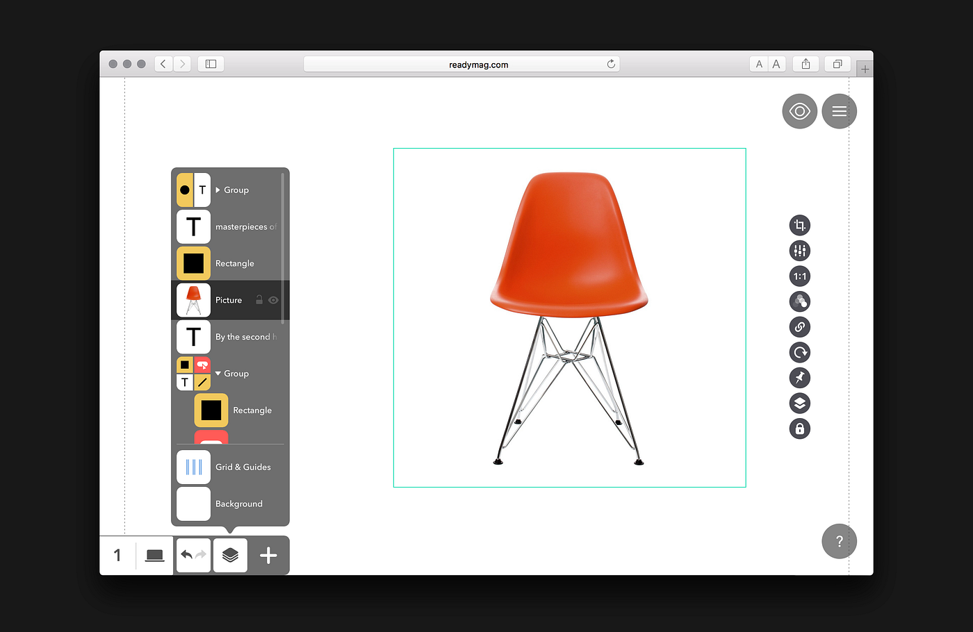
In the redesigned Editor, after a widget is added, its icon goes to a pop-up panel that reflects all of the widgets in their stack order. The hierarchy can be changed simply by dragging one or several widgets up or down. Individual widgets can easily be dragged into and out of groups. You also can give individual names to widgets and widget groups and can lock and hide individual widgets. Finally, you now can quick-scroll to the widget’s position on a page by clicking on the widget’s icon in the Widget Bar, a feature especially useful for long pages.
You may say, “Hey, that’s just the kind of Layers panel that most graphics editors have!” and you’ll be right. It definitely is. And that’s a benefit, not a disadvantage: the panel is familiar to most designers and won’t need much explanation. Our challenge was not to make something completely original but to make a panel superior to that in any other graphics editor.
To avoid clutter, we followed the principle of “as few details as possible.” Just one example: we wanted to simplify the process of dragging widgets. In most graphics editors, the place to which you’re moving a widget is highlighted with a line between neighboring widgets. We do the dragging without any extra lines, by merely shifting the widgets’ icons themselves. We even made it work with a cluster of selected widgets: they become a temporary group while being dragged and behave as a one-hole item. Have a look at how widgets are now dragged in the video below.
It was also important to reflect the special position of fixed widgets in the page hierarchy; these are widgets that are fixed to the browser window and do not scroll along with the page layout and other widgets. In the Widget Bar, we separate fixed widgets from regular ones because they never mix hierarchically.
Note that we have not only boosted the capacity of the Widget Bar but have made the look clearer.
P.S. We also:
1. Redrew the icons of all widgets to keep them neat and clearly distinguishable even when grouped;

2. Removed the Widget Controls and their settings from the dotted frame (1024 px wide) and placed them at the very right edge of the browser, giving users more space in the work area;
3. Updated the look of the Grid & Guides panel and made a few useful adjustments.

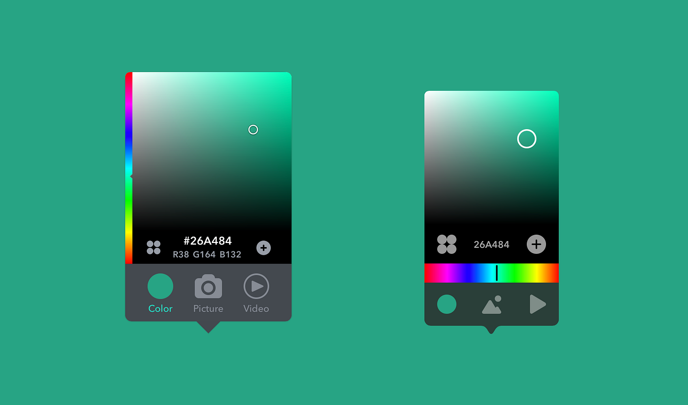
4. Updated the Background panel and redesigned the Color Picker;
5. Combined the Viewport and Page Height panels, adding a tiny but useful detail: an icon indicating that the mobile viewport is turned on for the current page when you’re working on the desktop viewport.

This redesign of the Widget Bar opens a new chapter for Readymag’s interface. Brand-new Widget Controls, Project Menu, and Profile are on the way.