Renewing the Readymag Editor: the whats and whys behind the redesign
We look at the most crucial UI changes up close and dig deeper into where they all came from.
In a permanent state of change, Readymag has inevitably accumulated some surface and structural inconsistencies. Even a single improvement may lead to controversies in the other parts of the interface, which is partially normal for products as complex as Readymag. Sooner or later, all such products need a thorough refresh that encompasses the entire system.
The refreshed Readymag interface is more uniform and has a simpler structure. All panels are now at the surface layer, accessible in just one click. Nothing is hidden unless absolutely necessary. Although no changes were made to the widget settings and their properties, we’ve shuffled the position of ‘first level’ panels (Pages, Devices, Widgets, Grid&Guides, etc) and tweaked a few niceties along the way. These panels serve as the very first points of contact for newcomers exploring the Readymag Editor. They also pave the way to start using the tool smoothly.
So, let’s look at the most crucial UI changes up close and dig deeper into where they all came from.
Article credits: Stas Aki, product designer at Readymag
Left and right docks
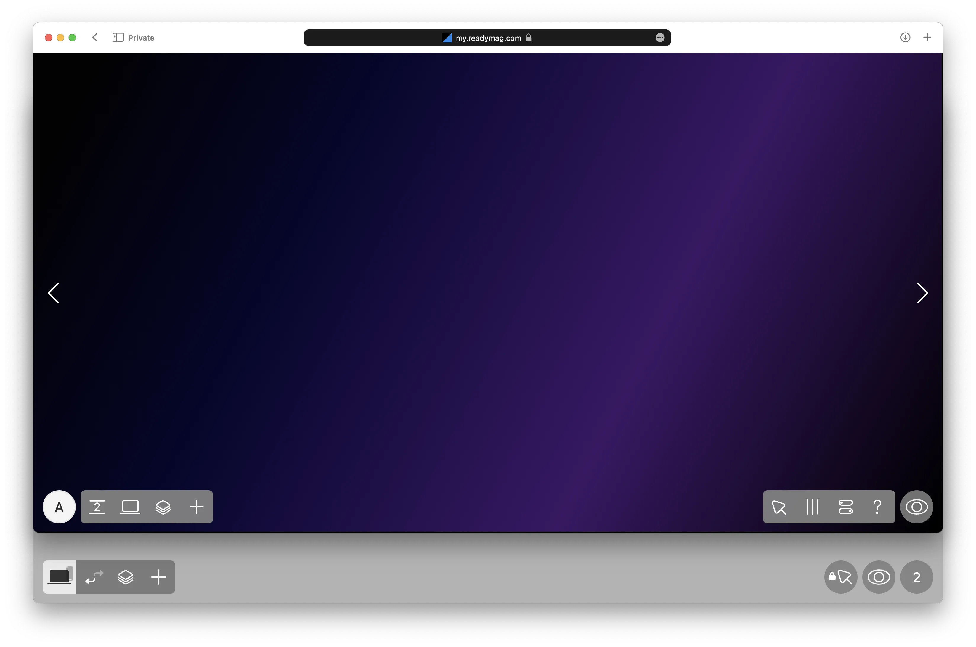
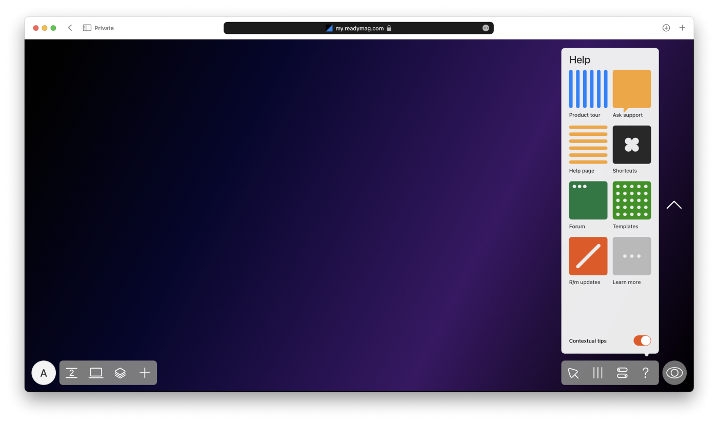
The new Editor interface is symmetrical. As of now, it includes two docks: the left dock with ‘material’ stuff (pages, devices, and widgets) and the right dock with settings related to structure and planning (cursor modes, grid, project settings, and a set of learning resources).
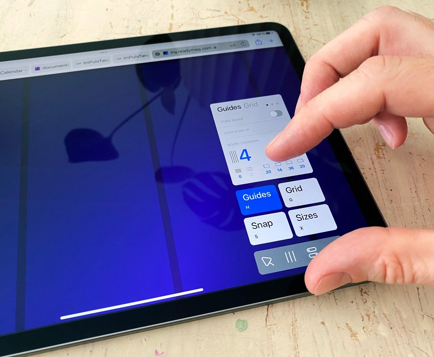
With all the panels expanding from the docks at the bottom of the interface, Readymag is now especially convenient for those using it on iPad. Now they can access any control just with their fingers and won’t cover page content with their hands anymore.
Both docks have five buttons each. Like humans have 5 digits per hand.
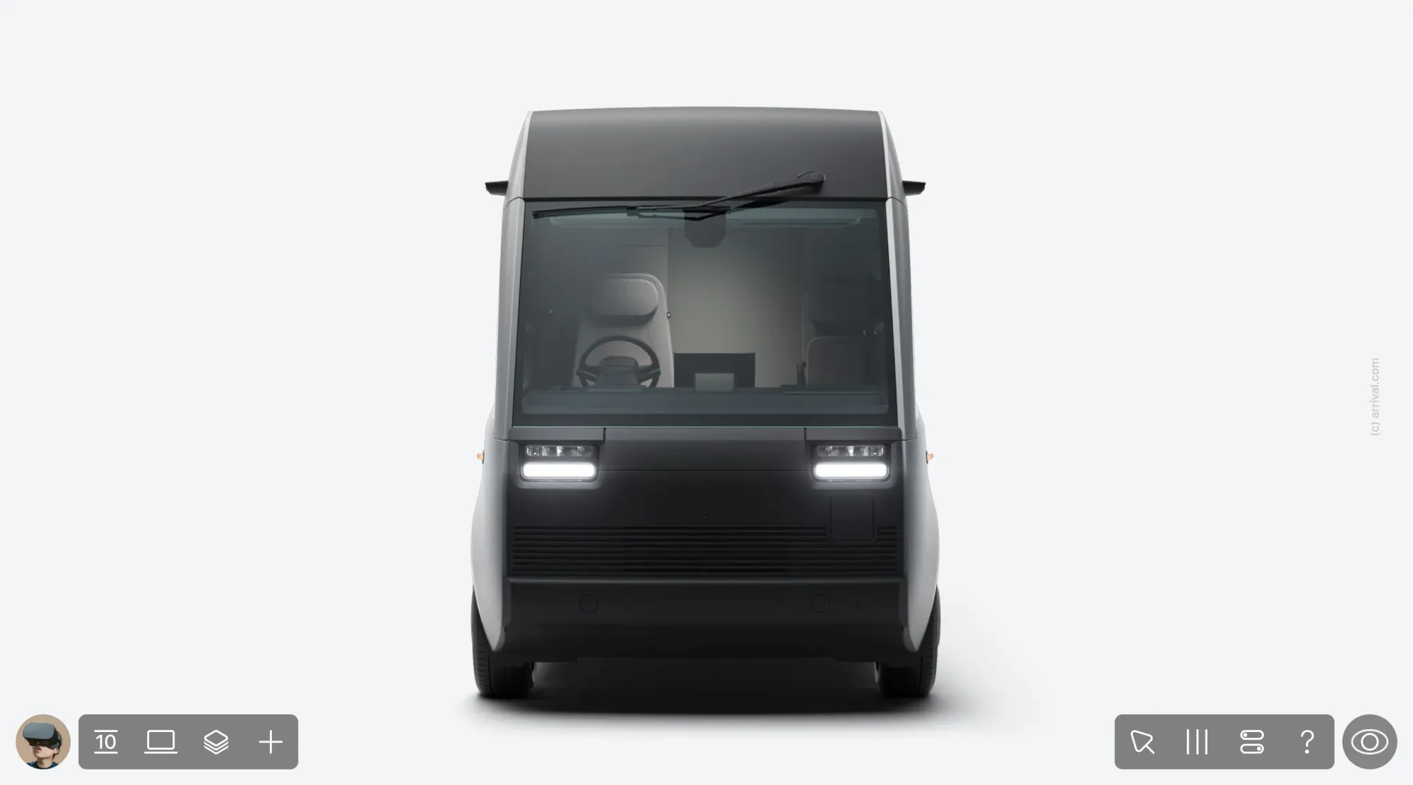
The docks also resemble the front of a car with their symmetry.
‘Go to Profile’ button with the left thumb
The ‘Go to Profile’ button is now accessible in one click and placed intuitively at the left bottom corner where you would expect. In the previous version, it was only available after opening the Pages/Settings menu.
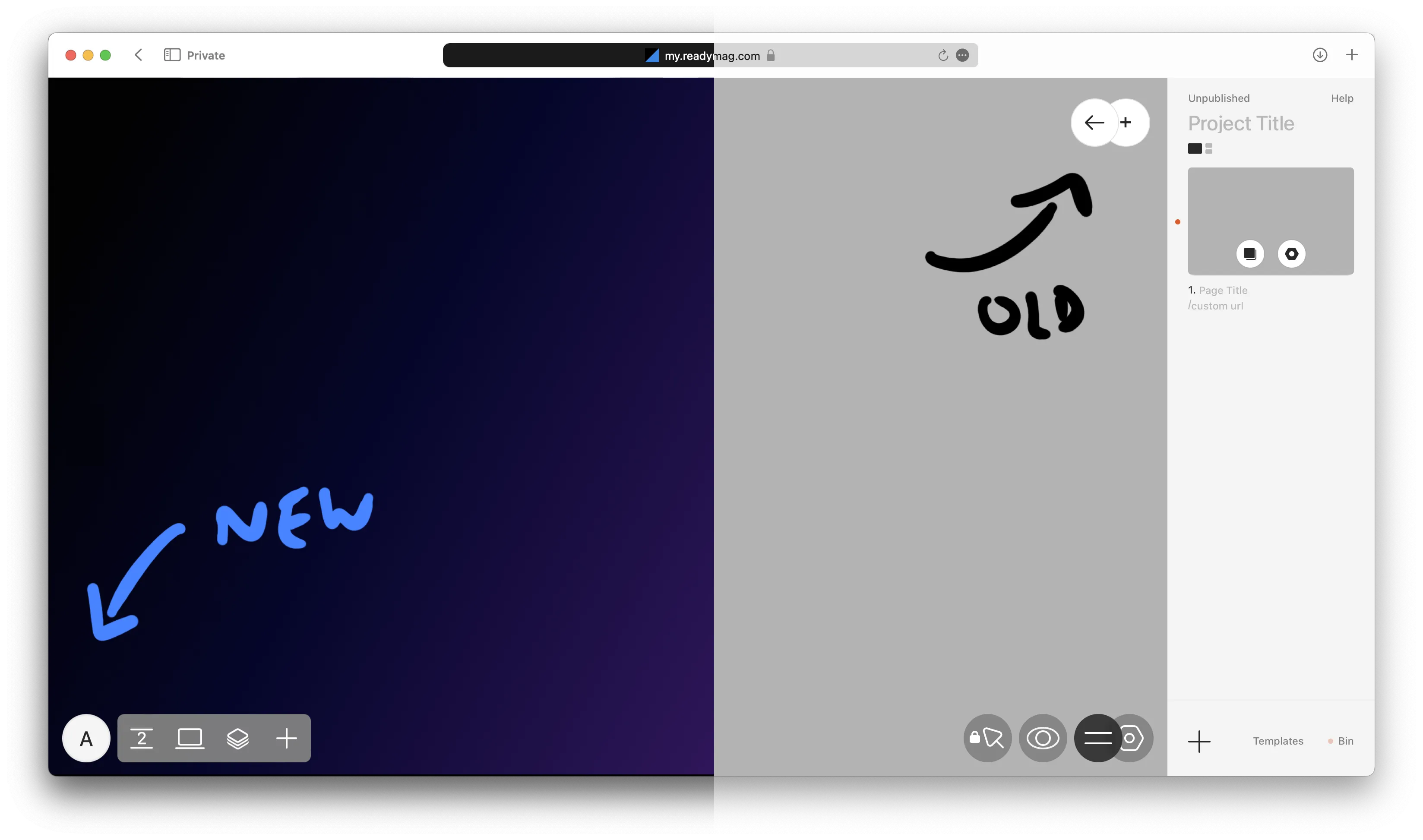
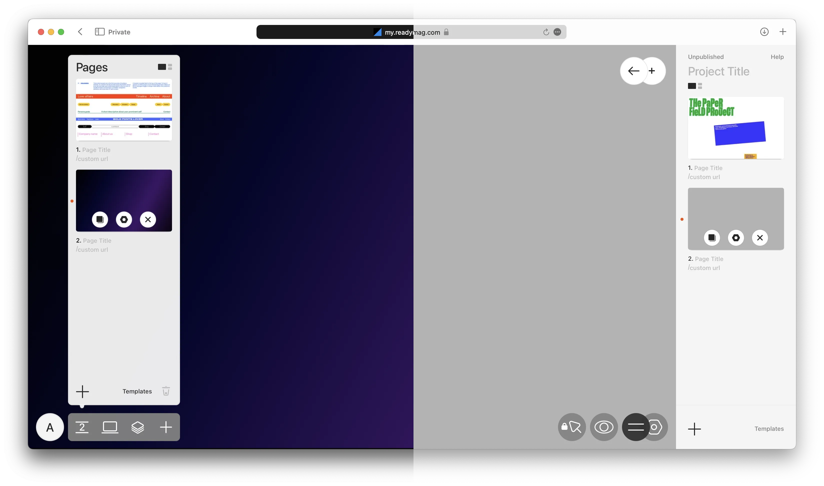
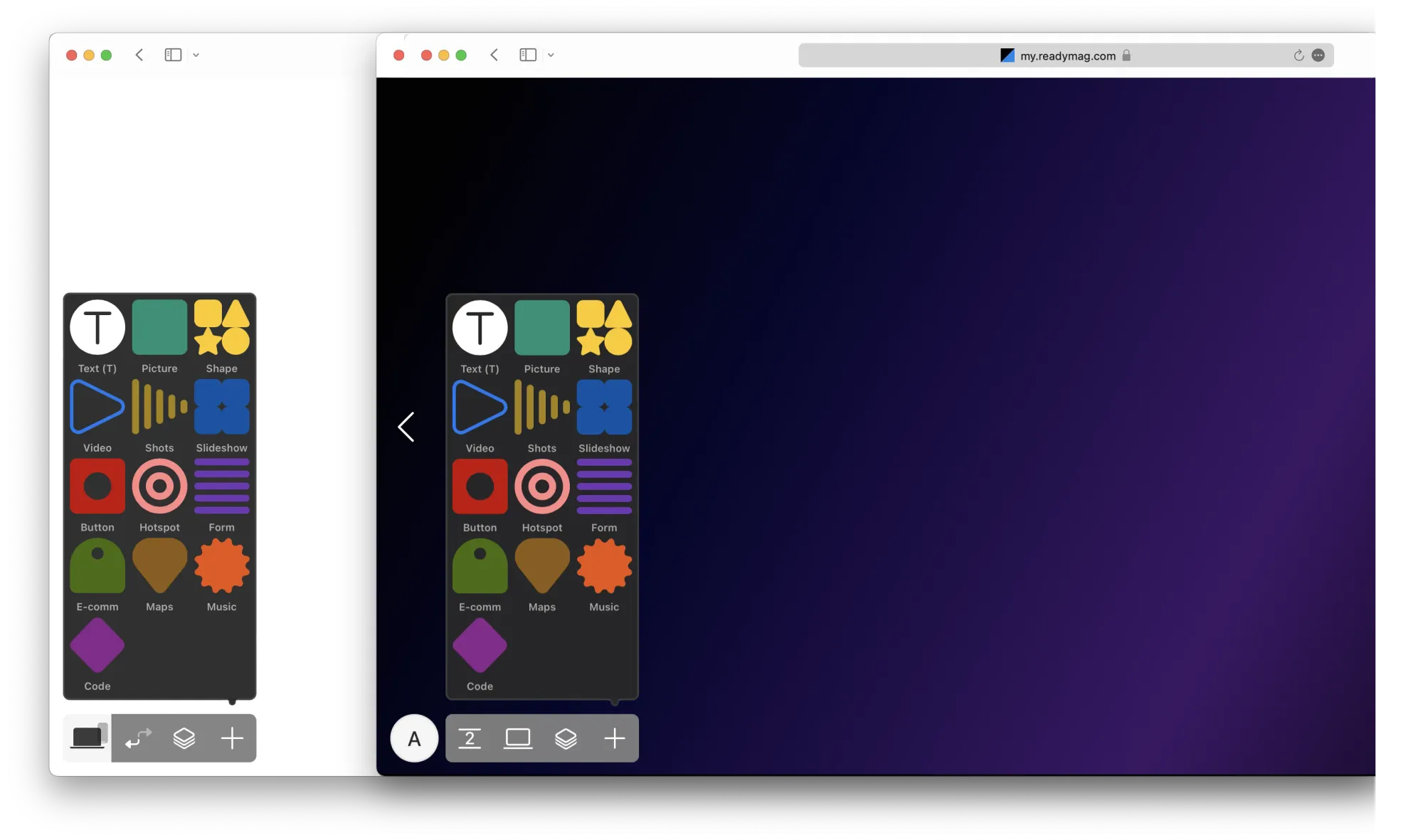
The left dock
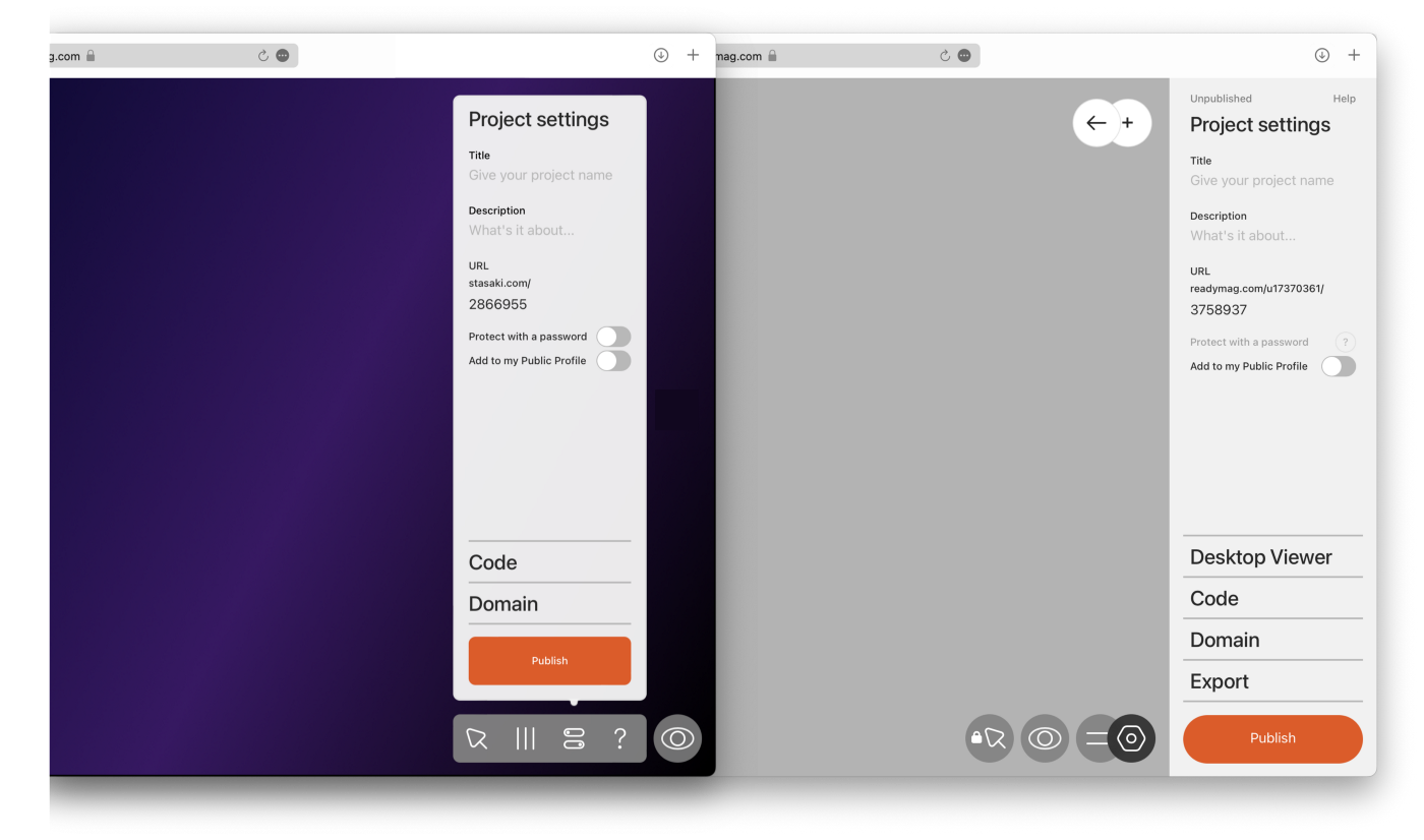
As you see, we’ve split the Pages and Project Settings panels. Previously, both panels were merged into a single button that split into two on click. Now the Pages panel is on the left dock, the second tab counting from the left.
In the old version of the interface, the Page/Settings panel used to overlay the right side of the page. This meant some content might be covered. Now, this area is left clear during left dock interactions.
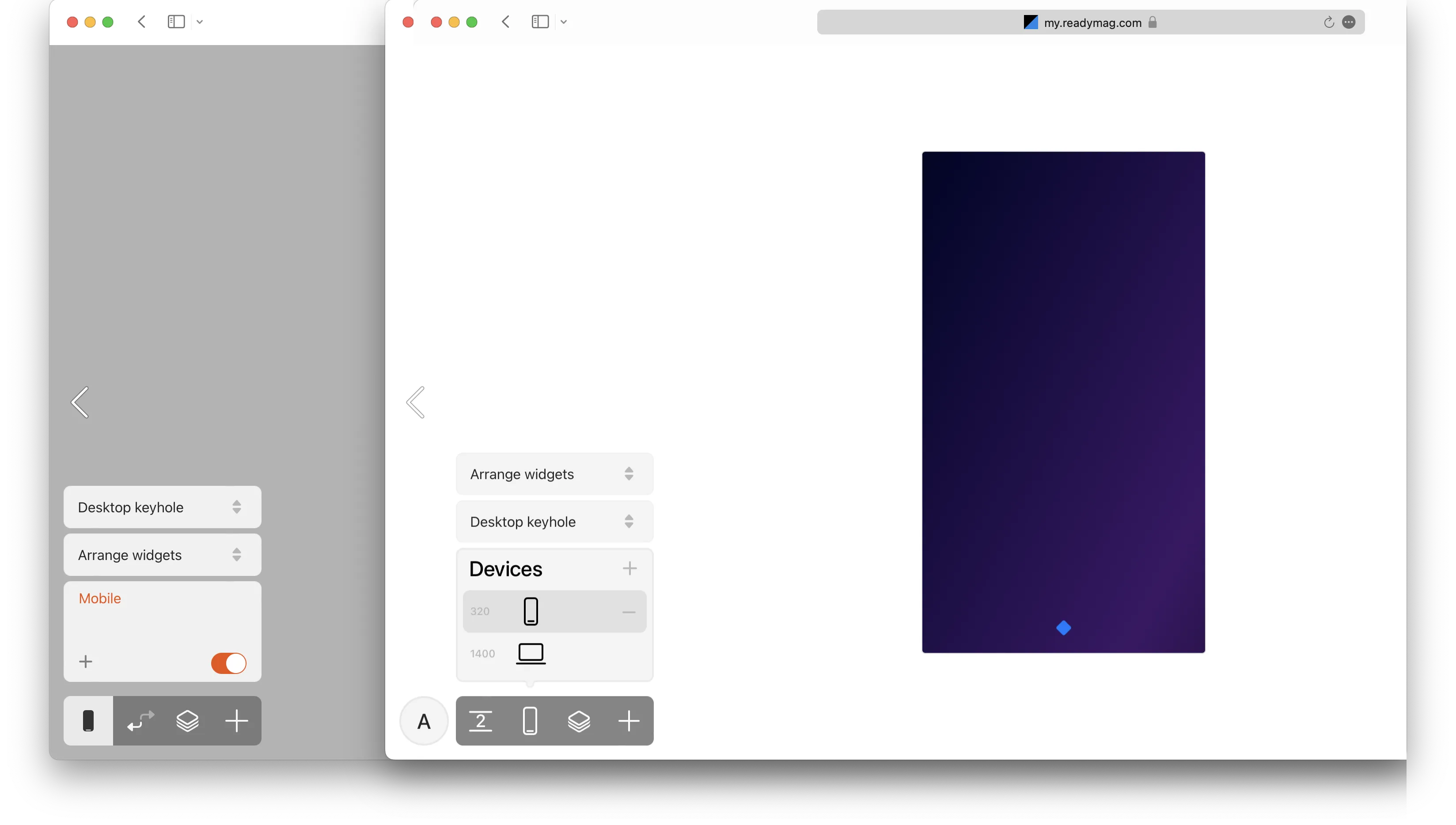
Devices (previously Viewports) remained in the left dock with a few visual tweaks.
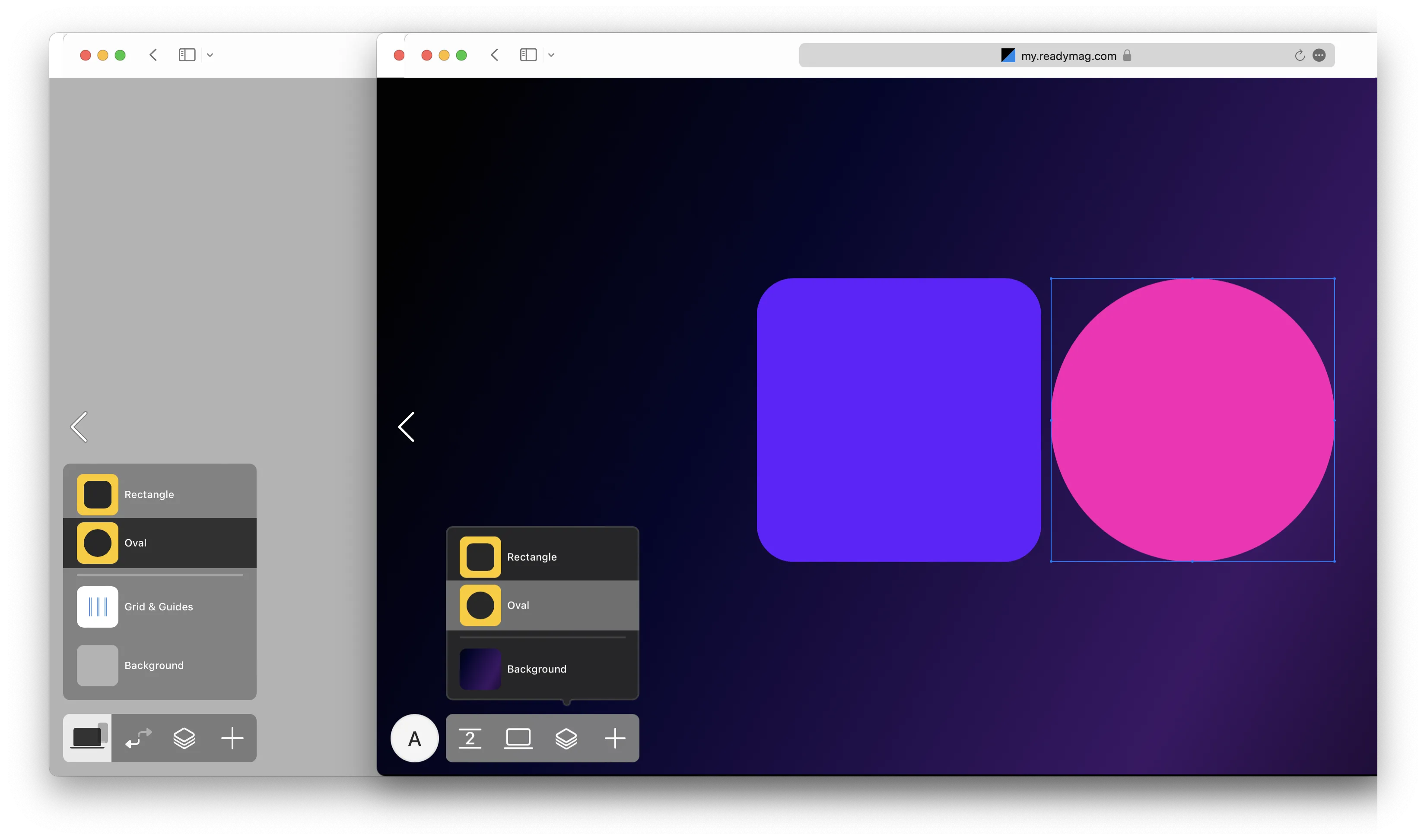
The Layers panel also remained in the left dock without any changes.
The right dock
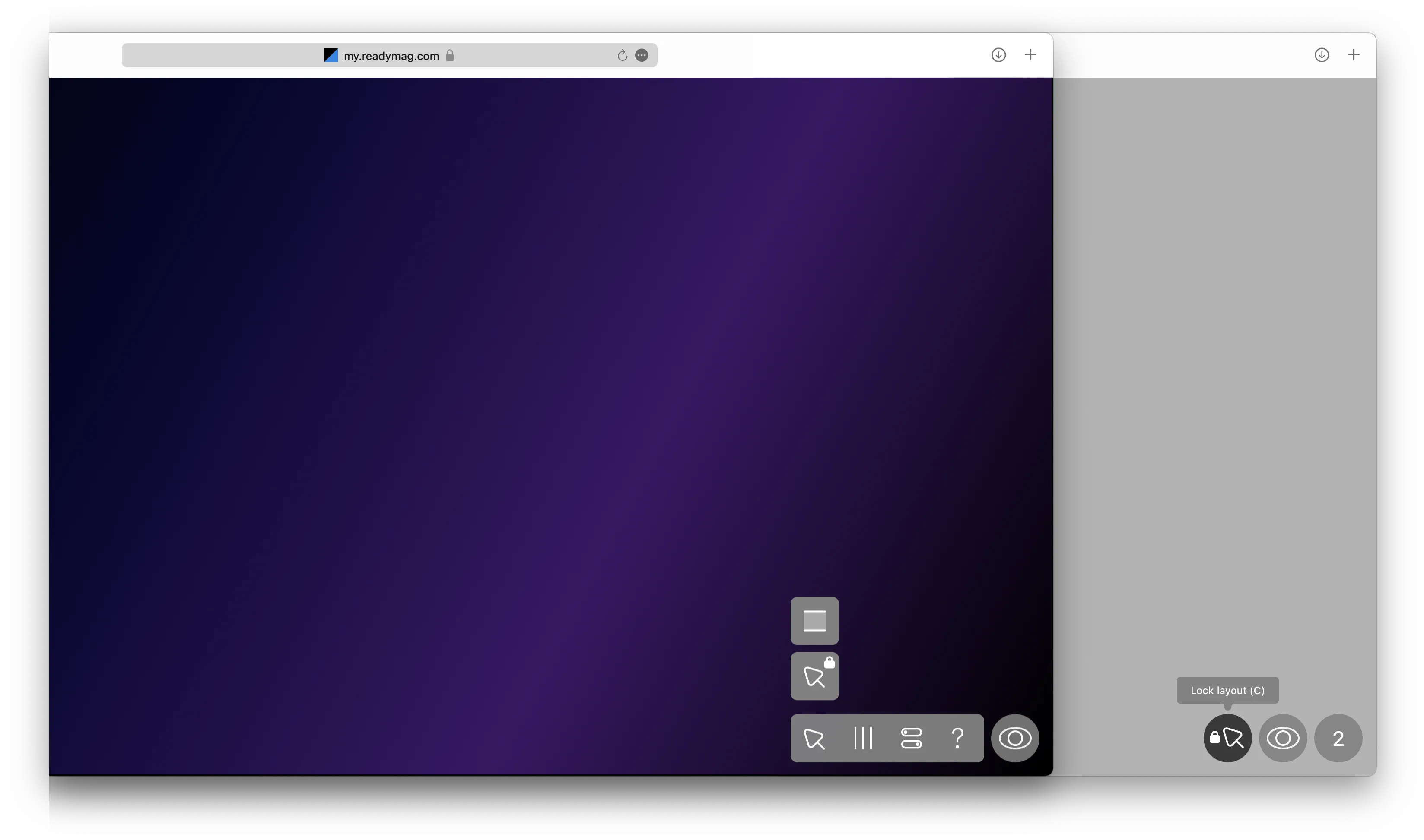
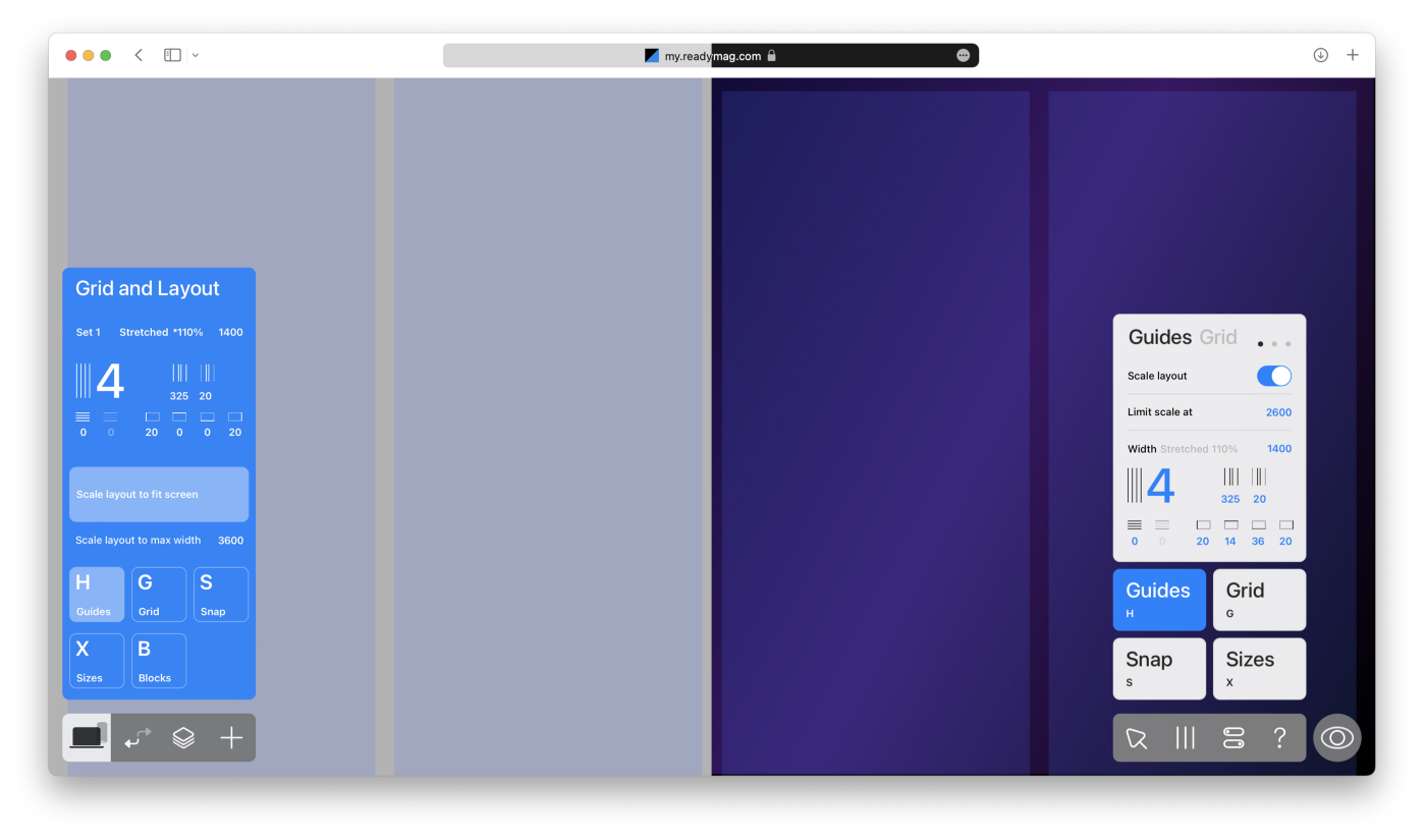
Blocks has been moved out of the Grid panel and turned into a brand new Modes menu, neighboring the Lock layout option.
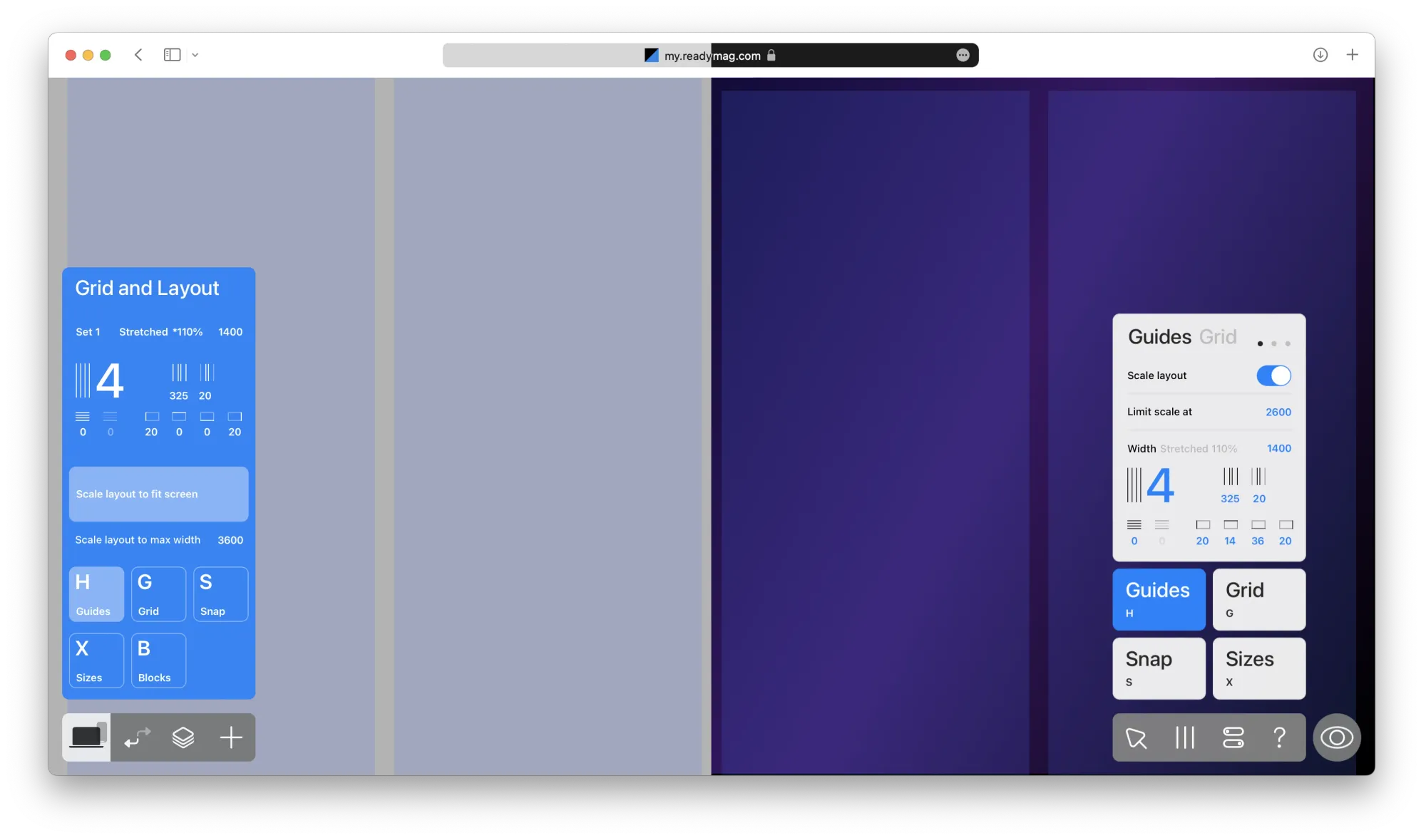
As Guides&Grid settings have become more frequently used, we took them out of the Layers panel and added them to the top level of the right dock. They’re now available in just one click.
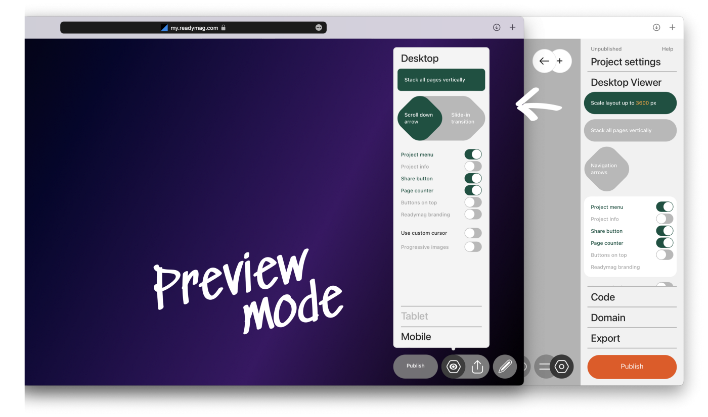
The most important change in the Project settings panel is that we moved the Viewer settings to Preview mode. Now, you can see all the viewing changes instantly on a published project. Export to PDF, HTML, and iFrame has also been moved to Preview mode.
‘Preview’ button with the right thumb
Down here on the right is the Preview button. According to Fitts’s law, the corner position is the most quickly accessed target on the screen. Consequently, it makes for more habitual usage.
So, now there is a strict left-to-right flow in the app: Back to Profile is on the left, while the Preview button is on the very right with a set of design tools in between.
Once the design is done, users can simply hit the corresponding button on the right to preview their project.
Viewer settings and the Export tab, as mentioned earlier, have been completely shifted into the Preview mode.
And a tiny pleasant detail: the icons in both docks are now animated on hover, which makes the interface feel more alive and responsive.
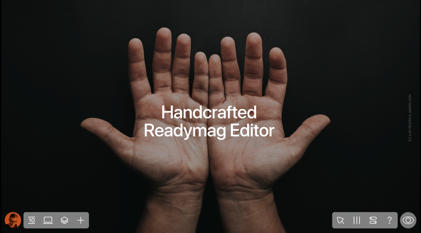
A human-centered interface
The idea of human hands with their ten fingers behind the user interface layout (Latin digiti meaning fingers) struck me. Perhaps, such a tool for handcrafting the web as Readymag has more claim to this association than any other design product. At least, I believe so.
We at Readymag hope you enjoy this fresh coat of paint for the Editor. As usual, we’re more than happy to hear your feedback at [email protected].