Preparing annual reports for your business
Meet tips and tricks on how to turn an annual report into a great immersive experience that will benefit your company.

With the switch to the web and the growing accessibility of intuitive web-design tools, we see how monotonous ‘year in reviews’ are becoming more and more artistic and engaging. Full of innovative visual elements and powerful stories, they are transforming into a means of communication between brands and audiences, showcasing the company values, goals and achievements.
Learn how your business can benefit from a carefully crafted annual report, try out our design & content tips and get inspired by a selection of stunning examples.
The benefits of an annual report
Yearly recaps reveal information about the health of a business. Drawing on the retrospective, investors decide whether they should pump money into the business and employees see how they've contributed to its mission. Even clients can understand more about the products and services they use.
A clear ‘year in review’ will often show which business decisions were right or wrong, which goals came to life and which were too challenging. Those observations help companies detect bottlenecks and set realistic goals for the upcoming year.
For media outlets, an annual report may include the last year's highlights. A recap of the best articles and news hooks helps to gather more views and win new readers.
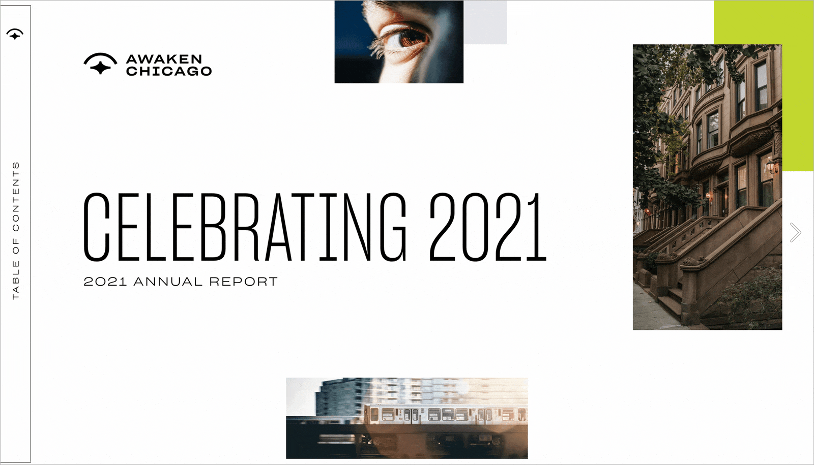
The most novel and viral ‘year in review’ reports are those created by companies for their customers. Highly visual round-ups entertain and give insights into yearly product usage. People tend to share them more frequently since they reflect their lifestyles and accomplishments and usually look trendy.
Tips for creating outstanding yearly recaps
Despite the final goal and target audience, the best annual reports all have something in common: clarity and flow. They’re precise yet narrative; visually eye-catching and intellectually innovative, as well as user-friendly and logical. Here are a few clues on how to make your round-up stand out and perform its best.
Keep it simple
People are most likely to read to the end and properly focus on what they’re reading when a report is short. Try to cover only the essential information, then categorize everything and summarize clearly without overexplaining.
Evoke emotions
Add inspiring stories from employees and customers to build trust among readers. Don’t forget to also personalize the report further with photos of people involved in the business, as well as pictures of products or services in use. This approach will help illustrate that the company is making a difference for humans and with humans.
Creating a text for a ‘year in review’ is all about selecting the most important outcomes and presenting them in order of their priority for the target audience. Make sure you know their expectations, hopes and fears when you make the report. Instead of fully focusing on the achievements of the business, try to highlight how they will reflect on the life and work of your stakeholders, employees, partners and clients. — Tsvetelina Miteva, Editor at Readymag
Practice storytelling
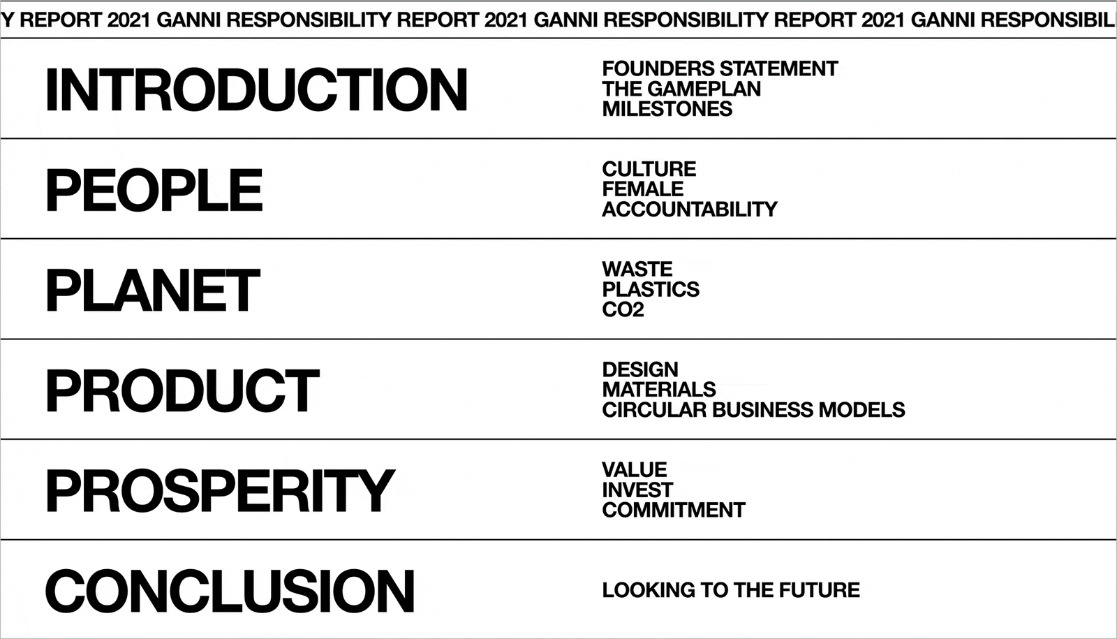
An annual report should have a clear narrative thread. Determine the messages you want to share and guide the viewer smoothly through the story. Be sure to follow a logical structure, adequately name sections and avoid jumping suddenly from one idea to the next.
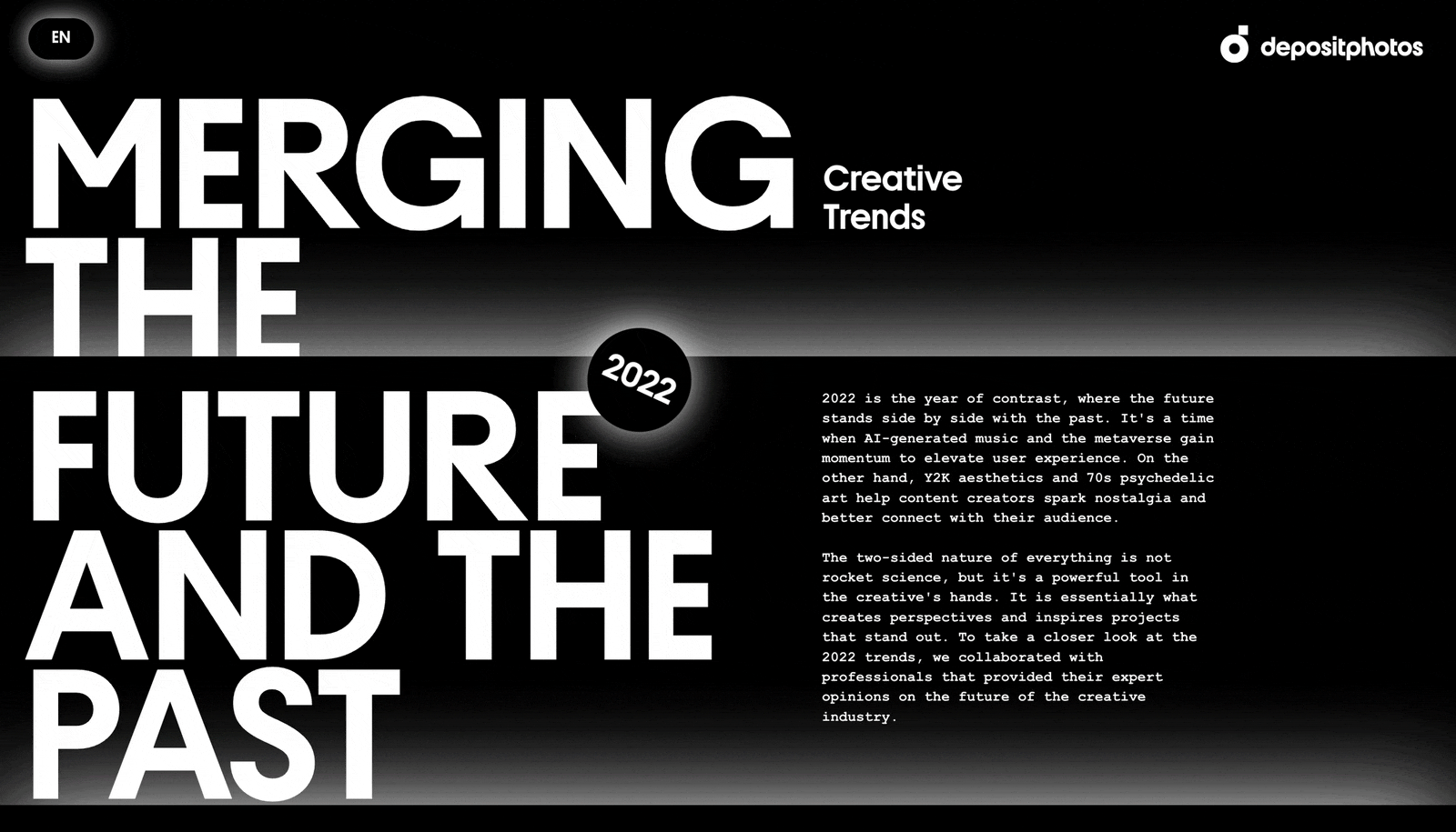
Design thoughtfully
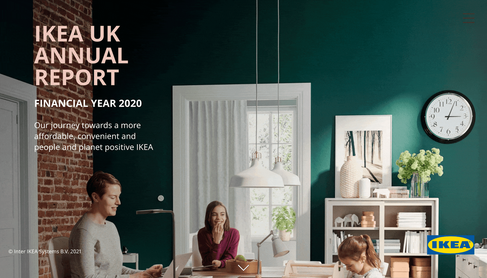
A well-designed report looks professional and compelling. But that’s not the main point. With the help of good design, readers should be able to run through any document and easily single out the most valuable information. When working on your project, don’t forget to use headings and subheadings, visually emphasize key elements, mark quotes and captions, mix necessary photos with infographics and animations; then finish things off by adding a brand touch with color schemes, logos and fonts.
Imagine you’re a film director who guides readers' attention. Try to build a visual narration by determining what your visitor should notice first and where they should go next. Adapt your design solutions to this narrative: make essential elements bigger, mark the transit to another piece of information with animation and put secondary data in an easily accessible place and non-distracting place.
Make sure you keep a balance between pages. If one has a lot of text, the other should have just a few sentences and a photo or a GIF. Some parts of the text can be easily packed into hotspots not to overburden individual pages. Some extra advice: don’t be afraid to use bold animations and juicy typefaces even for this business task. — Tatiana Egoshina, designer at Readymag
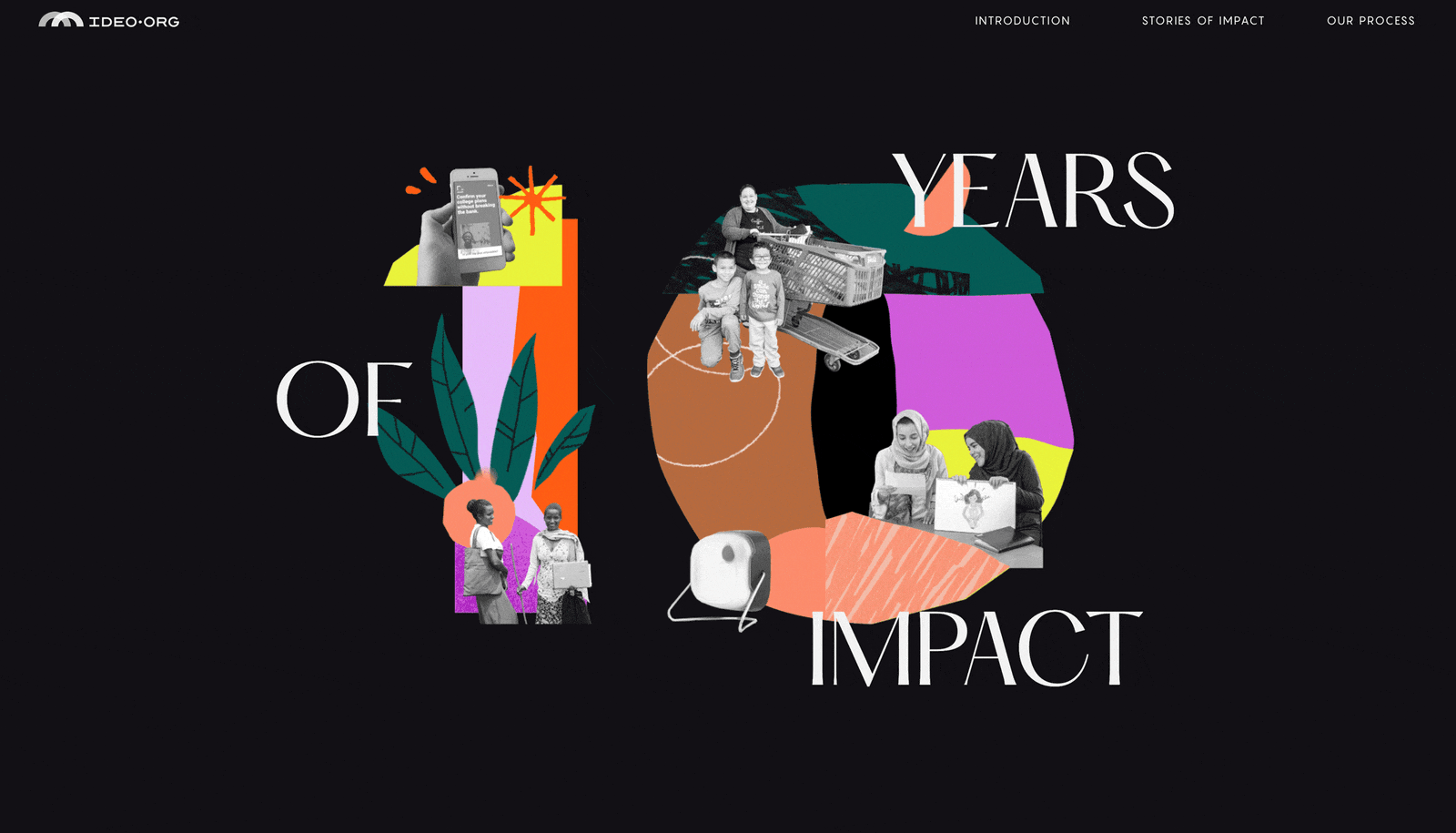
Create immersive experiences
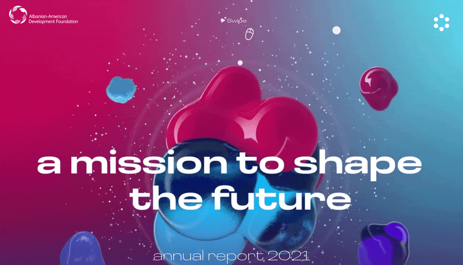
Turn your ‘year in review’ report into a blockbuster. Chase the boredom away by artfully combining different visual elements. Photos, illustrations, 3D designs, animations, catchy typography and video embeds—all that makes your ‘year in review’ report a thrilling hit that readers will remember.
Use infographics
People love infographics. They provide a simple, non-confusing way to understand information and often look nice. Help your audience understand your report quickly and thoroughly by converting text and digits into charts, tables and graphs where possible.
Now you can easily turn a bunch of texts and numbers into a great web page that will serve its purpose, draw attention to your brand and simply look like a piece of art.
Create your report with Readymag—the no-code web design tool tailored to your needs.