Non-trivial designs in marketing communication: examples from renowned brands
See how designs can boost your brand message—exemplified by reputed campaigns
Brands that consistently tell their brand story can boost their value by 20%. Read this piece to see how blending designs with a solid brand strategy can make a real difference, featuring examples from renowned market players.
Why brand communication strategy matters
A brand strategy isn’t just about choosing what to say or how to say it—it’s about creating a voice that resonates. A well-thought-out design captures attention and communicates the brand’s ethos and values.
What does a marketing communication strategy typically include:
- Consistent messaging that keeps your brand message the same across all platforms;
- Clear brand values that define what you stand for and shout it out loud;
- Target audience understanding that makes sure that your message resonates with the people you want to reach;
- A strong visual identity that sets you apart from others;
- Engagement tactics that involve and retain your audience’s interest.
How can designers weave business strategy into design execution? Tap into an op-ed by Douglas Davis, Head of Brooklyn-based consultancy The Davis Group.
Branding examples that speak volumes
Let’s zoom in on some top-notch designs that have set the bar high in how they integrate into the overall brand communication strategy.
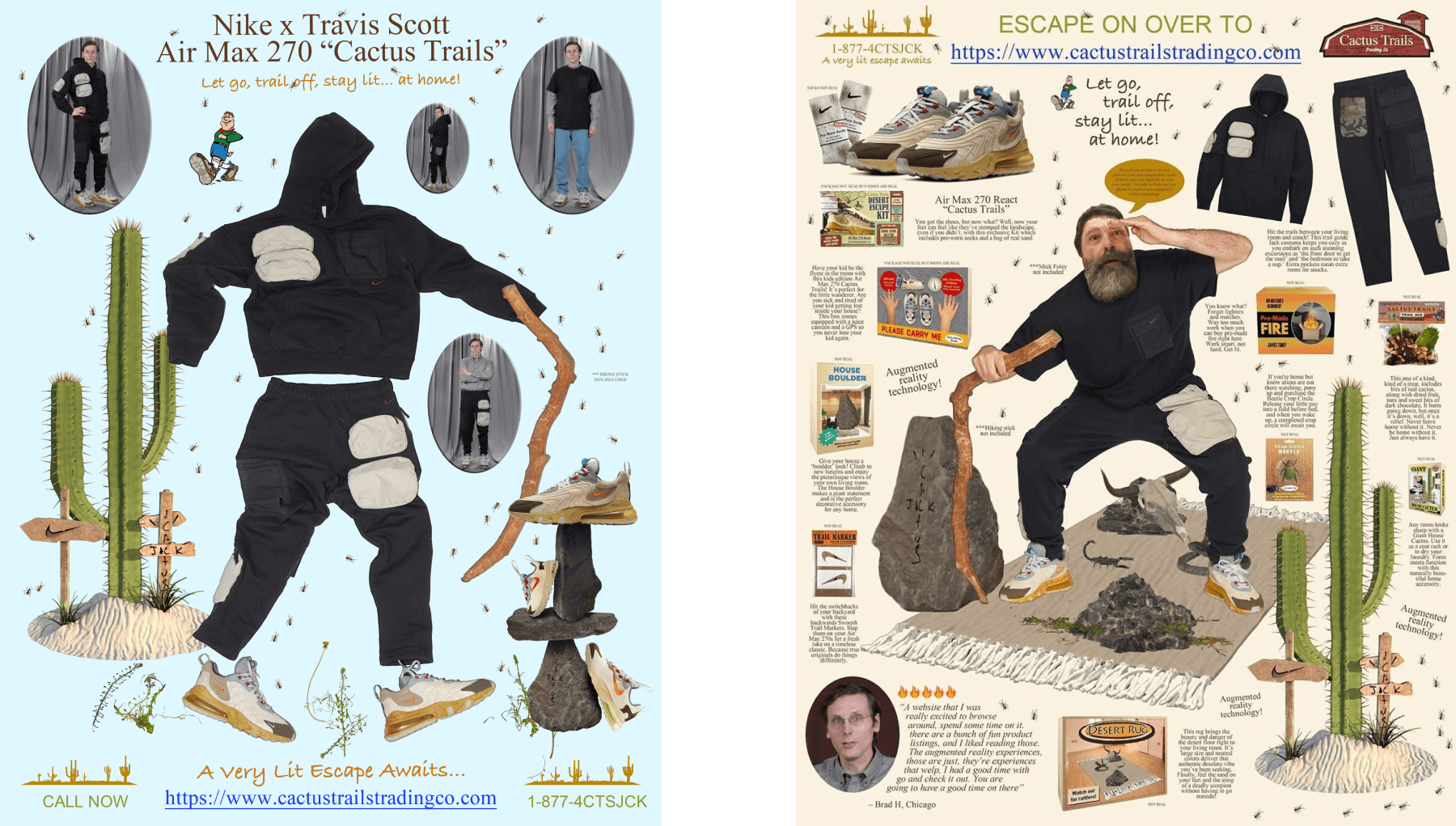
Travis Scott x Nike “Cactus Trails” by Thomas Pregiato
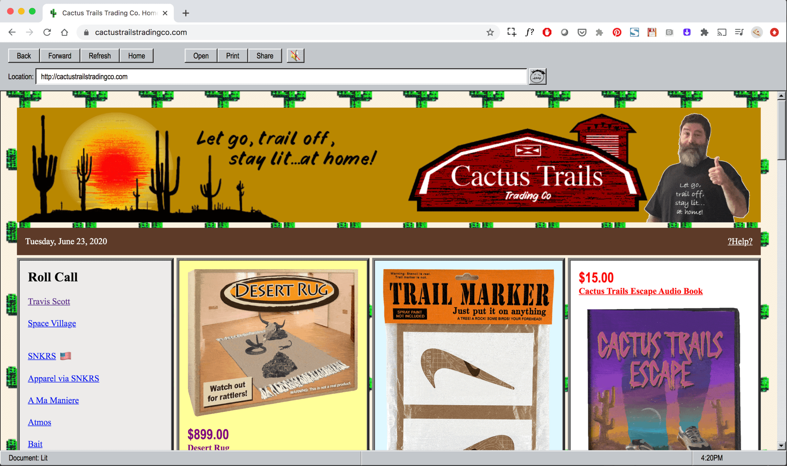
For this campaign, Nike and Travis Scott took a playful turn by setting up a fictional online store that throws back to the early, rough-edged days of the internet. The design cleverly taps into a sense of nostalgia, mixing a naive yet well-executed aesthetic with the modern hype of sneaker culture. This unique blend caught the eye and sparked significant buzz on social media.
Learn 5 essential brand message examples and how to incorporate them into your communication strategy.
BEATS BY DRE Beats Studio Buds Campaign by Something Special Studios
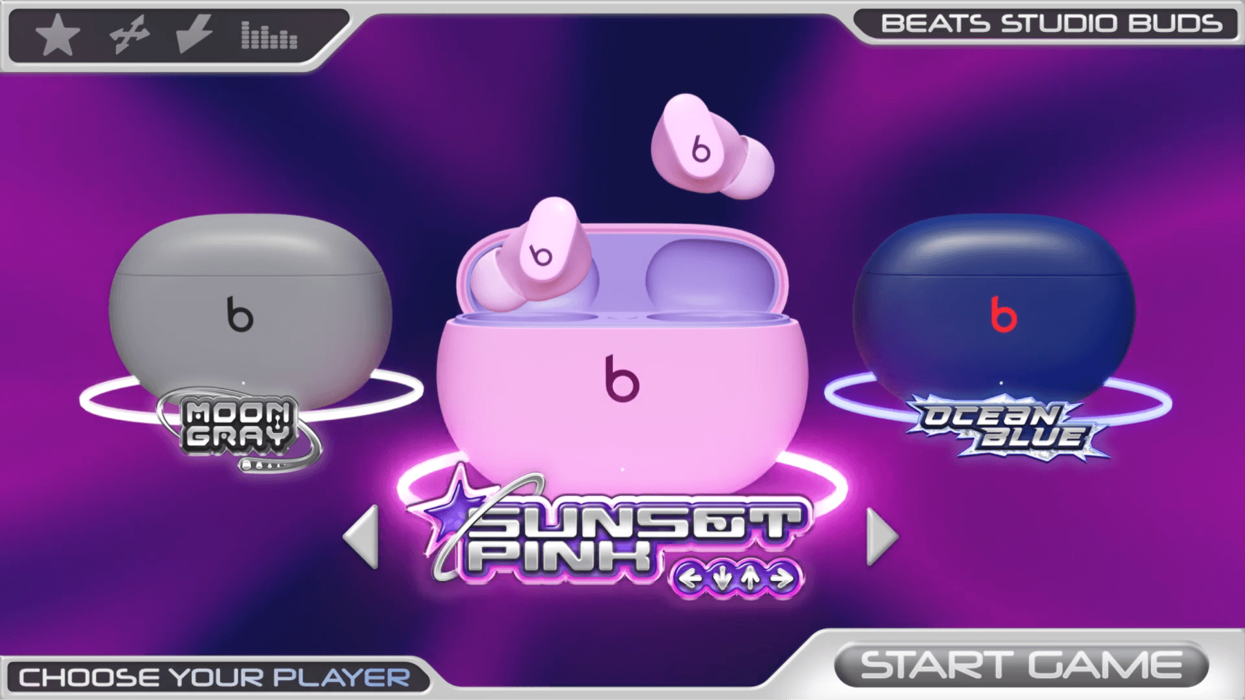
The “Choose Your Player” campaign was designed to launch three new colorways of Beats Studio Buds, targeting a Gen Z female audience. It uses color as a tool for expression, drawing on Y2K video game nostalgia with a character menu-like selection that mirrors avatar customization. The campaign brings each color to life through visuals that blend Y2K elements with manga styles.
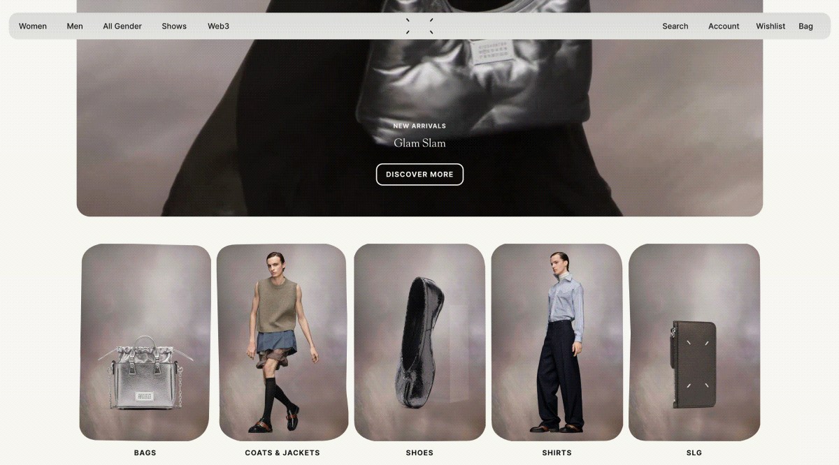
Maison Margiela website by SHOWstudio and International Magic
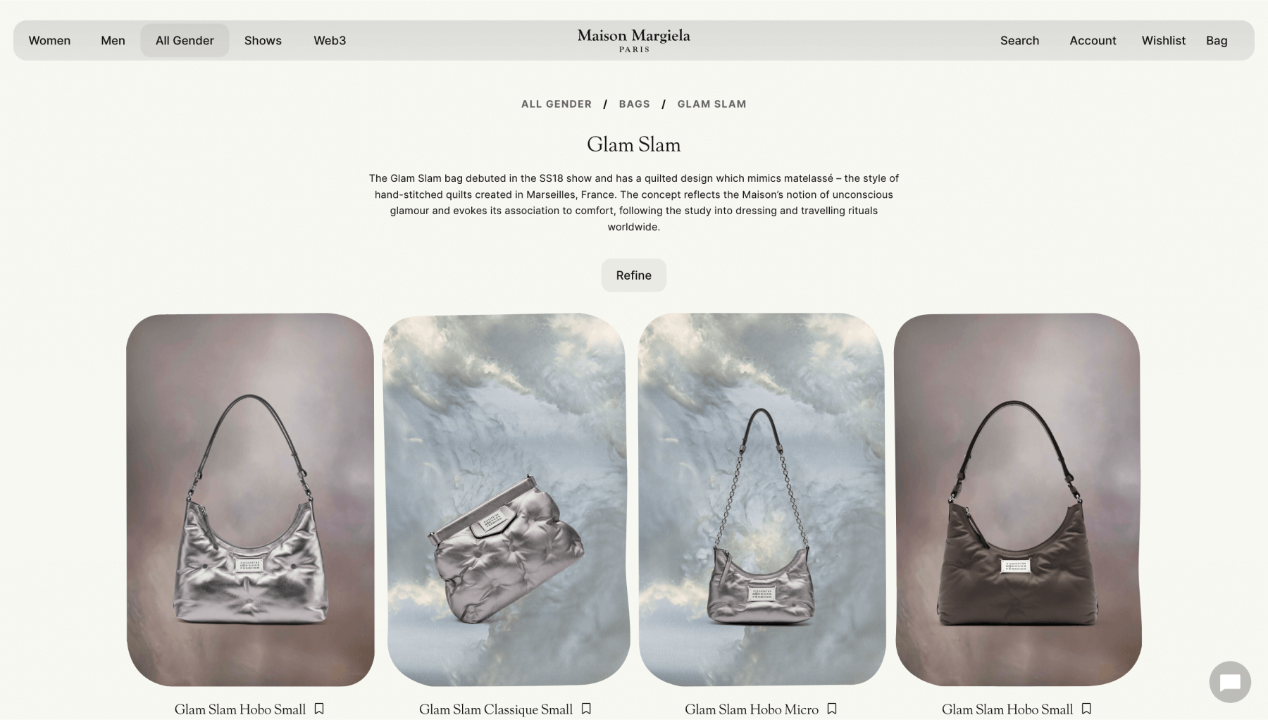
This website boosts the brand’s strategic business communications and offers a unique online experience that captures the brand’s distinct vibe, similar to what you’d feel at their runway shows.
New York Times’ stuff conference identity by CC Studio
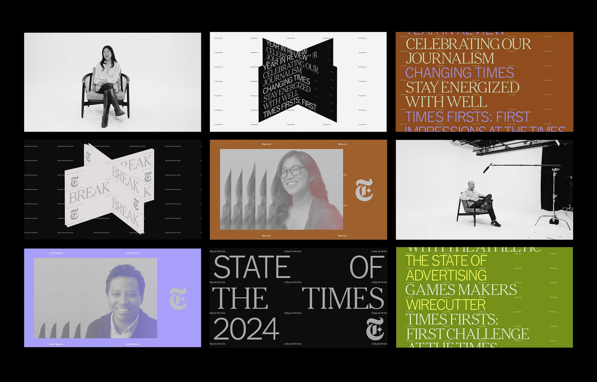
The conference identity includes an ‘X’ isometric graphic that symbolizes the newspaper’s growth across different media and gives a nod to flipping pages in books and magazines. For the fonts, they kept the newspaper’s classic style but added a modern touch—they used NYT Franklin and NYT Cheltenham fonts together, adjusting sizes and weights to ensure the text is both elegant and easy to read while still looking familiar.
Series of editorials on prominent designers by Readymag
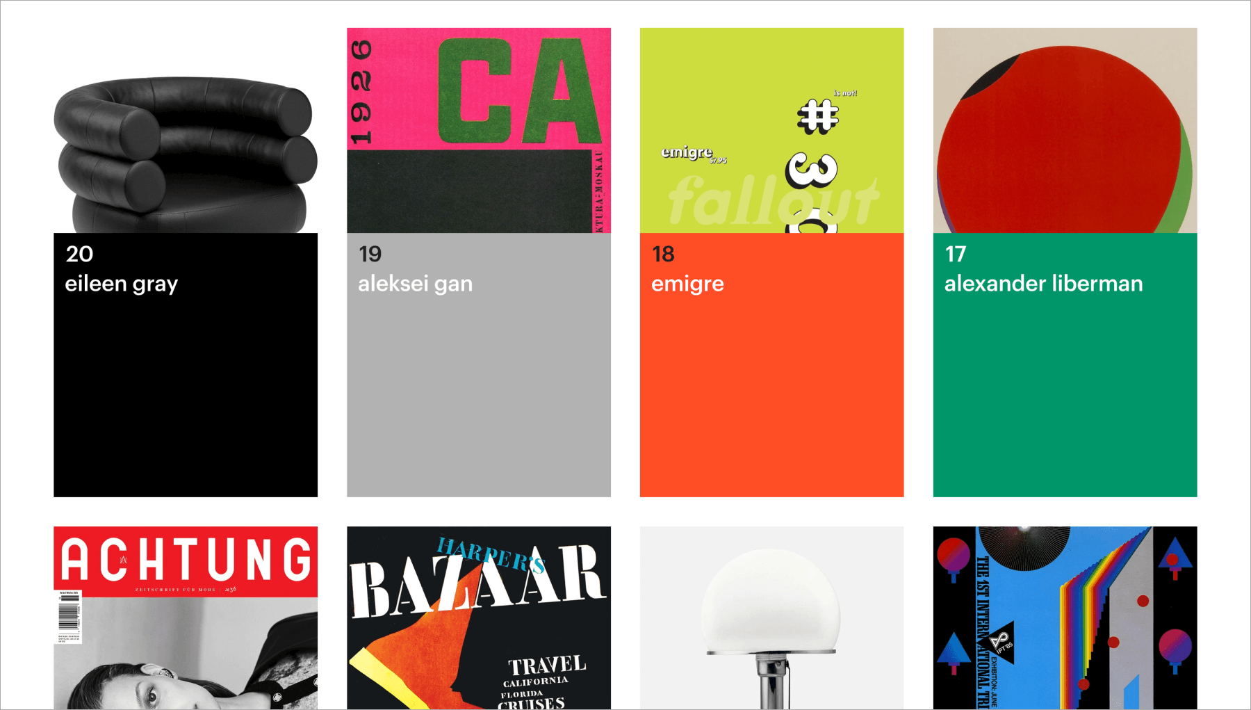
Editorials are a key part of how brands talk to their audience. “Design Stories”, for example, serves as a digital archive of prominent 20th-century designers and is a tribute to the visionaries who shaped modern design culture. The visual design of this editorial is tailored to reflect the unique code of each featured designer’s personality. Active, dynamic typography is used throughout the project to enhance the narrative. In creating “Design Stories”, we followed our marketing design philosophy, which revolves around the idea of useful content.
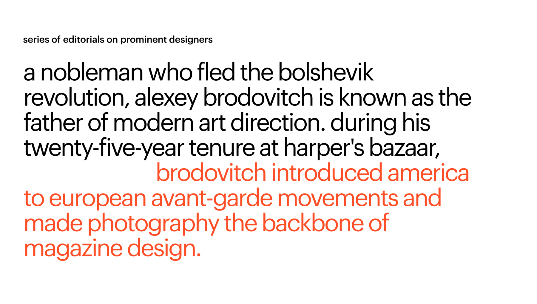
If you’re looking for a no-coding tool to create a website, you can use the Stories editorial template for your project or give building your own site from scratch a try.