Interactive designs that delight and engage
Designer's insights about projects where interactivity adds originality, grabs attention, or becomes the main design feature.
The use of motion, interactivity, and animation in design is becoming more essential every year. It’s getting harder to engage users without these elements, and the demand for dynamic content keeps growing. Some studios, like OBYS, rely almost entirely on interactivity and animation. And, if you browse the websites of other companies like Dumbar, you can roughly track the point at which movement increasingly started to replace stillness.
Readymag’s marketing designer Varya Fomicheva has shared insights about several projects where interactivity adds originality, grabs attention, or becomes the main design feature.
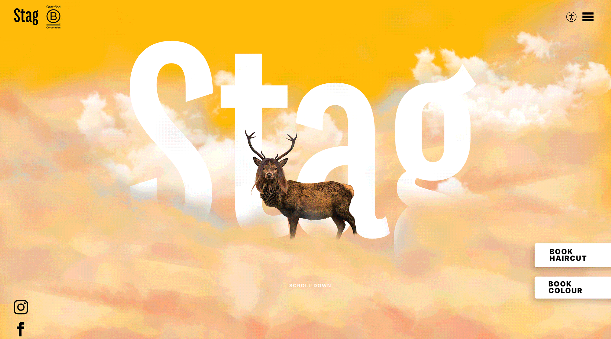
Stag Barbers
An unusual design choice for a barbershop, with clouds as a central theme. The connection isn’t exactly clear, but it works well, likely reflecting the brand’s spirit and helping it stand out. It grabs attention and gets you emotionally involved.
Copyright © Mainlyphotography Studio
The website features interactive elements on scroll, as well as hover effects on text and pictures, which have a slight jerky motion. Without the interactivity, the mood would still be conveyed through colors and images, but the animation enhances the light, playful vibe.
Kampong G(e)lamorous
This one feels more like a video that you scroll through than a typical website. It relies entirely on animation and wouldn’t work without it. Created using Readymag, a project like this requires careful planning to determine what goes where before building it in the tool. The animations themselves are basic—mostly scaling and positioning—but there’s a lot happening, making them seem complex. The key is in the concept; once that’s set, execution becomes easier.
Copyright © VOSK
The design is charming and could work as static frames, but the animation makes it unique. We’ve seen countless traditional landing pages, but this one, with its dynamic movements, feels fresh and unfamiliar.
NN Konrad
Here, the animation subtly enhances the design, adding a nice touch and directing attention where it’s needed. It effectively highlights the font in certain places, emphasizing it or breaking up the still content with slight movement.
Copyright © Martina Meier
Most elements stand on their own, but at the beginning, rotating circular elements and font changes on scroll made with Shots showcase a nice technique. There are also a few more elements that animate on scroll. Again, a static version would work, but not quite as effectively.
SRF Bounce by Studio Feixen
It’s hard to imagine this design without animation, as it fully captures the brand’s essence and idea. Here, everything revolves around movement, creating a cool, fresh look. The letters in the final image jump around, making it much more dynamic than a stationary picture.
Copyright © Studio Feixen
Bounce is a hip-hop show, and this minimalistic animation conveys the beats from the speakers and the loud sound effectively. It’s a simple solution, but sometimes simplicity is the coolest.
Deezer by Koto Studio
This project has a slightly different visual approach, but also focuses on sound visualization. The interesting aspect is that this branding translates to stationary mediums as well. Deezer has cool shapes and a rich color palette, which can work well statically, so the idea is effectively conveyed in both animated and still forms. This is the difference from the previous example, where the rattling feeling of the speakers can’t be captured in an unmoving form.
Copyright © Koto Studio
Even so, you can’t imagine this design without animation—everything lives on social networks now, where graphics naturally suggest movement. It would be odd to present it without that element.
Too Much To Watch by Studio Kiln
In this project, it was conceptually important to soften the tension of the content overload theme with soft, inflated letters. Using letters with physical properties has been done before, but animation brings them to life in a cute, cool way. The slight, imperfect movements and breaks in each shape add a unique touch.
Copyright © Studio Kiln, 2023
Still pictures would convey the idea, but be less interesting. There are many similar solutions out there, but animation makes this project much more distinguished.
These examples highlight the growing trend of using animation in design. It’s not just an aesthetic choice, but also a practical one. Animation plays several important roles in enhancing user experience, especially in managing attention and understanding (to see how, check out these findings from the Nielsen Norman Group). Readymag offers a wide range of animation features, with new ones being added regularly. Recently, we integrated Lottie and enabled Bézier curve animation. If you’re not sure where to start, this article will guide you.