(Un)conventionally sincere: Designers define web Brutalism and explain its rise
Designers' boredom of rigid corporate styles and society's open-mindedness made the 'new ugly' a trend.

Over the past few years, we at Readymag have seen a rise of websites that embrace the aesthetic of Brutalism. Ultimately crude and rough, this style certainly isn’t a choice for every industry and project, but still, in 2023 it’s celebrating a digital revival.
To delve deeper into this trend, we reached out to our Instagram followers to ask about the core features of web Brutalism, the audiences to which it applies most and the reasons behind its popularity. Also, we asked Readymag designer Varya Fomicheva to handpick several websites embracing the aesthetic and comment on them.
Echos of WWII and its reverberations on the web
Brutalism originated as an architectural movement in Europe in the 1950s as countries sought to rebuild after World War II. Because of the war, cheap concrete and steel were abundant, and served as the primary materials used to build brutalist buildings. Their affordability and practicality were crucial elements, which led Brutalism to slowly take over the big cities of the world, particularly in the UK and eastern Europe.
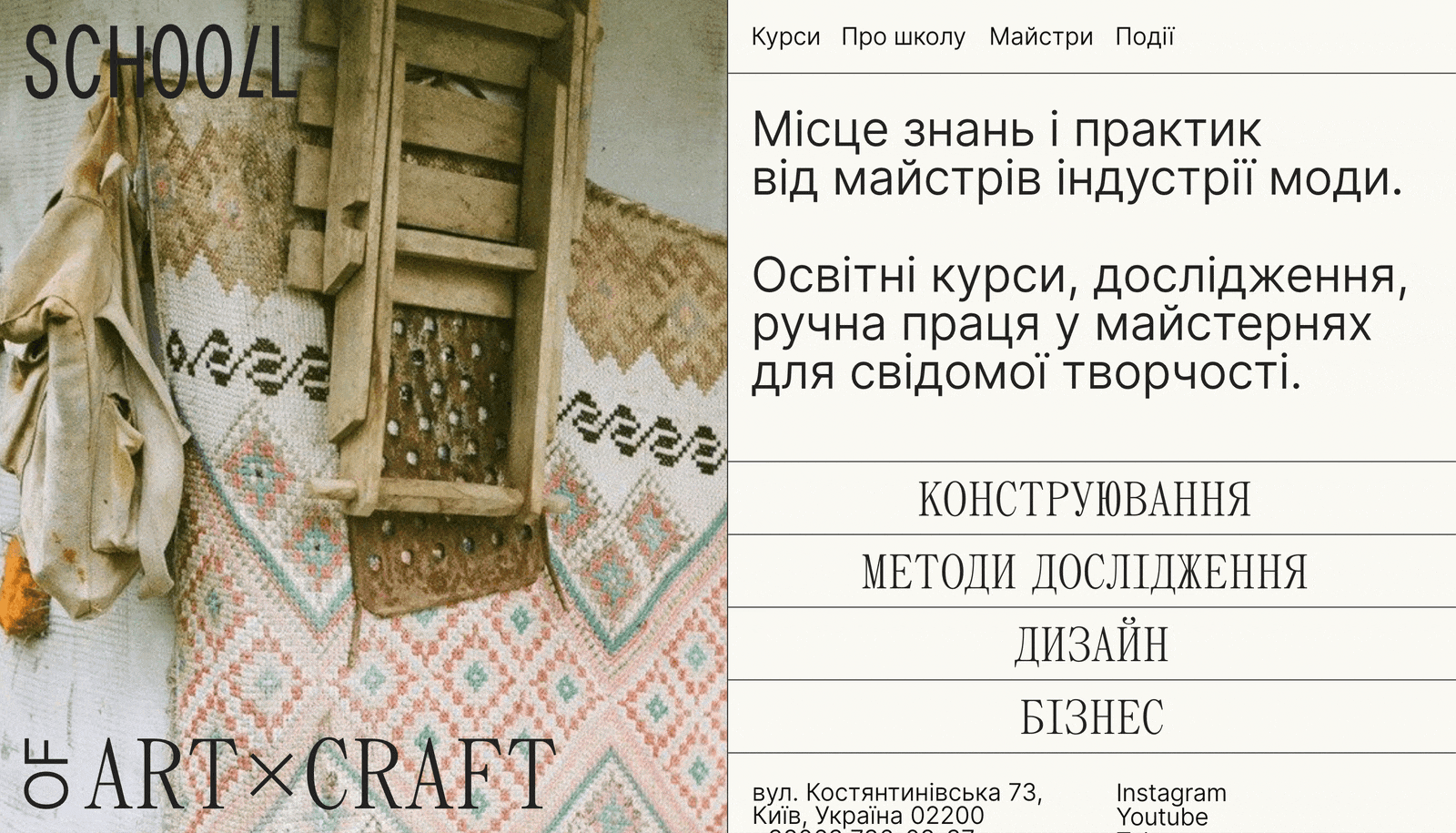
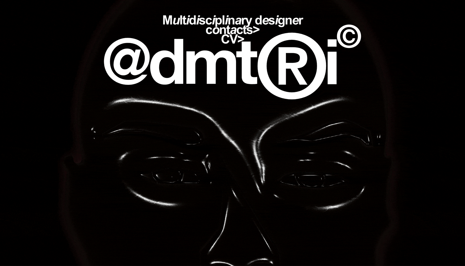
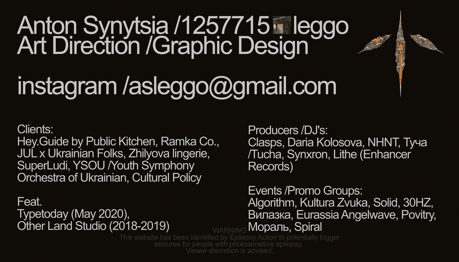
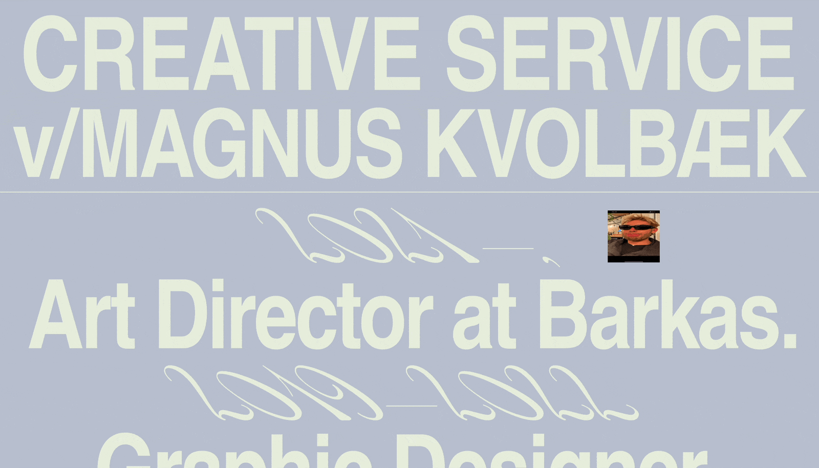
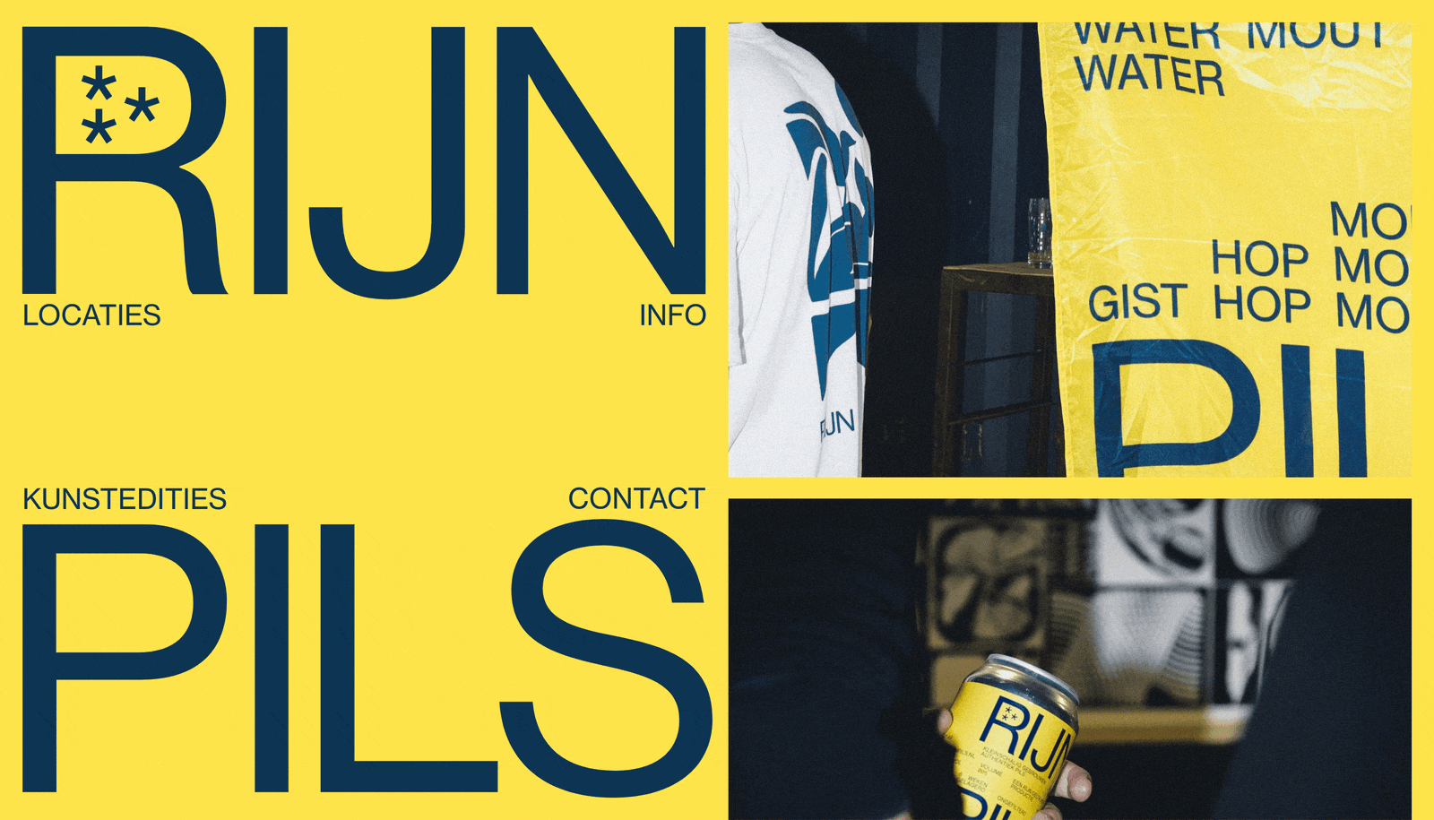
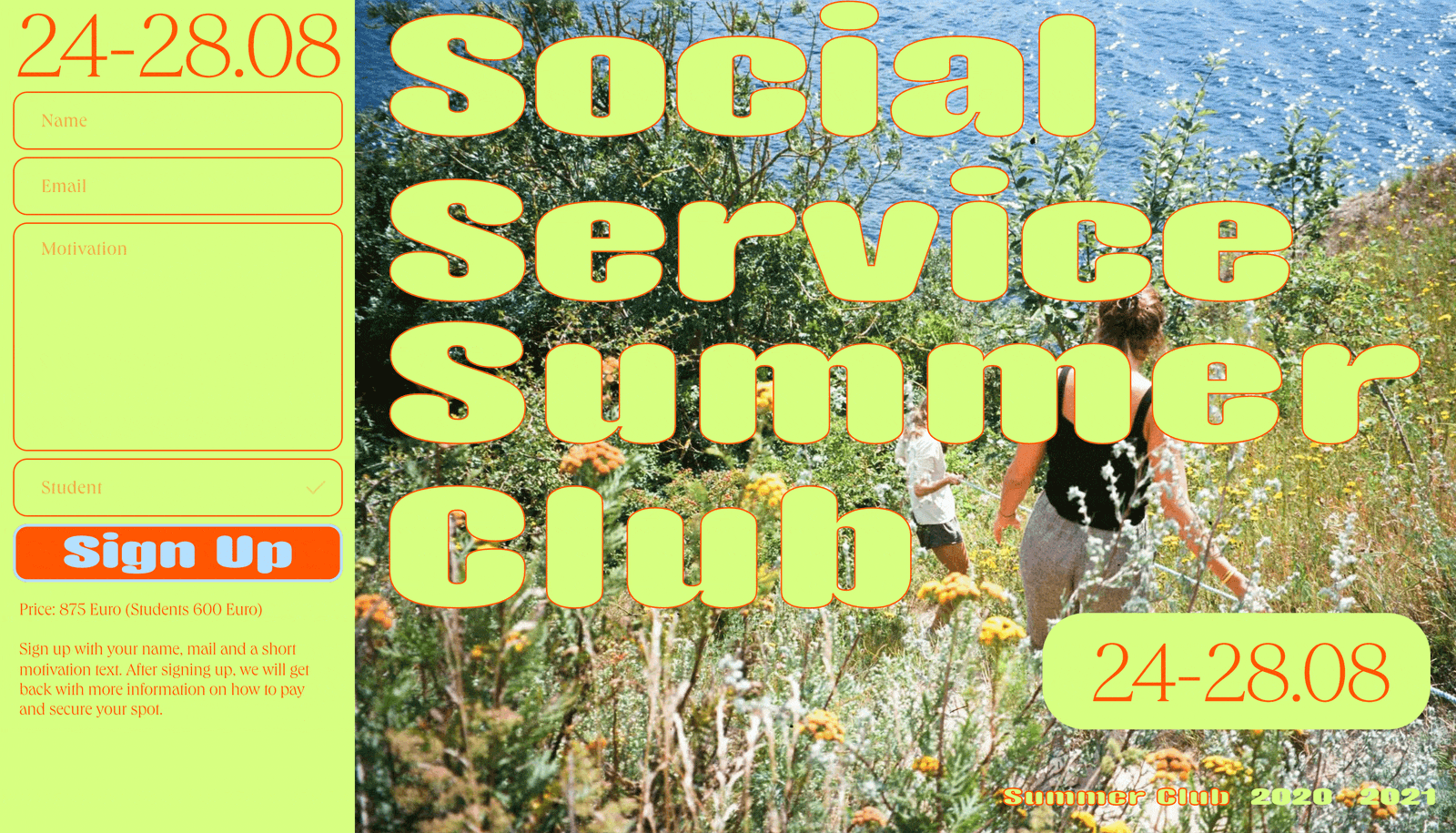
Digital Brutalism adopts the common logic and certain approaches from its ancestor—with a primary focus on the essence and absence of decorative elements. It’s a crude, plain, and transparent style that prioritizes functionality over form and effectiveness over aesthetics. It’s characterized by its raw appearance and extremely simplistic, minimalistic approach. “As with any artistic movement, Brutalism seeks to differentiate itself from established trends. In web design, it challenges the ideals of perfect user-centered designs, legible UX/UI, and pleasing colors. Just as Brutalist buildings are heavy and clumsy, digital Brutalist websites strive to mimic that impression,” says Markéta Babková, a digital designer who’s currently finishing up her master's degree.
Common approaches in different environments
Brutalist web design can’t be precisely defined, as it isn’t a standardized movement and is still in the process of defining itself, rather than being defined by others. Still, its philosophy suggests some common approaches and elements. “Both architecture and web design are about building a structure, which requires functional tech and a strong aesthetic. In this case, white space and view concrete share the same scope: just as Brutalist buildings are characterized by their heavy and material appearance, Brutalism in digital design is represented as a raw and unadorned style,” says Enrico Rodriguez, a master’s degree student in service design. In his bachelor’s degree project “World Rough Web,” he analyzed Brutalism in the contemporary digital realm.
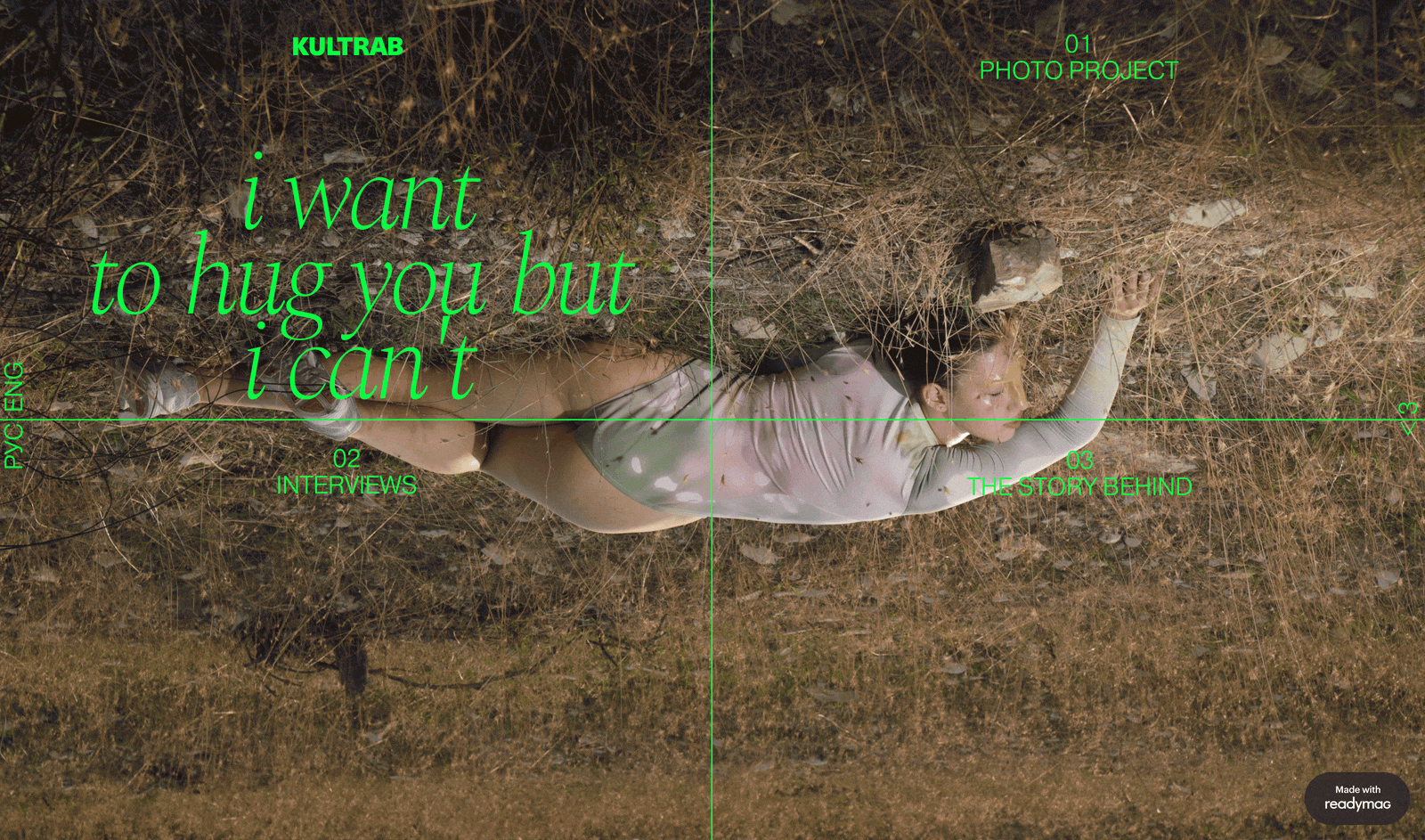
“The common visual idea behind most Brutalist websites is tension. It may be created in different ways, for example, by leaving almost no white space between elements or by playing with perspectives and volume to create multiple dimensions. Partially hiding a text behind elements or using large typography, often together with kinky fonts, is also a common stunt: it makes the text uncomfortable to read but creates excitement through this discomfort,” digital designer Lev Vladykin adds.
“Taking inspiration from the first web pages published in the ‘90s, where technical limitations prevented distinctive graphic styles, Brutalist websites often appear at the limit of their synthesis capabilities. HTML structure without graphic customization of CSS language, blue underlined hyperlinks, black text in black-on-white style, interlocking systems of linear grids and a lack of particular graphic identification enable complete focus on the website’s content,” explains Enrico.
Ugly is the new beauty
Brutalism gives you the freedom to be yourself, develop your vision and break rules if you feel like you need to, Lev emphasizes. “That’s why a lot of designers say Brutalism is one of the hardest styles to work with—you have to be experienced and carry a strong sense of aesthetics to know which rules to break and which to leave unbroken.”
Brutalism does aim to be convenient and understandable. However, sometimes, on the contrary, it’s as uncomfortable and incomprehensible as possible. Because we’re accustomed to polished design, the crude, raw decisions of the early web are now perceived as ugly, although they’re really honest and sincere, Varya Fomicheva emphasizes.
“In my opinion, as much as it’s nice to witness an enhanced awareness of what design could be without any restraints, we should keep our main focus—users. Users can be pleased as well as challenged, but at the end of day they’re our analogic clients and recipients, made of organic matter, thoughts and feelings,” Enrico adds.
Renewed-open mindedness
Brutalism has certainly experienced a rise in popularity in recent years, maybe thanks to a renewed open-mindedness by big companies who are pursuing new ways of standing out, Enrico believes. “There can’t be a lack of criticism and skeptical impressions alongside optimism, Brutalism is indeed unafraid to speak for itself and make uncomfortable yet powerful statements.”
In general, Brutalism in web design definitely aims at more creative people, people with out-of-the-box thinking, and people who seek out aesthetic pleasure and want to fully immerse themselves in a certain vibe or expose themselves to something new. That’s why Brutalism can also be commercially effective—it has a defined audience that just doesn’t care that much about the laws of UI/UX, and can be attracted specifically by this style. This has been proven by many brands, including Balenciaga, Gucci and Adidas, says Lev.
“People who reject Brutalism live in the past of strict societal standards and deny the tremendous rise of creativity and openness in recent years, which creates a commercial audience for this style,” he emphasizes. “Recently, I’ve seen Brutalism in the websites and graphic design of coffeeshops, restaurants, cosmetic brands, bookstores, plant shops and other areas. Brutalism is becoming a norm and our task as designers is to be ourselves, follow brutalist philosophy and make unique design the norm,” he adds.