From graphic design to web: Readymag's Tanya Egoshina talks about her career path
The story of one professional pivot: Readymag's designer shares advice for wannabe web designers
Learn how to pivot to web from firsthand experience: Readymag designer Tanya Egoshina tells how she expanded her graphic design work scope and shares valuable advice for those who want to make a similar leap.
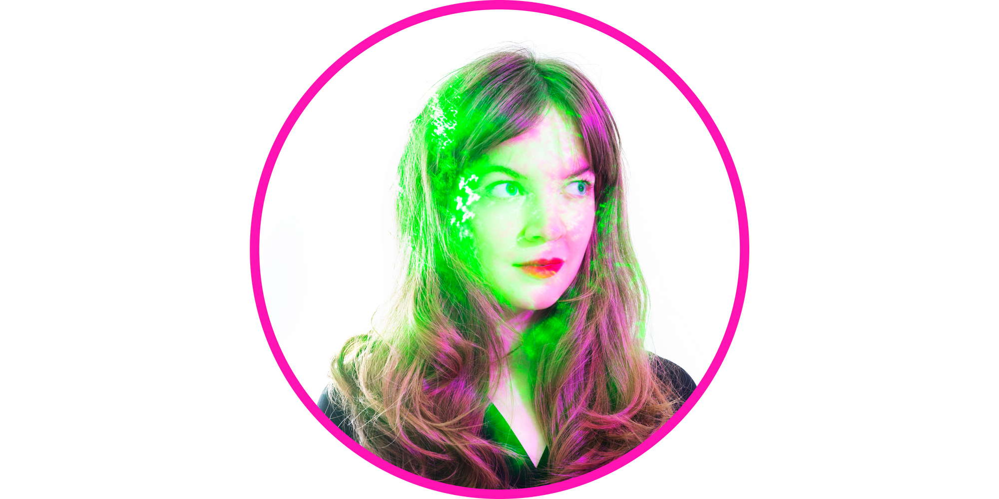
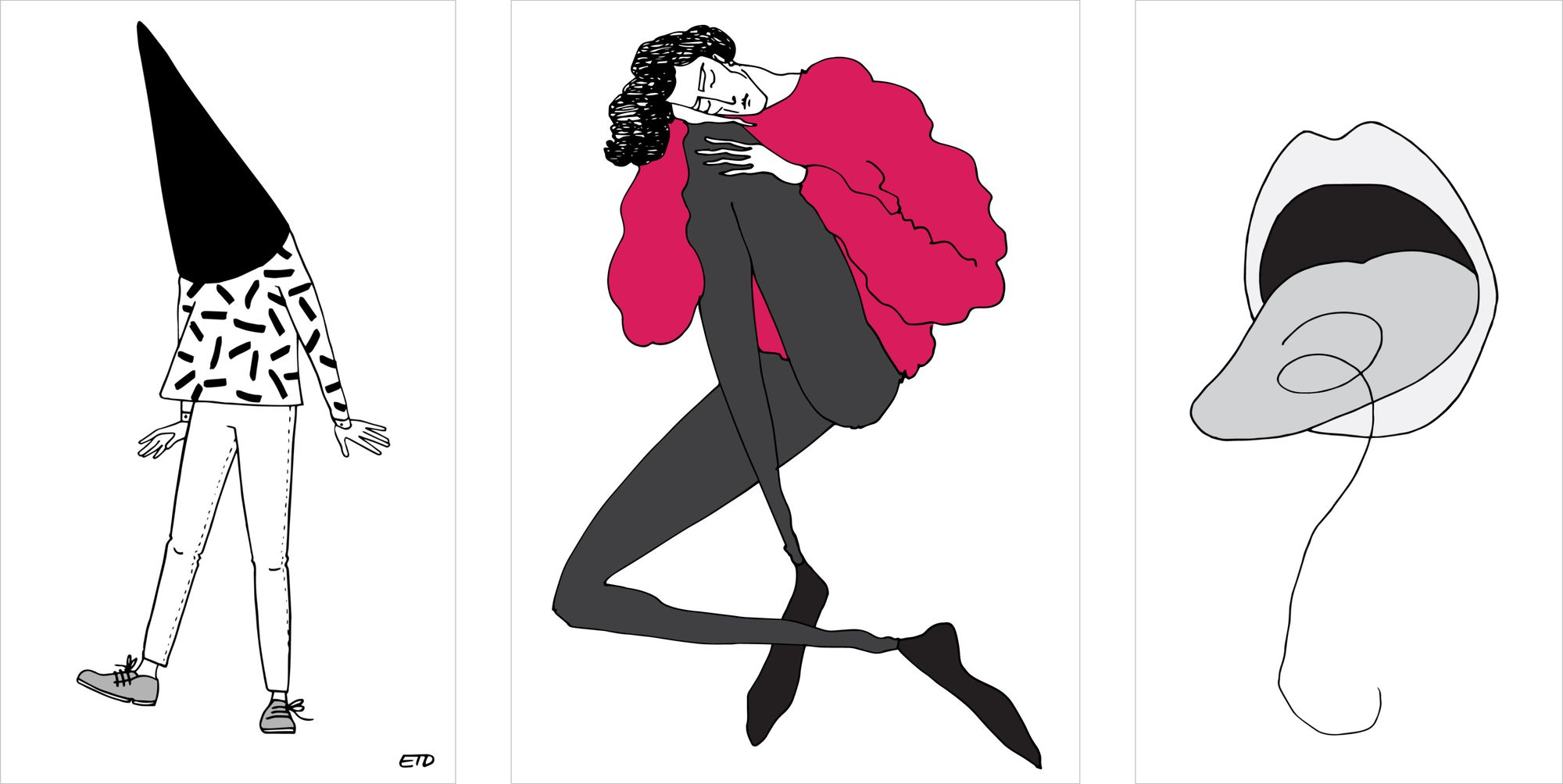
In 2019, Tanya stepped on board Readymag with the task of expanding and refreshing the visual language of the product across social media platforms. Over the years she grew into the position of web designer and is now responsible for all digital editorials, presentations and landing pages created with Readymag. In addition, Tanya regularly makes sideline projects as a graphic designer for global companies (among them International Film Festival in Lisboa) and as a painter, held a personal exhibition called Boys I’ve kissed.
Getting art skills
As a kid, I once drew a picture of an amazing five-legged horse. The horse made my parents think I was definitely gifted, so they insisted I enroll in art school. I studied there for almost ten years and learned everything I could about painting, drawing, watercolor, oil, building perspective and sculpture. When the time was ripe to go to college and turn all of these skills into a profession, my choice fell on graphic design. It was an almost random decision I made without having much of an idea of what graphic design actually meant.
First, I was the worst student in class: since I’d been taught to draw very well, I couldn’t understand the logic of design, which implies that the simpler is always better. If I’d been asked to create a Nike logo back then, I would have drawn a very realistic sneaker.
Led by curiosity and fueled by passion
However, in college I had super-cool teachers who taught me the golden rule of design:
You have to be very lazy about drawing and very inventive in your search for ideas. If you abide by this principle, you’ll be able to come up with simple and easy solutions that convey your message using minimal graphic means.
In college, we had an in-house design lab where students were invited to make real customer projects under the guidance of teachers. I was curious to try all of the possible formats and used my chance to get into all kinds of projects. At the time, I mostly made illustrations—though I keep it a secret, one of these first works was a series of banners with watercolor snowflakes for a theatrical production about the Little Humpbacked Horse. It’s not something to brag about, but back then I scored points using playful fonts and illustrations.
Along with the classic graphic design tools, I also learned some Readymag in college.
I had a crush on one of the teachers, so I was the only student who attended absolutely all of his classes. Even in the early morning hours of January when the weather was really disgusting, I came in with my bob-cut perfectly ironed and my outfit elevated. When we’d finished discussing all the topics on the program, the teacher began telling us all sorts of Readymag tips and tricks. That was how my secret crush determined my future.
Going beyond the static format
I started my freelancing as an independent graphic designer while still in college. First I did projects for several cultural institutions in Moscow: The New Space of the Theater of Nations and event posters for the Strelka Institute for Media, Architecture and Design. Later, I began freelancing for Readymag, making images for social networks and webinar announcements—all of which were very simple—and was soon hired to do the same tasks full-time.

Actually, my transition from graphic designer to web designer happened right in Readymag and was very smooth. During that kind of switch, the most important principle is to adapt to the format in which your works live.
Graphic design is static—the format is close to the pictures you look at in museums. The web inherits the best features from several formats: it takes composition from static pictures and typography from graphic design, while books give it a presence of plot and the ability to flip pages. Films bestow the web with screen scrolling and the ability to frame changes, while the ability to pierce all of the buttons and create scripts for moving around the site comes from games.
The web is similar to a stream because it includes page scrolls and adaptations for different screen sizes. Plus, it always involves interaction, following links, pressing buttons, and scrolling through screens. When working on the layout of a website, a designer has to take into account all of these things. You need to create a layout that can then be poured into any screen capacity and still look and work properly.
Equally important is mastering new instruments, including their physics and capabilities. At first I drew everything in Illustrator because I already had a strong command of it, but then Readymag Product Designer Stas Aki encouraged me to switch to Sketch, since all of the Readymag files are stored in it. All of these tools use similar interfaces and workflow logic, so I got used to them quite quickly. The most difficult part was getting used to new shortcuts.
I remember how, after making cover images for blog posts and visuals for social media, Stas asked me for the first time to assemble the mobile layout for one of our projects, then to lay out one issue of the Readymag Stories Design Archive editorial using a premade template. Though at first I was horrified by this responsibility, I laid out the Designing Women editorial, and all of a sudden I found myself designing all of the Readymag web projects.
In February 2023, I’m celebrating four years at Readymag. Over the years, my work scope expanded from singular pictures to designing more complex systems. Now I am more engaged in inventing concepts for projects, which will include landing pages, social media promo images, videos, GIFs, announcements and more.
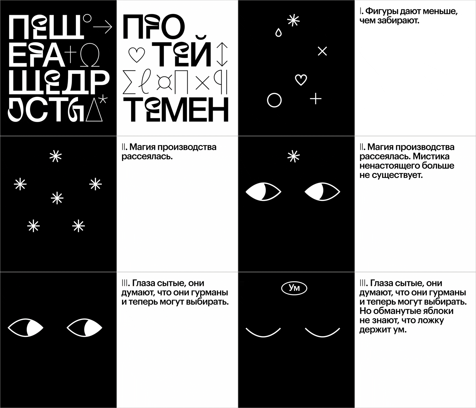
I like to get by with a minimal set of tools. Today it's Figma (which is enough for a start), Readymag, and Adobe After Effects for special occasions. Also, I’m now slowly learning Glyphs to build a custom font for a future Readymag editorial.
Harnessing the stream
Today I don’t separate graphic and web design because now all my projects include both graphic and web aspects. For me, the web is just another means of expressing an idea and conveying a message. The core concept is the same regardless of the format: you need to come up with cool inventive ideas and concepts, and everything else is technical skills that you can definitely pump.
I don’t even think that a college education is a necessary prerequisite. The longer I’m engaged in design, the more designers with unexpected career paths I meet. To start out, you need a basic understanding of typography, composition, colors and grid. To keep growing professionally as a web designer, it’s worth keeping an eye on joint spheres: graphic design, new fonts, etc. I would also add cinema to this list—I really like to watch cinema subtitles—and fashion, because it leads to new trends in combining colors and shapes.