Color theory basics: the color wheel
Let’s go through some color theory basics to make sure your design sends the right message.
In web design, colors reinforce the concept. Understanding color theory can help you select a color scheme that works in favor of your main idea, not against it.
What color theory is
Color theory is a concept that explores how colors relate to one another and how they affect our emotions. There are two main approaches to this theory.
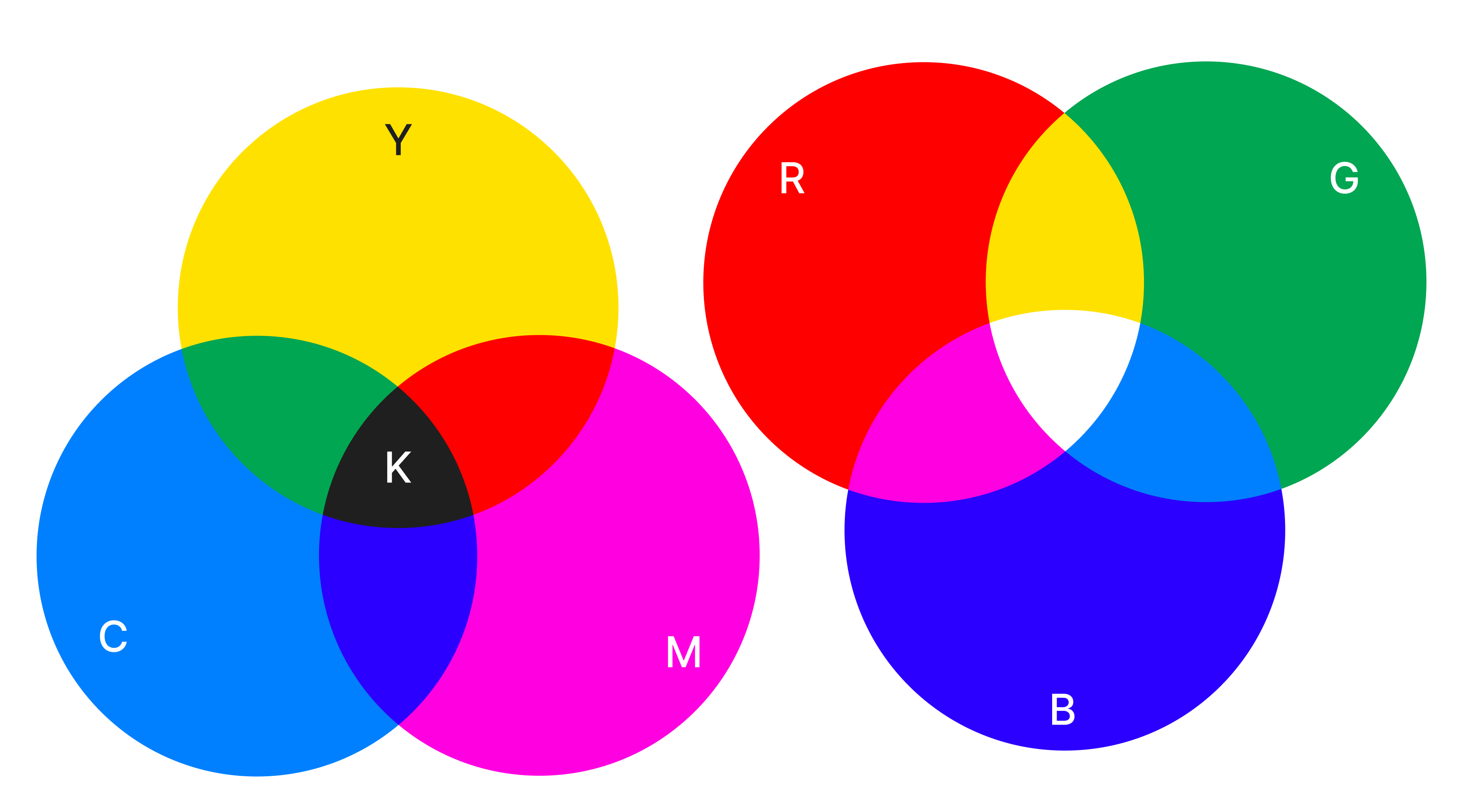
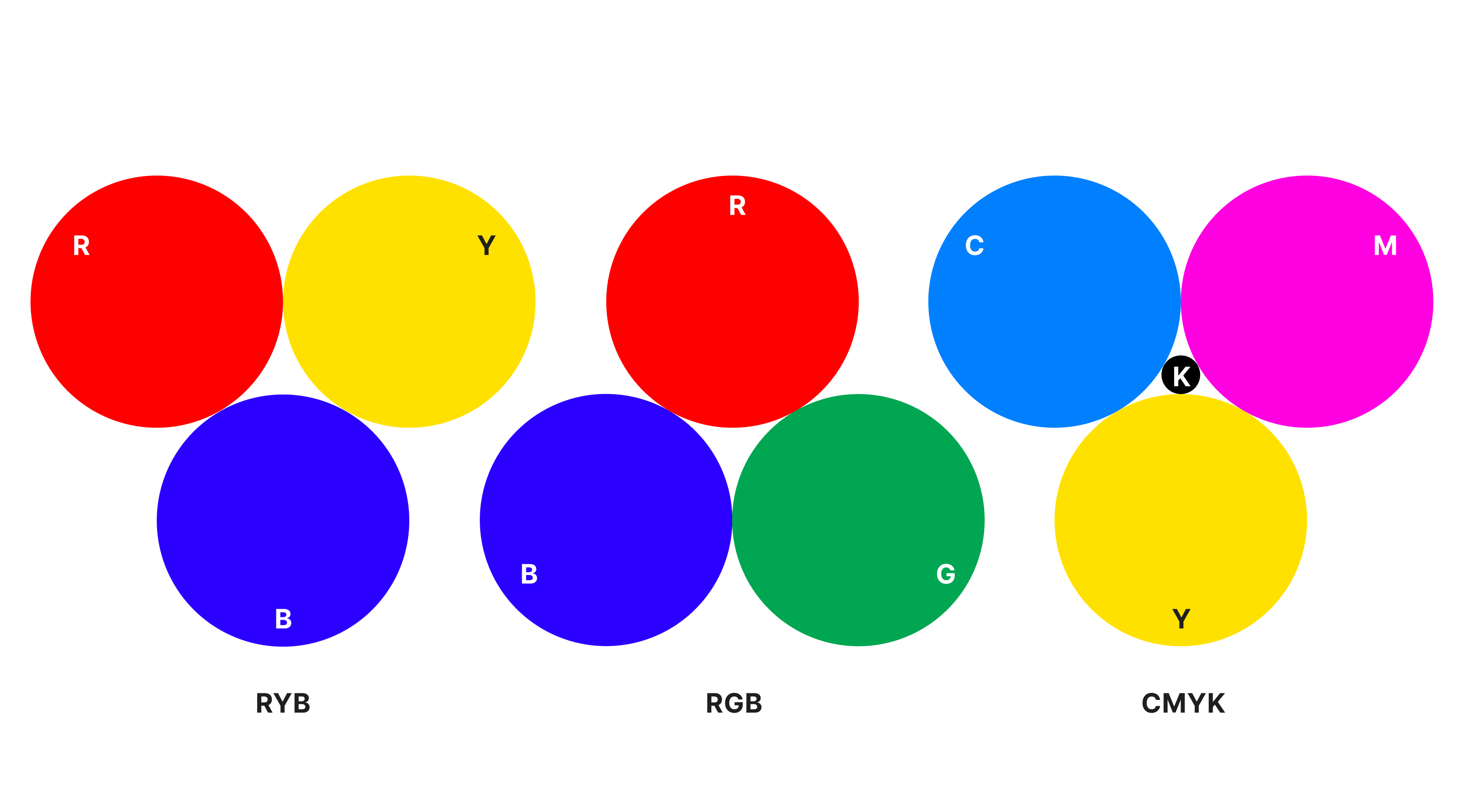
Traditional color theory was inspired by pigments used in paintings and prints. It relies on the RYB model (red, yellow, and blue as primary colors) and introduces concepts like complementary and analogous color schemes.
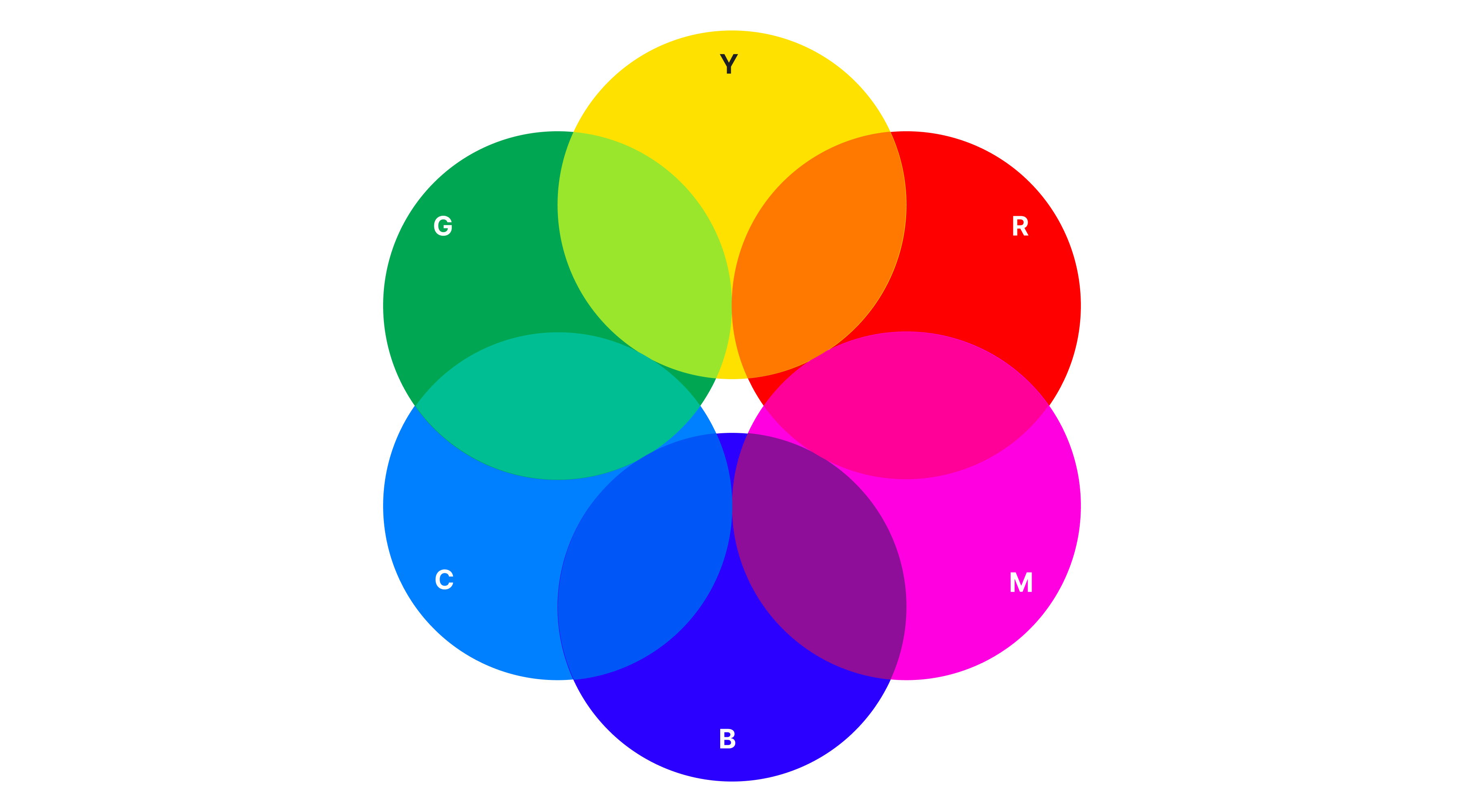
Modern color theory examines how we perceive color on digital screens. It uses systems like RGB (red, green, blue) for digital displays and CMYK (Cyan, Magenta, Yellow, and Key where Key is almost always black) for print. This approach also covers topics like color spaces, contrast, and accessibility.
Traditional theory is great for working with physical materials. Modern theory is useful for digital design, branding, and user interfaces.
What the color wheel is
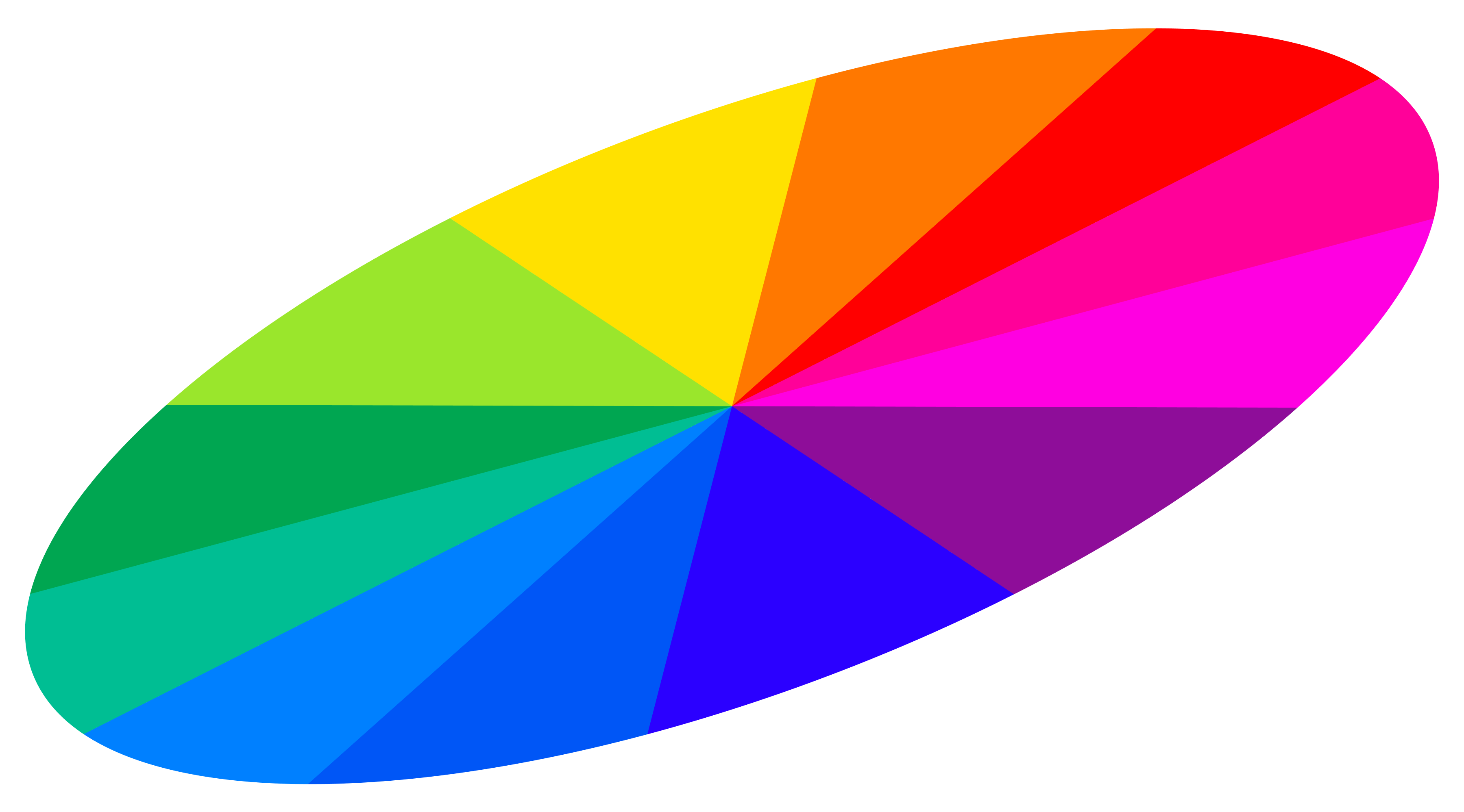
The color wheel is a tool that helps you quickly understand which colors work well together. It looks like a circular diagram that explains the relationships between colors. The color wheel features primary, secondary, and tertiary colors. Below, we’ll take a closer look at each of these color categories.
Primary colors
Primary colors are the base colors used to mix all others. In traditional theory, these are red, blue, and yellow. They cannot be made by mixing other colors.
Modern color systems like RGB and CMYK use different sets of primaries. RGB (used in screens) starts with red, green, and blue. CMYK (used in print) starts with cyan, magenta, and yellow.
Designers use primaries to set a strong foundation for their palette.
Secondary colors
Secondary colors are created by mixing two primary colors. In traditional theory:
- Red + blue = violet
- Red + yellow = orange
- Blue + yellow = green
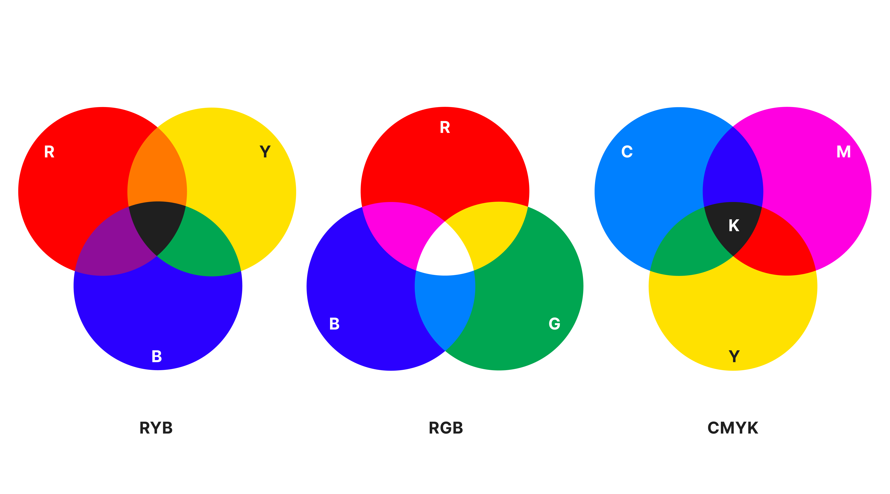
In RGB, red and green make yellow; red and blue make magenta; green and blue make cyan.
These colors add variety to a palette and often create contrast.
Tertiary colors
Tertiary colors come from mixing a primary color with a nearby secondary color. Examples include:
- Red-orange
- Yellow-green
- Blue-violet.
They fill in the gaps on the color wheel and offer more subtle options for web and UI design. Tertiaries help with building balanced, expressive color schemes.
How to use the color wheel to build color schemes
Let’s break down three key concepts that can help you build a color scheme: color groups, color harmony, and color context.
Color groups
Color groups are sets of colors based on their position on the color wheel. Designers use them to build structure into a palette. The most common color groups include:
- Analogous colors. On the wheel, they appear next to one another, like, blue, blue-green, and green. When you use analogous colors, you can create a calm, even soothing look for your web project.
- Complementary colors are opposites, like red and green or blue and orange. This high-contrast pairing draws attention. Use them when you want elements like CTAs to stand out.
- Split-complementary colors are a more balanced take on complementary colors. You pick a base color and the two colors adjacent to its complement. It offers contrast without creating too much visual tension.
- Triadic colors are three colors evenly spaced around the wheel. Think red, yellow, and blue. This color group is good for playful, bold, or creative websites.
- Tetradic (double complementary) colors are two sets of complementary colors. They create a rich and dynamic palette but require careful balancing to avoid clashing.
Each color group serves a different design purpose. When choosing colors for a palette, rely on the emotions you want your design to evoke. If you want to learn more about color theory and psychology, explore Readymag Design Almanac.
Color harmony
Color harmony is the visual balance between hues. It’s what makes a palette feel visually appealing.
There are a few ways to build harmony:
- Keep the saturation similar. Even contrasting hues can look balanced when they share a similar intensity.
- Control the brightness. Mixing bright and muted colors adds depth but can also overwhelm. Adjust value to maintain focus.
- Limit the number of colors. Start with two to three hues and expand with tints, shades, or neutrals if needed.
For example, a modern SaaS landing page might use a triadic scheme with dominant blue, supported by orange accents and soft yellow details. Harmony comes from controlled saturation and lots of whitespace.
Color context
Colors don’t exist in isolation. Our perception of one color depends on what’s around it. This is called color context.
Here’s how context affects color perception:
- Surrounding colors can distort appearance. Gray shades may look warmer next to blue and cooler next to red.
- Contrast influences readability. Light text on a slightly lighter background might technically meet accessibility guidelines but still feel hard to read.
- Accent colors change impact based on the background. A red button on a white page sends the message of urgency. The same button on a dark violet background might feel softer.
Test your palettes in real layouts. Move beyond the color wheel and look at actual user scenarios like dark mode vs light.
Color scheme and color temperature for design harmony
Color schemes define how colors work together in a design. But harmony doesn’t come from color choice alone. Temperature is important too.
Warm colors (like red, orange, and yellow) feel active and energetic. Cool colors (like blue, green, and violet) feel calm. Balance warm and cool tones to support your design’s goal. A landing page with a cool palette and warm accents can guide attention while keeping the overall feel focused.
FAQ
How does color theory work?
Color theory explains how colors interact with each other. It uses the color wheel to show relationships between hues and helps designers create color schemes. The most popular visual diagram of the formation and interaction of colors is Itten's color wheel.
Who invented color theory?
Most sources will name Sir Isaac Newton as the creator of color theory because he invented the color wheel when he was experimenting with light and colors. However, there were attempts to formulate color theory both before and after Newton. Aristotle, for instance, believed that all colors came from mixtures of white and black. Later thinkers, like Goethe and Chevreul, expanded on Newton’s ideas.
Why is color theory important?
For web design, color theory allows you to emphasize key elements in your project and evoke a specific emotion in other people.
Where can I find a color theory example for website design?
A great example is Knit Grotesk, a project built on Readymag. It uses a bold complementary color palette, vibrant orange and deep blue, to create strong color contrast that echoes the interplay of yarn in knitting patterns. The feeling the colors evoke is very much in line with the project’s name—the design looks a bit grotesque. You can see more examples of designers embracing color theory on the Examples page.