Beyond a tool: a decade of design in Readymag
Explore firsthand how the product has been smoothly shaped over the last 10 years and why now you have this very toolbox of Readymag's features.
This month, Readymag turns ten. It grew smarter and easier to use over time—and that growth can be tracked by the constant development of its interface and features. This process was never occasional but the result of thoughtful research, prototyping, testing and tweaking. In searching for inspiration for feature updates and ways to improve the current ones, the team always turned to what they cherish—creativity.
Read this anniversary blog featuring comments from the Readymag Head of Design, Stas Aki, and Head of Product, Mikhail Nikolaev, to explore how product decisions smoothly shape Readymag’s editorials and are shaped by them as well and why you can now enjoy this very pack of features.
2013: Releasing the tool for digital magazines
Readymag was launched to the public in 2013 as a tool for web magazines, conceived by a group of design agency friends. You’ll get the idea if you combine the words ‘ready’ and ‘magazine’.
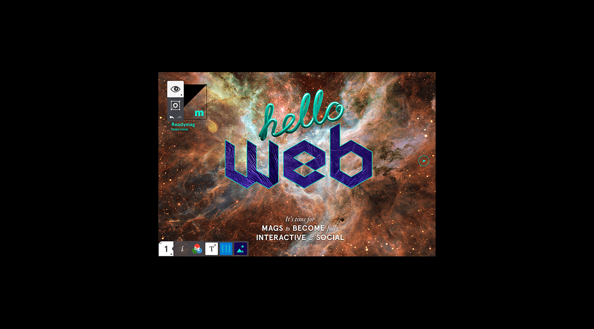
Like any digital product, Readymag started some time before its public release. This cosmo-inspired picture from 2012 is actually the first-ever public user interface of the Editor—a virtual work desk for future websites.
“Readymag was first created to design zines. In those years, zines became popular partially due to Apple: it had an app called Newsstand, where you subscribed to a magazine and got a nicely laid-out product with pics and GIFs. After some time, Newsstand was discontinued, and that’s when Readymag stepped in.”—Stas Aki, Head of Design at Readymag
“Back then, there were hardly any no-code tools for web designers and all websites were laid out with HTML,” Stas Aki recalls. “Also, there was Macromedia Flash software, which was the closest thing to a no-code web design tool. After it lost popularity, there weren’t any proper alternatives to Flash for several years, so if you wanted to make websites, you had to learn HTML.” Aki shares that Readymag came to the market and changed the game by allowing people to design without coding while having complete control over the layout, and gradually became a versatile tool for anything on the web.
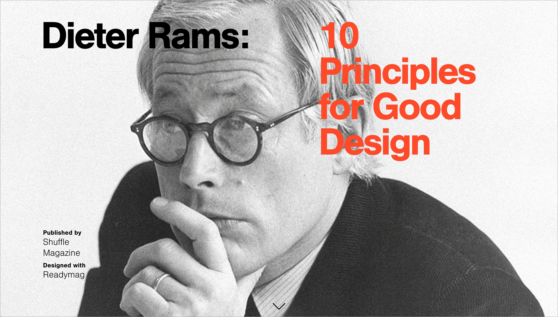
Since a picture paints a thousand words, Readymag contrived and laid out an editorial to showcase the horizons it opens for digital publishers and designers. The laconic and smooth piece exploring the 10 principles for Design by Dieter Rams saw the light in 2013. It also established a nice tradition that Readymag still follows: initiate projects that don’t just highlight the tool but also share knowledge. Since then, almost every year, Readymag publishes its own educational and inspirational editorials that use the latest features to narrate, structure and put in accents.
“Our own creative experience becomes the impulse for new features. If we notice that we lack something in our own projects, we add it. I’ve never been able just to sit and click through the interface to understand what we might need. I needed to make up a wholesome content piece and be head-to-toe in the process, spot all the irregularities, and map out tweaks, possible additions and removals.”—Stas Aki, Head of Design at Readymag
2014: Shaping the Viewer
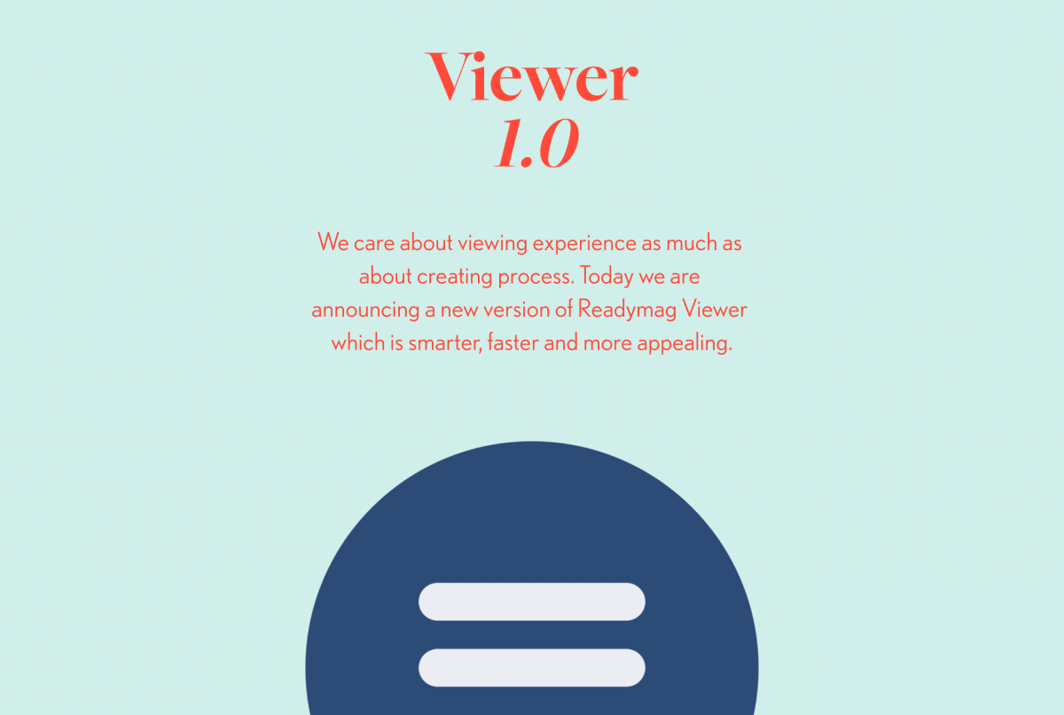
The first enhancement of 2014 was the Viewer. The Viewer is a distinct part of Readymag’s interface, which contains settings for published projects and determines how they’re displayed. Since its release, Readymag has had a Viewer where every page can be switched horizontally using arrows, changing the height of the page and then moving further by click—just like in real-life magazines. But as the tool itself moved forward, something had to be changed in the Viewer. That year, it got a bunch of under-the-hood tech improvements, a mini-menu for seamless navigation and a specific end page where you can preview other projects on the publisher’s profile.
“From the beginning, apart from the editing experience, Readymag has been thinking about how websites will look when published. Since Readymag operates in browsers, and browsers are constantly evolving, development on the Viewer is an ongoing job where you always have to keep up to the highest standards.”—Stas Aki, Head of Design at Readymag
2015: Shifting to animation
2015 was marked by the development and wide use of animations. Publications, which started out as motionless, turned into dynamic, ever-changing stories.
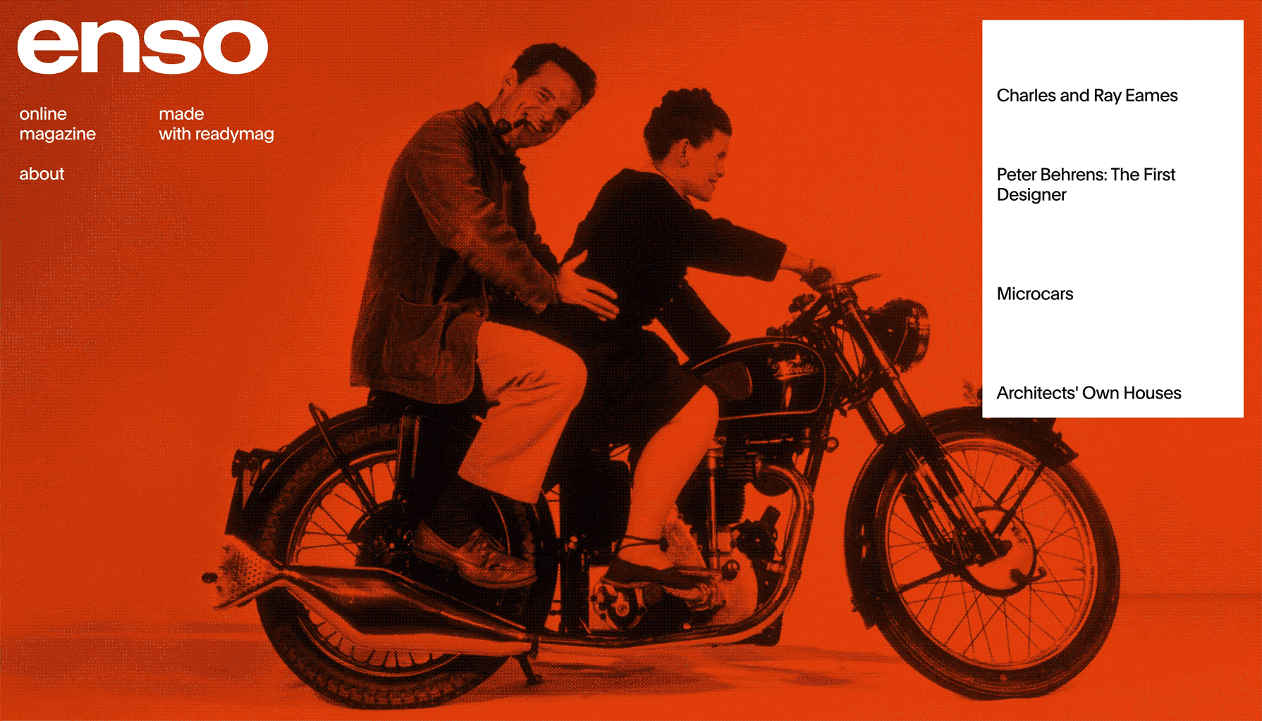
The Enso editorial appeared as the forerunner in early 2015. It was a project to test animations in action before releasing them to the public, and a loud transition from previous static websites to interactive stories that unfolded with the help of animations.
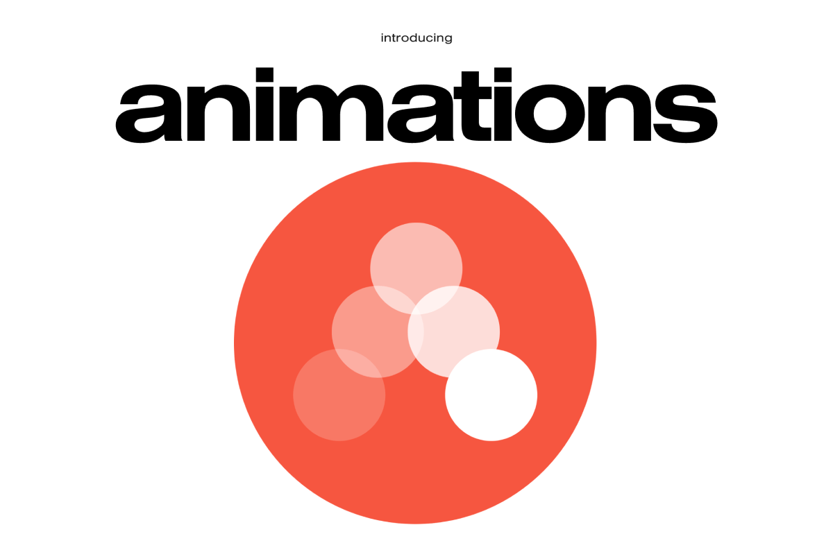
“The first animations in Readymag were almost the same as the ones available now: four types of internal triggers and four types of effects. What made them so special is that they didn’t have a timeline and don’t have it now. You don't need a timeline for the tasks that Readymag solves at the current stage—the animation works fine without it. Besides, you don't have to think about where to put key points, how to splice frames together, and what transitions to make.”—Stas Aki, Head of Design at Readymag
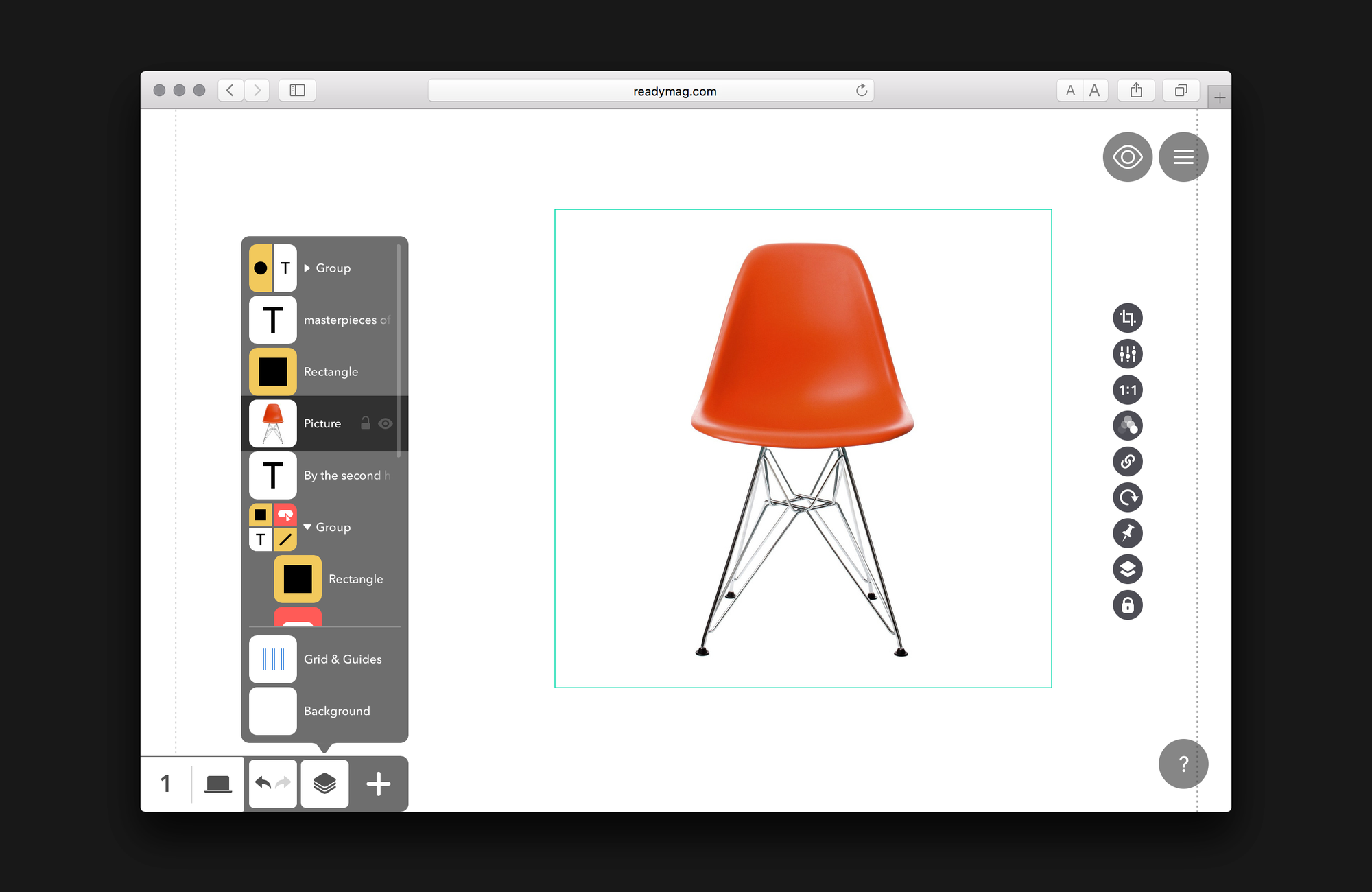
2016: Structuring layers
Designs are nearly impossible without layers, but what’s crucial is how they’re arranged. In 2016, the Readymag team gave the Layers panel a re-do, making them easier to find, navigate, change and arrange. Since then, you can find any element you might need in a few clicks, and, what’s more, the whole panel looks just great.
2017: Making layouts responsive
An orderly, compelling website design is only half of the page’s effectiveness. The rest of the responsibility rests on how it will be displayed: whether or not the margins of the screen will cut it, and if yes, then how?
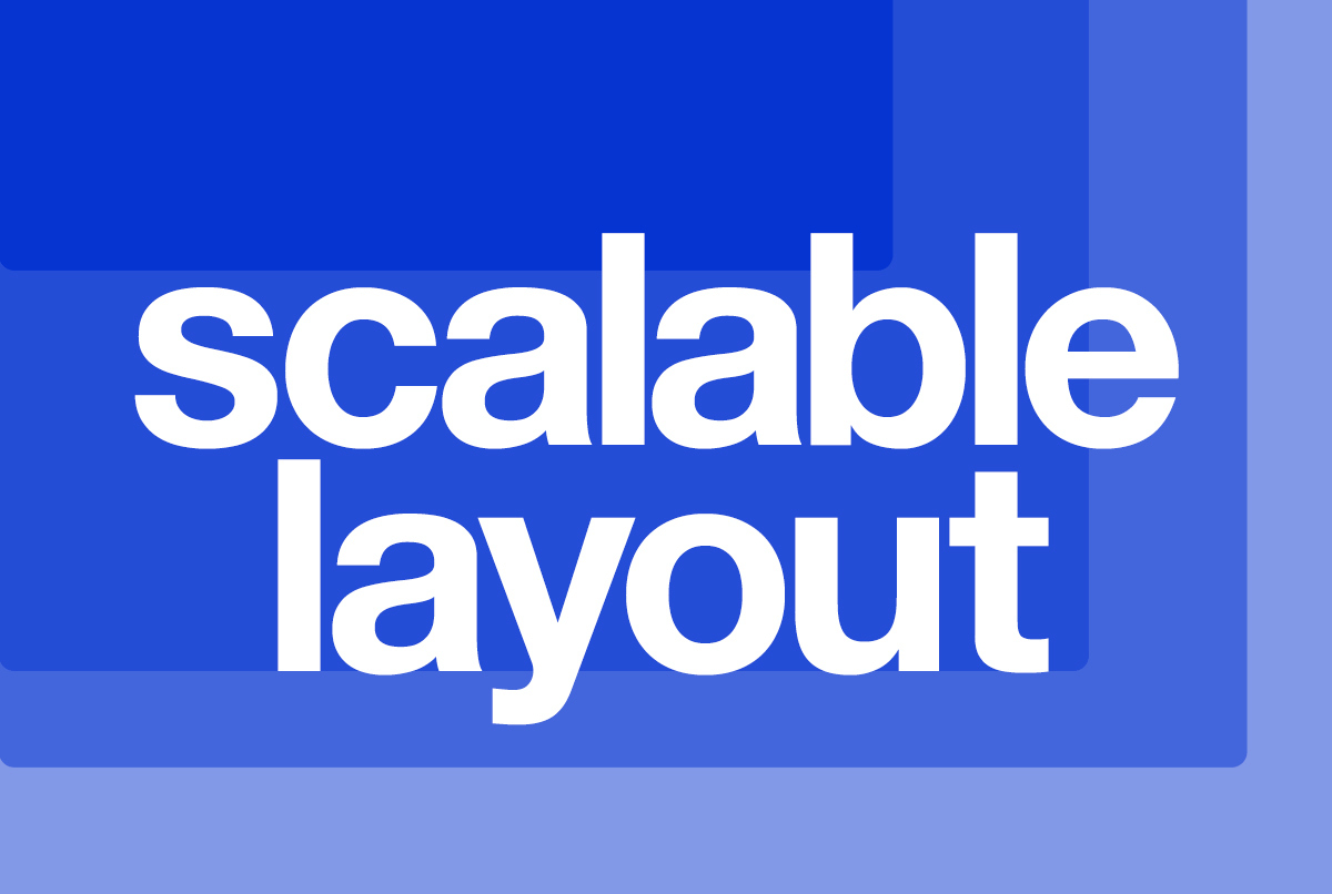
Scalable layout came as the solution to this challenge. It allows you to squeeze and stretch the page, leaving the content proportional and adequately resized for different desktop diagonals.
“Web design largely depends on the characteristics of devices, and there are so many of them on the market nowadays. Plus, you need to adapt your layout to each device and its width. In classic web design, this is labor-intensive: you have to set breakpoints and overall spend time and effort on the process. That's why we devised an elegant way to deal with different devices that turned out extremely convenient and popular. Now designers don't have to spend effort where they could do without it.”—Mikhail Nikolaev, Head of Product at Readymag
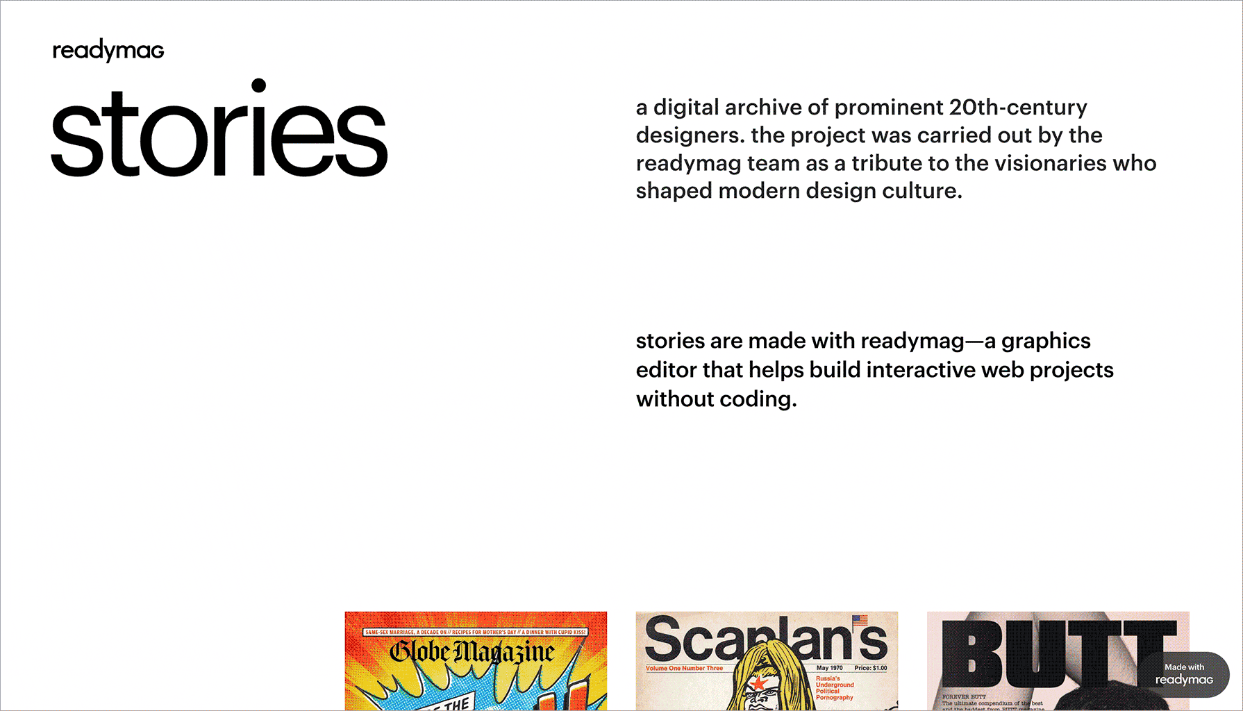
Stories—a digital archive devoted to the outstanding designers of the 20th century—was the first to test and fit the Scalable layout and, of course, to celebrate the prominent figures and their heritage that have shaped the design practice we all follow now.
2018: Going more automated
2018 came rushing in with Auto Layout for mobile devices and the On all pages setting.
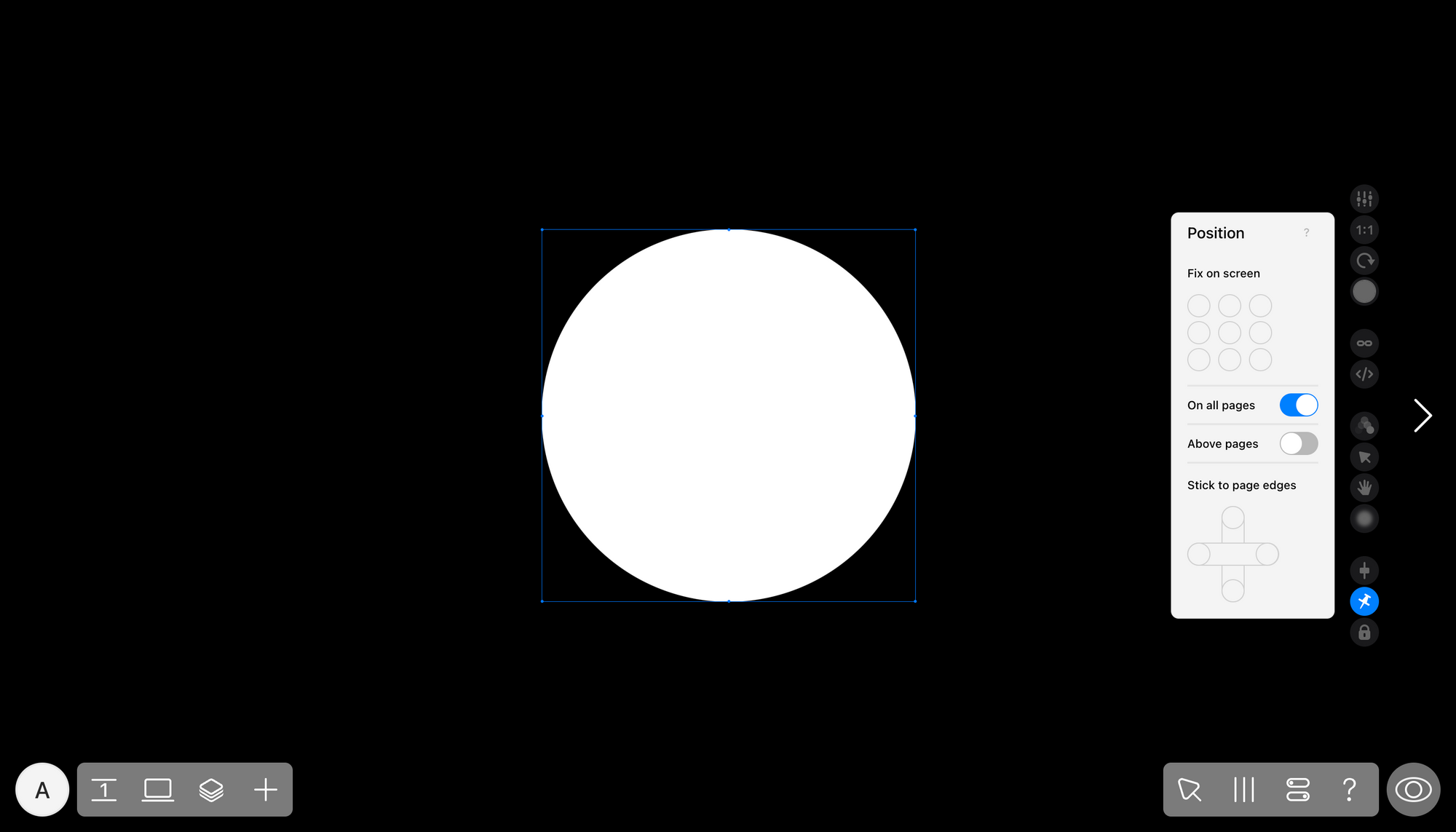
The On all pages setting allows designers to not waste their time creating repetitive elements, such as footers or headers, and assign and tweak them all at once for the whole website.
Automated layouting for mobile devices in action
Before 2018, mobile versions of websites were laid out by hand, which meant lots of manual work and details to keep in the designer’s head. Readymag wanted to ease that process and thus developed a fully-automated layouting for different devices. All you had to do was click on the ‘Auto-layout’ button, choose the device and get your widgets neatly ordered by Readymag. If something wasn’t laid out like you expected, you could tweak the composition until the final version meets your goals.
“We changed our approach to mobile layout in 2023. Not everyone was comfortable with this compulsory automation—in Readymag, creatives build complex layouts, and some can’t be automatically restructured—so we made the mobile layouting semi-automated. Now you have complete control in choosing from the three options of composition and specifying which widgets it affects.”—Mikhail Nikolaev, Head of Product at Readymag
2019: Re-imagining the Profile
In 2019 came the Profile’s turn. Initially, the team had the idea of giving a social function to the profile: you can share your profile like in social networks, but afterwards, it recognised that Readymag is about the product, not the socials. So the Profile became totally different, obtaining more clarity and space for projects, settings and functional elements.
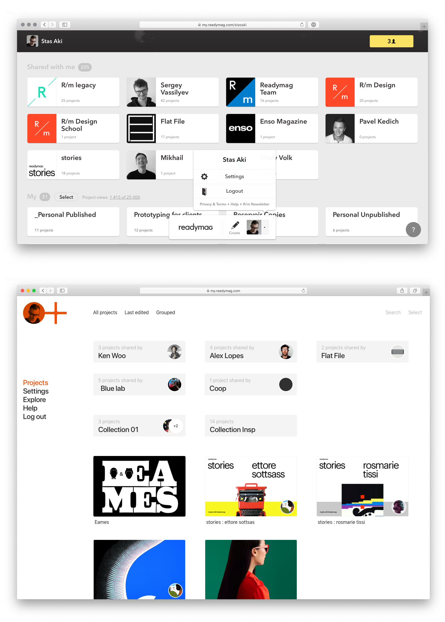
“The initial Profile was a workable one, but it wasn’t perfect. Our users would say they wanted to log in and instantly access their projects. But then they saw the custom wallpaper on 80% of the screen and had to scroll down to the projects. So, we decided the Profile didn't need any special design and unnecessary icons, as they would quickly become outdated. That's why we made the new page as simple as possible: no design, no pop-ups, just a maximally blank chart that won't get boring. Since then, there have been no urges to redesign it stylistically, animate it or change the background. Now we just keep working with the user's needs within it.”—Stas Aki, Head of Design at Readymag
2020: Introducing E-commerce
As with most features, Readymag’s been on the E-commerce widget for a while to allow designers and business owners to seamlessly offer products and services on their websites without third-party integrations. And in 2020, it was ready to help you sell your goods.
“At some point, we noticed that our users started to create shops using their own workarounds, so we developed a convenient e-commerce tool. However, we wanted to avoid turning Readymag into an e-commerce platform, which is why we chose to make the feature work through easy-to-add integrations.”—Mikhail Nikolaev, Head of Product at Readymag
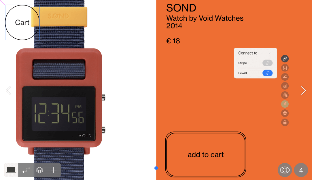
Now the E-commerce widget allows you to pick from two major vendors and set up a worldwide online shop in less than an hour. Then, just customize the widget to your taste and business needs. You may want to check out these two awesome examples: a trendy page for a publishing project and a dynamic lingerie shop.
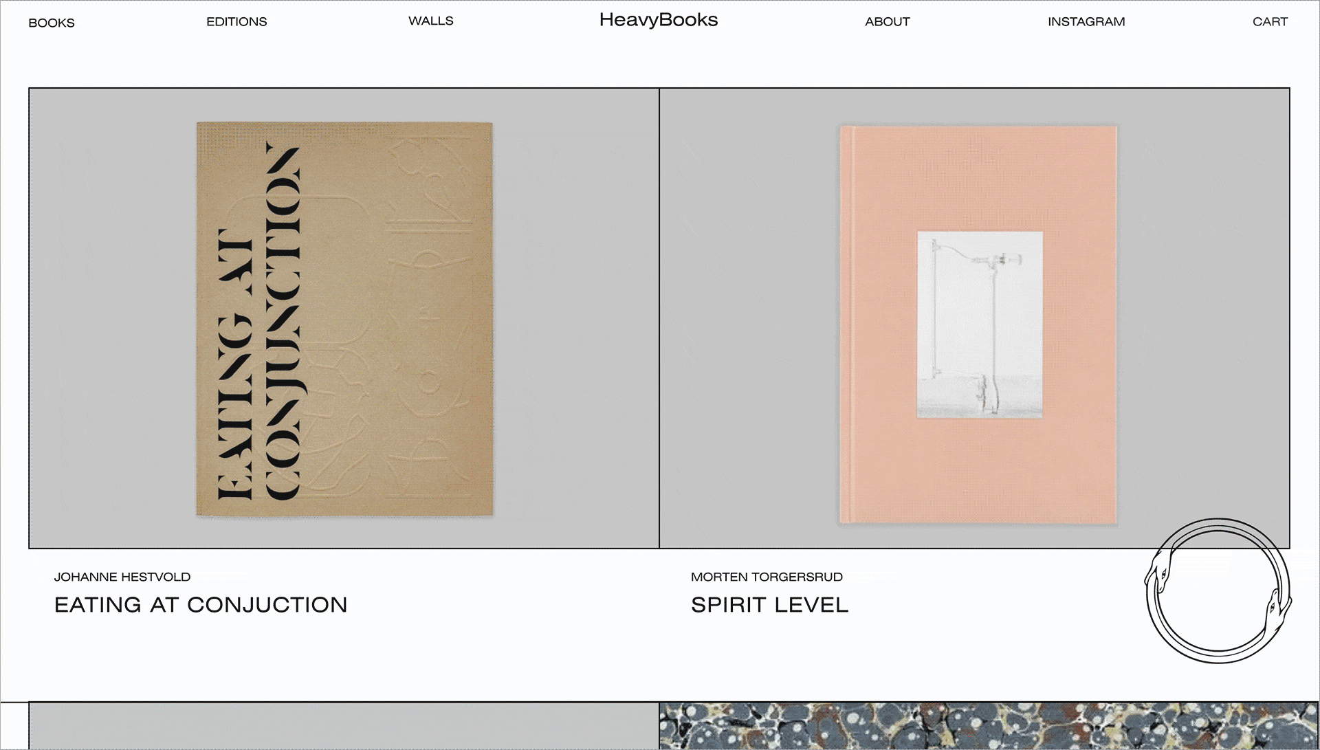
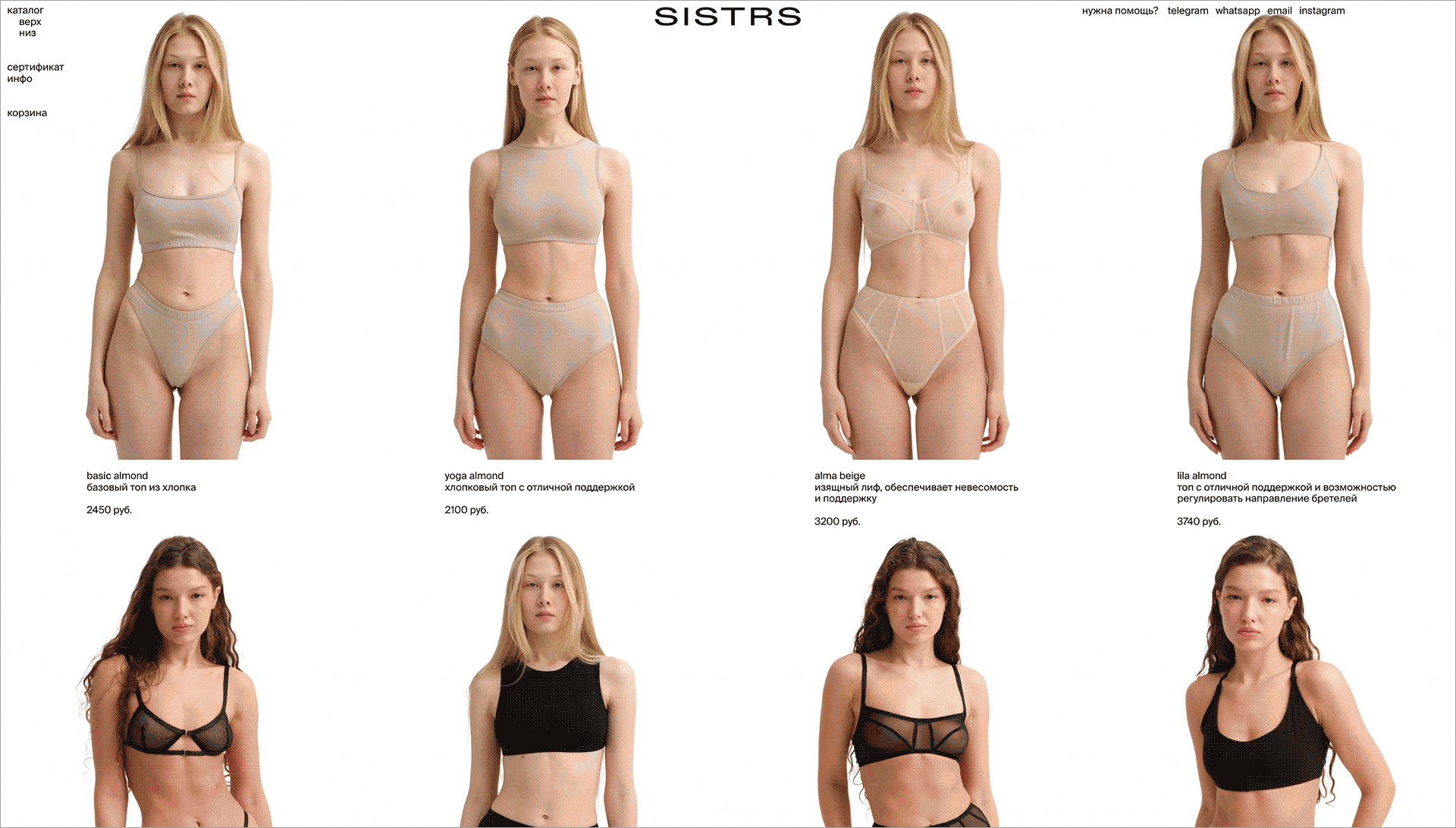
“The E-commerce widget has turned out to be an incredibly good solution when it comes to small creative stores. It’s not very convenient to set up large shops, as updating products becomes too time-consuming, but for shops with up to 20 items, it works wonders.”—Mikhail Nikolaev, Head of Product at Readymag
2021: Delivering new interactive features
2021 was rich in product features with an accent on interactivity. Since then, you can make website elements draggable, upload custom cursors and let them change whenever you want, outline text and pictures with dynamic shadows.
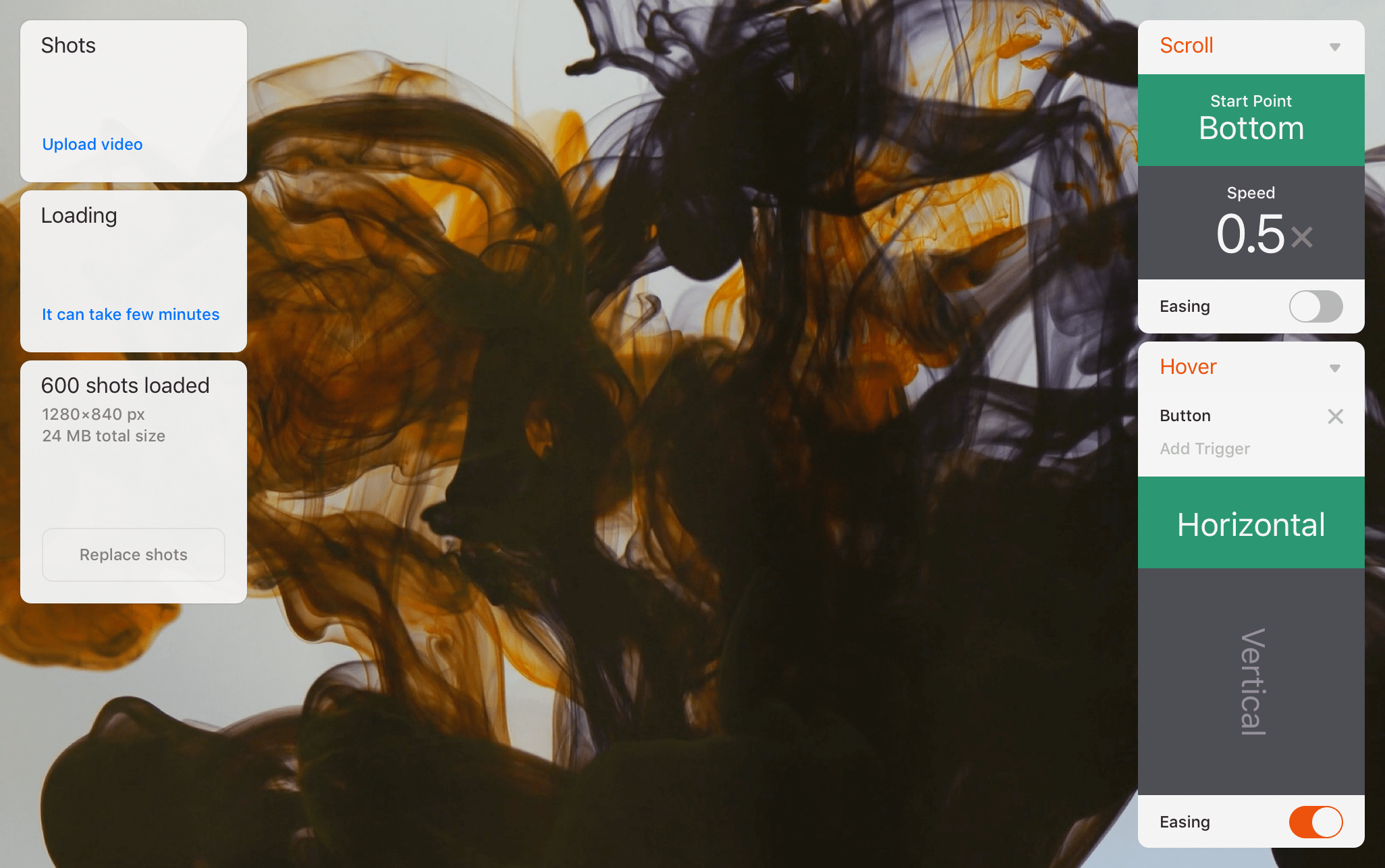
Also, back then, the Readymag team enhanced Shots, reactive frame-by-frame sequences triggered and controlled by cursor movements, scroll or click, which became one of the most loved and catching features Readymag boasts. It’s better to see Shots once to understand what kind of magic they create.
Check out all the significant and ‘wow’ moments, small yet meaningful updates of 2021 in the interactive recap. This editorial was laid out specifically to show each of them in action next to the feature description. Moreover, the roundup is just so visually satisfying.
2022: Re-defining the Editor
In 2022, the team decided the Readymag Editor needed a light retouch. It wasn’t a spontaneous move but instead a way to tailor it up to the principles of the Readymag UX.
As the tool is committed to sharing knowledge with the world, in 2022, the team lifted the curtain on the main principles behind the Readymag User Interface.
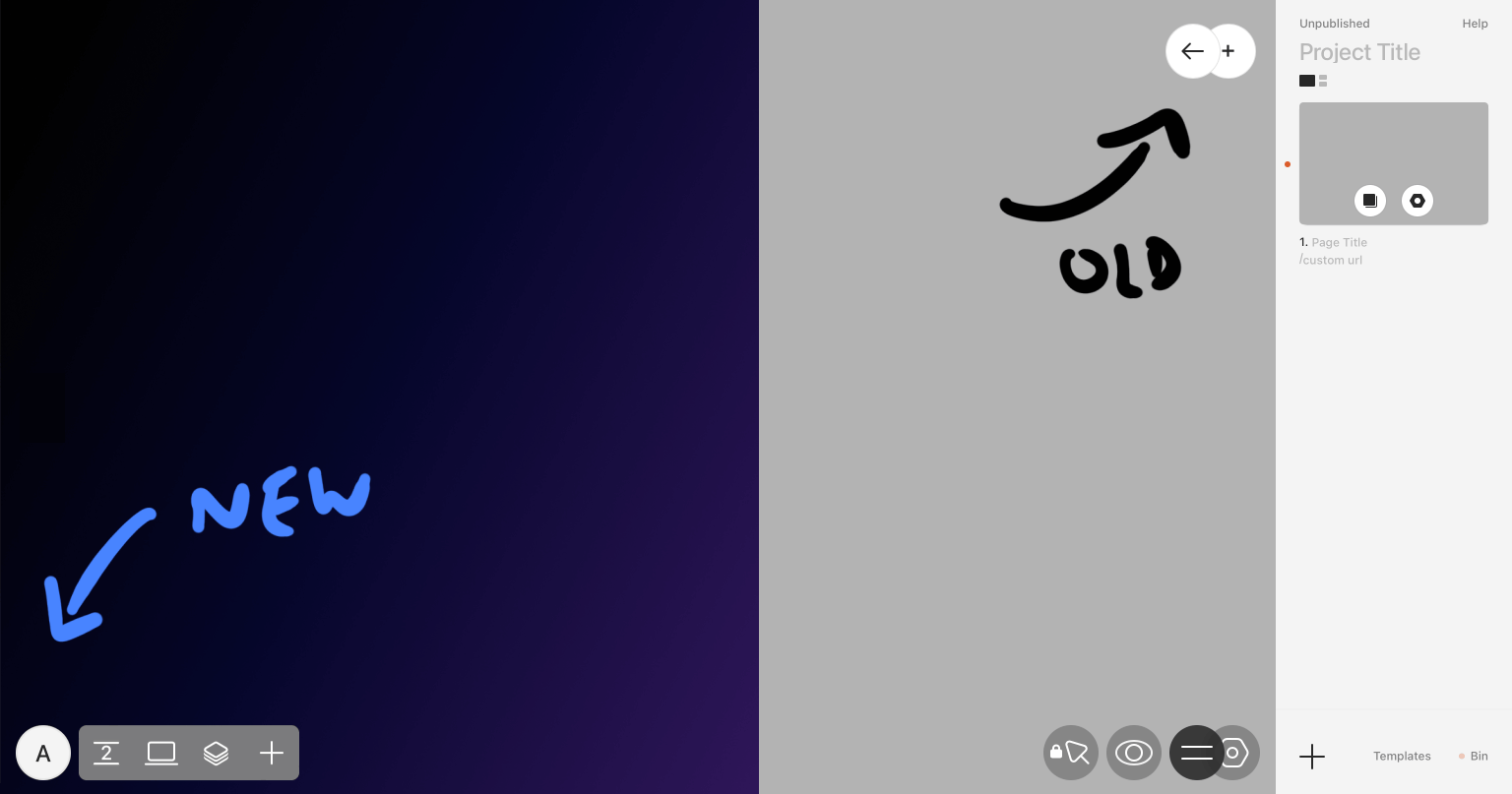
“The UX rules we formulated for ourselves in the essay are reflected in the new Editor design. It’s very much about balance. I hadn’t explicitly thought of symmetry: it was found in the process of creation. I saw how everything appeared symmetrical and immediately thought of the new interface as a car with headlights. But then I realised there were five plus five elements, and the Docks looked like an extension of human hands.”—Stas Aki, Head of Design at Readymag
A short video about the concept behind the new Editor
The new Readymag Editor came with two Docs, each having five main elements as a symbolic continuation of designer hands. The left Dock mainly deals with projects in progress, while the right lets you switch between modes, preview your designs and define settings for the Viewer.
2023–∞: Still in progress
In 2023, Readymag released a bunch of helpful things to streamline your design routine to make it swifter and more effortless. As for the future, the team is working on a new and more powerful version of the Viewer and enhancing the Animation. Keep an eye on the updates—they’ll help you get even more creative, effective and lucrative in your designs.
Become an essential part of Readymag’s journey into the future of the web—sign up for free.