Architecture, design & 3D modeling combine to create event website
An international conference called Future Architect took place in Moscow in September. Its edgy identity was created by Ira Ivanova, an independent Russian graphic designer and Readymag ambassador.
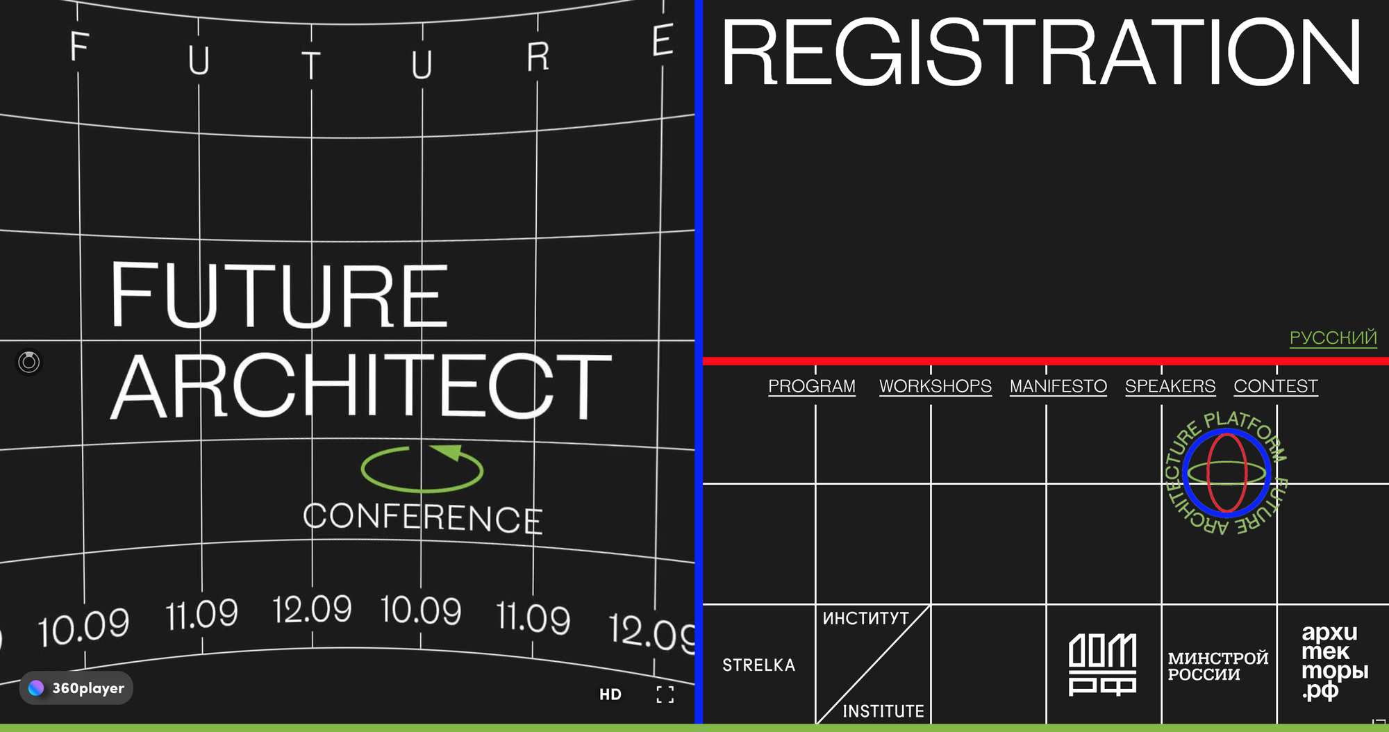
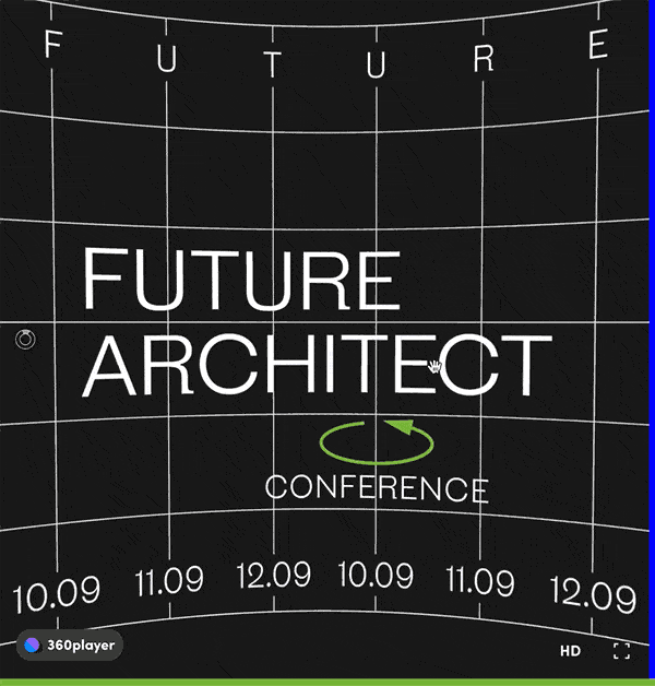
An international conference called Future Architect took place in Moscow in September. Its edgy identity was created by Ira Ivanova, an independent Russian graphic designer and Readymag ambassador. She also made a minimal but memorable website for the event featuring an interactive 360° panorama.
Ira joins the Readymag blog to discuss the aesthetic and concept of the conference, the allure of technical graphics, and how Scalable Layout helped her switch from print to web.
Interdisciplinary tools as a source of inspiration
Today the architect’s profession is getting increasingly digital, with buildings designed in 3D using elements of gamification and VR to present projects. In the future, such interdisciplinary skills will become essential. The organizers of the conference, Strelka Institute and архитекторы.рф educational program, asked me to reflect these changes in the identity of the event. During our brainstorm session, I made two lists in my sketchbook of cutting-edge tools and technologies utilized by architects today.
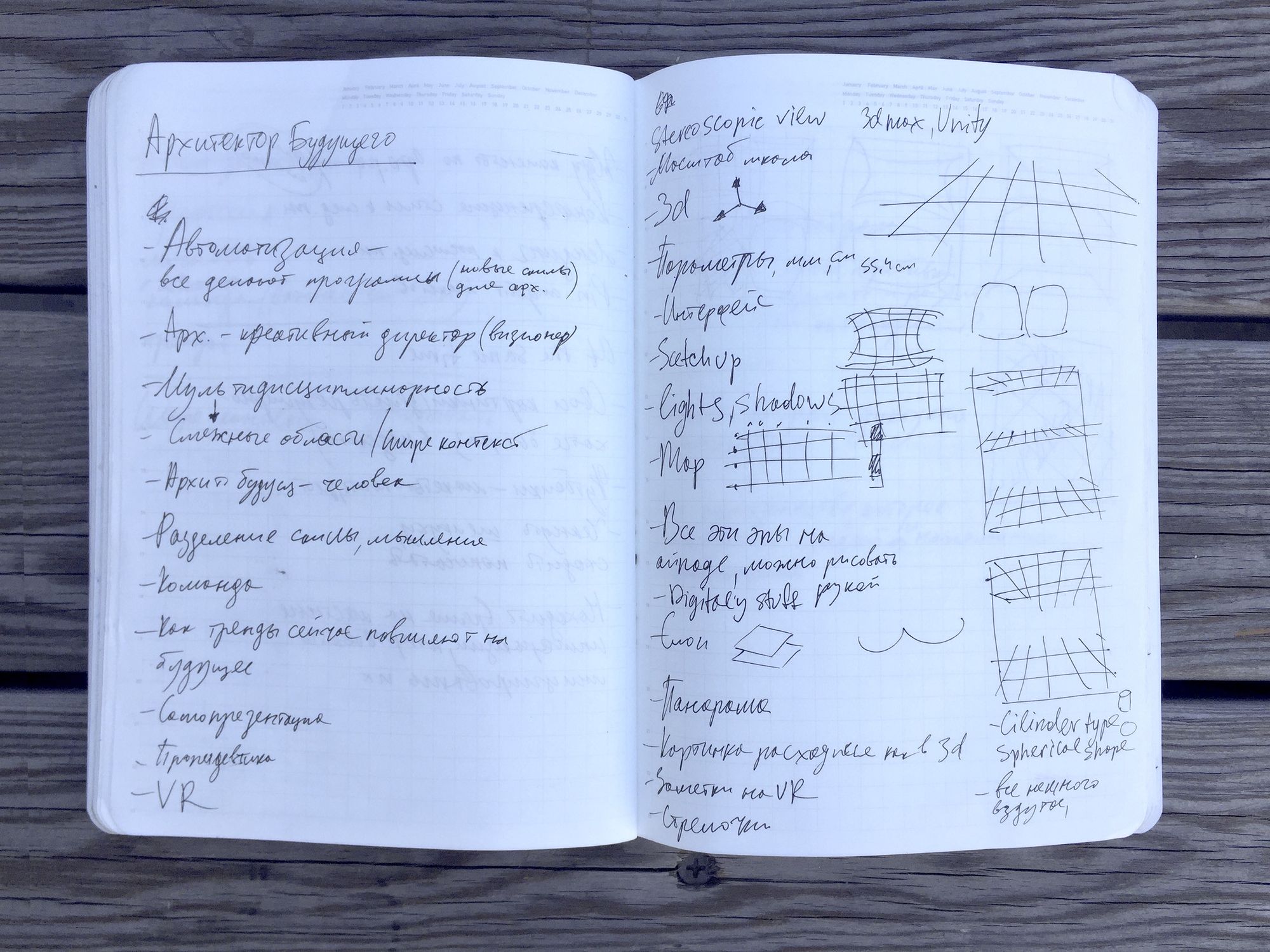
After some Googling I found inspiration in the interfaces of 3D modeling software. I’ve long been fond of technical aesthetics and technical graphics. To me they feel very sincere and honest; they do not try to please the viewer or sell something. Also, technical graphics have what I call “material resistence”: recognizable features and a particular character. My goal as a designer is to extract this quality, amplify it, and use it as an advantage in my work.
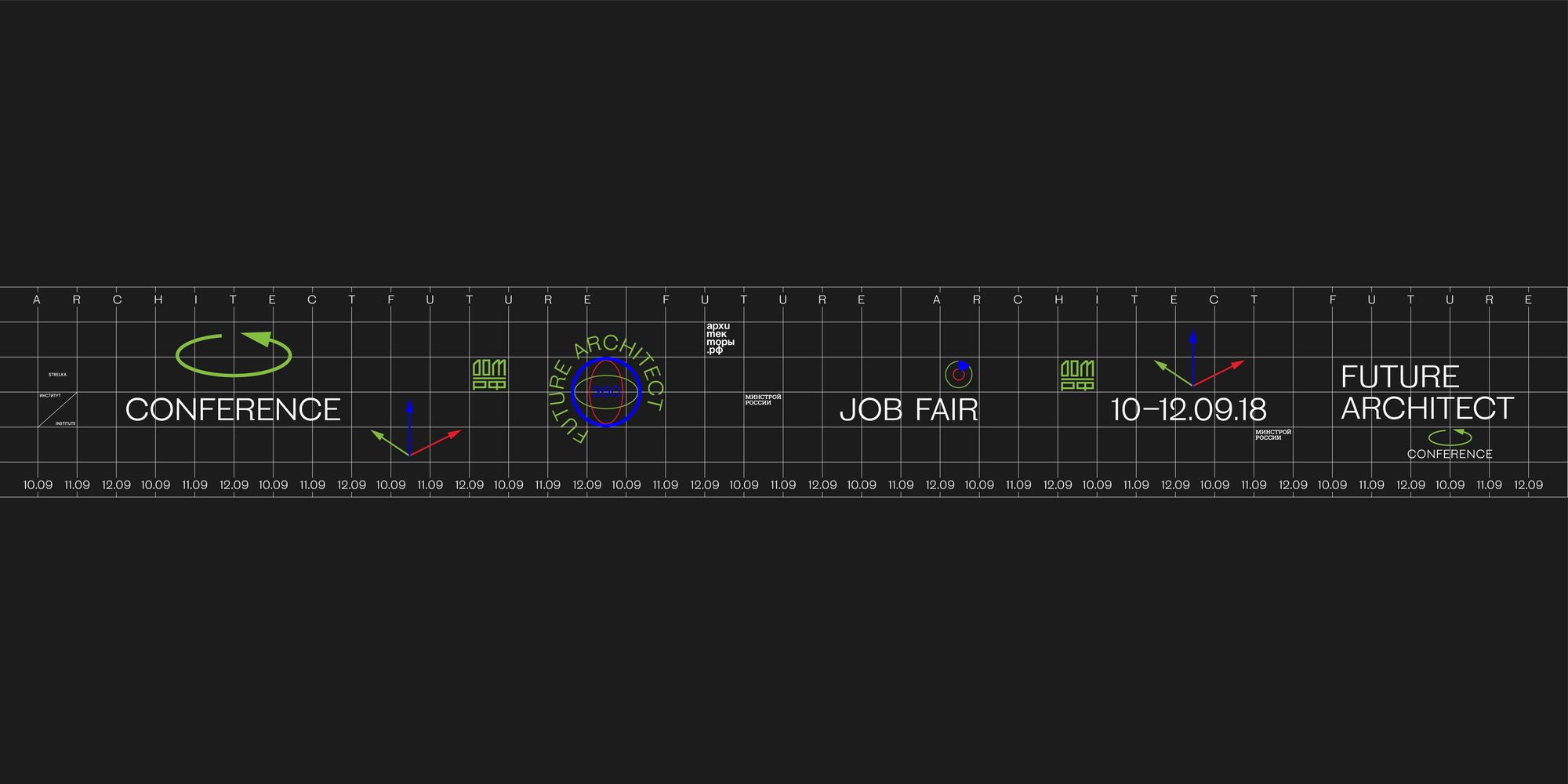
For the conference’s identity I combined several elements standardly used in 3D modeling software interfaces: a black background, perspective grid, and the specific organization of space, with the screen separated into distinct sections. For the website’s favicon I used a triadic red-blue-green arrow — in 3D editors this is used to indicate operational dimensions. Red, blue, and green were also used as color accents through the rest of the website. Also, green happens to be the signature color of one of the conference’s partners. It’s not always easy to work with this shade but used in this combination it looks good.
Steinbeck paired with interactive panorama
I created the website of the conference using Readymag. Its first screen is a cover split into three parts: registration, menu, and an interactive panorama with the name of the event. We used a static version of the cover for promotional purposes on social media.
A few words about the panorama: I was eager to include an interactive element and searched for a free service that could transform flat pictures into something dynamic, so the viewer could pan across it. The 360player.io service perfectly suited my goal. I achieved my panorama and integrated it using code embed.
The first screen also features an animated logo of the conference — that’s a gif on a transparent background. It moves across the menu, that’s been implemented with animation.
The second screen presents the timetable of the conference. The organizers were constantly updating the details so I decided to just put the names of the workshops and discussions in large type. I use only one font for the entire website: Steinbeck, a fresh creation by Russian font designer Roman Gornitsky.
Next to each event there’s an inscription for “more info” — clicking on it opens a pop-up banner. To implement this effect I used trigger animation with transparency changing from 0 to 100. The inscription is a large text widget, a banner opens wherever you click on the endorsement. Next to each “more info” there’s a small cross. You don’t actually have to click exactly on the cross to close the banner — any click on the text block will work.
The site utilizes Readymag’s Scalable Layout feature. I love this so much and will keep using it in the future. I’m originally a graphic designer and for a long time it was hard for me to switch to the web. The reason was self-evident: in graphic design elements are static; the dimensions of the project don’t change. But the web displays in multiple formats and sizes and it’s impossible to create a new version of the website for each of them, so the project often looks very different on various devices. Scalable Layout solves this problem. Future Architect looks nice on any device.