5 principles for creating eye-catching event landing pages
Five simple strategies with real examples and ready-to-use event website templates.
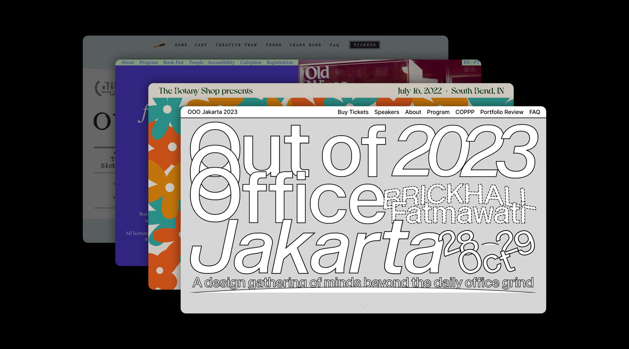
Crafting an event website that grabs attention and brings in sign-ups can be daunting, especially when you’re faced with a blank page. In this guide we’ll walk you through five key principles and show you how easy-to-use event website templates powered by Readymag can help jumpstart your creativity.
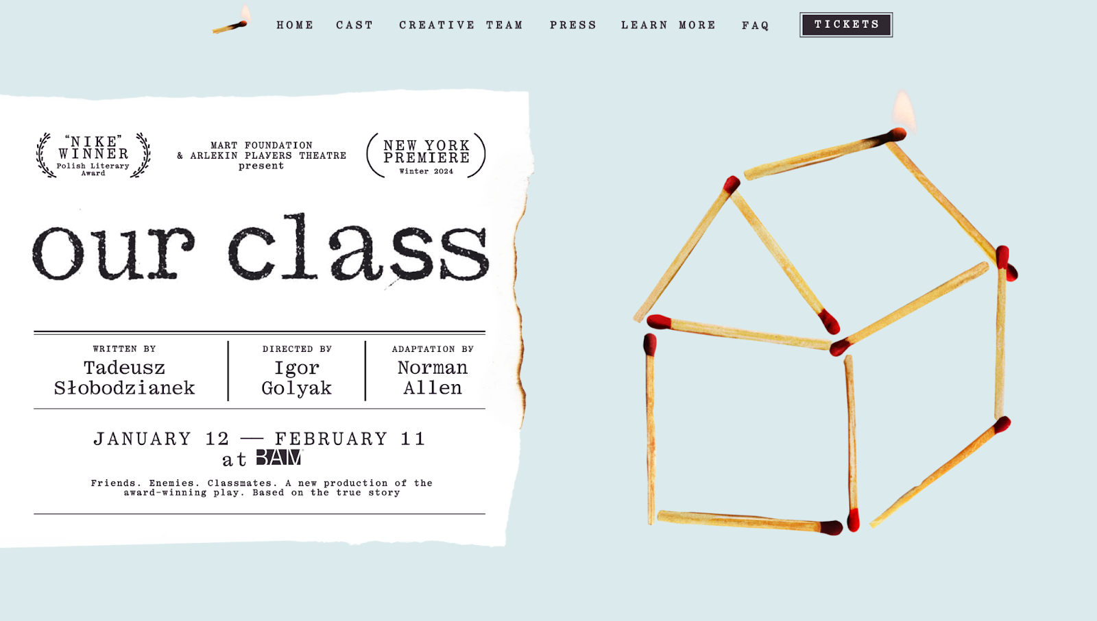
Principle 1: start with a story
Every event has a story. Whether it's the journey of an annual conference evolving over the years or the fresh, ambitious vision behind a brand-new workshop series or performance, your event's narrative sets the stage.
Example: the "Our Class" play page grabs you right off the bat with a striking story—the twisty tale of ten friends, split down the middle by their faiths, that spans decades of history. This immersive effect is achieved through live photos, dynamic graphics, and a captivating visual of a house constructed from matches that slowly breaks down as you scroll. These elements combine to draw you deeper into the narrative, making the drama feel alive and compelling.
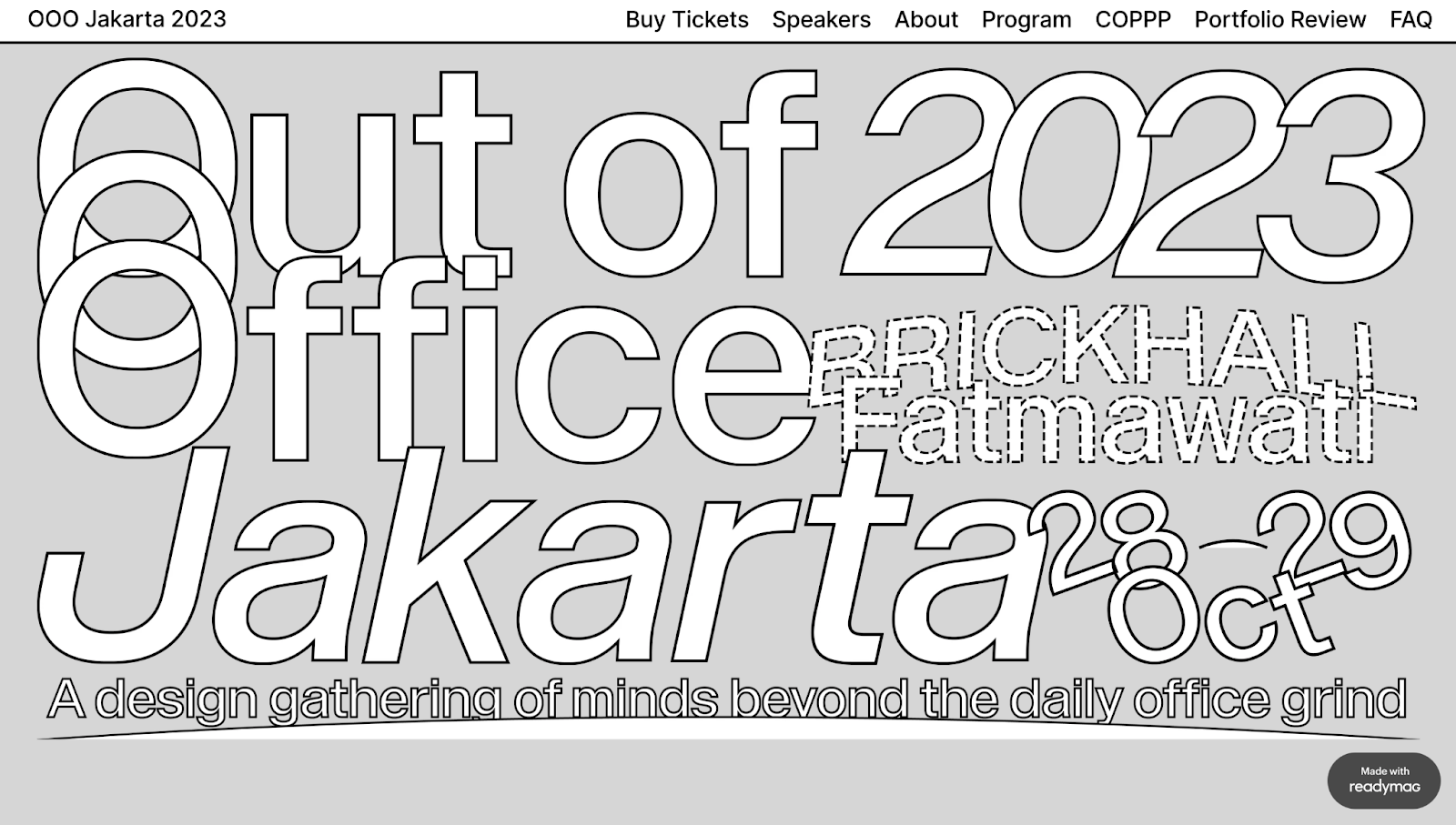
Principle 2: master visual hierarchy
Think of your event page like a storybook. Visual hierarchy is all about arranging things so visitors naturally glide from one part to another, catching all the bits you want them to see without getting lost.
Example: take the “OOO Jakarta 2023” event site as a prime example. Their site is sliced into blocks, making it super easy for anyone dropping by to get the lowdown. First up, you're greeted with eye-catching info about the event. Scroll down a bit, and you're introduced to the speakers. Keep going, and you'll hit the event schedule. This setup makes sure you soak in the important stuff in the right order, without feeling overwhelmed.
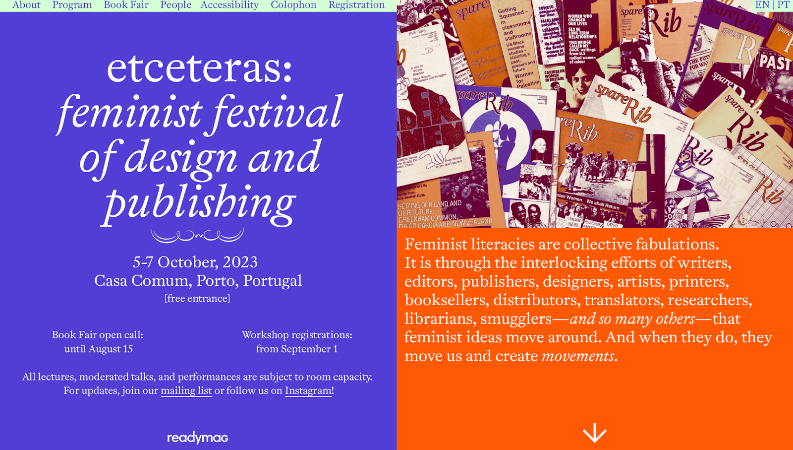
Principle 3: choose colors and fonts wisely
Color and typography are the silent yet powerful communicators of your event's vibe. They keep your page looking sharp and boost readability. Here’s how to wield these tools effectively:
- Colors: сhoose a palette that resonates with your event's essence. Whether you're aiming for something vibrant and bold or soft and tranquil, make sure your colors harmonize and evoke the desired emotions. Tools like Color Mind or Color Hunt can help you craft the palette that aligns with your event's energy.
- Fonts: keep your main text easy to read so everyone can get the info they need. But, for your headers, have a little fun to make your event pop. Check out tools like Monotype or Mixfont to find good font combos.
Example: the “etceteras” festival totally nailed their color game. Each vivid color complements the others, inviting you to dive deeper into what the festival is all about. The fonts they chose tell the festival's story without making things hard to read. This mix of strong colors and matching fonts makes a friendly space that really shows off the festival's vibe: powerful, creative, and welcoming.
Principle 4: go dynamic
Dynamic features like animations or interactive blocks do more than just decorate your page—they engage. Imagine scrolling through a page and stumbling upon a video tour of the event venue or an animation that illustrates the event theme. Movement creates an experience.
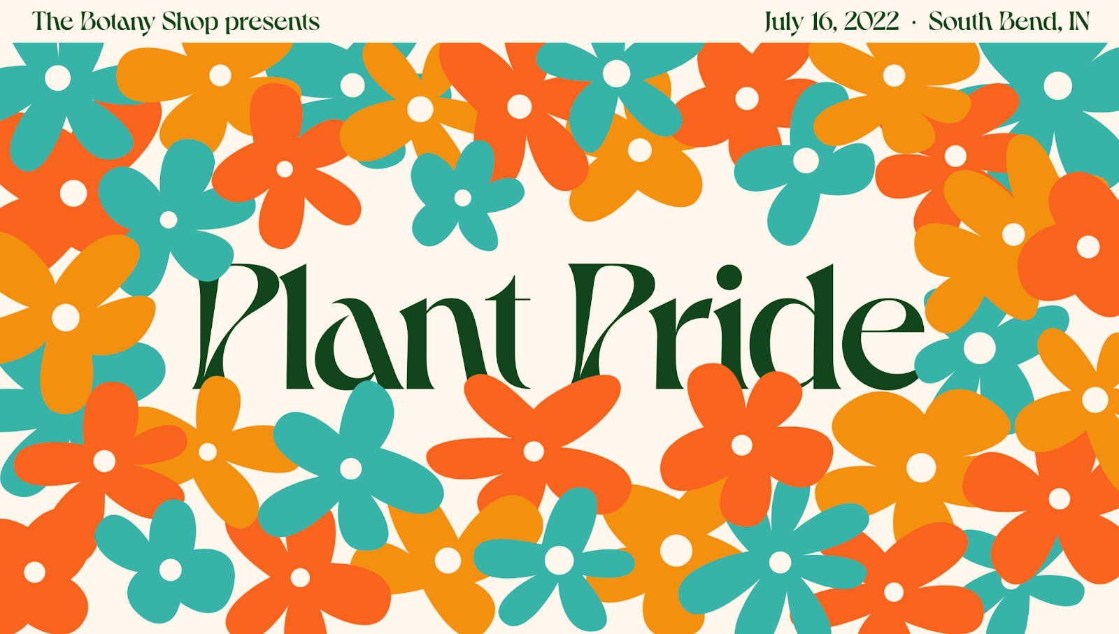
Example: “The Botany Shop Presents” uses vibrant colors and illustrations, making the brand identity instantly recognizable. But what really sets their site apart are the animations and dynamic blocks on the website that breathe life into the page. These elements transform the static into the spectacular, making the visual identity not just seen, but felt.
Principle 5: optimize for mobile users
Mobile devices generate 66% of global website traffic. So, with the majority of internet browsing happening on mobile devices, your event page must offer a seamless experience across all screen sizes. Tap into the principles of mobile design strategy in our latest piece.
In a nutshell
Start with a catchy story, organize your page so it's easy to follow, pick eye-catching colors and fonts, make sure it looks good on phones, and add some appealing videos or interactive bits. Aim to make your page so engaging that people can't wait to sign up and join the fun.
Besides, Readymag is always here to help you deal with the blank page, offering inspiration and ready-made event website templates to craft a story for your event.