What makes outstanding design projects. 5 stories behind Projects of the Year 2021
5 Readymag Projects of the Year 2021 winners speak on making their inspirational designs.
Successful web designs are thoroughly planned and prototyped — or invented right on spot. Eye-catching imagery is hours of 3D modeling — or an instant drawing by an inspired child artist. Award-winning works require months of intensive collective labor — or several days of individual inspiration. Here’s five stories behind Readymag Projects of the Year 2021 winners.
Tricks not seen before
Obys, a design agency from Kharkiv, Ukraine have a dozen jaw-dropping websites under their belt — with Readymag at the center of their workflow. “We tried to implement tricks that we have not seen in Readymag before. And we’re absolutely happy to get this award again”, hints CEO and art director Viacheslav Olianishyn at Obys’ web zine about Peter Lindbergh, awarded at Projects of the Year 2020.
Grids, earned Project of the Year 2021 in Storytelling (as well as Site of the day at Awwwards and three prizes at CSSDA), is third in the series of graphic design education zines published by Obys. “We identified four types of graphic grids used in our work and tried to describe them as accurately as possible, providing good examples”, Viacheslav explains. “Initially, the whole team was involved, we started with a moodboard, found the main design principle and wrote the text. Then, one of us made a prototype in Figma and implemented it in Readymag.” The project took about three months from start to finish.
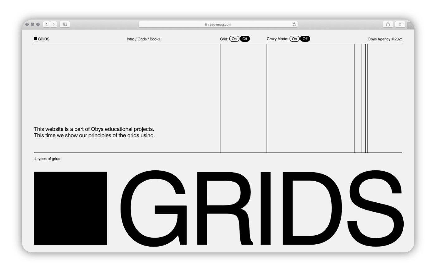
Grids is restrained in color and images, it has a pretty strict — naturally, grid-based — layout. With monochrome shapes, clear typographic hierarchy, spectacular narrative animation and satisfying transitions, the layout resonates with the content, almost becoming a part of it.
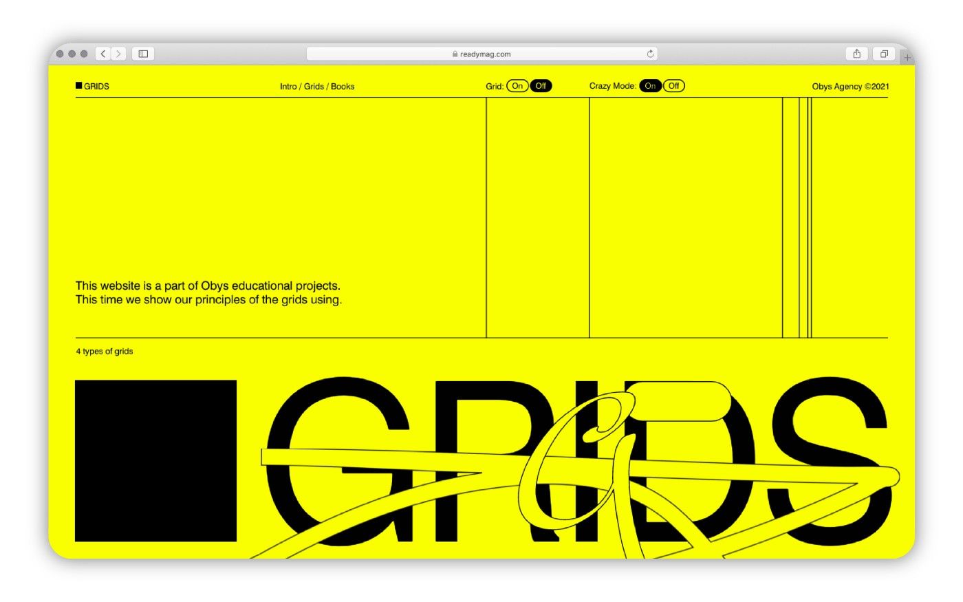
Things become a lot less restrained if you toggle Crazy Mode in the menu: the background becomes acidic yellow, accurate geometric shapes and sans-serif types turn into childlike doodles (which also start flying around the screen.) “That is definitely our favorite part of the project,” remarks Viacheslav.
A much more dynamic way
A personal portfolio made with Readymag was Raissa Quintão’s first venture into web design. “I did not start with any certain brief, rather with my intention to show my work in an authentic way”, explains the Brazilian multidisciplinary designer.
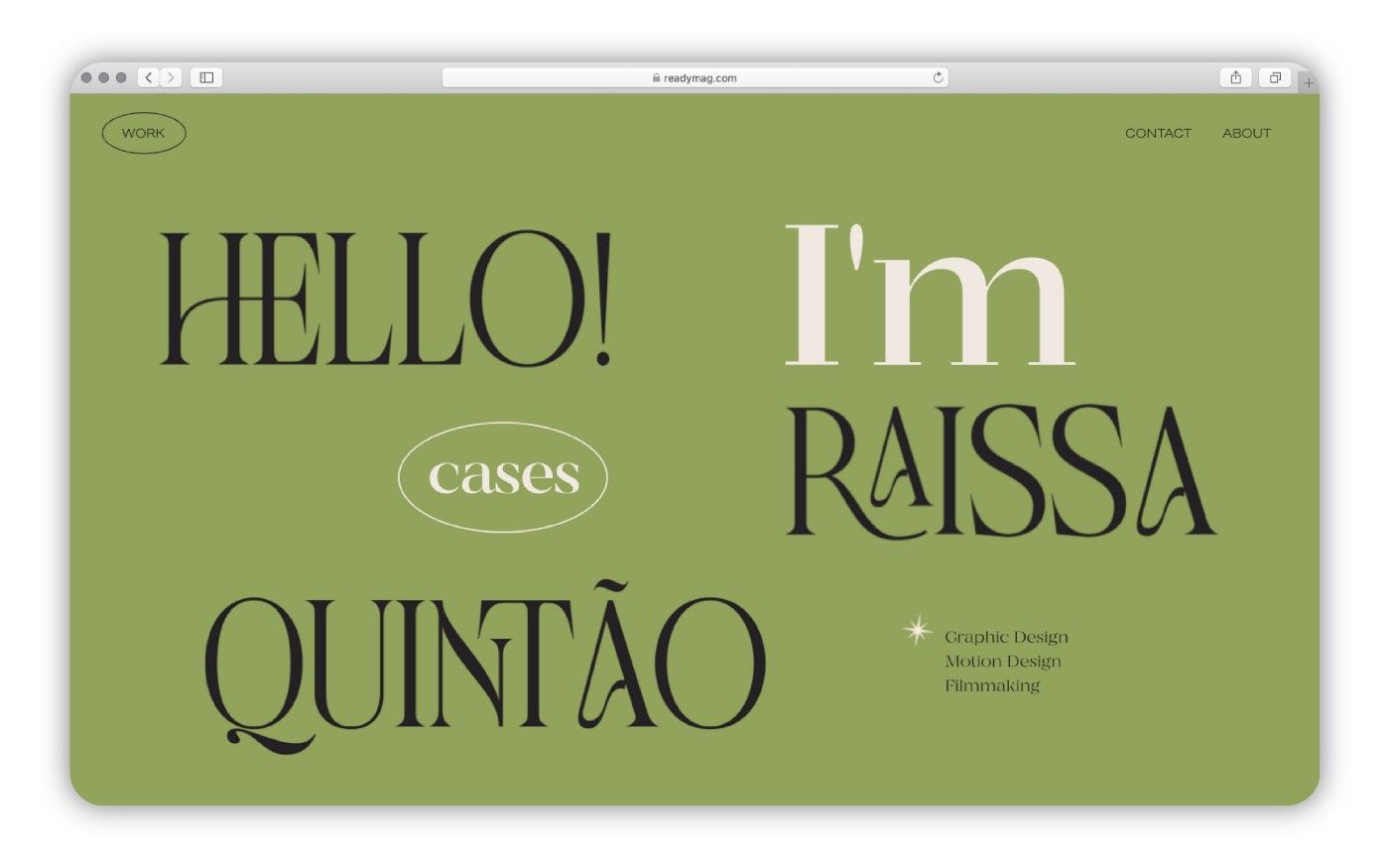
Challenging as it is, the website manages to showcase the wide variety of graphic and video projects in a fun and exciting way, while not distracting the viewer from the content. “The design was influenced by the diversity of Readymag’s toolset”, Raissa notes. Most notable for her, were the animation tools, “enabling a much more dynamic and interesting way to present things, with just a few simple tricks.”
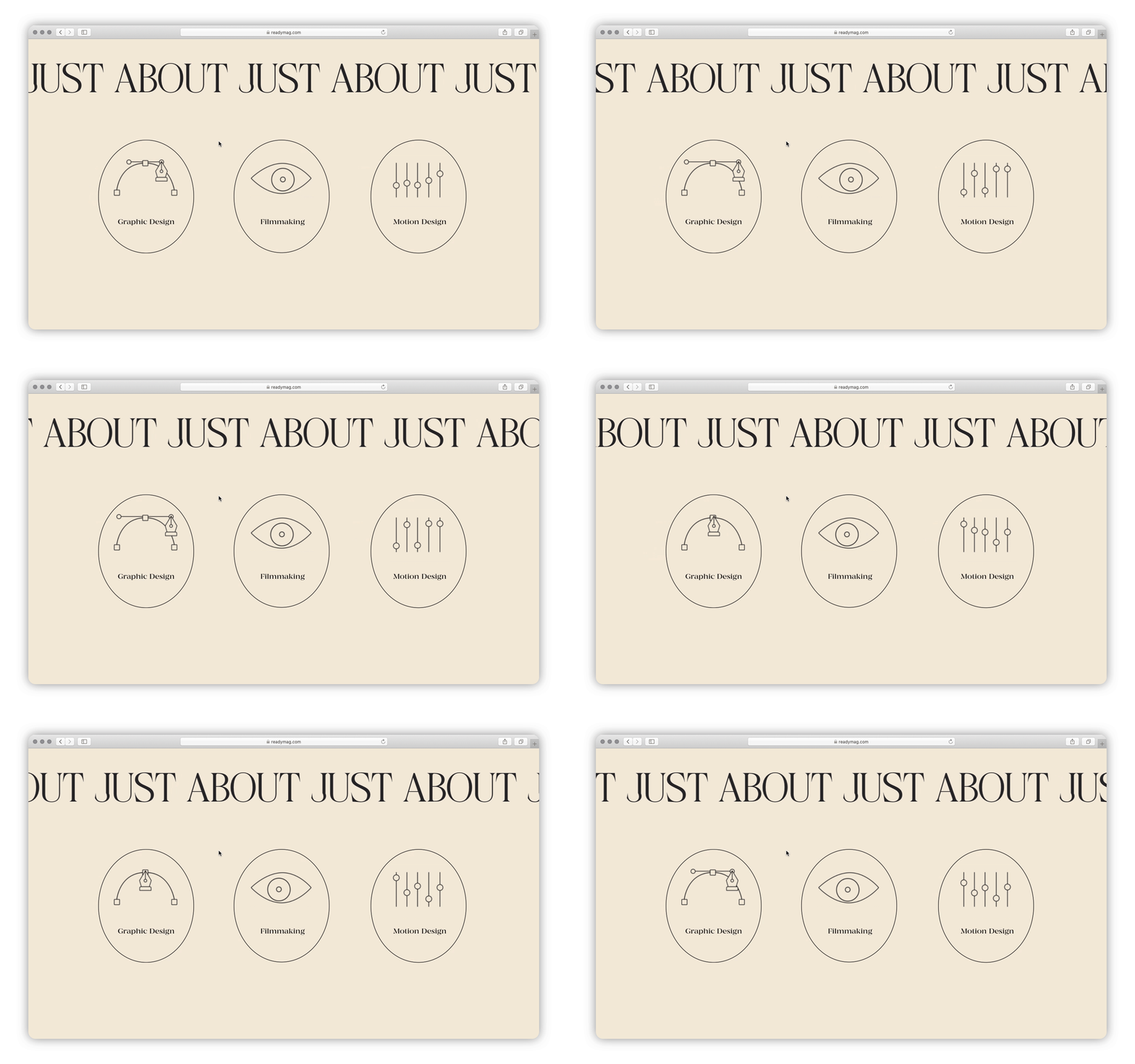
Apart from the subtle animations, Raissa delivers a concise layout, elegant font pairing and subtle color accents — all of which works equally well on desktop and mobile devices.
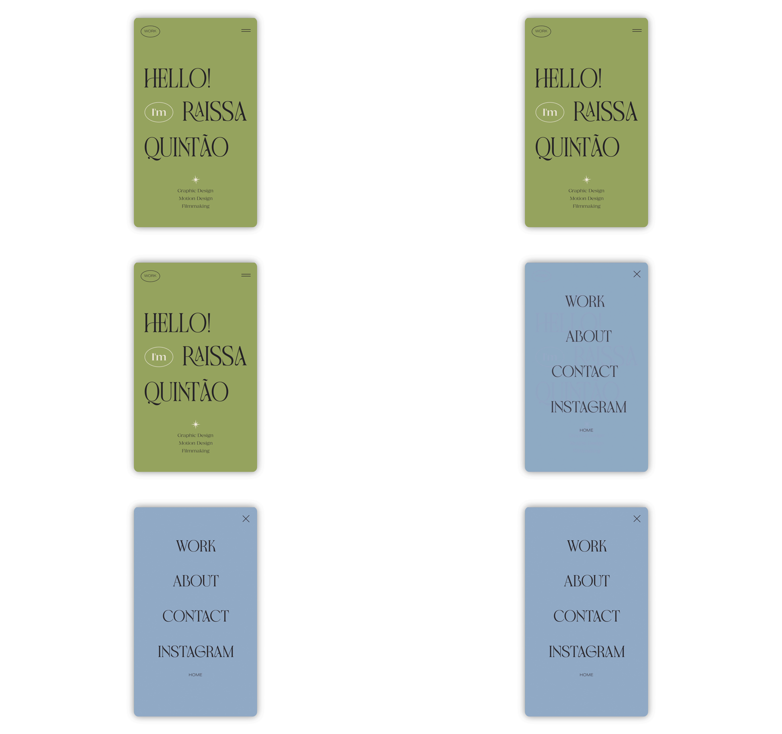
Winning Project of the Year in the Mobile category makes her feel “confident about my own work”, she adds. “Readymag has been a great source of inspiration. To feel affirmed by people you admire is very special! I hope the visibility helps me make connections outside my usual local network.”
Like snowboarding on a fresh slope
Creating a website for Ambidexter, just like designing the typeface itself, was an experiment for Egor Belozerov, a multimedia designer from Moscow, Russia. “I made the project for myself”, he explains. “The journey turned out quite lengthy, but it made me realize I like venturing out of commercial design, into the art territory.”
The display typeface is presented with a huge animated story, pre-rendered in 3D and controlled by scrolling. Eager to try on-scroll animations, Egor conceived the concept with the Shots Readymag widget in mind. “Manipulating time, making it run backwards, speeding up and slowing down — how cool is that? I’m sure there is still plenty of dopeness to be made with this technique.”
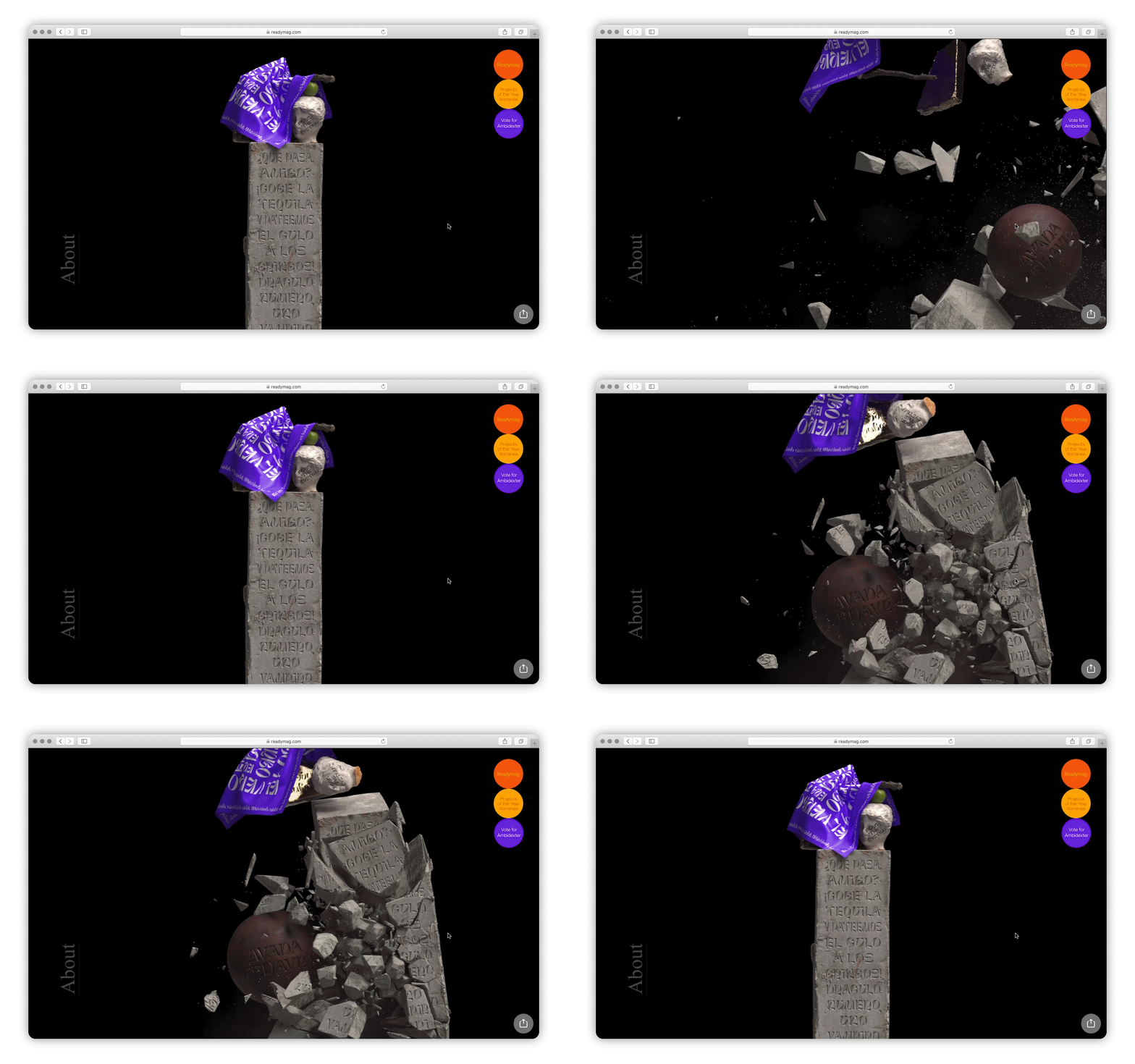
Ambidexter took about half a year — up to 50 hours of which were spent in Readymag alone. “Flexible animation workflow, typography, grids and Shots turned out to be absolute fun”, Egor adds. “Creating a new page was like snowboarding on a fresh slope early in the morning — complete, euphoric freedom. Readymag is the strongest tool for a solo designer with no coding experience”.
“I might be quite skeptical about competing in visual or intellectual disciplines, but I do realize that working to impress is completely natural for any designer,” notes Egor, reflecting on his victory in the Typography category.
Think out of the box
“An imprint of a past that repeats itself over and over again in the present”, reads the description to Suburbs are dead, an interactive art zine authored by Roma Zhigarev.
Heavily processed photos of urban outskirts come into view at the sides of the screen to shrink and disappear in the distance, as if a metaphor of vague memories in a rapid flow of time. “At first, I designed a slider gallery in Figma. It looked good in static, but turned out a bit boring in dynamic. At some point in Readymag, I came up with this idea of zooming out”, recollects Roma. “With Readymag it is quite easy to think out of the box. On-scroll animation, I think, was the very first thing I wanted to repeat after seeing it in other projects.”
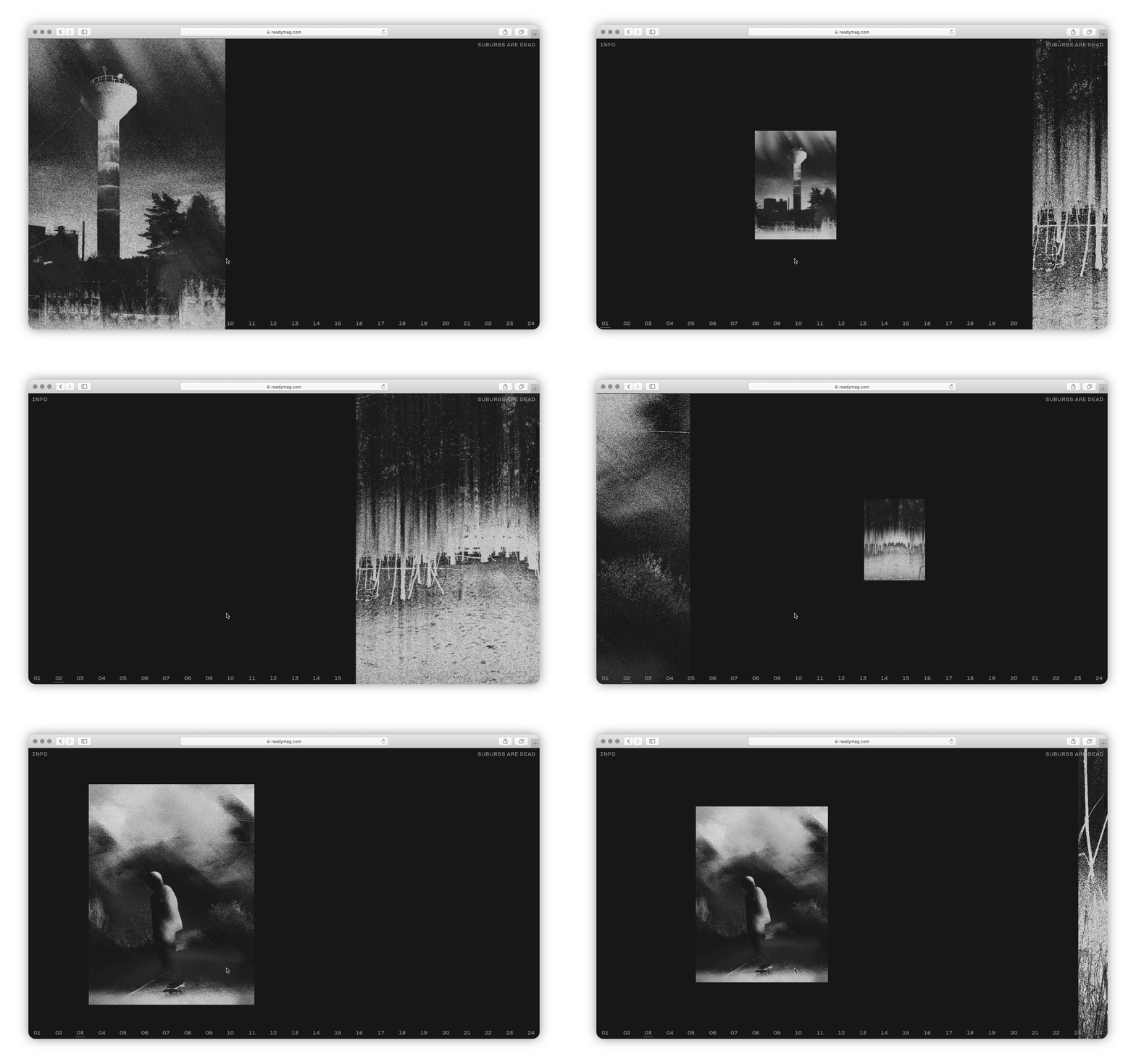
Expressive use of the technique earned Roma Project of the Year in the Navigation category. Contests are much like “discussing what good design is”, he argues. “People would try and repeat things, someone would realize they can do better, while others would see that their work is not so bad at all”.
Seeing the whole community engaged
The website for Diagrama was meant to be an in-house project. “Only one iteration was needed, since I was also the client”, half-in-jest, notes Rogério Lionzo, who has produced and hosted the design podcast since 2017.
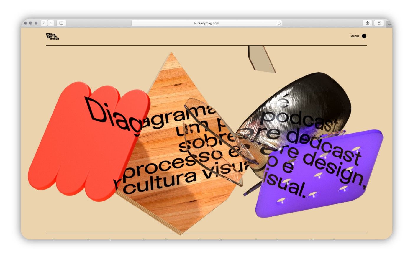
Awarded Project of the Year in the First Page category, Diagrama immediately catches eye with a busy cover illustration. “I teamed up with Flavio Carvalho to build a 3D animation to be controlled with the Shots widget”, explains Rogério. The remainder of the site, with its simple layout, cheeky font and doodles by Rogério’s kids, was also designed with the Readymag workflow in mind, he adds.
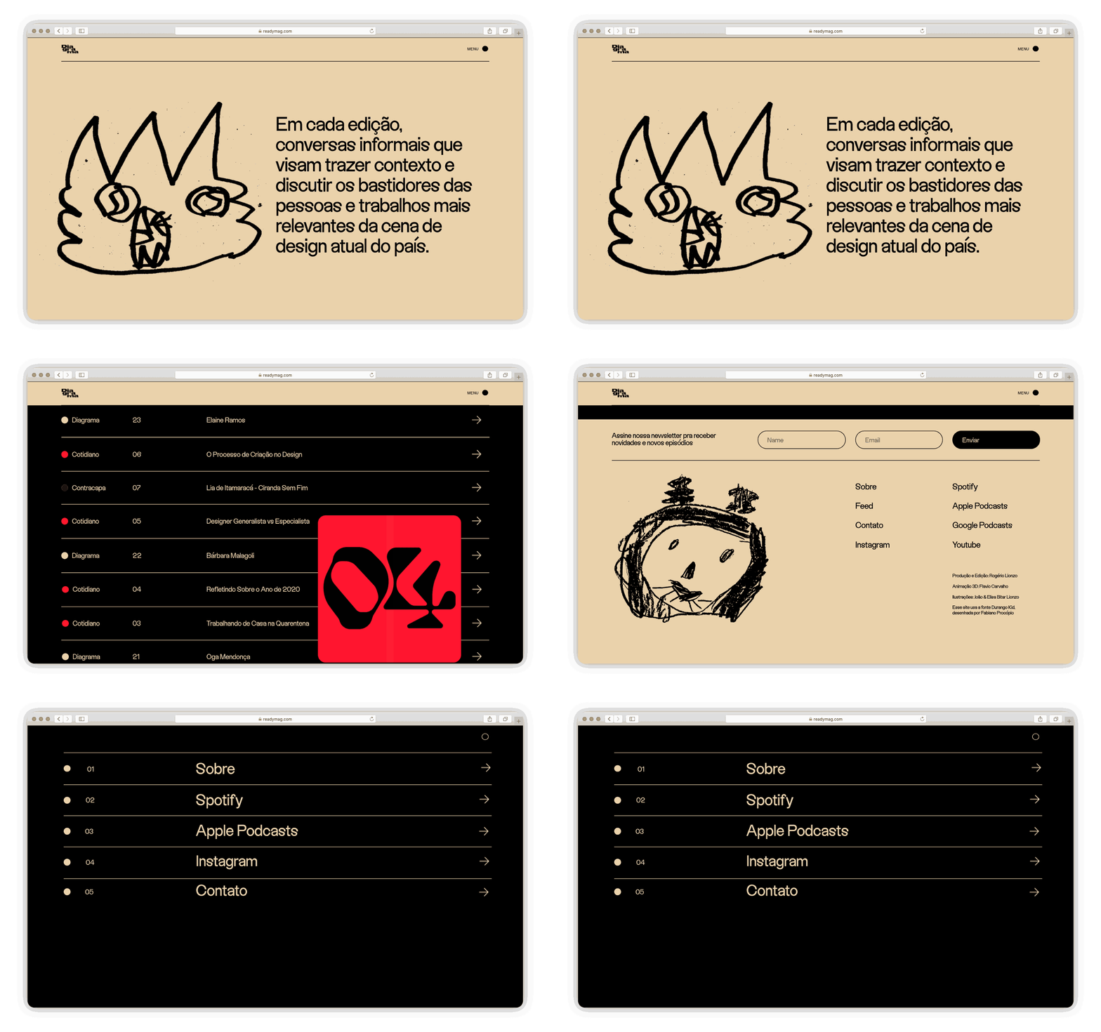
The award “definitely had a major impact” for the podcast and Rogério, who cites it as a reason to renew Diagrama for another season. “It was really nice seeing the whole design community in Brazil engaged!”
See all Projects of the Year 2021 nominees.