Meet the winners of Readymag Websites of the Year 2023
Dive into exceptional web design and see what makes the winners stand out
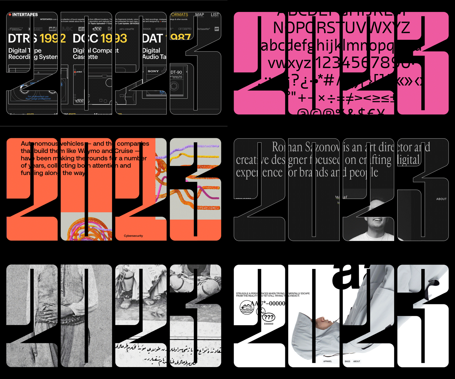
This year marked the 10th anniversary of the Readymag contest for the best website designs, and it was a big one! We received a record-breaking nearly 400 entries. People voted for their favorites, and the winners have been chosen in five categories: Impact, Interactivity, Self-promo, Storytelling, and Typography.
Let's take a look at these amazing websites through the lens of our designers Tanya Egoshina and Varya Fomicheva. Their evaluations played a crucial role in forming the shortlist and will help us understand what made each winner stand out.
Impact
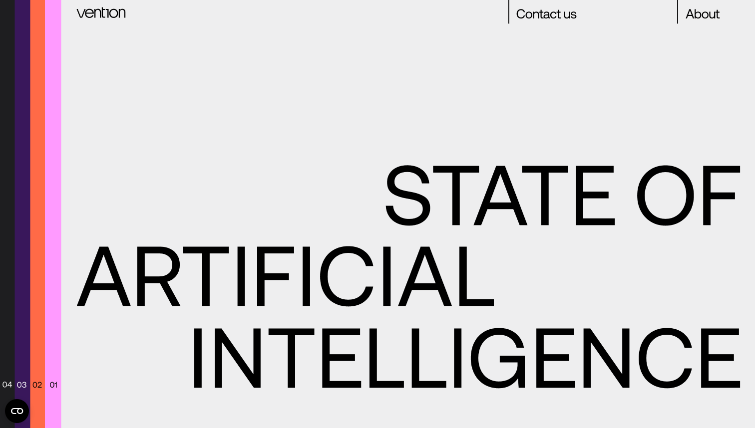
1st place winner: The state of artificial intelligence by Vention
This site takes a topic that might seem complex at first glance, but it soon becomes intriguing thanks to the animations, which bring the information to life with moving pictures.
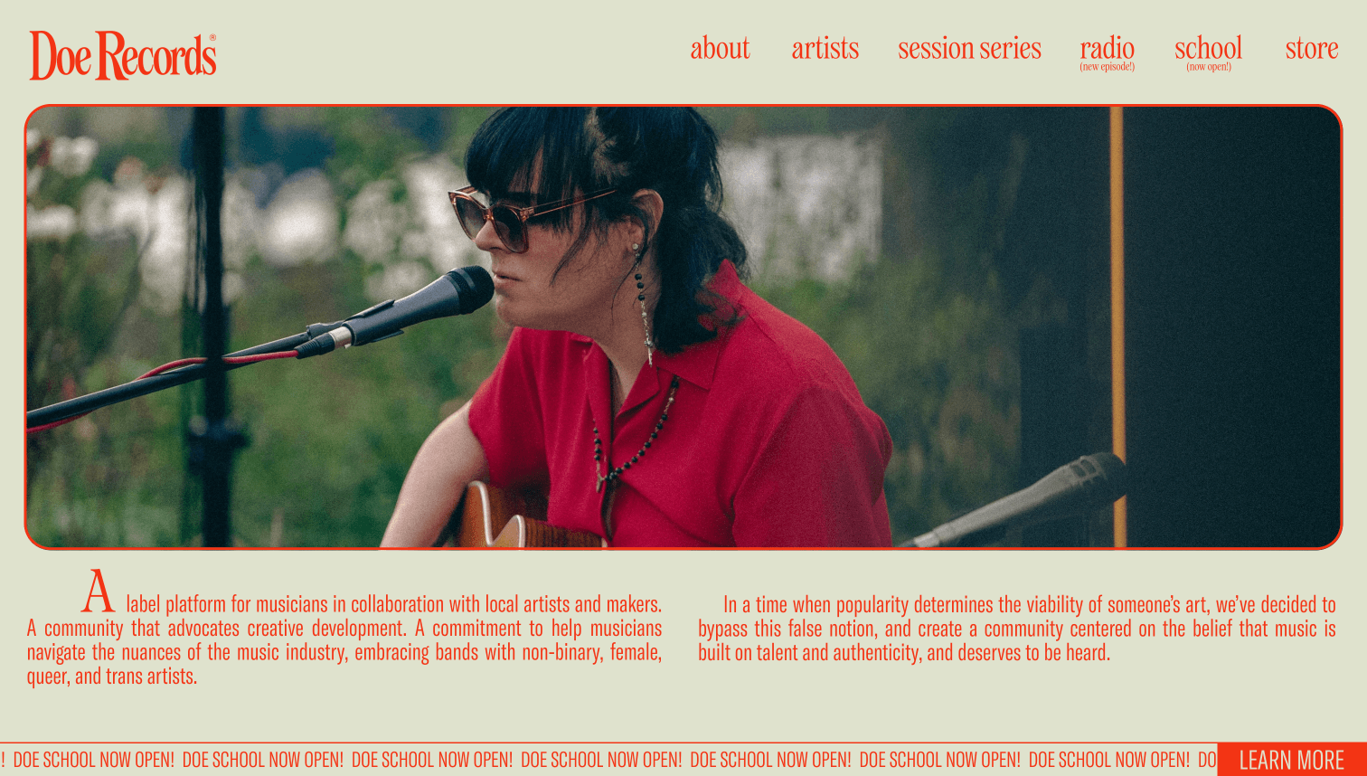
2nd place winner: Doe Records by Ricardo d'Avila and Lizzy Ellison
Doe Records’ website stands out with its typography and color palette that carry an analog vibe. It's a refreshing change from the digital norm, offering a blend of retro and modern styles.
Interactivity
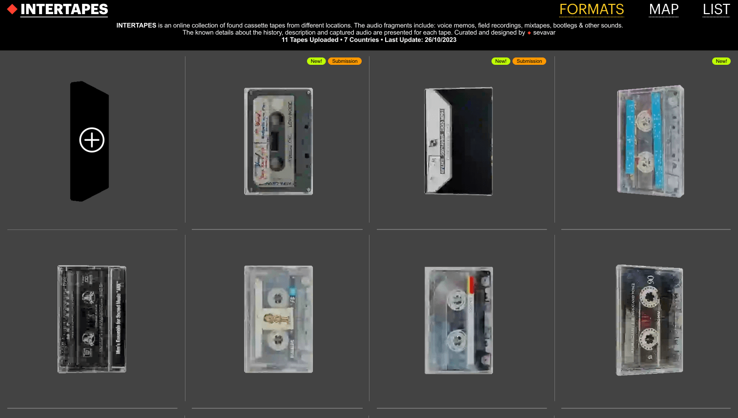
1st place winner: Intertapes by Seva Varfolomeev
This website is super fun, with moving images and a cursor that changes when you move it around. It almost feels like you're playing a game! The design is bold and big, and the descriptions use two languages. The author paid attention to every little detail to make it awesome.
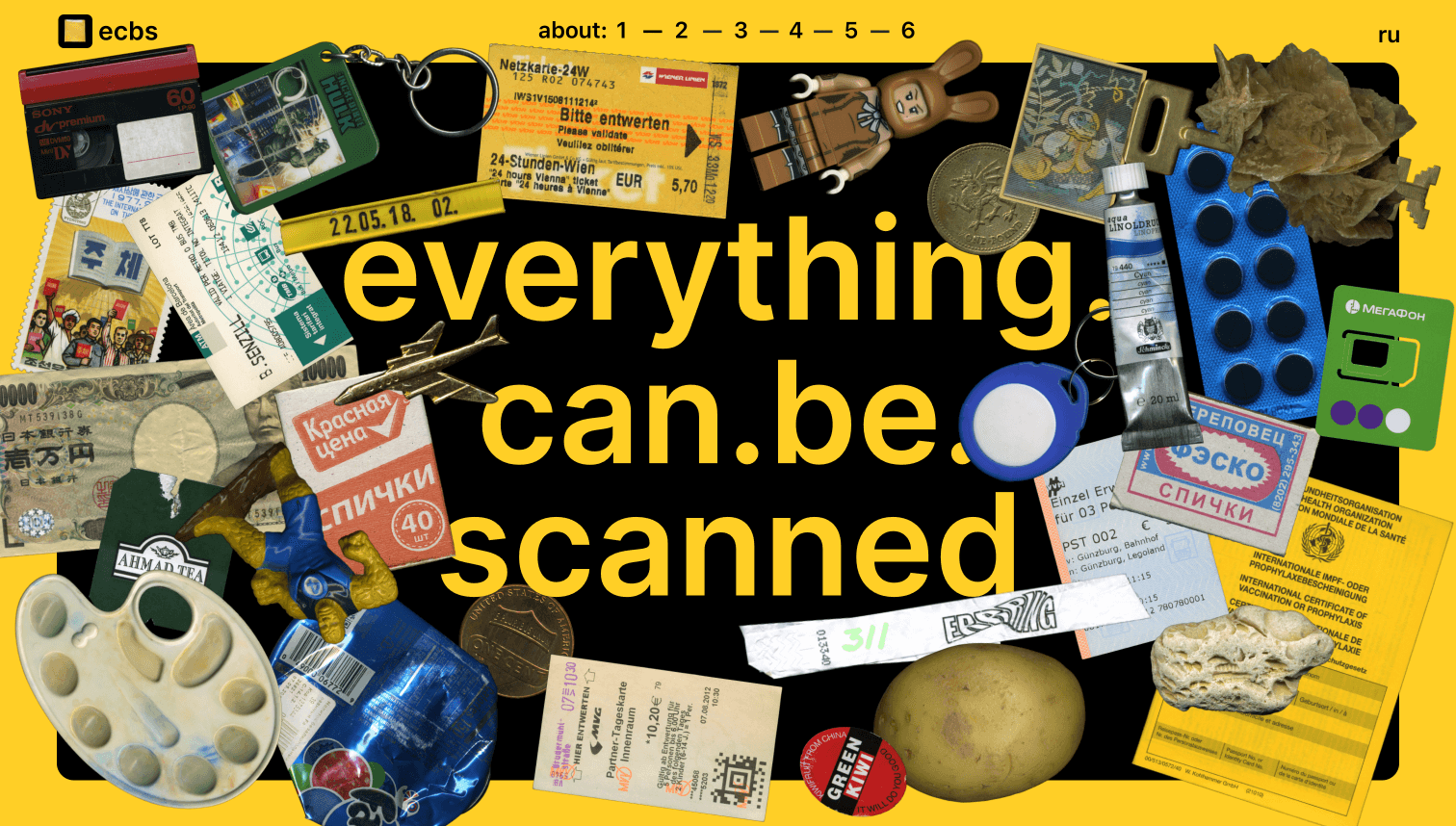
2nd place winner: Everything.can.be.scanned by Daniil Kurguzov
This site is full of things you can move around and play with. The design is simple but bold, with big letters and lots of surprises as you scroll down. The interactivity here is top-notch, offering a diverse and layered user experience as you scroll through various elements.
Self-promo
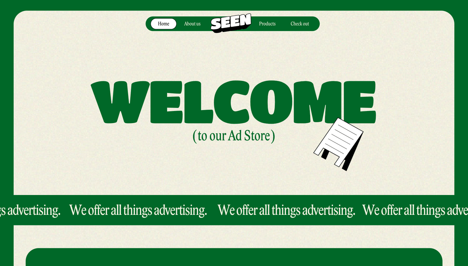
1st place winner: Seen advertising agency by Marie Estaire
Here we have a site that mixes cool animations with draggable elements and interactive quasi-3D objects made with Shots. It's a showcase of the agency’s creative abilities, blending technical skill with artistic vision.
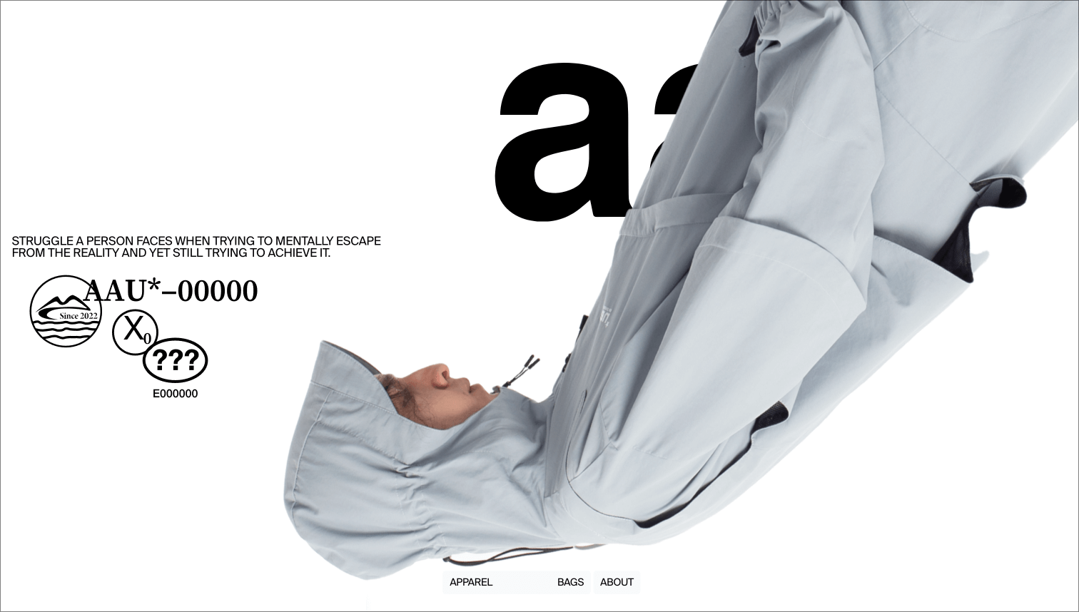
2nd place winner: All around us* by Siarhei Plashchynski
This site redefines online shopping with its trendy approach to design. It plays with typography in an unexpected way, using contrasts and interactive additions to make the shopping experience both minimalistic and dynamic.
Storytelling
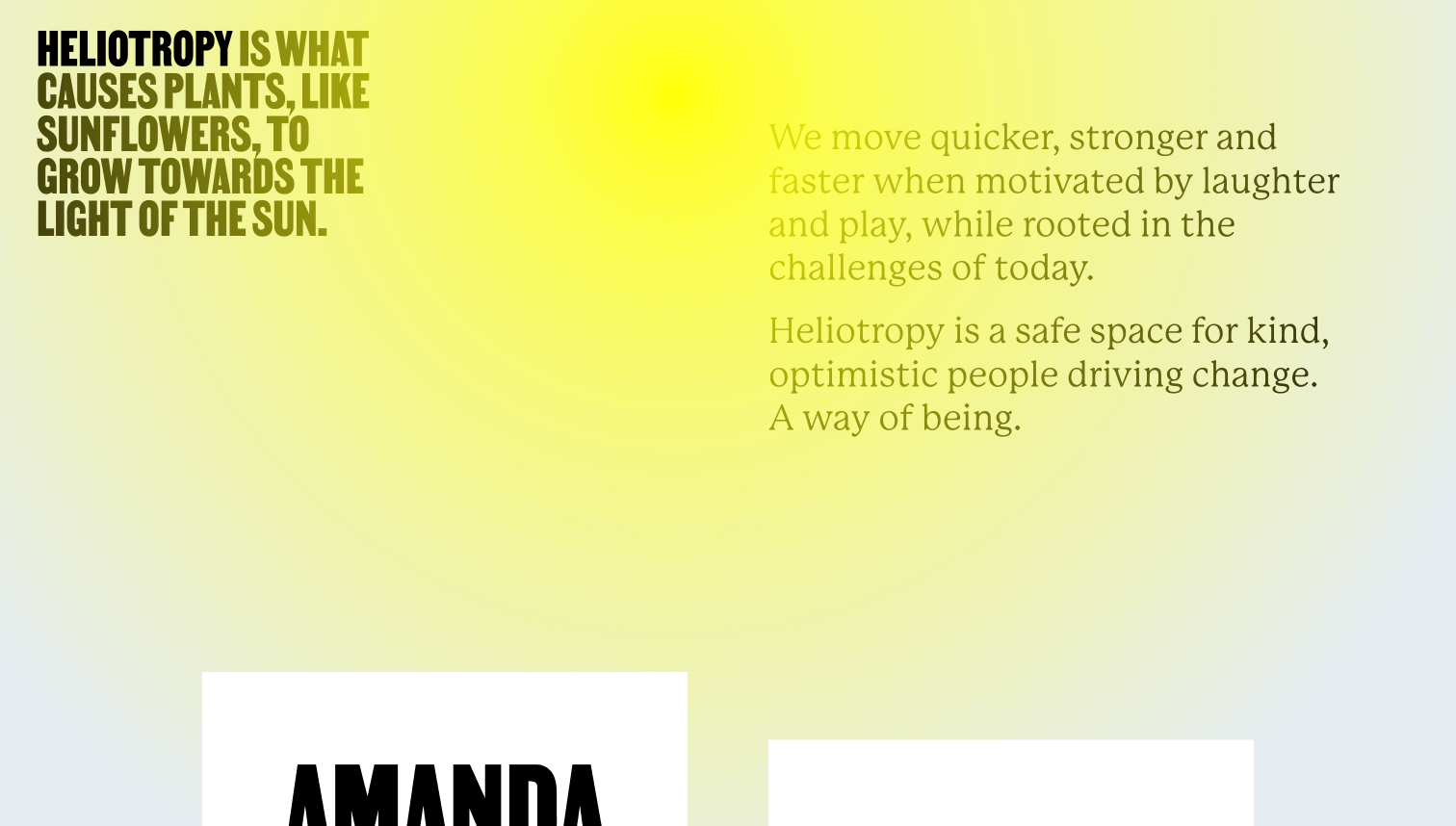
1st place winner: Heliotropy by Studio CRONICA
Heliotropy's website is a masterpiece of composition, combining artistic layouts with individuality. Each page tells its own story, showcasing a strong sense of artistry and layout design.
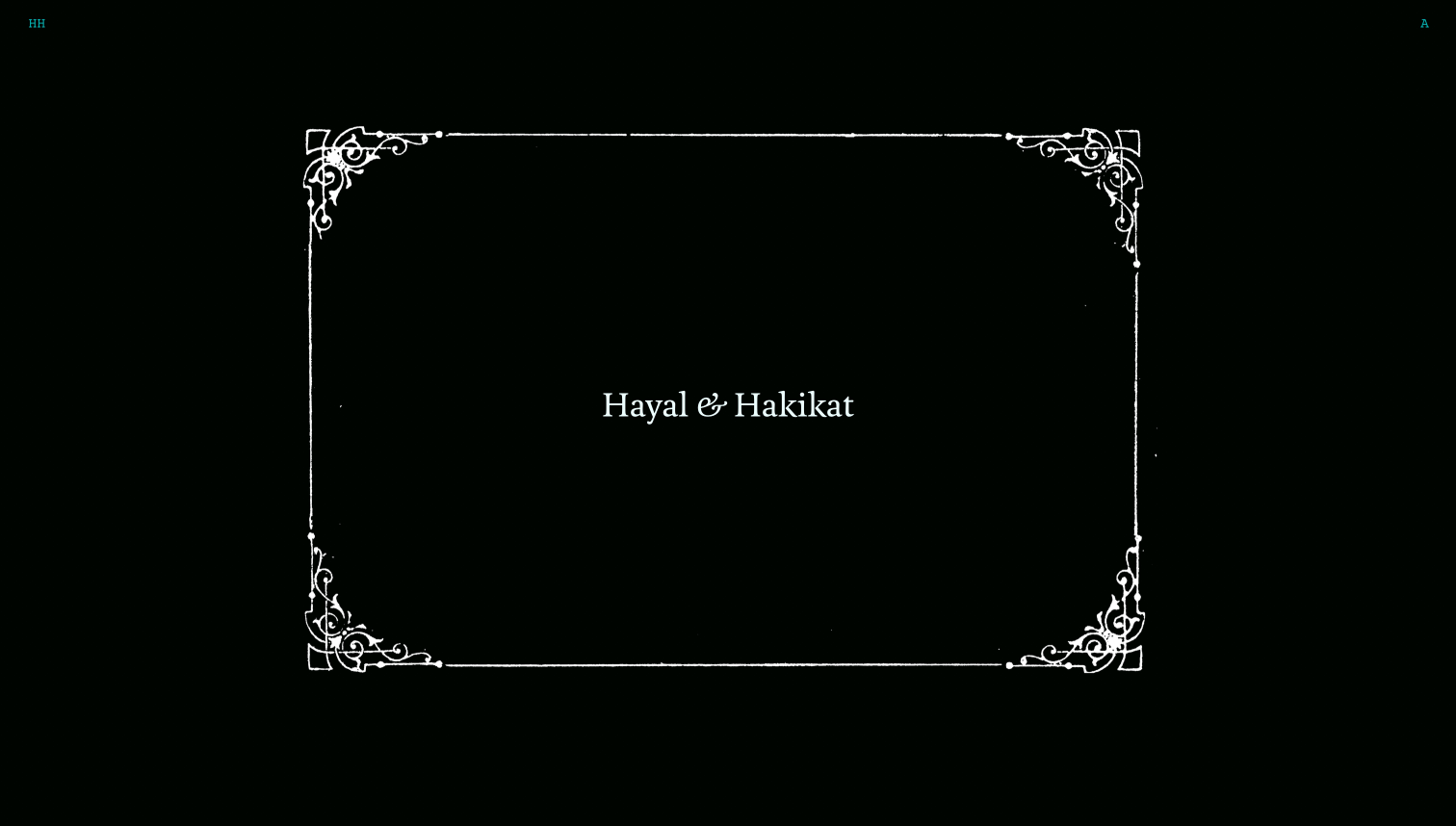
2nd place winner: Hayal & Hakikat by Marina Meyer
This site takes storytelling to another level. It's like watching a movie, with a consistent focus on either text or imagery. The storytelling is seamless and cinematic, creating a profound user experience.
Typography
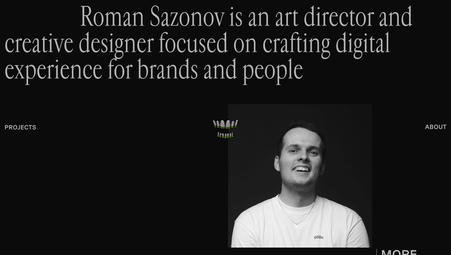
1st place winner: Roman Sazonov’s portfolio
This portfolio stands out with its edgy use of typography. The trendy design and center-locked animation of teeth amidst various elements make it a visually striking and unique experience.
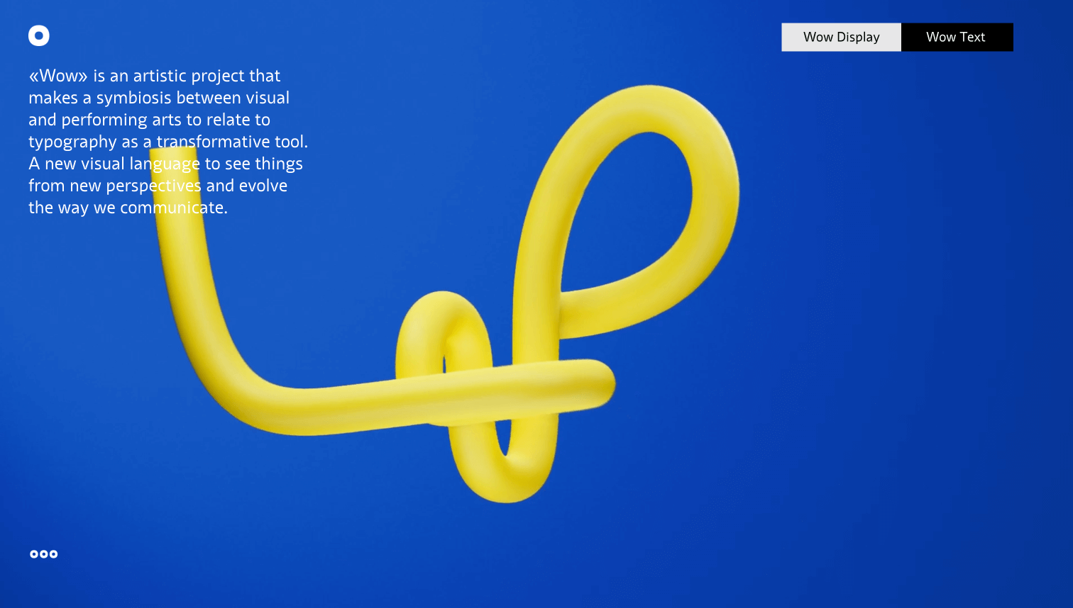
2nd place winner: Website for WOW typeface by Carol van Waart
This site showcases the WOW typeface in a fun and unique manner. The emphasis on the font itself, with colorful bars and playful presentations, makes it a standout example of creative typography.
The roadblocks for making the shortlist
The final winners of the contest were chosen by the public, but the journey to victory began with our shortlisting, based on specific criteria. Let’s explore some reasons why websites didn’t make this crucial cut.
Originality played a significant role. While following trends is common, those submissions that heavily relied on popular styles missed an opportunity to stand out with a unique identity.
Also, readability was an issue for some websites, especially in designs with extremely tight letter spacing. These designs can pose challenges for people with dyslexia, highlighting a gap between trendy aesthetics and practical accessibility.
An additional factor was website performance, particularly loading speed. Quick access is key, and sites that weren’t fully optimized tended to lose ground.
Explore all the shortlisted websites of 2023 and dive into past years’ winners. Get inspired by the creativity and skills of fellow designers, and go for the gold in 2024.