Want to start your own online magazine? Readymag publishers offer advice
We’ve selected three online magazines created with Readymag to ask their publishers for advice on how to run a great online publication.
The imminent death of print as predicted several years ago now seems slightly premature, but the market share for online magazines keeps rising. A growing number of prominent news and media outlets have established fully-fledged online editions or even switched over entirely to digital. Web magazines are also an effective option for smaller publishers to avoid significant expenses on printed matter.
We’ve selected three online magazines created with Readymag to ask their publishers for advice on how to run a great online publication.
Curate Magazine: Put the magazine together in-house. Hire freelancers for specific tasks.
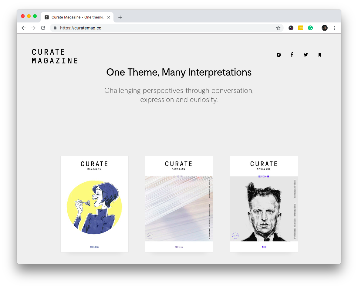
Curate Magazine is a lifestyle publication created by two British designers, Abb-d Choudhury and Sara Scobie. The magazine offers pieces on topics ranging from music and sports through to food and tourism. Travel has become the central topic of their second online magazine, Wandering Through. Abb-d and Sara also own a design studio, Curate Labs, that takes a strict ethical and sustainable approach to their design projects.
Abb-d Choudhury and Sara Scobie, founders:
“Our idea was always to have the focus be the creative content — not the design, not the logo, not the way we function as a magazine. We want people to concentrate on the actual themes and broaden their perspectives through curiosity. For us, it has always been about trying to strip things back as far as we can, making the magazine as simple as possible.
From an aesthetic point of view we’re trying to build something that’s friendly and engaging, but also allows space for different types of interpretation through different forms of content. We hope Curate Magazine allows us to cater to very different perspectives and backgrounds — a mathematician, a chef, an artist — and really let their experience and words come through.
Resource-wise we have an extended remote team of about eight people, ranging from copywriters to developers to illustrators, but we two are the core. We are also part of numerous co-working groups such as ustwo Adventure & YCN (Young Creative Network), who really help us with resource and advice where needed. As soon as we have an idea we try to implement it and get it out quickly — the quicker the better. We find that the most valuable feedback is from real data and real people having hands-on experience with the product. We’re very receptive and listen to feedback quite a lot, both in content and design. This is where Readymag really comes in.
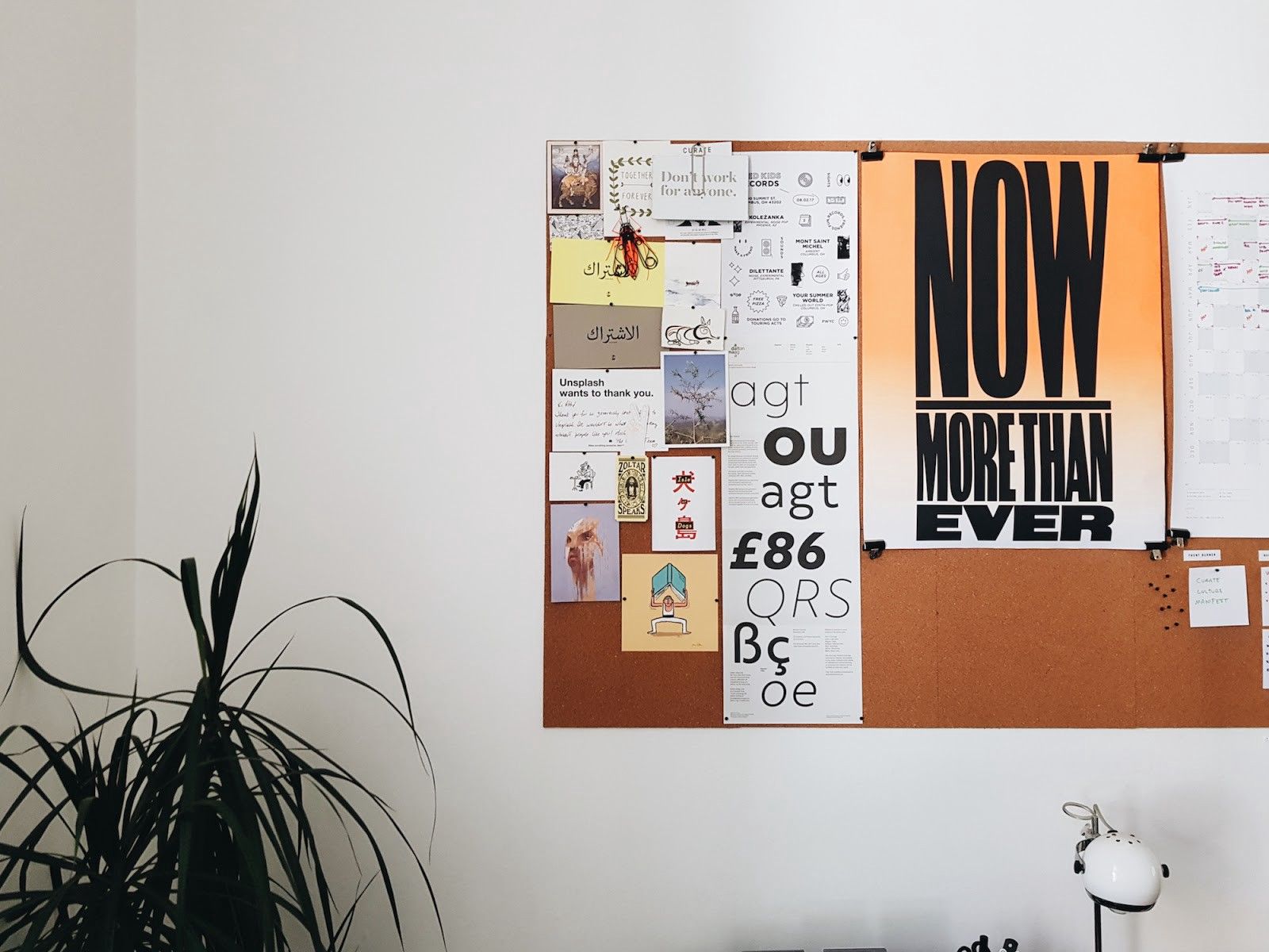
One of our favorite features in Readymag are grids. They’re really flexible, so it’s easy to shape the grid exactly how you want it. With other software and platforms you have to load the grid and then it’s fixed, stuck like it is, or you have to start a completely new document. Of course, there are convoluted ways to sort it out but Readymag helps make grid alignment a quick and effortless process.”
FLUX Hawaii: Embrace the medium of the online magazine. Make it stand out with memorable photos and font
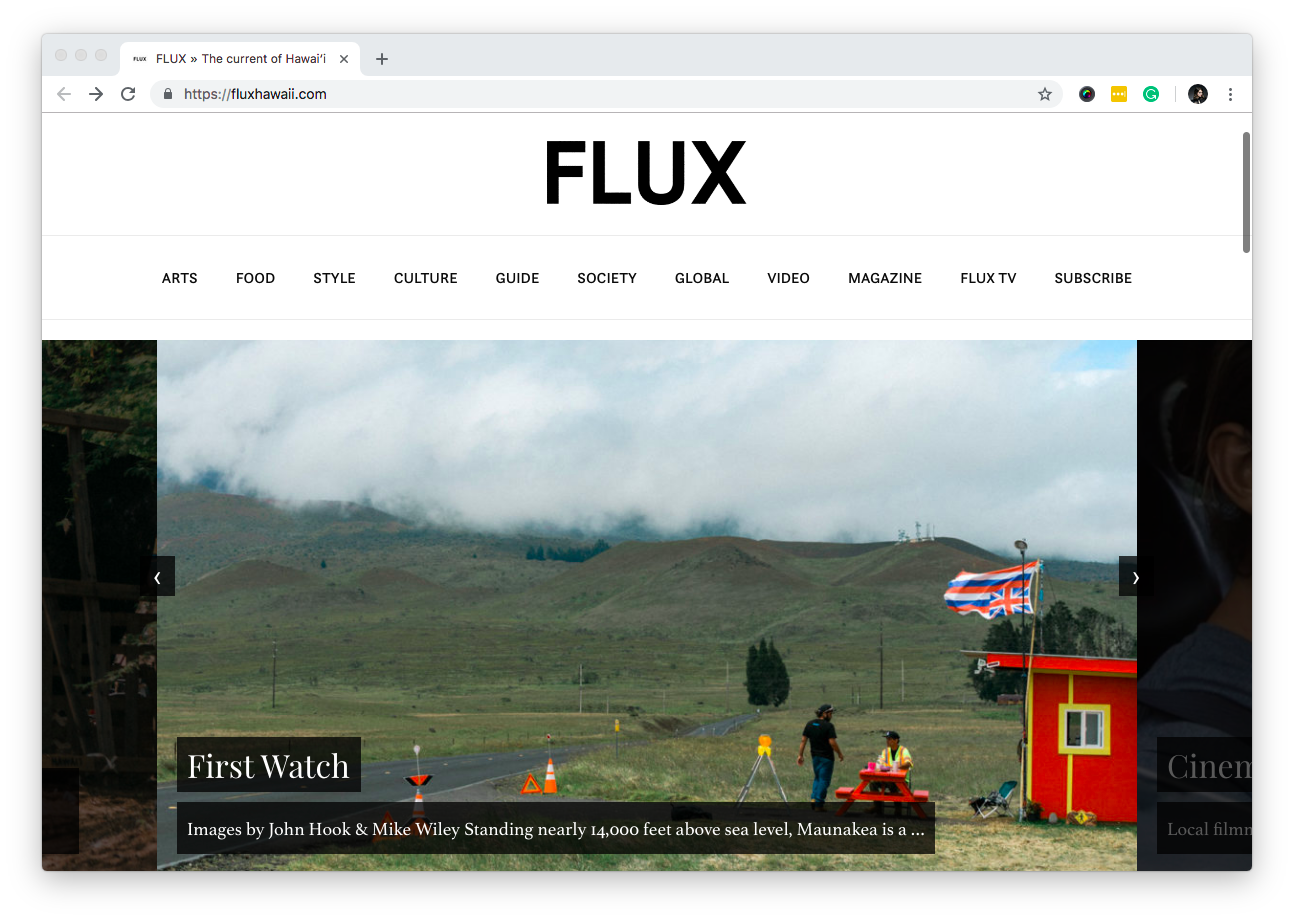
FLUX Hawaii is a lifestyle brand of NMG Network that offers a curated look at Hawaiʻi’s arts, culture, design, and innovation. Recent issues are dedicated to themes as diverse as tribes, food, movements, and sacred spaces.
Mitchell Fong, designer:
“FLUX Hawaii, as the name suggests, is always changing, and we’ve already redesigned the magazine a couple of times. But, whether it’s a huge intentional redesign or incremental, issue-to-issue changes, the idea has always been to focus on readability. We try to provide readers with a lot of visual space, and to focus on minimal ornamentation and good typography.
Typography was actually one of the key reasons we chose Readymag. For a magazine like ours it’s important above all other features. It’s as simple as that: a good font selection and good control over these fonts. But we also make use of other Readymag features like animation and multimedia embedding to enhance our storytelling.
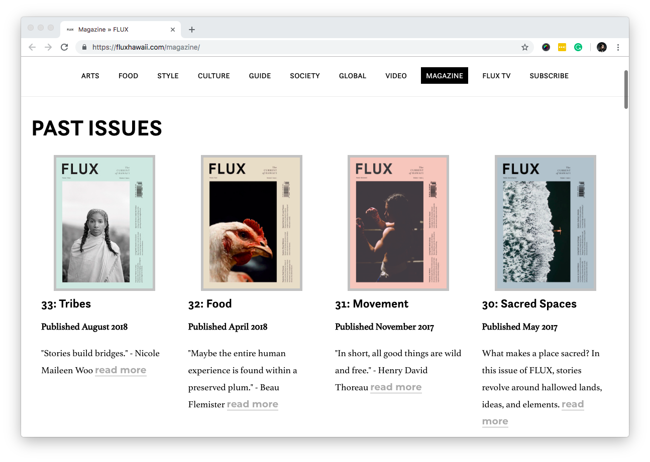
Another thing that’s very important for us is a perfect photography and the possibilities Readymag offers to showcase it. Over the years it’s been a long process of finding really good photographers and highlighting their strengths. As such, we design our stories to elevate and not detract from the photography as much as possible. Readymag offered a way to post high quality images in an uncompromising way.”
Gritty Pretty: First make font guidelines, then dive into publishing
Gritty Pretty is a Sydney-based interactive online beauty magazine.
Morgan Tait, creative director:
“Gritty Pretty Magazine was born off the back of the Gritty Pretty.com, so our editor-in-chief Eleanor Pendleton already had a clear vision of the customer and the aesthetic we were creating. Based on our existing brand, we made sure the aesthetic of the magazine was clean, sleek, and timeless. We did have print publications as our inspiration but we understood digital and print are a completely different audience. With print you tend to put more onto a single page, and it can be quite overwhelming, whereas digital publications need to be cleaner and easier to digest — the attention spans are significantly smaller there.
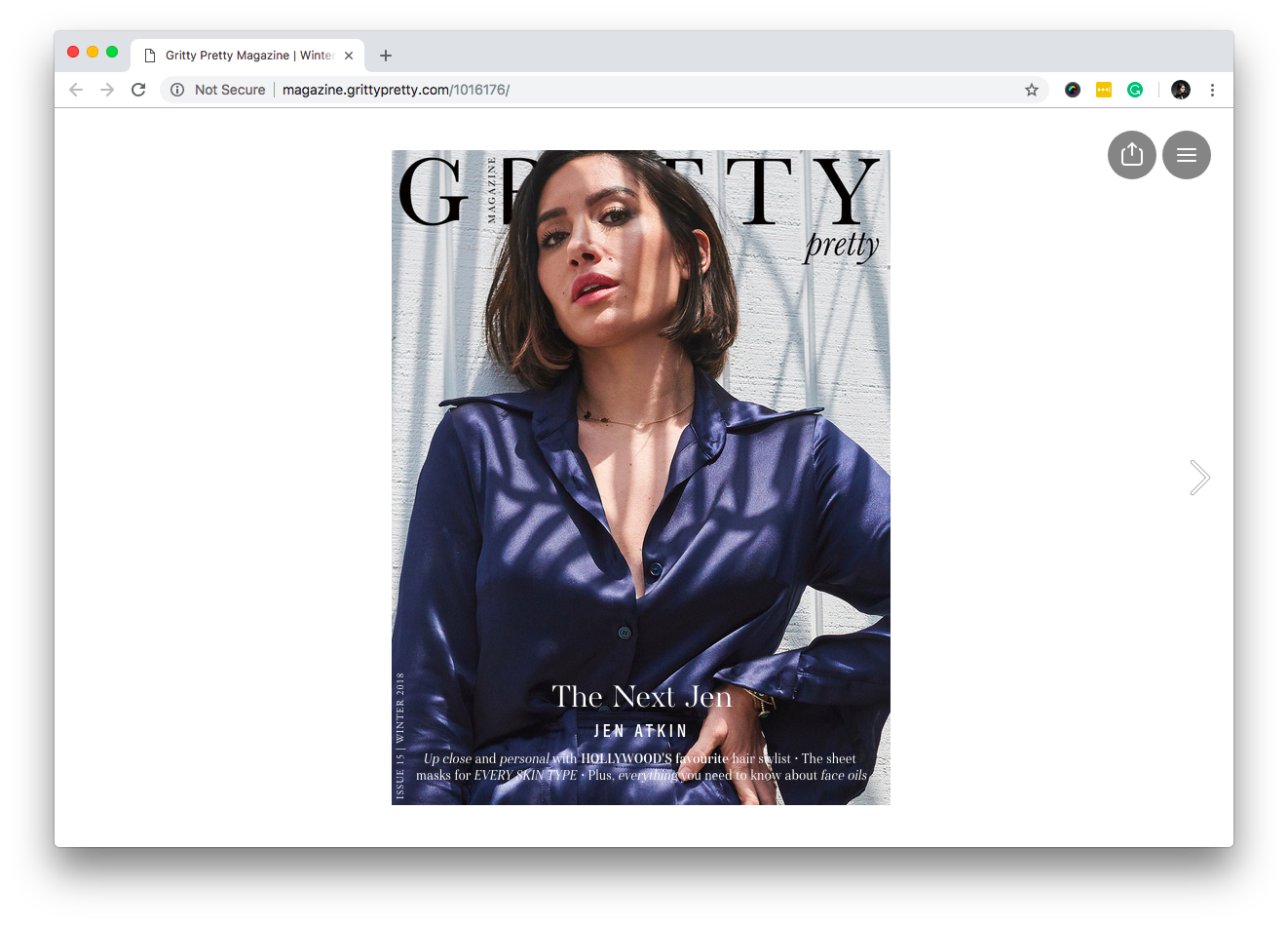
To maintain a clean aesthetic Gritty Pretty follows explicit font and style guides. There are fonts that we consistently use for body copy, headers, and quotes which make the magazine cohesive and creating a strong tone of voice. We mainly stick to those but we definitely don’t hold ourselves back from evolving. Each issue we’ll consider extending on our creative guidelines and keeping up with the evolving trends in the industry.
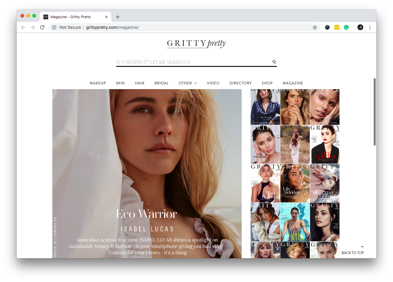
For an online magazine we needed something digital savvy, and after extensive research we went with Readymag. Neither Eleanor or I are coders, so Readymag was the best user friendly platform. It’s quite easy to design but it is also offering some complex features like animations.
If you’re interested in starting an online magazine my advice would be to start by making a creative guideline for your brand to follow. Making each page easier to design and maintain a consistent tone and voice. That’s how your reader is going to be familiar with what you’re bringing in.
Then just go for it: you’re definitely never going to be as prepared as you want to be anyway!”