Voyage Loire: fashion journey website made with Readymag
Created by graphic designer Leonid Tatarinov as a sideline, the website for Voyage Loire won in the Promo category in Readymag’s Projects of the Year 2018. We asked Leonid about the story behind this work.

Created by graphic designer Leonid Tatarinov as a sideline, the website for Voyage Loire won in the Promo category in Readymag’s Projects of the Year 2018. We asked Leonid about the story behind this work.
Private trips for fashionistas
I am a graphic designer at the Kyiv agency Fedoriv where I mostly create visual identities. Several years ago I stumbled on Readymag — the tool seemed to be very useful for quick presentations and brand books, which compose the biggest part of my work routine. I was lured by the lush animation capabilities and the easy optimization for mobile. So, I started a free account and later my colleagues presented me with a Creator.
Beside my full-time job, several years ago I started Straight — an independent one-man project which I view as my alter ego. One of my clients there is Femmes Fatales, a Vilnius-based fashion house. They not only make clothes, but also organize group travel for clients themed around a specific destination or art period. This was the case with Hidden Tuscany and Voyage Loire. I made websites with Readymag for the both.
These are private events with very limited audiences — some 50–60 people from Russia, Ukraine, Kazakhstan, Italy, Switzerland, and Great Britain. The fashion house’s managers promote the tours among their clients and tour purchases are usually made in time of this communication. So, the websites don’t aim to compel for a bargain, they are just a libretto, explaining the visiting program day-by-day.

Royal Blue & timeline as a river allusion
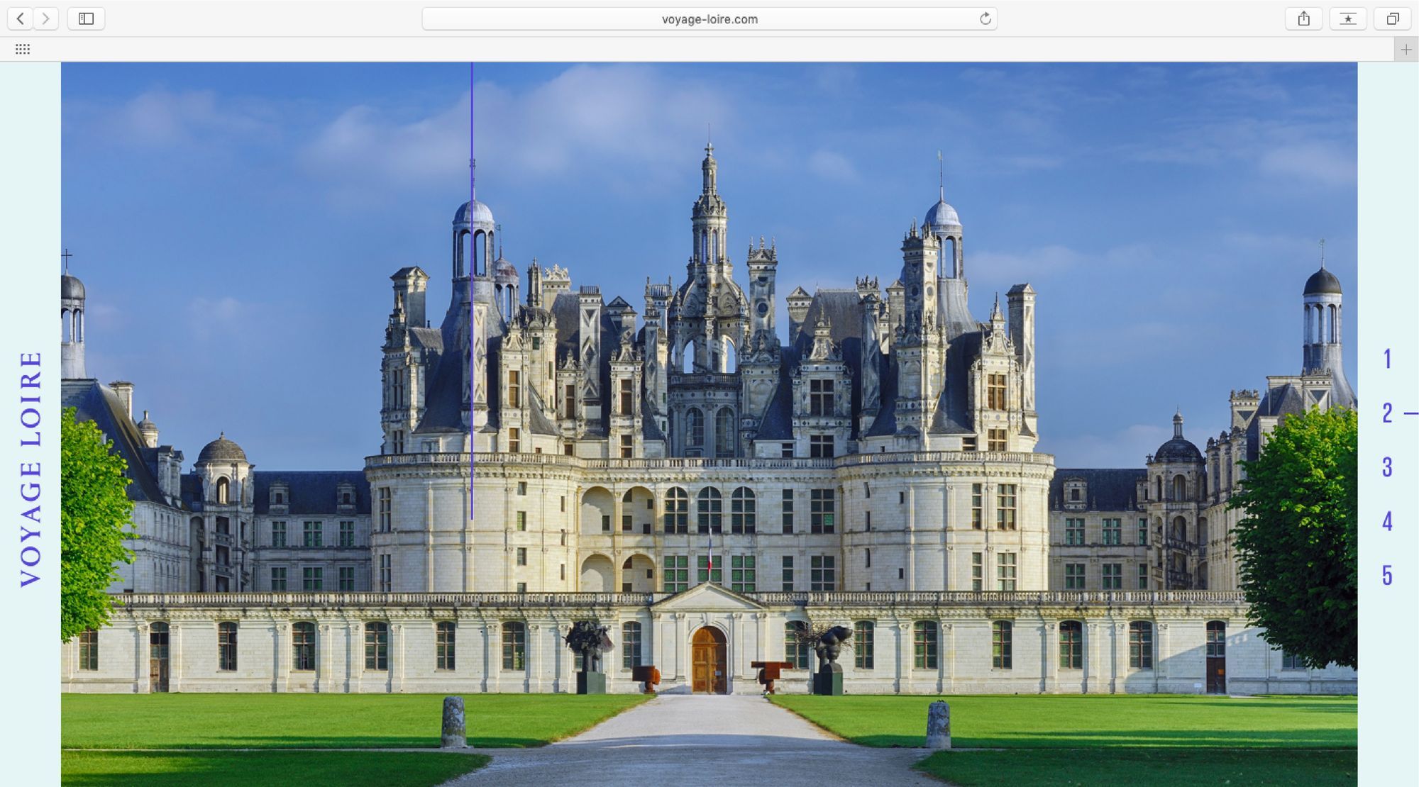
The Loire Valley is located in the middle stretch of the Loire River in central France; it’s often called the ‘Cradle of the French’ due to the abundance of vineyards and Renaissance castles. Femmes Fatales organize a journey through the region, in which visits to castles are combined with fashion shows.
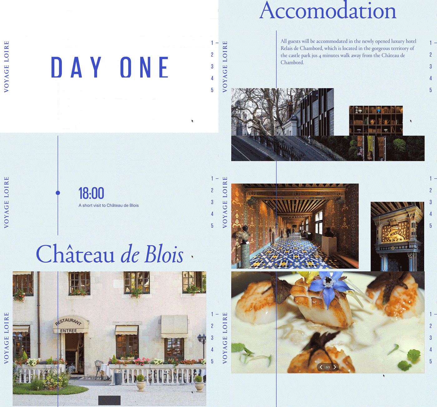
I structured the website as a timeline, by itself a very obvious and logical decision. When you scroll down, a thin blue line appears to unite each day and event into one whole immersive experience. The timeline is also an allusion to the Loire River around which the whole journey is built. The key color — Royal Blue — is an allusion to the Renaissance times. Back then it was the most expensive pigment available, extracted from Lapis Lazuli rock with enough difficulty that only royal families could afford it.
The timeline is implemented with the use of animation: the blue line is a fixed widget, over it, there is a white rectangle, which covers most of the line. When the viewer begins scrolling, the rectangle starts moving down uncovering more of the line, which then comes in view.
The website offers lots of videos and images, all of them provided by the management of the hotels, castles, and restaurants engaged for the tour. My job as an art director was to choose the best and the most compatible images, so that the content creates a cohesive aesthetic experience.
Fresh reading of the French Renaissance
The website of Voyage Loire offers three fonts: Portrait in headings; Giorgio Sans for dates, days, and hours; plus Neue Haas Unica as a text typeface. I uploaded Portrait and Neue Haas Unica myself and Giorgio Sans is held in the Readymag font collection.
Portrait is a relatively new accidental font by Commercial Type. It perfectly fit my needs, since I was searching for something that would look like a modern reading of the French Renaissance. Commercial Type took the classical proportions of Garamond and mixed it with an antiqua using triangle strokes, making Portrait clean and easy-to-grasp. Yet, it still embodies a Renaissance spirit.

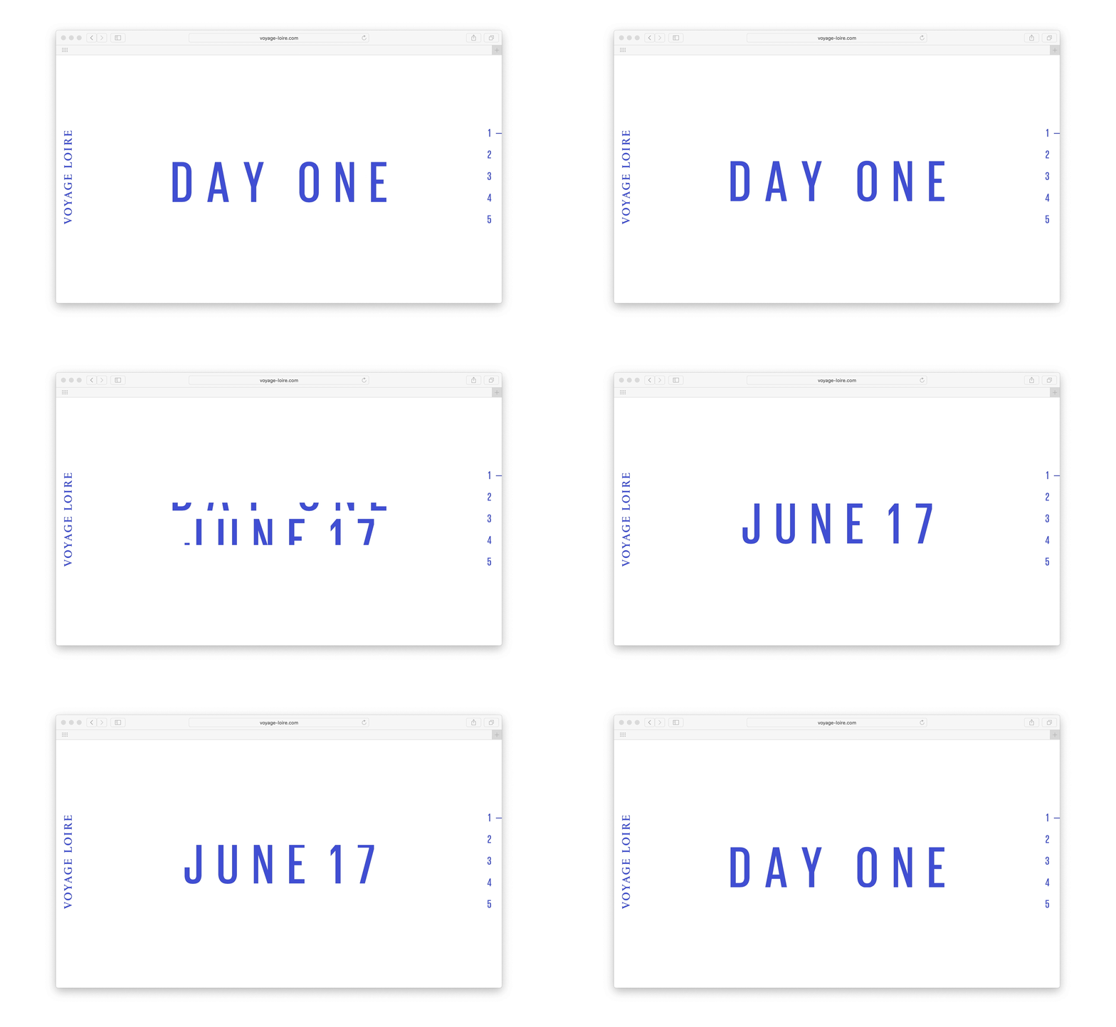
The second font, Giorgio Sans, is used very moderately. Take a look at how the day and date change through the use of animation. There are two text widgets stacked upon each other, with two white rectangles (form widgets) between them, so that everything comes into view at the correct intervals of time.
The text font, Haas Unica, is a very simple grotesque build with a view to Helvetica proportions. Its character is very neutral and it looks nice paired with the accidental font in the headings.
The voyage was successfully held in the summer of 2018, a new one is planned for 2019.