5 visual storytelling techniques to craft engaging web publications
Get design tips and inspo examples for better digital editorials.
With 55% of website visitors spending less than 15 seconds on a page, catching their eye quickly is crucial. This guide, based on the wisdom of Readymag designers, will show you what visual storytelling is and how to make your design projects grab attention.
Let the grid grab attention
Your choices in design really shape how people catch content—you've got the power to guide viewer eyes where you want them on a web page. Changing the size of elements is a smart way to spotlight the important stuff.
Take “Designing Women”, the editorial that aims to combat gender inequality in the design world. The grid makes the whole thing easier to get and remember.
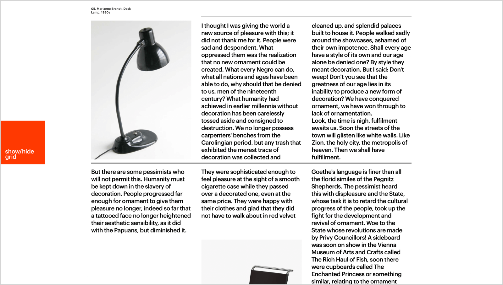
“Ornament and Crime” is another example: it’s an experiment with grid-based layouts to show how we can make web pages more interesting without adding extra stuff. Two different layouts for the same content were created, then made to blend together as you scroll down.
Let typography take center stage
Expressive typography is a strategic visual storytelling technique to make sure your audience doesn't skip over the key elements of your page. Choosing fonts that echo the essence of your content and tweaking their size and position can boost the visual appeal of editorials.
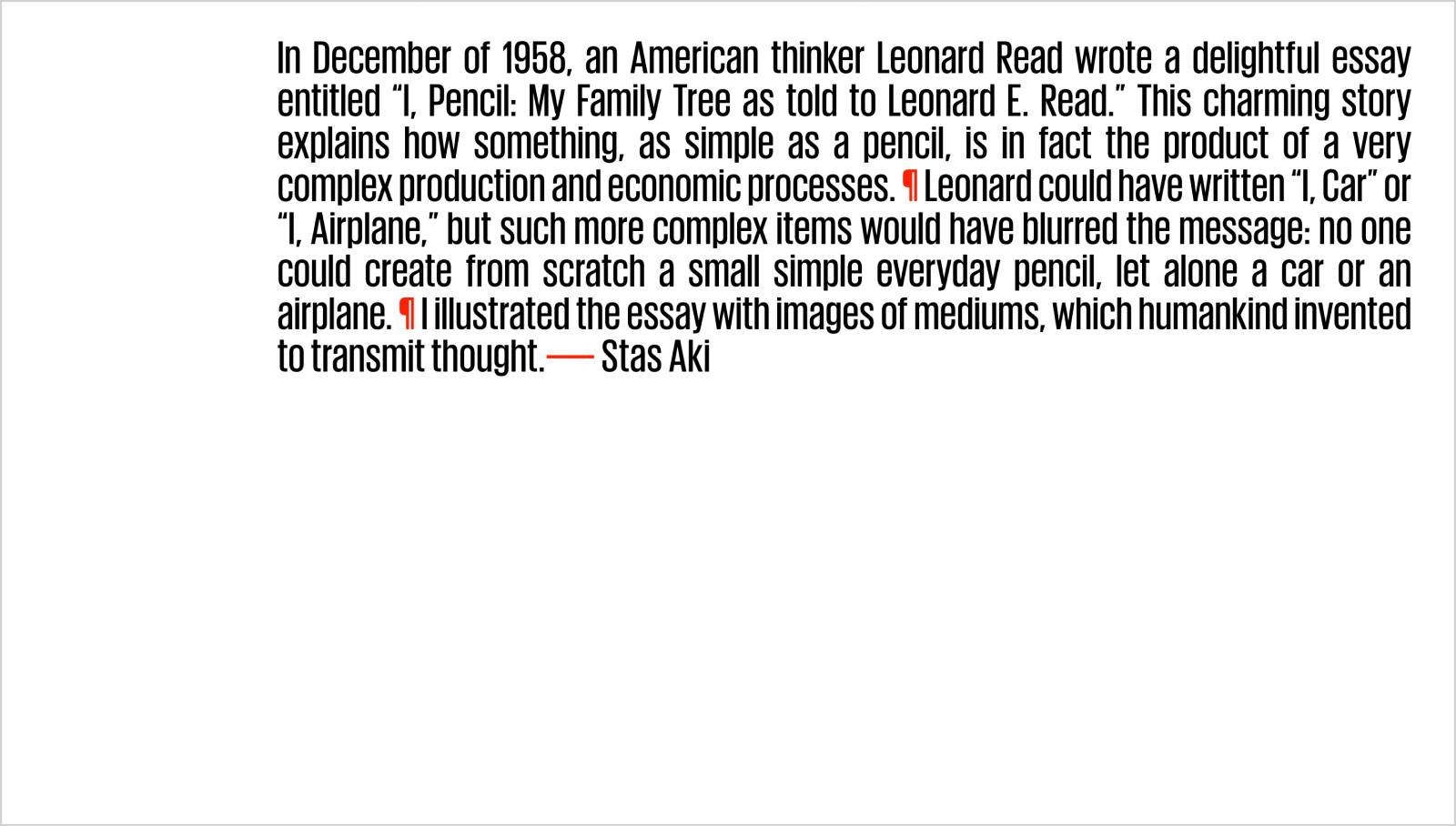
The essay "I, Pencil" inspired a creative idea to animate its title and sections, making it feel more like a movie than a regular read.
Let the web be fluid
The web is super flexible, giving designers a ton of room to create. Thanks to its adaptability, websites can change up their look, feel, size, shape, or structure. Plus, using no-code tools like Readymag lets you bring your ideas to life.
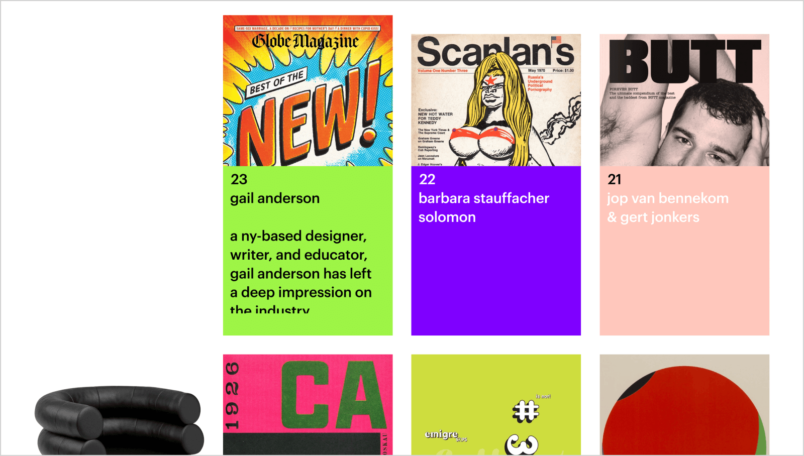
Take a look at the "Design Stories" project, which celebrates famous designers from the 20th century. Inspired by Edward Tufte’s ideas on showing data clearly, it uses a storytelling style that doesn't just go from start to finish—it's shaped and reshaped, stepping away from the usual rules.
Let content reign supreme
When it comes to design, never underestimate the power of top-notch content. Exceptional stories, insightful interviews, and compelling narratives form the foundation of memorable editorials. So, the success of any design project relies on its content, underscoring the importance of a balance between visual elements and textual depth.
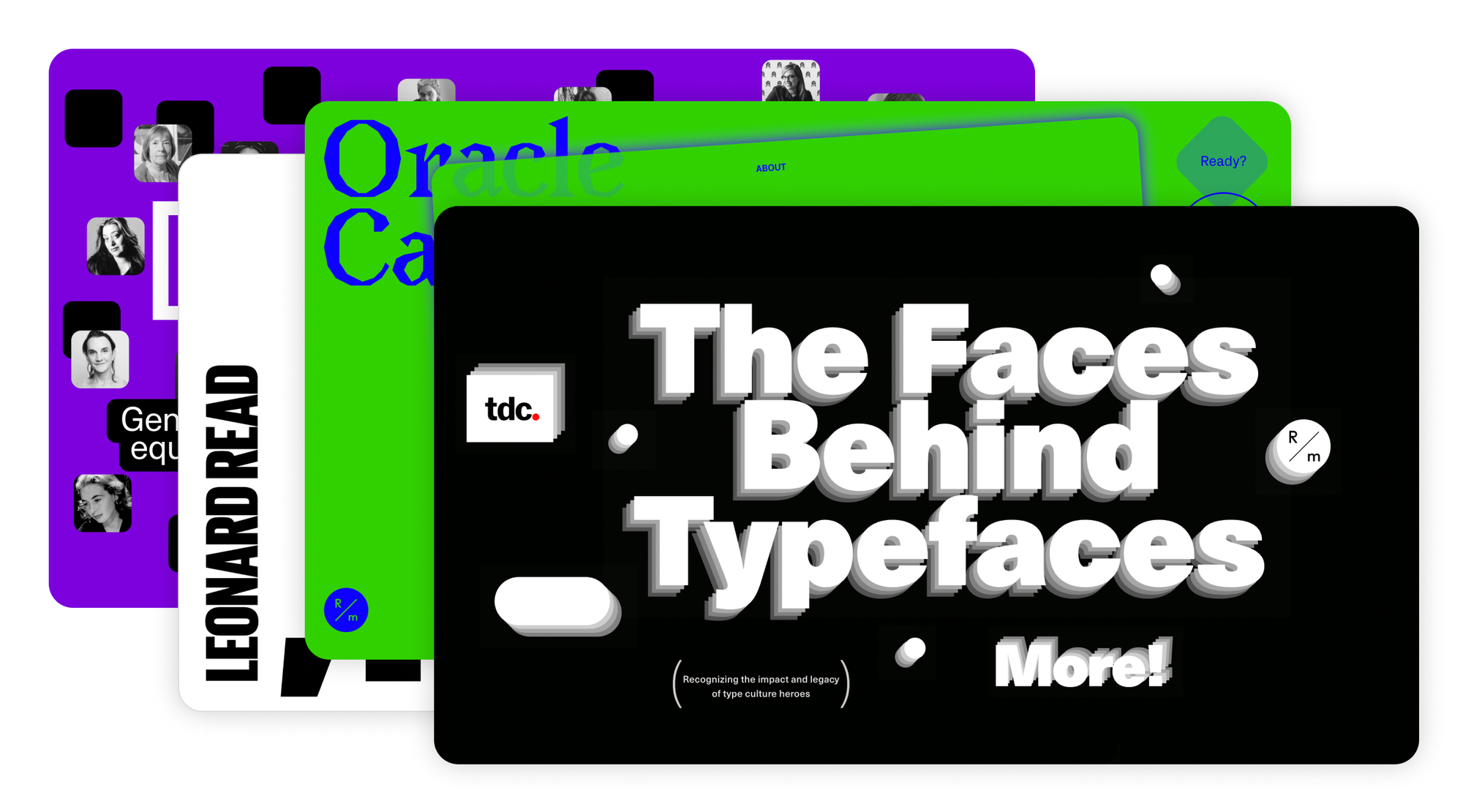
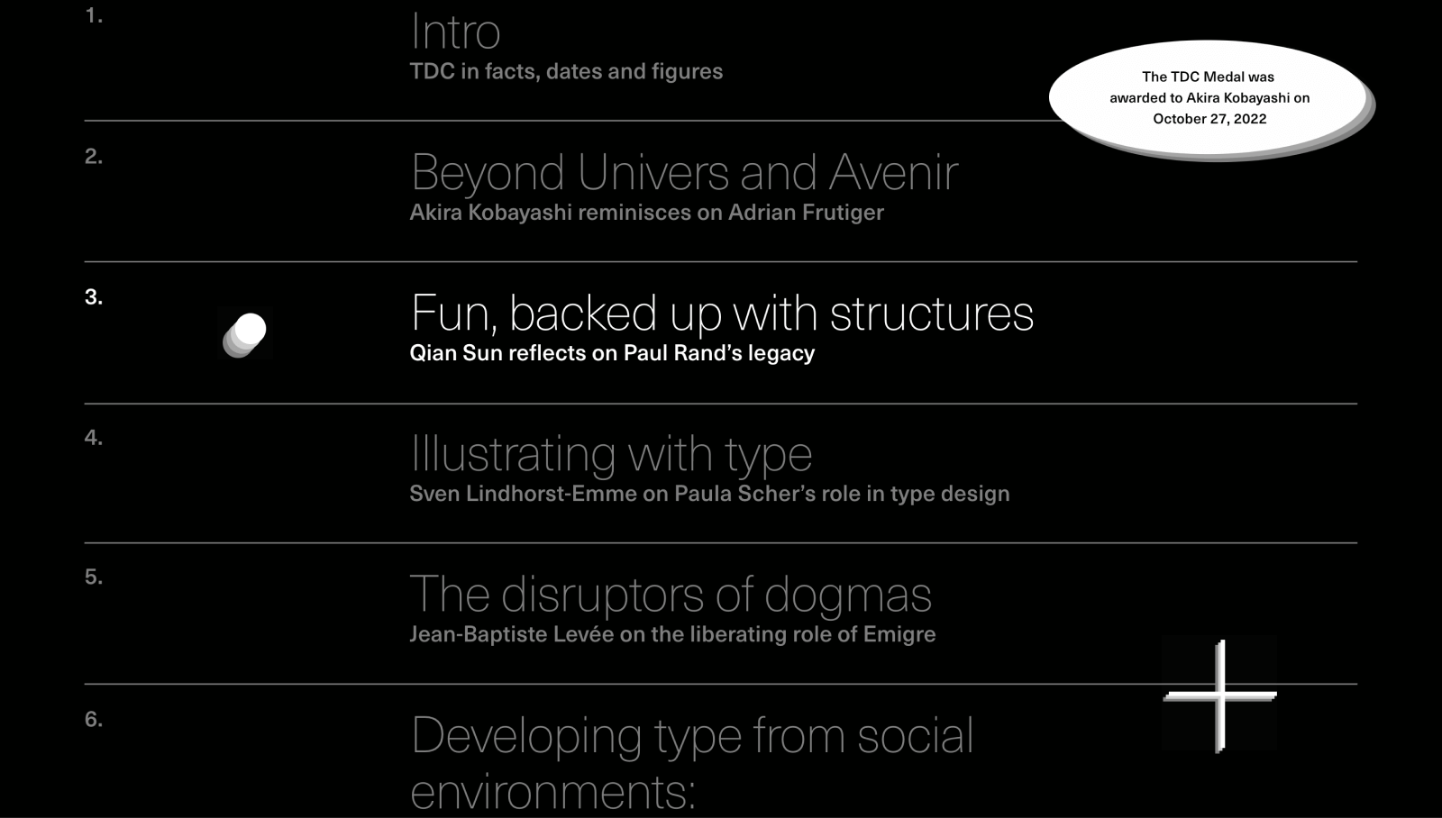
A standout example is the 2022 collaboration between the Readymag team and the Type Directors Club for "The Faces Behind Typefaces". This project racked up more media mentions in one month than projects usually get in an entire year. The secret sauce? It's all about the content. The project wove together deep insights from modern leading type designers, with stories from legends like Paul Rand, Emigre, Paula Scher, and Ruben Fontata, among others.
Let your project be a bit playful
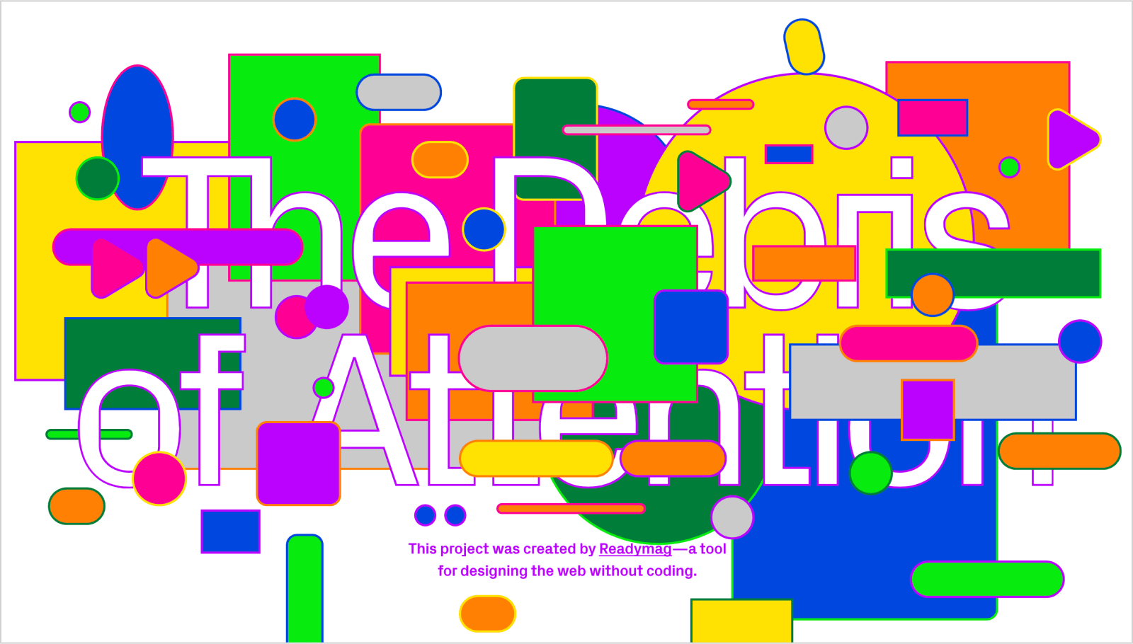
Active participation helps maintain a focus on digital content. For example, the "Debris of Attention" project turns into a game where readers can eliminate distractions. This approach allows readers to engage more fully with the text, encouraging them to think more deeply as they proceed.
Another example is "Oracle Cards of Design Manifestos", where each click gives you a piece of advice from design stars like Experimental Jetset, Paola Antonelli, and Dieter Rams. This mix of fun and learning shows how keeping things engaging can make a big difference.
Check out more Readymag editorials in our library. And yeah, you can sign up for free to try making your own.