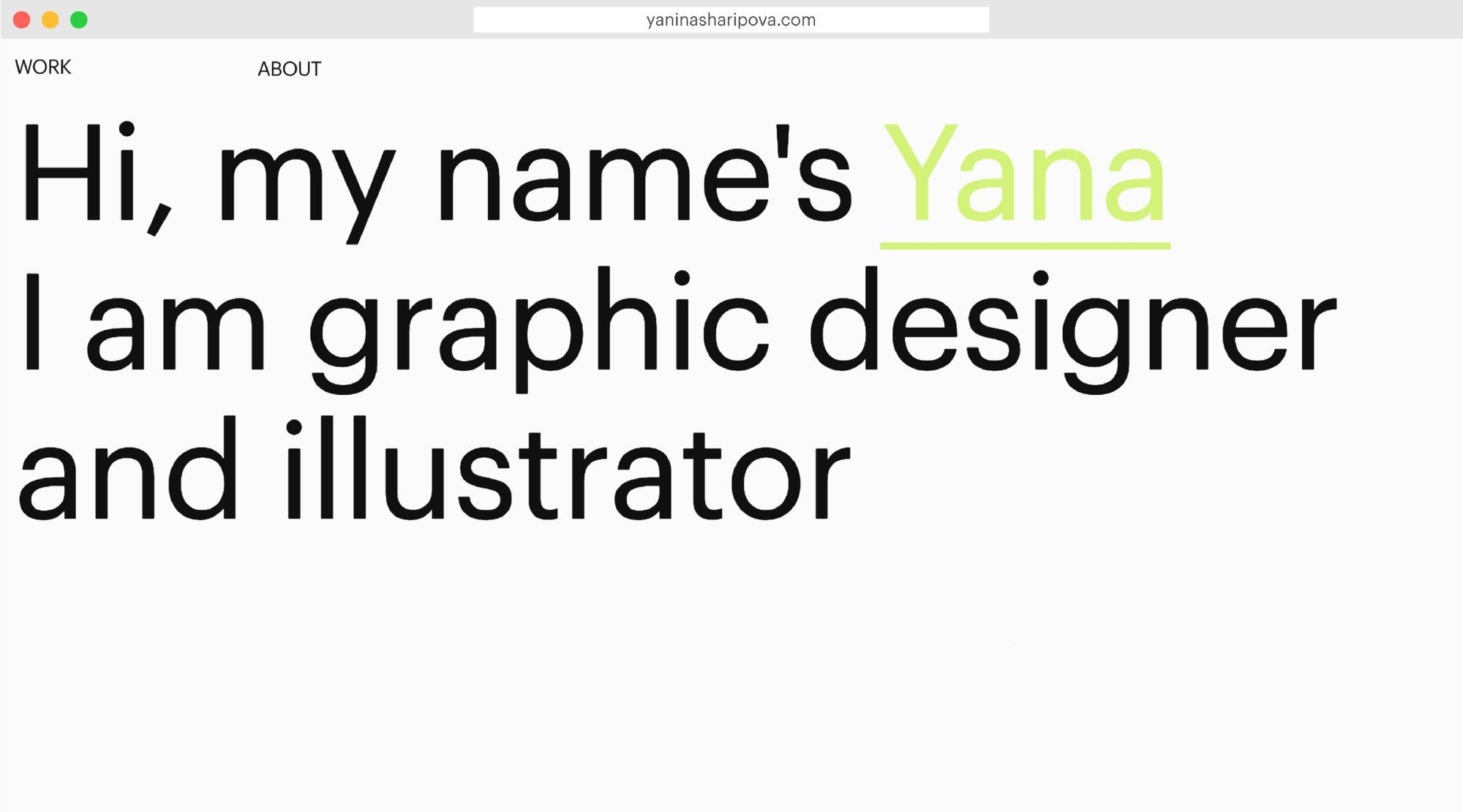
Visual blocks & accent on navigation: how to build a portfolio for a multi-hyphenate
Yana Sharipova, a young multi-talented creative from Moscow, tells how she created a minimalistic edgy portfolio with Readymag.

Yana Sharipova is a young multi-talented creative from Moscow: she juggles the roles of an illustrator, graphic, set and costume designer. Yana tells how she managed to put on display so many professional fields in a minimalistic edgy portfolio, without getting the viewer disoriented. This work got recently featured in Readymag’s Explore section.
Balancing multiple spheres
After school, I enrolled in communication design but later switched to scenography and theatre arts. Also, I took a course in illustration and completed it alongside. Currently, I work as a graphic designer at Pixies studio, where I create interactive branding for clients. As a sideline, I’m now making costumes for a theatrical performance that will be released in the fall of 2019.
I love to balance all these super different fields. Graphic design works with abstract forms; UX is about logical thinking; and as a costume designer you have to recognize archetypes hidden in the characters and express them through the choice of clothes.
Make the complex simple
The most important thing about my portfolio was to make it easy to grasp and navigate. I created this work in several iterations: at first, it was more visually sophisticated and included elements of personal branding. I was apt to use accidental typography and was mulling a catchy font. As for composition, I wanted to build my portfolio on simple geometry forms like squares and circles, so that each shape would represent each field of my work.
When I tried Readymag and made prototypes of a couple of pages, I realized all this distracts the focus from where it should be — my projects. So, I decided to make the portfolio to the utmost minimalistic: I picked Graphic, which is edgy but quite neutral, and used a default 12-column grid.
All of my projects are featured on the main page — each name presents a chunky visual block. When you click on the project name, you go to a new page and see the work in detail. At the end of all project pages, there are two black navigation circles: they help switch between projects and unite all pages visually. In the future, I’m going to restructure the portfolio and discern the spheres even more.
Viewer’s journey as a theatrical play
My understanding of drama theory helps a lot in design: I realize better how an idea develops over time and use this to make meaningful and exciting user experiences. You can not change the sequence in which viewers see a theatrical play, yet you can play with sequences when designing 4D objects like books or booklets. I love when the construction of a project somehow reflects its whole idea.
Let’s take for instance my graduation project — visual branding and a multiverse yearly catalog for Ground exhibition space in Moscow. This gallery showcases a wide range of projects on the intersection of visual and sound art, experimental theater, new technology and media.
The main idea of my catalog is that Ground is very flexible and every time opens to visitors in very different ways. I created folding booklets for all lectures, workshops, and exhibitions that had been held over the course of a year and handed printed sheets to visitors and venue managers, so that they could bind them depending on their preferences and interests. Each person creates a custom catalog based on his or her needs.