Viewport customization for mobile
Preview your mobile version as it will appear on a variety of devices and change the width of mobile layouts in the Editor using the Guides menu.
We have released two new features that allow to fine-tune user mobile experience.
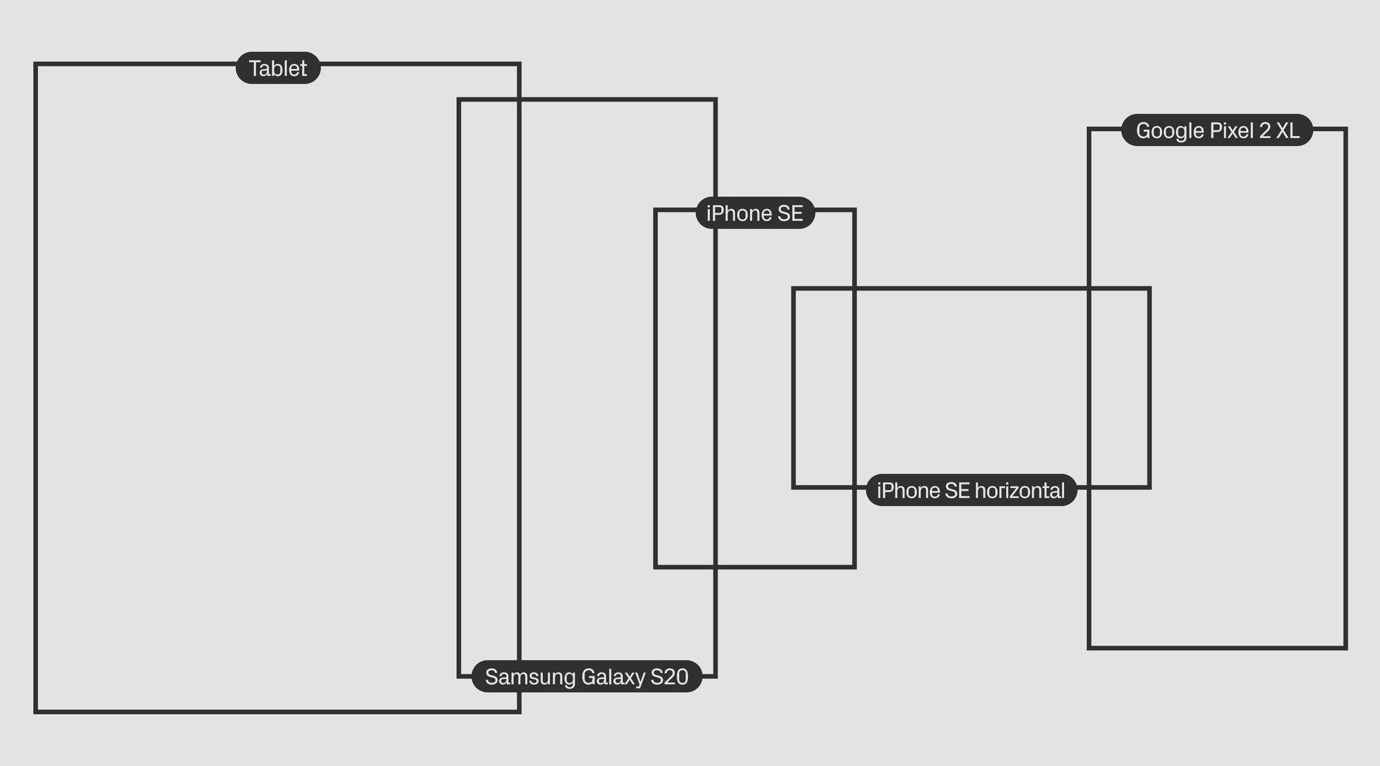
— Select from a list of mobile devices in Preview mode. This feature allows users to view the mobile version of their page as it will appear on a variety of devices.
Use this feature, for example, to make sure that your project’s most relevant details fit the first screen of all devices.
— You can now change the width of mobile layouts in the Editor using the Guides menu in the mobile viewport.
This will help you fine-tune your project for a particular device version. Content will scale up or down on devices with different screen proportions.
Learn more about working with mobile layouts in our Help section.