Clients choose us to make a statement: Together with You studio on the inner workings of a design company
A deep look inside the creative processes of a two-man design studio that sees people as creators and works together with clients, not for them.

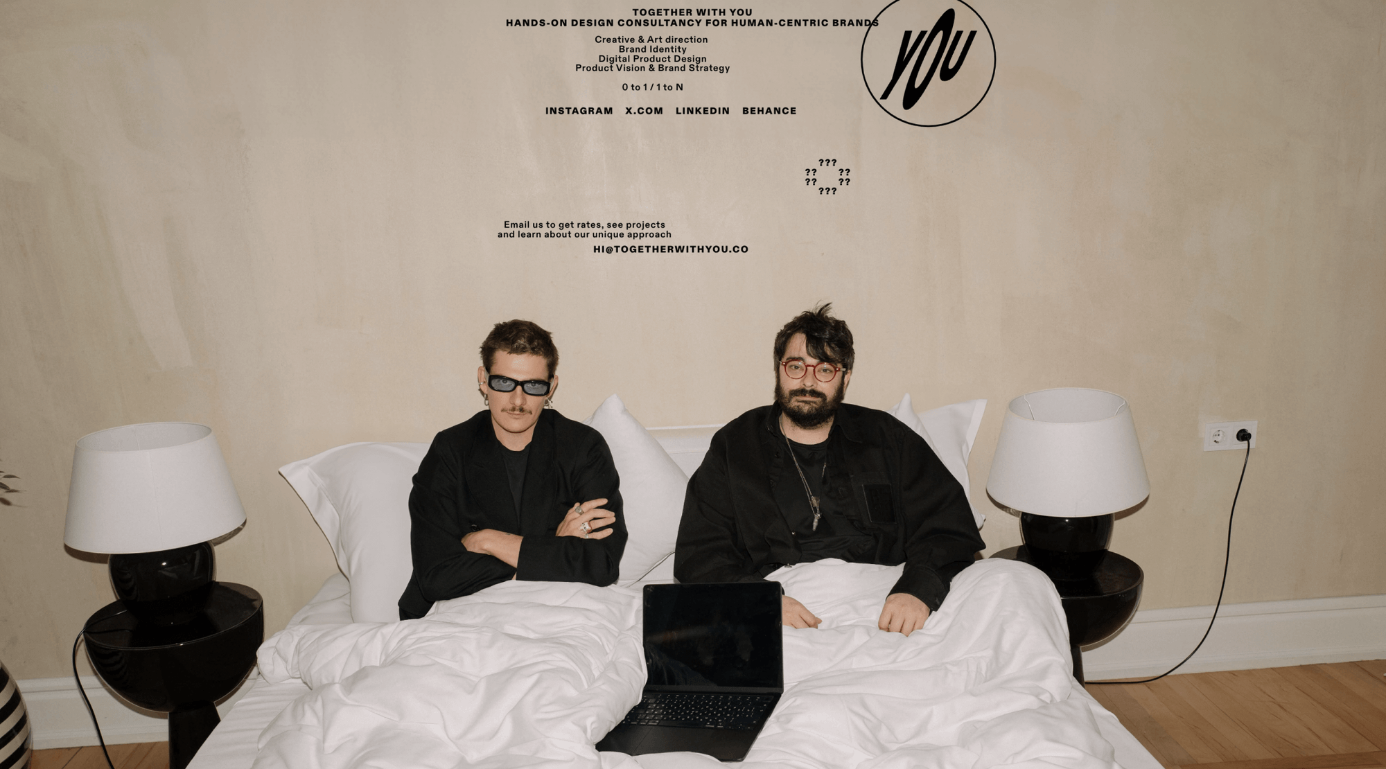
If you’re wondering how to fine-tune creative processes within a design studio of two and handle everything without managers, this article might help. Artem Tarasov and Artem Taradash from Georgia-based design studio Together with You share how they created a tiny studio, why they chose such a name, how they empower clients to be bolder, and how they structure their design pipeline.
The text below comes on behalf of Together with You.
Together with you, and you, and you: the origins of the studio
We met at Arrival, a UK-based startup that was developing electric transportation for B2B clients. In 2023 we got laid off because the startup had to drastically reduce its costs. However, we left with a positive feeling: we’d done a lot of good work there, and it turned out that the culture and community that had emerged there were more important to us than the business objectives. This experience gave birth to Together with You, a design studio that believes that all people are designers and creators in one way or another: you just need to let them talk.
The Together with You concept is based on our perception of clients as co-creators and us as a retranslator of the client’s ideas into the language of captivating imagery and user experience.
“The studio’s name is modular: we usually name online meetings with clients Together with (company name), and if another party joins the meeting, we add them to the name as well.”—Together with You studio
There’s no management at Together with You: only the two of us. From time to time we work with assistants, but in general, we intend to develop Together with You as a collaborative business. Obviously we have tasks that the two of us share in implementing design, but this division is very conditional. Just before creating designs, we work side by side on conceptualization, where, in our opinion, there should be no discipline. No matter whether you work in a corporation or a startup, defining yourself as a separate unit of a product or brand design kills an important creative component. At Together with You, we try to blur these boundaries.
Be brave to use it: about clients as knowledge holders
Our clients come from different niches, most often from tech startups, offline services, and consumer goods. Geographically, they’re from the European Union, the United States, the Gulf, and China. I think they come to us when they want to speak up. Our clients’ previous experience with design studios was mostly like this: the studio usually expresses itself, and the clients act as silent advisors standing next to the studio team. We say right at the first meeting, “We’re going to work together with you.” If there are different people at the table, the design will also be different.
“We have a balanced, sober understanding that clients are the keepers of knowledge about the business they’re engaged in. We respect that but don’t go beyond it.” — Together with You Studio
Generally, in an agency business, it’s common to either demonize clients or glorify them as someone you depend on. We don’t share this approach: we have a balanced, sober understanding that clients are the keepers of knowledge about the business they’re engaged in. We respect that but don’t go beyond it, and we won’t go out of our way to fulfill all of their requests.
Basically, we offer clients what we call a Design Foundation. It’s a brand identity and product vision with a strong emphasis on concept. Our process of working with clients is organized this way:

Discovery. For the first week or two, we workshop together and pull any verbal or visual information out of a client that can be useful in the future and form a creative concept. The process consists of a narrative system: Abstractions -> Metaphors -> Preferences + Mood boards and Design drafts and is rooted in what the client expressed during the workshops.
Formation. As soon as all participants agree on the creative concept, we move on to refining the design. For the identity work, this includes media tests and systematicity, and in product work, interactivity.
Execution. Here, the work revolves around final artifacts: for example, designing and launching a website, or creating an identity or campaign.

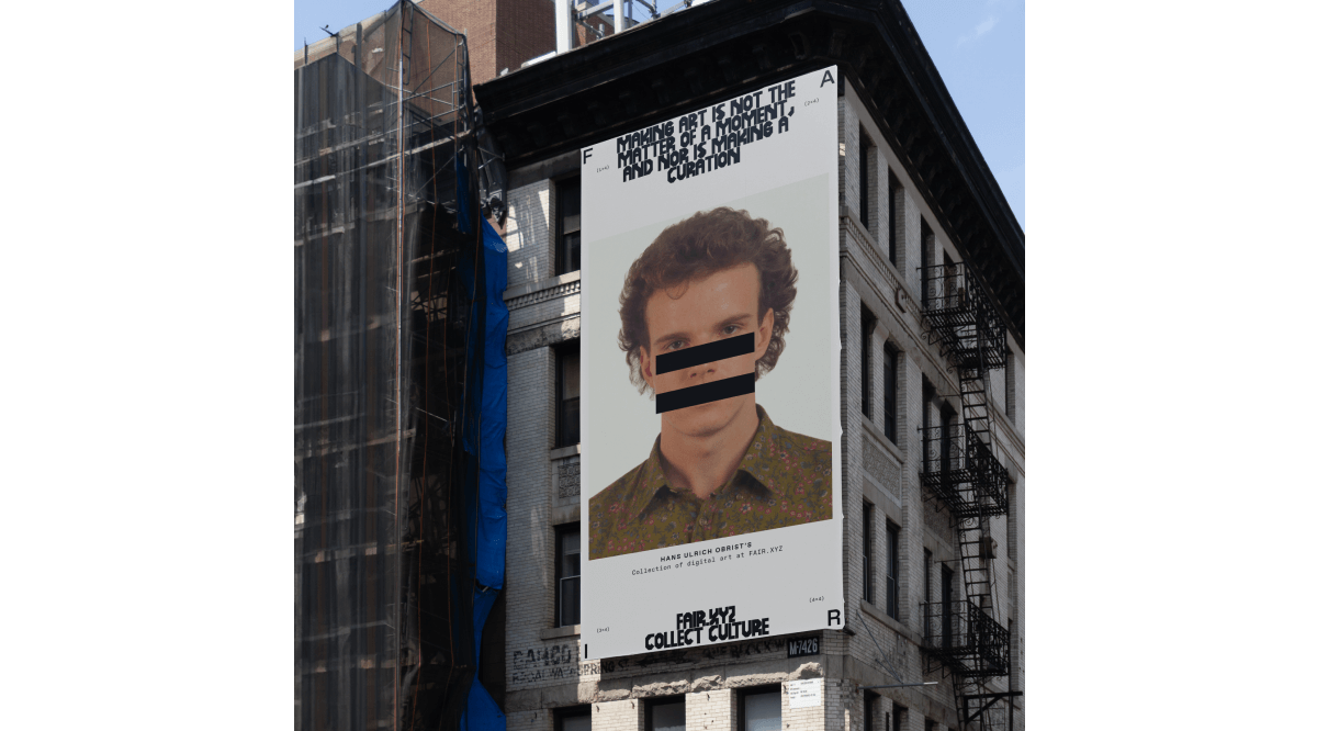
We like to push something that the client isn’t really ready for. For instance, we recently tackled a cryptocurrency project where the clients saw certain standard interfaces and identities. When we offered them options that cut out of that familiarity—albeit ones that were logically sound and based on what the client was bringing in. They took this as us awarding them the courage to do something that wasn’t previously in their realm. We as designers dare to create unconventional things and see that clients are actually so ready for them.
Made with Readymag: After Hours Workshop and Together with Anapea
While there are many website design tools on the market, Readymag is the first one that comes to our mind when we need to do something groovy, now, and ready to publish in 40 minutes. Readymag has a human feel to it: it’s outright smart but with an attitude. For us, the stuff we do with Readymag doesn’t have to be overly complicated and live a super long time. It’s more about making a statement.

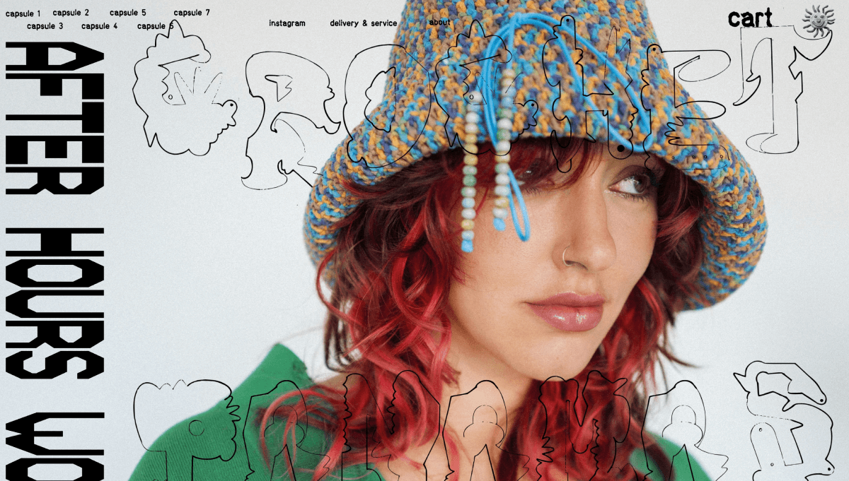
When we were working on a website for our friend’s unconventional handmade goods shop, the After Hours Workshop, we got the idea to design the project exactly as Readymag guided us: not to align anything and to free ourselves from boundaries. In general, the question that we advise every designer to ask themselves to get visually emancipated is, “Can I do it? And why not?” We only live once.
“The process of designing the website for me was similar to collaging: you cut up pictures and assemble some sort of entity right on the floor from a pile of scattered pieces. First, I made a simple logo. It was designed to express nothing because I didn’t yet understand what I would need to express. But then I realized that I had to somehow balance the craziness and versatility of my visuals. That’s how the current bold logo was born. It’s ultimate, choppy, and heavy, but it also keeps the reference to craft thanks to the font from the receipts”, says Sasha Akhramenko, a friend of ours and the creator behind the After Hours Workshop.
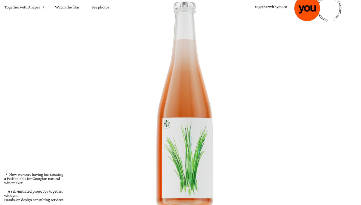
The second soulful project designed with Readymag is the branding for natural wine bottles by Anapea, a Georgian wine producer. We took a tour of the winery and got to meet Khatia, who owns the business.

At one point we were walking between vineyards and she brought our attention to the bushes between the vines, telling us that conventional wineries cut this grass, and unconventional wineries leave it. To describe the difference, Khatia used the phrase “shave the bushes” in English, and a metaphor came into our heads right away. We veiled it in patches of grass, but despite the metaphorical nature of the wine label, that was the first Georgian wine bottle with a picture of a woman’s pubis on it. In Georgia, winemaking is quite archaic and patriarchal, and the label refers to women’s power and all of the women who work in winemaking day-to-day.
Why not help your clients make bold statements or just simply express their ideas together with you? Try Readymag, it’s perfect for translating any idea in an easy and thorough way.