The ultimate guide to mobile
Summarizing work with mobile websites in Readymag
These days, 64% of all web traffic comes from mobile. So if you want your ideas to shine online, your mobile project needs just as much attention as your desktop one. In this piece, we’ll walk you through working with mobile in Readymag.
General flow: Desktop and Single column auto-layouts
In addition to a default desktop viewport, Readymag offers a mobile and tablet one. Before you switch on the mobile viewport for your Readymag website, you will still see the desktop layout from any mobile device. It will be scaled to the screen’s width (both in landscape and portrait orientation).
When you switch on the mobile viewport, you’ll see a menu with a choice between two automated options of mobile layouting:
Single column resizes widgets to fit into the mobile viewport and positions them in a column, one after the other. Auto-arrangement into a single column doesn’t apply to fixed widgets and widgets with on-all-pages positioning.
Desktop layout recreates the positioning and sizes of all widgets just like in the desktop version, but does so within the gray frame, which represents the borders of your mobile layout.
Working with individual widgets
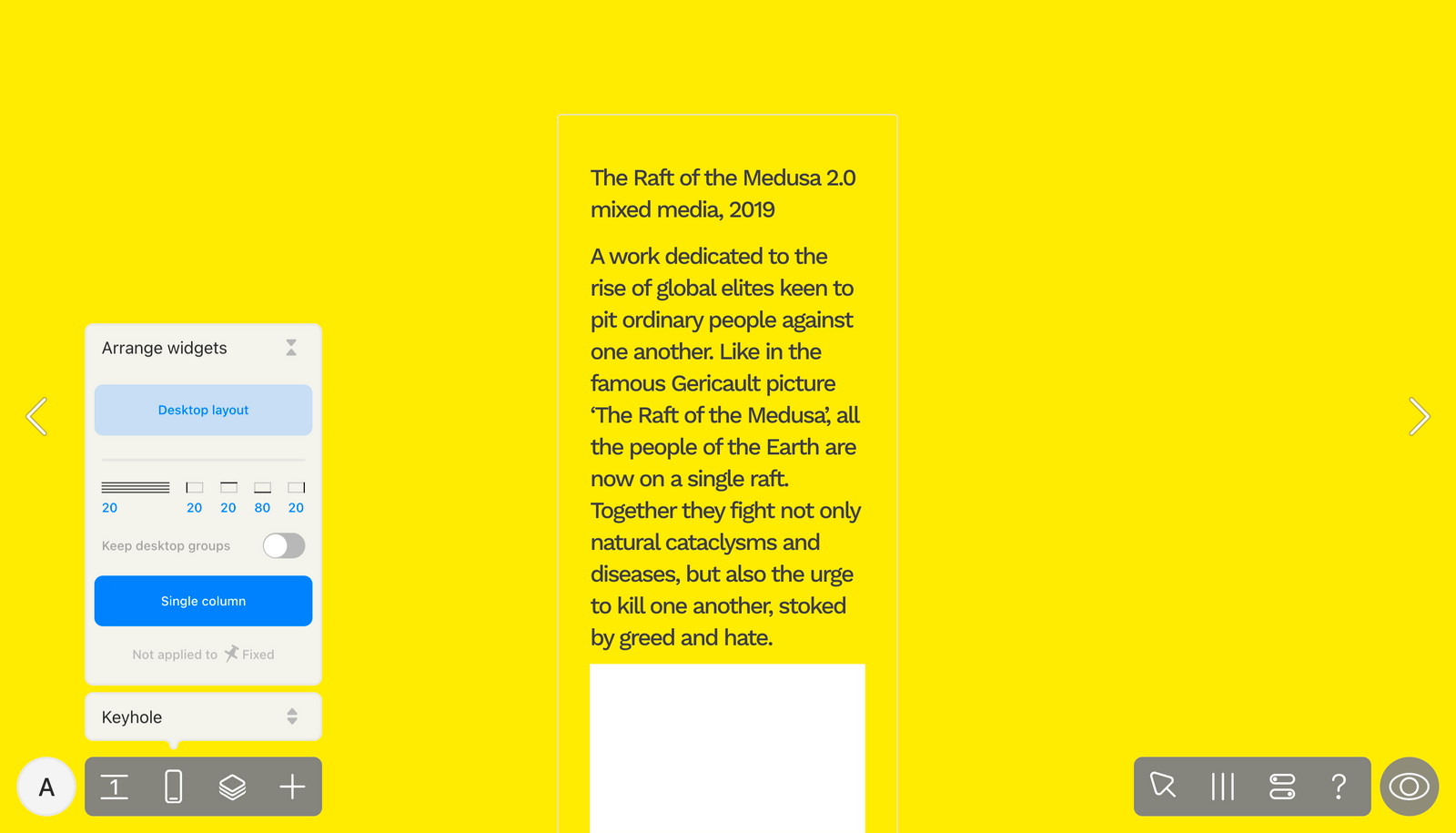
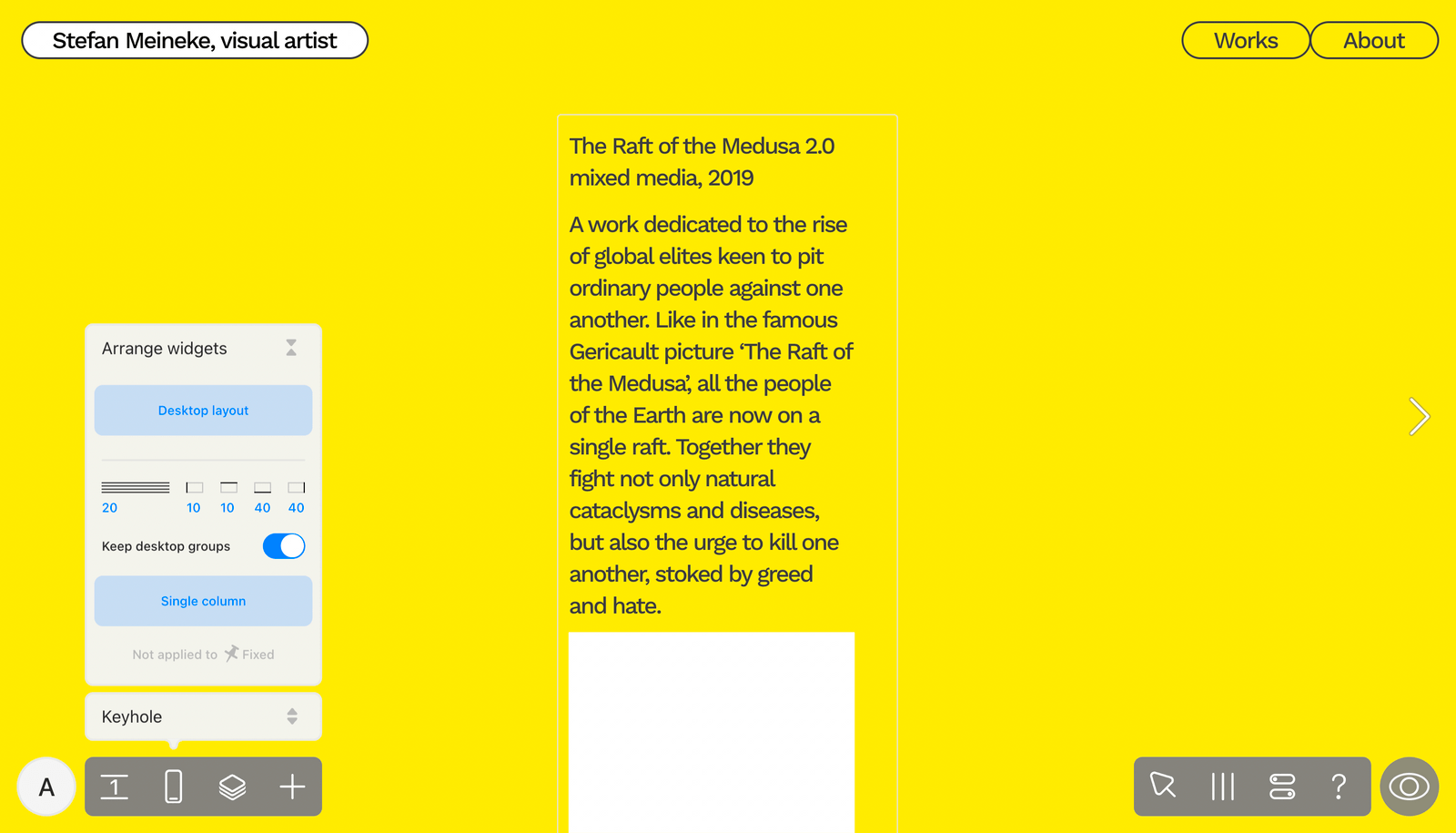
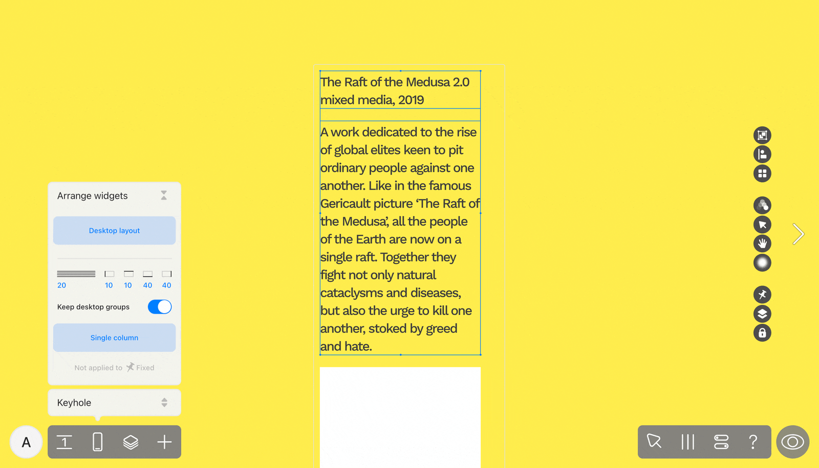
When you select at least two widgets in the mobile layout of your website, Arrange controls appear in their attributes on the right side of your screen. When you work with them, you can adjust the chosen widgets without the risk of damaging the rest of the mobile layout. If the selected widgets have regular positioning, there are three option buttons.
Desktop composition: this option will recreate the initial proportions and positioning of the widgets in the Desktop layout.
Fit Desktop to Mobile: this one will keep the widgets in the same positions as in the Desktop layout, but will resize them to fit the width of the mobile layout.
Single column: this variant will rearrange the widgets one after another and position them in a vertical column. In this panel, you can set margins and line spacing, as well as decide if you want to keep widgets grouped together like on the desktop.
If you select widgets that include one with a fixed position, you can opt for Desktop composition.
Automated mobile layout arrangements don’t apply if at least one of the widgets you select has the on all pages and above all widgets positioning. This was done to prevent the overall composition of the mobile layout from breaking.
Composition tips & tricks for mobile
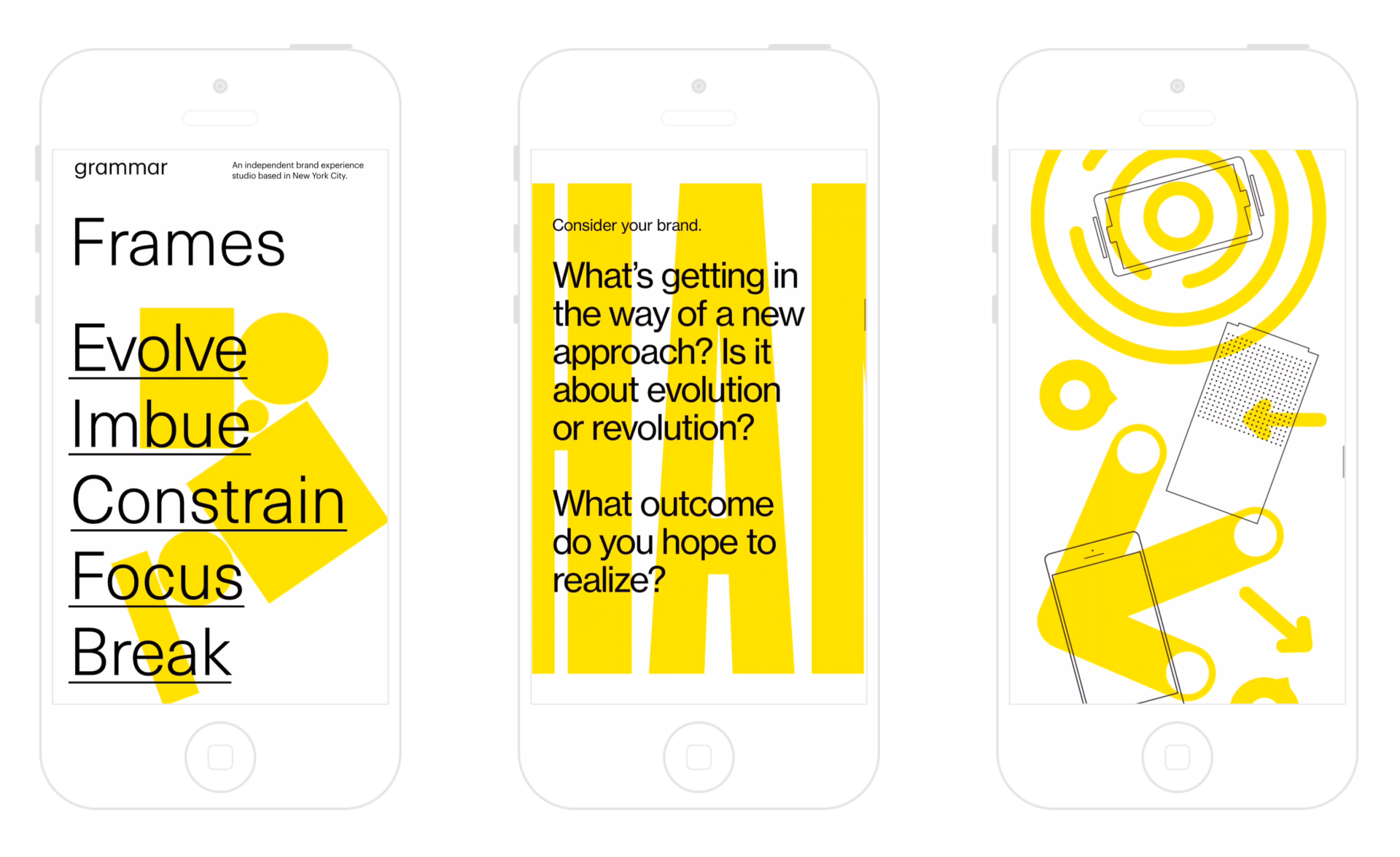
“Visual contrast and rhythm are very important, but mobile screens don’t offer much space, so the possibilities for creating visual contrast are quite limited”, says Readymag Product Designer Stas Aki. Don’t hesitate to recompose your website substantially — the smaller width of mobile screens and their proportions call for a unique composition approach.
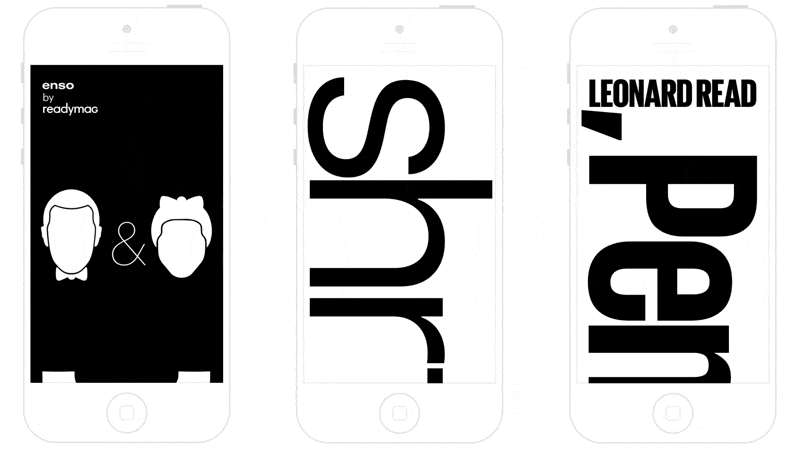
“Let’s take our editorial about Charles and Ray Eames as an example. In the desktop, headlines appear in a very big font with animation applied. In the mobile version, I left the headline large but rotated, so that it spanned the whole screen, stretching past the bottom edge. That’s a very simple stunt, yet catchy. When you see only part of the headline, you intuitively begin scrolling down to see the rest of it”, Aki adds. The same trick is used in his editorials iPencil and Shrtcts.
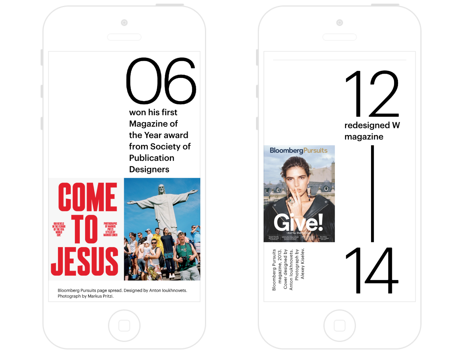
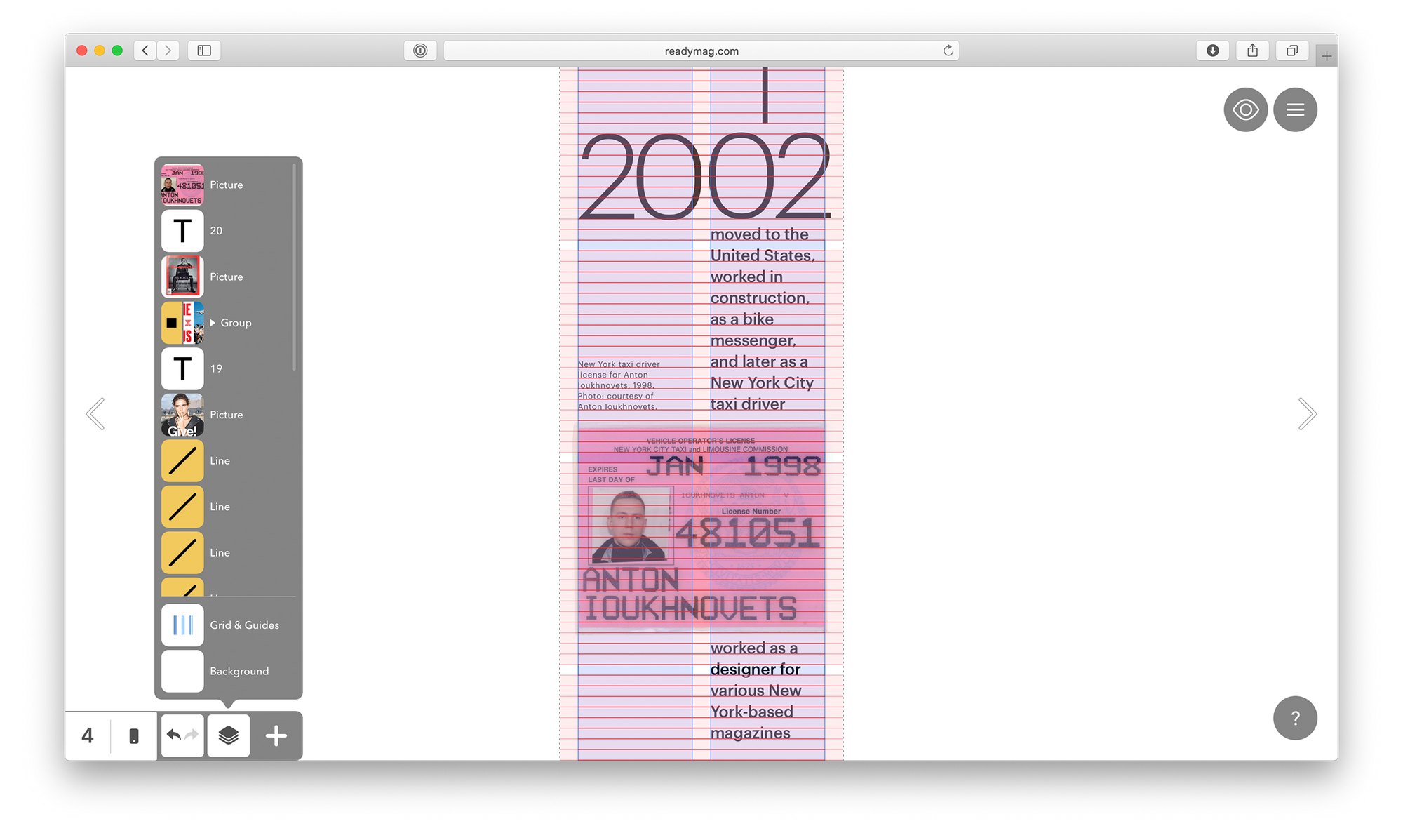
Beating cliches is always a good idea. In mobile, text and images are traditionally placed in one column — but there’s nothing preventing you from using more. Take for instance Readymag Stories’ installment about Anton Ioukhnovets.
Things to be cautious about
Synchronization between layouts
The content and most properties of widgets are synchronized between desktop and mobile layouts. When you change the content of a widget in either layout, the change is repeated across both.
Yet, some widget properties can be set differently. Positioning, size, opacity, animation settings, image cropping, font, font size, and text line spacing can all be manipulated independently.
Sometimes, you may need to change the content of a mobile widget — for instance, to syllabify words differently, add extra hyphens to a text, or assign different graphics for desktop and mobile. In this case, we recommend you hide (but not delete) the mobile widgets synchronized with the desktop and create new, independent ones for mobile. They will appear as hidden in the desktop layout.
You can always reset the Mobile Auto-Layout by using the restore panel.
Please note that the Scalable Layout viewer mode is unavailable in mobile, it works only for desktop.
Animation in mobile widgets
Readymag maintains two types of mobile animation: On Click and On Load. When you activate the Mobile Viewport, all widgets animated in desktop mode appear static. You can set On Click and On Load animations for mobile widgets from scratch or use Shift+Cmd+C/V to copy animation attributes from desktop widgets to mobile.
Performance of mobile websites
It’s better to avoid complex animations on mobile. Firstly, due to the lower power of smartphone processors and mobile internet. Secondly, because of the circumstances in which people view mobile websites, you usually do something else, such as look at your smartphone, hastily scrolling down. “I think that any kind of on-load mobile animation breaks the smooth viewing flow and irritates people”, Stas Aki adds.
Large images also thwart mobile website performance. We recommend TinyPNG to compress images without affecting their quality.
Testing your mobile
To test how your work looks on various screens, open the console in Google Chrome (Ctrl+Shift+J for Windows / Linux or Cmd+Opt+J for Mac) and choose the tab with a mobile phone and tablet icon. You’ll find a range of simulators. We also recommend BrowserStack — a paid service with a free trial period. But of course, the best solution is to have several devices on hand to directly test how your website looks on their screens.
Feel free to reach out to our support team at [email protected] with any questions on mobile design.