Tell your story visually: Tips and examples
Some practical visual storytelling tips come paired with plenty of real projects for inspiration
With the ever-increasing information overload and audiences’ elusive attention spans, a designer’s top challenge is breaking through the noise. That’s where visual storytelling leverages the two human realities: people process images 60,000 times faster than text, and the overwhelming majority of us unconsciously tend to buy experiences rather than products.
In this piece, we run through some practical visual storytelling tips and techniques, along with plenty of example stories for inspiration.
Plan ahead
The common approach to content creation begins with developing text, followed by the creation of design supporting the message. With visual storytelling, the graphics and images play an equal, if not more important role, and should be considered from the early stages. So, try bringing together everyone involved in the production for a strategic session. Pay attention to the following questions and plan accordingly:
- Who is your target audience?
- Does your story have a human interest potential?
- Is your plot obvious? How would you emphasize the change of events?
- How would you motivate people to keep consuming the story?
- What’s your call to action?
“In well-crafted visual stories, a call to action logically follows from the narrative itself. If you manage to create a story that holds attention and creates a mood, then by its end the viewer will be ready to take the desired action. Only one final point is necessary: a button, a link, or a form.”— Varya Fomicheva, Designer at Readymag
Build visual hierarchy
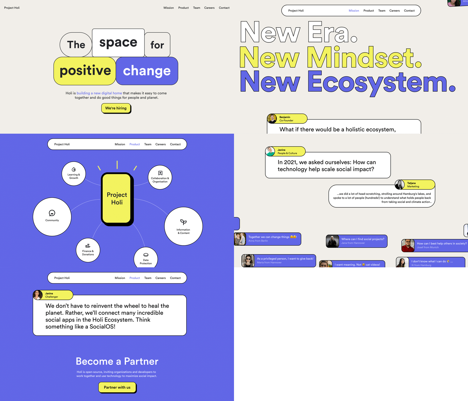
Proceeding from the insights you’ve gotten during the kick-off discussion, decide what elements you want to emphasize in your story. By ranking them from most important to least important, you make it easier for the viewer to absorb and digest your content. There are a number of visual tricks you can use to influence this flow: size and scale, color and contrast, rhythm and white space, all of which can communicate your ideas accurately and in depth.
Avoid monotony, but be cohesive
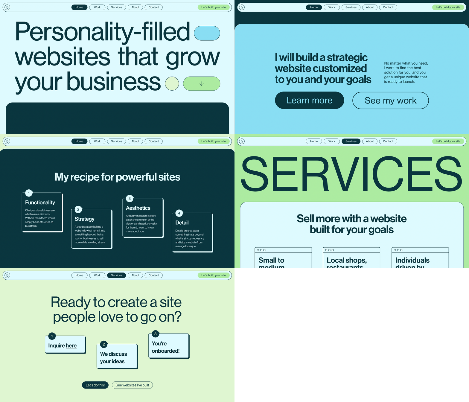
Split the text of your story and the subsequent design elements into small batches. Don’t put in too much information, and keep the structure simple. This will help keep you in control of your story and reveal only what you want, when you want to reveal it.
Create a mood, awaken the senses
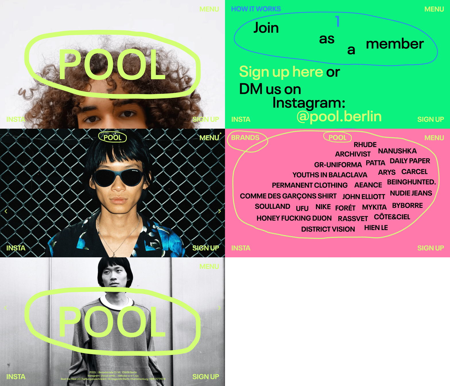
A good visual story is not only nice to look at but also stimulates the senses. Design goes far beyond communicating an idea—it can create warmth, evoke yearning, or trigger anxiety. By working with color, fonts, images, textures, shadows, motion, sounds, and video, you can pull audiences in and make your story come to life.
“Tension builds primarily through visual imagery and style. Video background, animation and gifs can help keep viewers scrolling through your project”,— Varya Fomicheva, Designer at Readymag
Be strategic in your use of motion & interactive elements
When used properly, motion entertains us and inspires emotions that drive audiences to continue through the narrative.
In Readymag, you can animate objects on load, on hover, on click and on scroll, adding movement, transparency, rotation, and size change effects—or combine all of these to create a multistep triggered motion. There are even more sleek and sophisticated Readymag interactions: you can turn video into a sequence of stills that plays when the user scrolls or hovers over it, create video backgrounds and play on scroll, or replace the standard cursor with whatever graphic object you want. When they interact with these elements, viewers feel in control and become more vested in the experience.
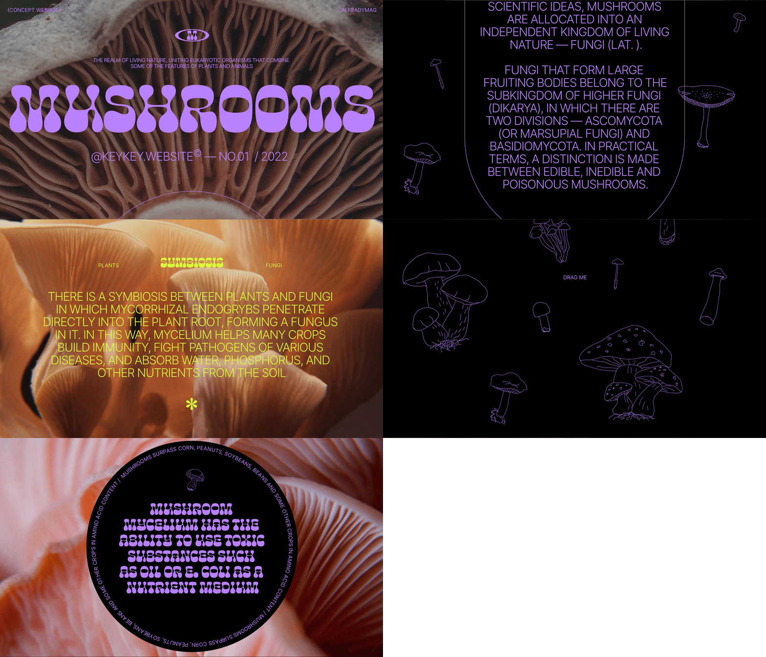
Challenge the common, go beyond the choir
The sensation of novelty you experience when you look at a web project is very important. That’s why new, original ways to present information are always advantageous, and why fashions in design change so frequently.
“In all the projects mentioned in this piece, entertainment plays an essential role in the visual narrative and is perhaps the main tool to attract and focus viewers’ attention. Don’t bore the user with a monotonous flow—spice the thing up with elements that surprise the viewer and boost intrigue.”—Varya Fomicheva, Designer at Readymag.
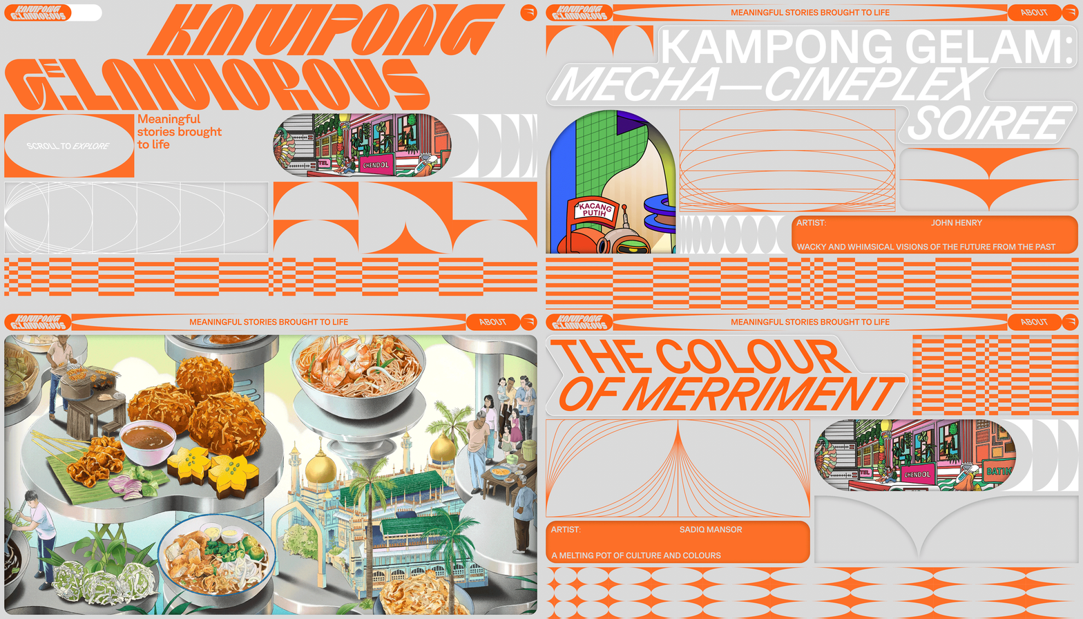
Last but not least, enable deeper reach
By doing your best to harness stunning visual storytelling, you imply that the project aims to attract a broad audience. Use this checklist before publishing your website to ensure that it is indexed by search engines, doesn’t break the law, and is accessible in a wide range of viewing situations, like small screens, visual impairment or slow internet connections.