Telecom website makes good use of Readymag animations
Futuro is a full stack development studio based in Berlin and Kyiv. Their project for Ontel, an American telecom company, won in Readymag’s annual Projects of the Year competition. We asked Futuro and our product designer Stas Aki to describe what’s so special about this website.

Futuro is a full stack development studio based in Berlin and Kyiv. Their project for Ontel, an American telecom company, won in Readymag’s annual Projects of the Year competition. We asked Futuro and our product designer Stas Aki to describe what’s so special about this website.
Artem Portugalsky, co-founder and CEO at Futuro:
Futuro is a product design and development company, building SaaS, B2B, web and mobile apps for startups and enterprise companies.
For example, one of our projects is a real-time analytics platform for football clubs that generates detailed performance reports based on game footage and machine learning. Another project is an online bidding platform for logistics. Yet another one is Ontel, a telecom company — we helped them develop their workflow-management system for telecom operators.
Working with Ontel, we understood that a great website might actually boost their sales. We offered to create it on Readymag, and they agreed. Looks like we did the right thing!

Initially, we thought of Readymag as of a tool that was most useful for prototypes and presentations. But after creating a number of projects, we understood that its power could be much greater. Now we offer a Readymag webpage as part of our usual deal with clients since it can significantly decrease costs compared to a self-created webpage, without compromising on the design. In our practice, we could save our customers up to 50%. That’s why all four of our designers use Readymag now.
As for Ontel, we put together a concept in Figma, got an acceptance from Ontel, and then created the site with Readymag. Our design decisions were based on the telecom’s existing brand, with a flair of good taste. For example, we used Maison Neue and Berthold Akzinenz fonts because they are quite simple, but look great from a typographic point of view and convey the right feeling.
Stas Aki, product designer at Readymag:
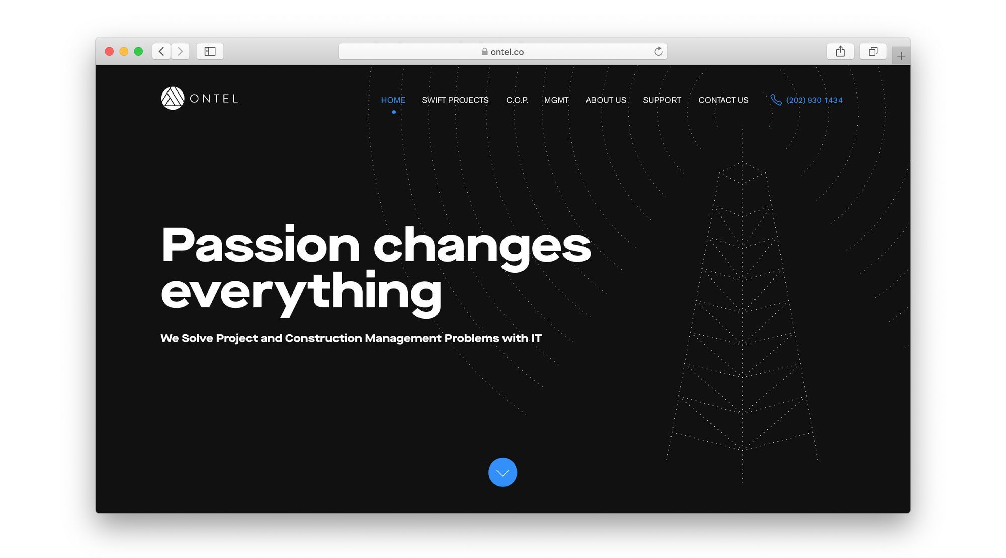
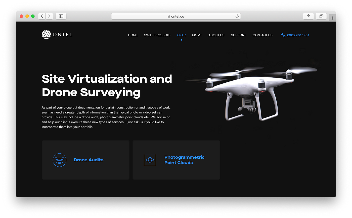
What I like most about the Ontel website is that it utilizes a lot of Readymag’s hidden potential without really putting it on display. For example, note these infographics created only with Readymag-internal animations.

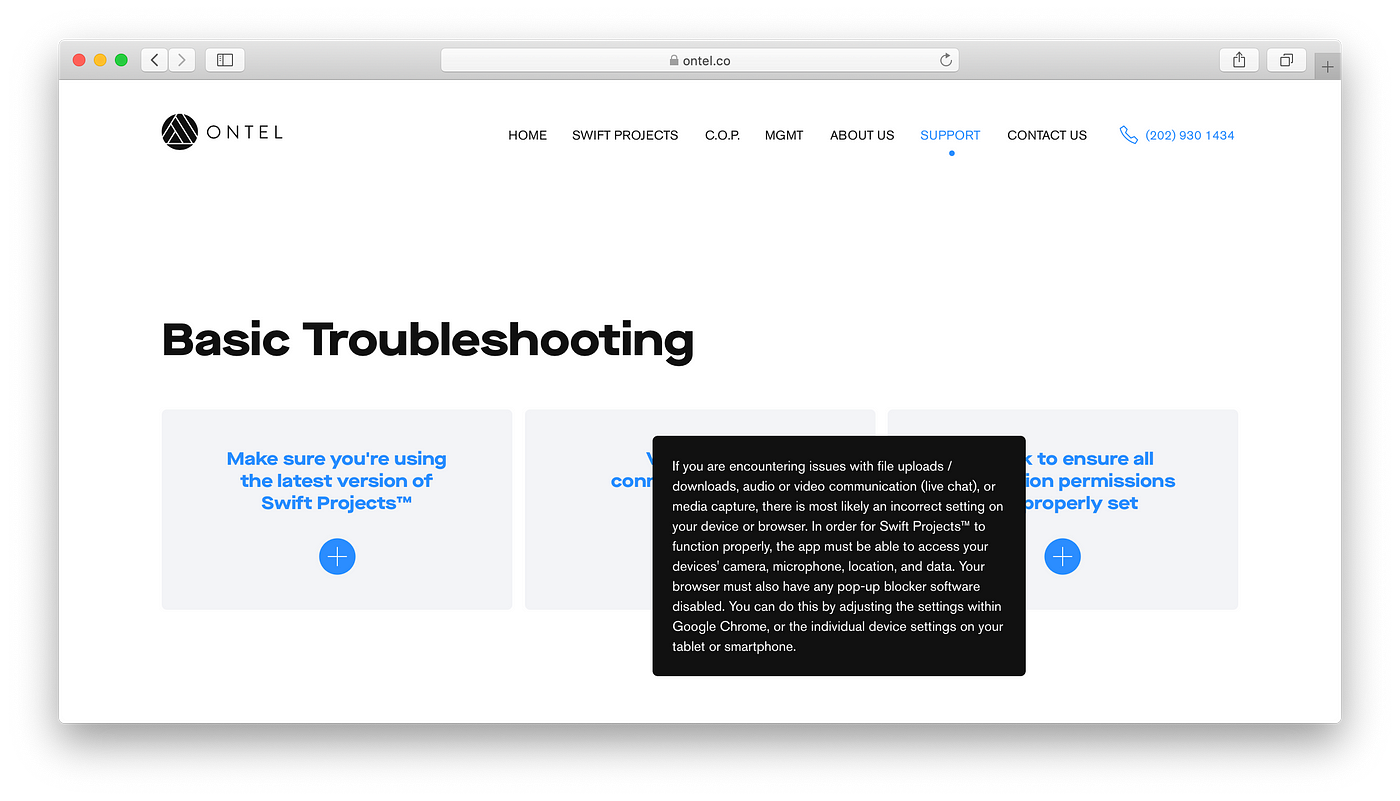
The site is also quite spacious, and browsing through it you always stumble upon some subtle, yet interesting design decisions. These ones, for example, are our Hotspot widgets.

All in all, I also really like the integrity of the whole project: it’s a fully functional corporate webpage, created only with Readymag in a very tasteful way.