Reciprocity: what actually shapes the spirit of a typeface
Can a typeface stand out, and still be readable? Type designers often claim that a good typeface for continuous reading is one that remains unnoticed. Yet, typeface designer Maria Doreuli suggests the opposite.
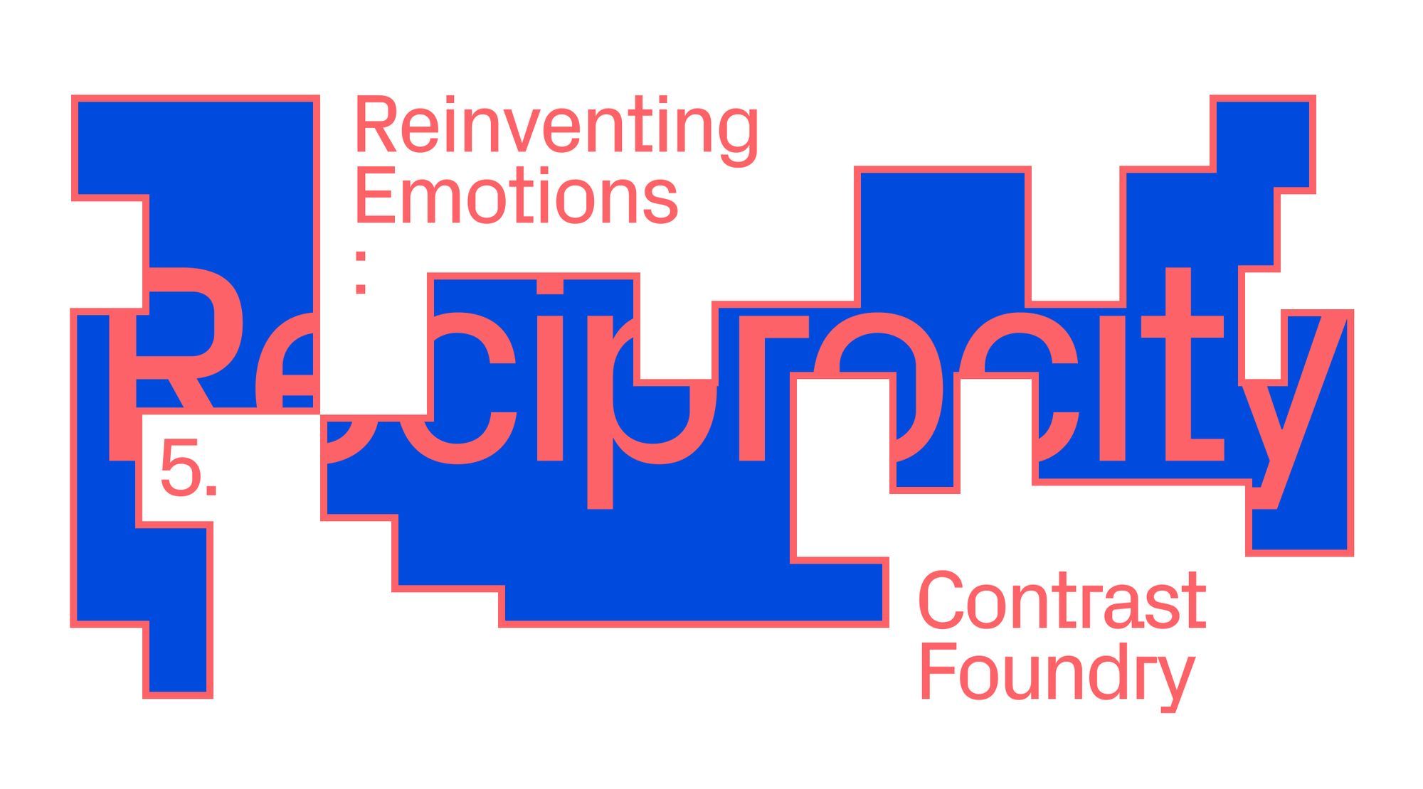
Can a typeface stand out, and still be readable? Type designers often claim that a good typeface for continuous reading is one that remains unnoticed. Yet, typeface designer Maria Doreuli suggests the opposite: in this text she describes how Contrast Foundry expanded on some of their most prominent works — Chimera and Beeline Sans — and concludes that the reader and context also help shape its final voice.
Is there a space for emotions in type design?
Some may remember a quote from American type designer Zuzana Licko: “We read best what we read most”. The more often we see a typeface, the more familiar it becomes and the easier it is for us to read. For good or for bad, most people don’t pay attention to fonts and hardly realize that new ones are still being developed.
As opposed to typefaces used for readable text, it is often typefaces meant to be used in large sizes that are allowed to have a unique personality — since their purpose is to catch attention. Here another quote comes to mind; as American type designer Ed Benguiat said, “type should be beautiful — screw readable”.
So, should a typeface be noticed or not? Is there a space for emotions in typeface design? For me the truth lies somewhere between these two quotes, regardless of what typeface we are talking about. They all carry emotions and stories, enrich texts and allow us to build associations while reading.
Even those who rarely use custom typefaces and only work with system fonts might struggle with their choice, because nothing really fits their message. There are common patterns though; for example, a typeface with rounded details usually feels friendly, while a typeface with prominent sharp details is seen as more aggressive.
To a certain extent, a typeface can tell as much of a story as any artwork. Like a piece of art, a typeface may resonate with us if we look at it closely. When I started working on my typeface Chimera, I realized that letters have an ability to carry the emotions, energy and passion we put into them further out into the world. CoFo Chimera is an experiment in bringing dynamism and beauty to the traditional reversed contrast typefaces that remind us of Western movies. Historically, these typefaces were intentionally created to be ugly. Their letterforms were designed as the opposite of the elegant classics, their weirdness was cultivated to challenge expectations and grab attention. Defying the rules once more, CoFo Chimera twists this quirky concept into an elegant and versatile type family.
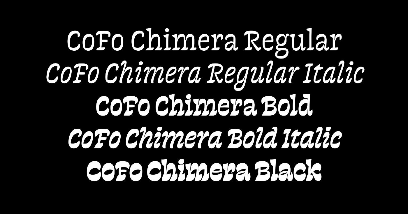
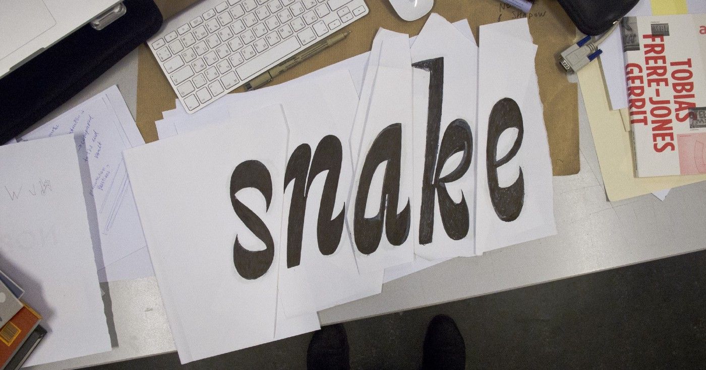
Work on Chimera began with a sketch. Even among thousands of Latin fonts, I couldn’t find any similar examples. It felt like stepping on an uninhabited island! Without other things to measure against, I had lots of fun figuring out how to make things work from the ground up. To my surprise, many others felt the same when they saw my project.
This is how I first realized that typefaces can truly carry the energy and passion that we put into them.
Does typography really influence us?
Typefaces are not usually end products, but tools for designers. Chimera became popular for projects with a bold emotional statement to convey. By describing my design process and challenges, I created a new narrative that other designers began incorporating in their work. This is how the story behind the typeface was able to influence how it was being used.
But how does a non-designer perceive a typeface? How are they influenced by different typefaces? Do they feel something? Viewers become accustomed to seeing certain typefaces in a certain context. They may not even realize how often! Most available typefaces reference their predecessors and are often more like replicas than entirely new creations.
By making a typeface that carries a new character and new emotions we, on the one hand, challenge designers and, on the other, challenge viewers and readers, since it may take time for them to get used to reading.
When Contrast Foundry released Beeline Sans, it attracted a lot of media attention. It was not a typical custom typeface. Neither classical, nor neutral, Beeline Sans felt different; it stood out. Unlike many custom typefaces developed for large companies, ours has a unique personality that can’t be fit into a single category. This did not happen by accident.
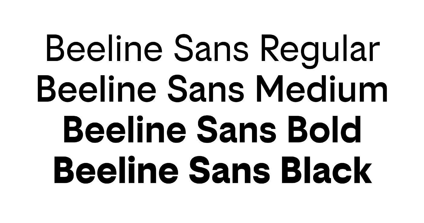
At the very beginning, we had a wide open brief without many specific references. This gave us the opportunity to produce our own concept. In the process of combining geometry and dynamics in the typeface, we gradually arrived at a slight reverse contrast — this became the basis of the character of the Beeline Sans typeface. It features a slight emphasis on horizontals. While it’s known as “reversed contrast” in Latin and Cyrillic, this emphasis is common and completely normal in Hebrew and Arabic. The popularity of this style has grown over the years, yet it still feels fresh and interesting for the general public. To a non-designer, a reversed contrast typeface looks unusual; it catches their attention and makes their eyes stop to figure out what is going on. It looks wrong and therefore many may call them ugly.
Motion: Dima Kozlyaev
However, the more often we see a typeface in a certain context, the more we associate the typeface and situation. Times New Roman is definitely not neutral, but it became a typeface that feels default because of its wide availability. Though some typefaces may have a long history and many associations, new and unconventional designs may have less baggage. It’s up to designers to shape what the audience will think and feel about them.
A collaborative process between typeface designers and users can disrupt norms, create new styles and influence what the average person sees as normal, exciting, ugly, etc. By finding a space in our work for new typeface designs, together we can enrich the industry and inspire others to experiment — but also redefine what is neutral and the kinds of emotions people may feel when reading.
Reinventing Emotions is a series of articles initiated by Readymag — a digital design tool that helps create websites without coding. Readymag values creative freedom, appreciates the trust of its users, and aims to support the development of the global design community. Continue exploring Readymag and our other resources here.