A roundup of unreleased Readymag designs from 2025
A selection of concepts that came close to becoming part of Readymag’s identity but didn’t make the final version.

The Readymag design team gathered a selection of concepts that came close to becoming part of the brand’s identity but didn’t make the final version. They show how ideas are explored, discussed, tested, and occasionally get left behind.
Speakers:
Francisco Pires, marketing designer.
Alexandra Golubeva, product designer.
Denis Devyatko, marketing designer.
Mariia Chupina, communication designer.

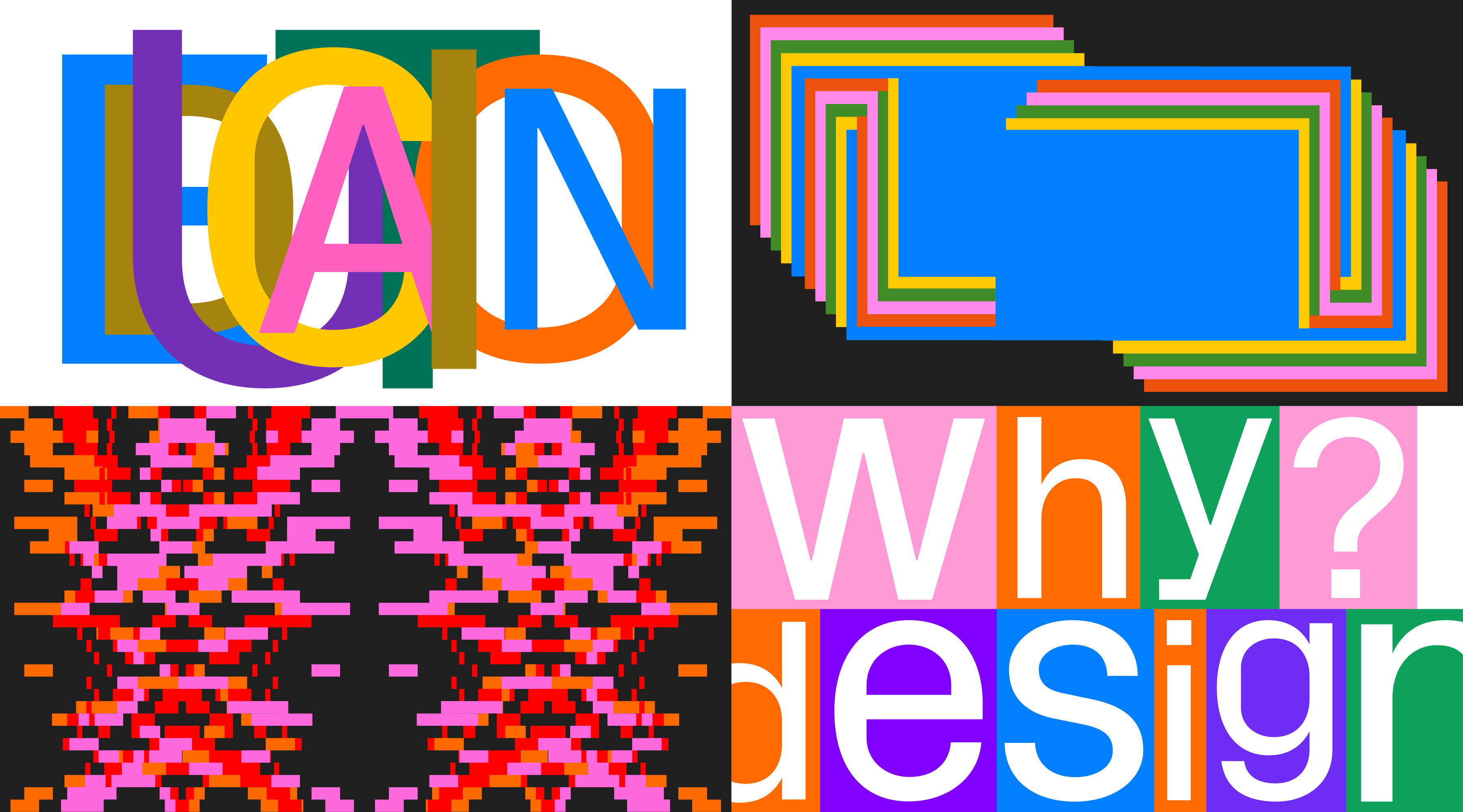
Merch
Stickers
Francisco Pires: “The goal was to explore different graphic directions and draw inspiration from examples around the world, allowing us to experiment with new visuals and push beyond our comfort zone. We ran a number of experiments in different styles so the team could review them and choose the most suitable ones. In this case, these examples weren’t selected because the visual language didn’t feel recognizable as Readymag—the look and feel drifted too far from our core brand elements.
When working, I usually keep this Hemingway quote in mind: ‘The first draft of anything is shit.’ It often takes a few rounds of revision to arrive at the final version.”
Product
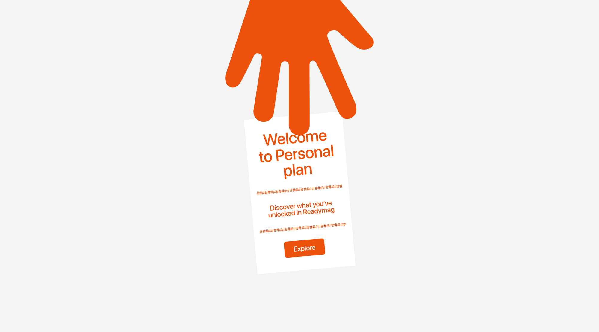
Alexandra Golubeva: “These are variations of the purchase success page. The first version was inspired by a physical receipt: when you buy something, even in the online age, you’re often still given a paper receipt—so why not give the customer one for a digital product? We rejected it because it felt a bit overkill for the interface and would have required a fairly complex animation: a hand gives you the receipt and then moves away, like a cashier’s hand at the register. I still really like this version.
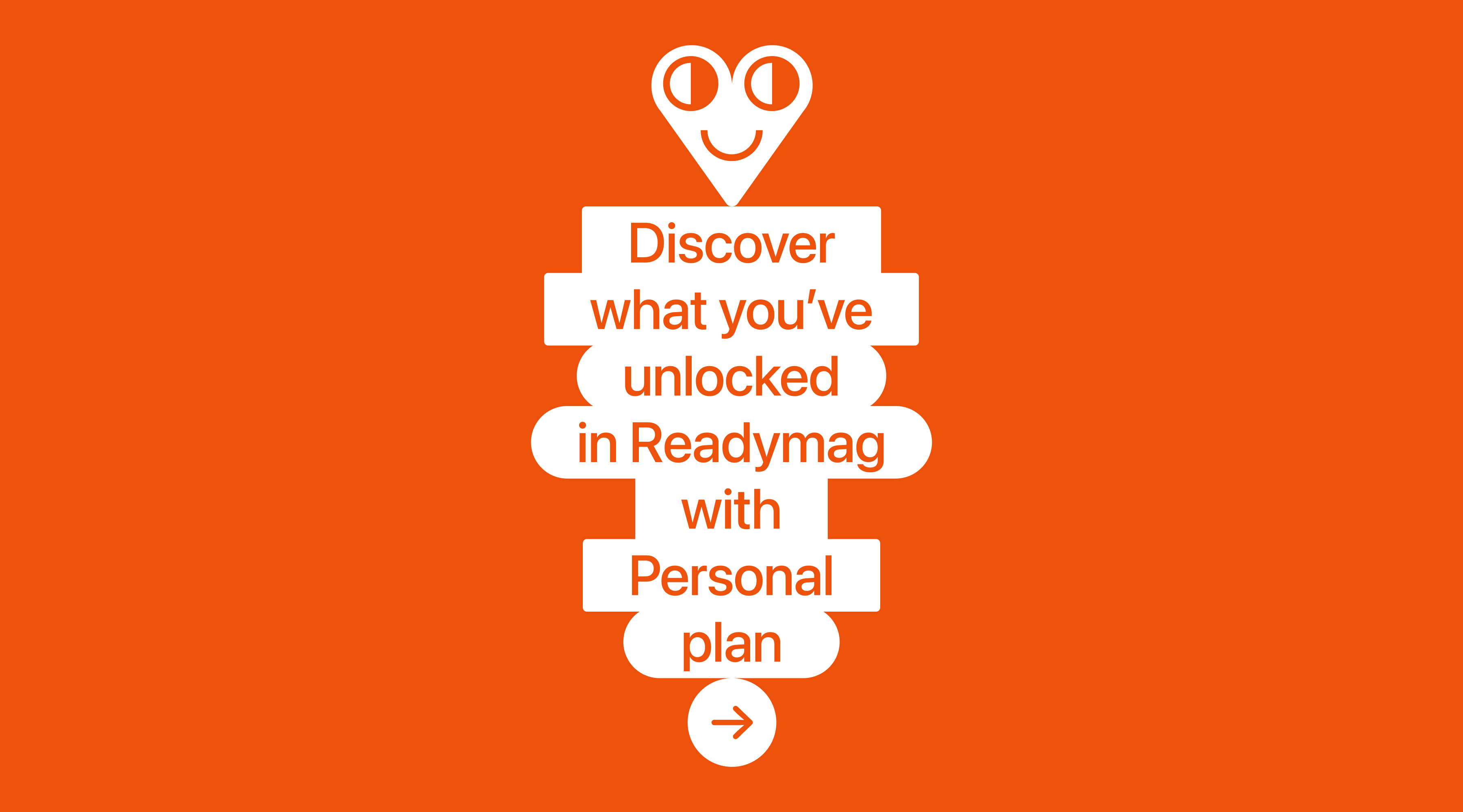
The second version builds on an idea we sometimes use—a pyramid of blocks. Here, I wanted to try more emotional graphics, which is how the heart appeared in a few drafts. That’s also why we rejected it: once it appeared in the interface, the heart felt too much like a mascot. Introducing a mascot is a serious decision at the design, product, and brand levels, so we decided to abandon this direction.
In the end, we went with a completely different version—but you’ll see it next year in a product update. Stay tuned!
I have a lot of drafts in my work because for every interface detail, I draw multiple variations—from high-level composition and content layout to button options and specific screen states. Every small detail is worked out individually, which is why there are always far more drafts than what you see in the final file.”
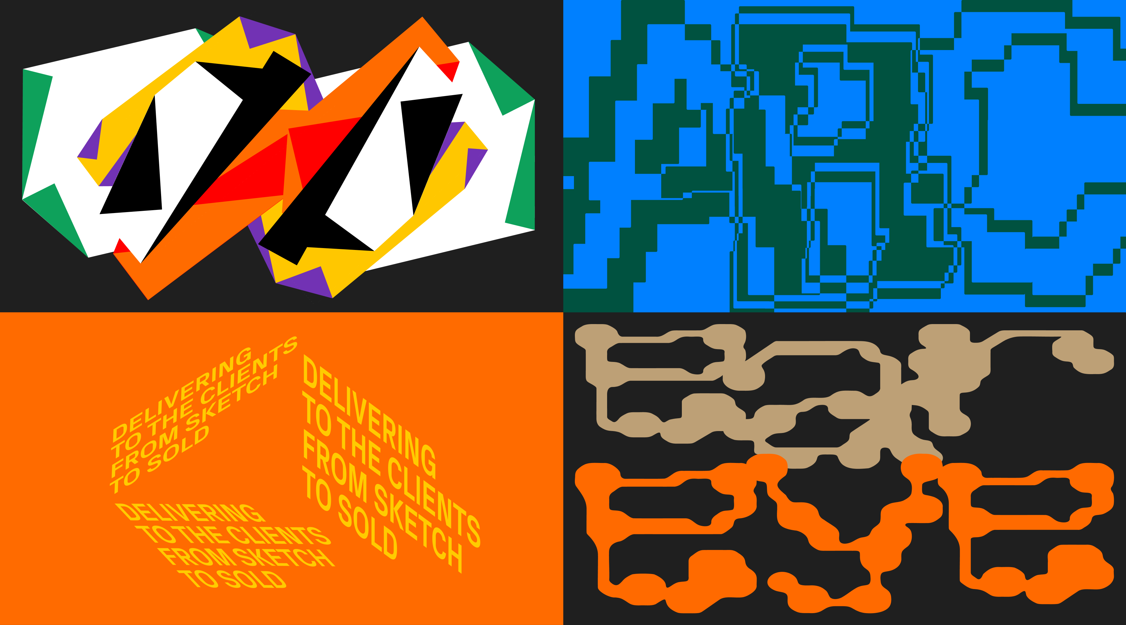
Landing pages
Denis Devyatko: “One of the most interesting and fun drafts came from an unreleased version of the educators page. My first approach grew out of searching for a visual metaphor for the learning process and its attributes—school pencil cases, curly rulers, and similar objects. One key element in that design was a hole punch, and I thought it would be cool to literally punch a hole in the webpage. I hope to use this approach in a suitable project in the future.
I almost always start with a free-form approach, without strict constraints, while staying within the boundaries of the identity. This stage allows me to explore many directions that can later be reused and adapted to the chosen vector. During visual exploration, you begin to unconsciously add something personal to the design, enriching it with meanings that are often visible or fully understandable only to the author. For me, though, the final result is always defined by a cohesive, resonant composition that emerges from this mix of explorations.
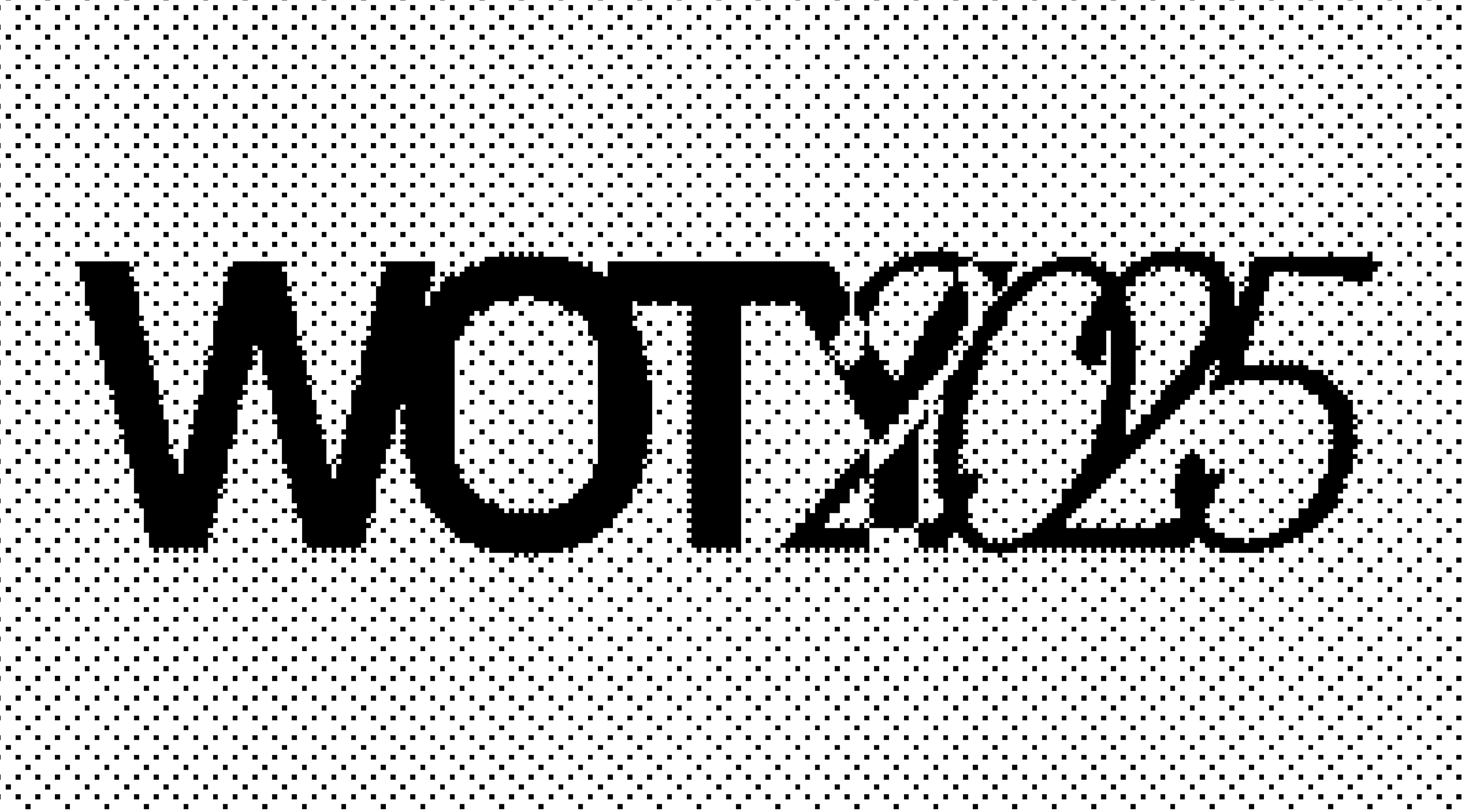
The ratio of drafts to final versions always varies. Sometimes a draft, after many intermediate iterations, becomes the final version—as with Websites of the Year, where an early sketch of the page structure eventually became the skeleton of the final design, gradually transforming and gaining meaning, graphic techniques, and visuals.”
Blog
Mariia Chupina: “For blog design, my goal is to reflect the article’s topic in a metaphoric, minimalistic way—more like creating a poster or an illustration. Our branding exists on a spectrum: a recognizable style with strict rules and templates on one end, and experimental design on the other. Blog design sits closer to the experimental side, so here we can deviate from templates and rules.
At the beginning of a project, I collect references from my camera roll, review what we’ve done before, and often find ideas in very old Readymag projects or colleagues’ designs. I have my own criteria for deciding whether something is ready—and they’re often subjective. The composition has to meet my expectations for contrast, purity, and clarity.
These specific images were rejected because other options felt more precise, paired better with the rest of the covers, or simply seemed sharper to me—in composition, metaphor, or some other way.”
Design is built through trying things out. Some ideas work better than others, and that’s how decisions take shape. This article looks at how Readymag as a tool encourages out-of-the-box thinking and experimentation.