Reimagining the paradigm: how emotional branding helps Badoo build connections
Merging dating and design requires a deep understanding of the human psyche, compassion, and empathy — all impossible without real emotional connections.

Merging dating and design requires a deep understanding of the human psyche, compassion, and empathy — all impossible without real emotional connections. Alyssa Ordillano, former Senior Graphic Designer at Badoo, suggests that emotional nuance is not all that makes dating apps more engaging, but also what makes us more human. In this piece, she dwells on using this approach for Badoo brand campaigns and designs.
The dating world is extremely complex — as much as we are opening ourselves up to new and exciting experiences and feelings, we are also exposed to rejection and self-esteem challenges that can affect our well-being. That’s why we require a more careful and in-depth approach to design and dating apps.
However, it’s one of the most gratifying challenges I’ve encountered in my career. What I appreciate most is the focus on people and the monumental journeys they go through in life. From 2017 until 2021, I with my former design team at Badoo helped almost half a billion people shape their thoughts and experiences in dating.
Shifting the paradigm
During my time at Badoo, we tackled a variety of brand and visual identity challenges for the dating apps in our brand family. One of the biggest was Badoo’s brand refresh, completed in 2020. We had an ambitious goal of reimagining the dating world and bringing back ‘real’ dates, to remind people of the true value of relationships.
In 2017 Badoo rebranded for the first time, stepping up our design and presence. At the time, the market was saturated with tedious reds and blues, so it was the perfect opportunity to go against the grain and make a statement. Purple was chosen as the brand’s primary color — its boldness and distinctiveness helped us push boundaries and stand out.


Alisia, a Badoo user, speaks of her dating expectations in a Badoo campaign
After a couple years, the dating world evolved and so did our perspectives on it. We realized the old branding lacked warmth and was a bit too bold: bright orange and heavily geometrical typography didn’t succeed in communicating people’s romantic journeys. There was a myriad of emotions and experiences that required more flexibility and tenderness.
“Designers must consider the type of relationship they want users to have with their products… this means prioritizing trust and creating spaces for connection and joy”. This quote from Readymag perfectly captures the goal of our new identity (designed in 2019). We wanted to raise awareness, create empathy, bring understanding of people’s wants and needs, and provide a safer space — that we know the dating world doesn’t always have.
Connecting with community and personal experience
Another goal of the redesign was to bring our community’s emotions, feelings and memories into one space; using clean, simple and flexible layouts that people could personalize. The first project after the refresh, our Date Honestly campaign, featured real users and asked them to share what they are looking for when it comes to dating. Their stories were highlighted on billboards, printed newspaper zines, social media platforms, and even at The Honesty Gallery pop-up in Paris.

The project’s visual arsenal was shaped to reflect raw emotions through handwritten elements, and honor the true personalities of our users. At the time, no other dating brands were doing this. We incorporated more subtle colors and developed a handwritten typeface with original characters and good type pairings to humanize the brand.
This was a great attempt to distinguish ourselves within the dating industry as a brand that not only promotes dating, but encourages self-care. Afterwards, we created a set of projects to nurture mental health and well-being in the dating space. They were the main focus of my work within the company, and still hold a special place in my heart. I was able to channel my own experiences, feelings and emotions and translate them into design — I was also using our apps and felt genuinely able to relate to other users. Coming out of a long-term relationship during my time at Badoo and having no dating experience at all propelled me to give it a go. At the time, I didn’t see the connection between my personal and work life. But in hindsight it’s clear to me that getting in touch with my own emotions, while crafting designs, undoubtedly helped make something more meaningful.
Paul Gilbert, the author of one of my favorite psychology books The Compassionate Mind, wrote, “Compassion can be defined in so many ways, but its essence is a basic kindness, with a deep awareness of the suffering of oneself and of other living things, coupled with the wish and effort to relieve it.” This is exactly what helped me understand our users and put myself in their shoes.
Celebrating life journeys
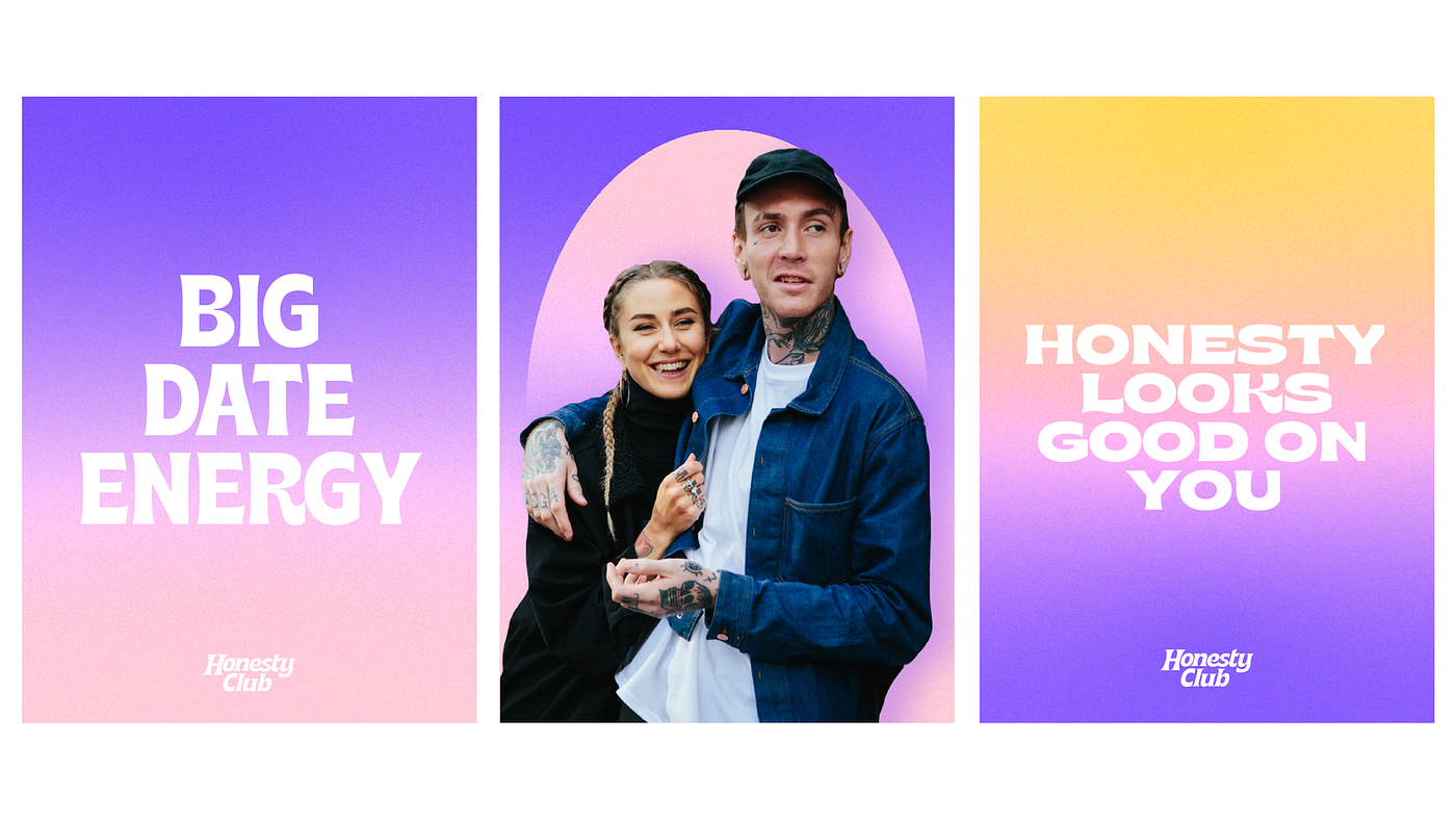
I was drawn to the projects that contribute to expanding people’s perspectives and celebrating their life journeys. At Badoo, we did our best to celebrate our users by sharing their dating stories. We began with a project called Success Stories, illustrating all the happy and successful partnerships we helped foster. After a while, we realized that the other sides of the story, not just the happy or successful, are also worth celebrating. In reality, not every dating experience ends up well. Dating is messy, unpredictable and it’s a journey above all. So we reframed the project and called it The Honesty Club.


Honesty Club campaign: Rosa, Spain
Honesty Club campaign: Pabllo, Brazil
Leading the project, I wanted to visually communicate its idea through our extended color palette and a bold typeface. I wanted the design to feel raw, but not harsh; mix it all with the different dating stories and include visual elements that support them, allowing viewers to feel the entire experience rather than clashing into it.
Where no one feels alone
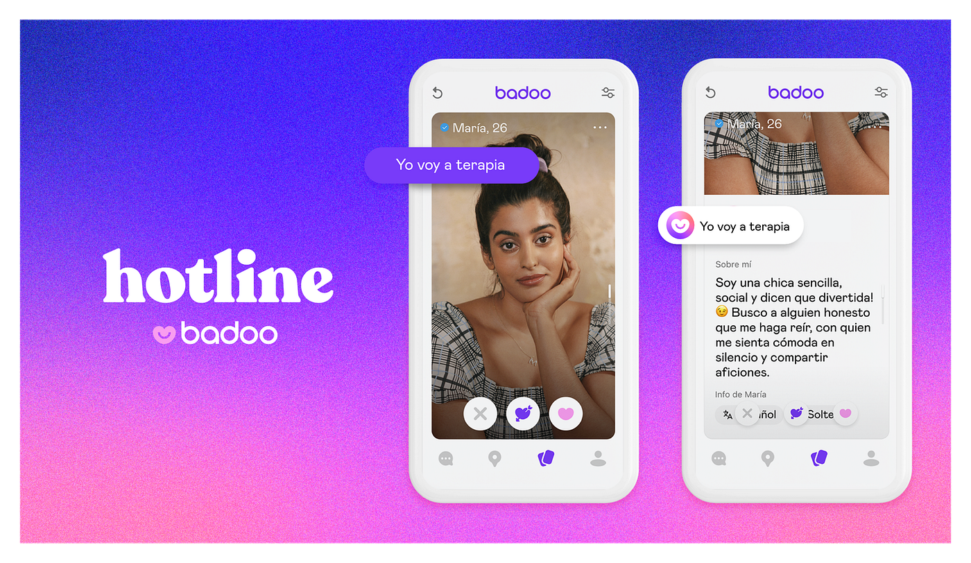
Our exploration of mental health in the dating sphere never stopped. We wanted to create a virtual world people could navigate at their own pace, but never feel alone nor lonely. That’s exactly what we’ve achieved with our Badoo Hotline project, a virtual realm for people going through the same experience. The message of our visual communication was: you are not alone, what you are feeling is valid, and we can navigate every experience together. We wanted to provide a space for users where they can not just read tips on how to manage relationships and anxiety, but actually speak to therapists. We also worked with illustrator Perrine Honoré, who elevated our themes: Emotional Intelligence, Self Esteem, Sexuality, Relationships and Anxiety.

This project was very close to my heart: I designed something that would improve people’s perception of the dating world and show it’s okay to be honest about different thoughts, feelings and experiences. For our Spanish market, we crafted a badge within the app that would show users proudly presenting that they are going to therapy “Yo voy a terapia”. This feature garnered a lot of attention and generated much-needed discussions between people, responding to research carried out on the pandemic and its impact.

Different voices in dating
Sometimes seeing isn’t enough, and people have to listen. We wanted to amplify different voices from the global LGBTQIA+ community in our project A Letter From…. All stories there are told and captured exclusively by LGBTQIA+ commissioned photographers. They each take us behind the lens to discuss the importance of visibility and Pride meaning.
A Letter From…
Connecting back to our core identity, we represented each and every hero with their own logos — which they helped us create to stay true to their personalities. This made their stories much more impactful and truly personal, which people can resonate with. In this project we wanted to show that Badoo is the place to date honestly, represent a wide variety of people and their dating preferences, and continue to educate Badoo’s straight community.
Making design more human
Design works more effectively when it feels human: when you listen to people and represent their needs and wants. Since we humans are complex, there’s not a silver bullet that addresses all problems. There are just key ingredients that might help: explore, push boundaries, and most importantly feel. When you level with people, stay more compassionate and apply this approach to your work, people around you feel better understood and considered. The more welcoming and curious we are, the more valuable insights we can gain for our work.
So for design, I constantly ask questions like: how would this make our users feel? In which stage of their lives will they find this useful? How can they apply this to their day-to-day lives? Would it stand the test of time? Would it be relevant in the future? What can we break to make things better?
And the truth is: no matter how highly technical and useful the design is, only emotion can make it valuable and give weight to your work. It makes products and designs humans. Feel, and you’ll see that design has many layers that are yet to be touched.