Redesign as passion: meet three designers who made bold changes to already great projects
Why bother to redesign web projects at all? After all, a website is not something set for eternity — so maybe when it’s already OK, you should not bother to make it better? Well, not exactly.
Why bother to redesign web projects at all? After all, a website is not something set for eternity — so maybe when it’s already OK, you should not bother to make it better? Well, not exactly. Sometimes there is a new agenda set by the customer, and sometimes you just can’t stop polishing your portfolio until it feels perfect. We talked with three awesome designers who were not ready to stop just yet — you can find more examples of design perfectionism in our Explore section.
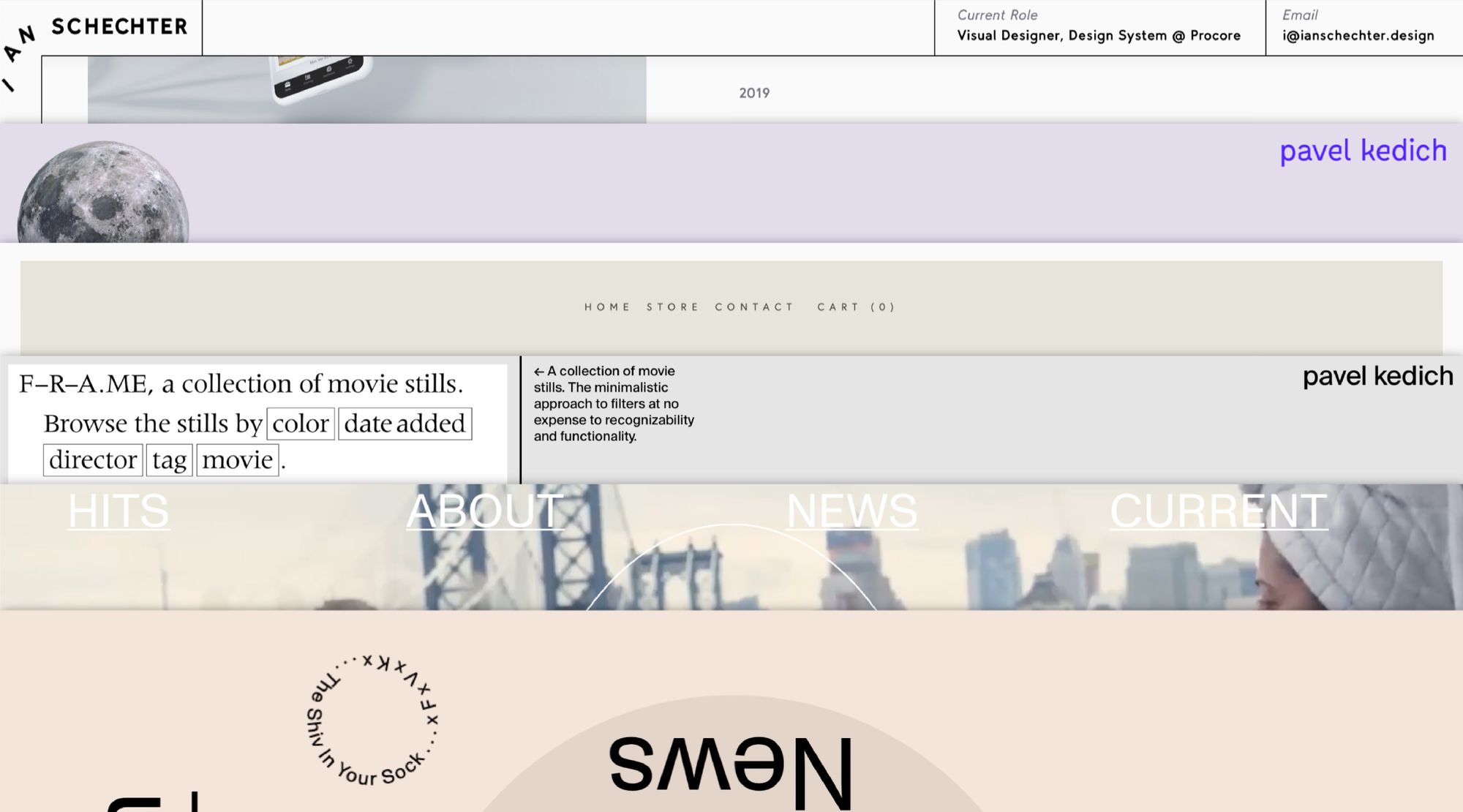
Pavel Kedich, kedzich.com
Portfolio emulates longreads as an example of the “other web”
I’m a web and graphic designer based in Riga. I specialize in web editorials, as well as the “other web” — a style of web design aiming to find balance between conventional and experimental layouts.
I put together my first Readymag portfolio in 2017. It’s still accessible under 2017.kedzich.com but doesn’t reflect my approach, so I decided to redesign it.
Both versions are laid out as one long page, with scrolling as the main method of navigation, rather than a set of pages connected by links — a layout you might not expect from a portfolio. That was intentional. As a long read designer, I find scrolling a much more intriguing interaction than clicking and I tend to experiment with it more. In Readymag, using scroll creatively is super-easy: pages can have their own addresses, and still be stacked on top of each other.
I decided to move away from traditional portfolios, that contain mostly work examples, and engage my reader in a dialog. I also tried to lower the degree of seriousness and show the reader something unusual at the same time — that’s how the curly lines at the bottom of the images appeared. Technically, they are PNGs with a transparent background.
From a daring font to simple colors
The 2017 version used Marion font — for me, it was mostly a way to try something with an interesting typeface that didn’t fit with any commercial projects. Marion also doesn’t really line up with any particular time period, giving the whole project this in-between feeling. Still, later I found the font too demanding and for the new version, I picked Suisse Int’l and Suisse Works as a more neutral complementary pair: one for the main text and the second for the key parts of the text.
I changed my approach to colors, trying to diversify different types of content. Grey now stands for the content of the portfolio itself, while colored backgrounds are reserved for certain cases.
Another interesting feature is a custom video player. To do this stunt, I used onelineplayer.com along with code injection feature.
Giuliano Garonzi, lightningorchard.com
I’m the head of a design studio called Studio Garonzi. One of our clients is Lightning Orchard — an advertising agency founded in New York in 2018 by the famous US ad man, Jeff Kling.
I created the first version of the Lightning Orchard website quickly, because they were getting interest fast. There were no brand guidelines at the time, so we had to develop them as we worked. Despite all the rush, I love the result. The first version of the site feels fresh, not like a common portfolio. It’s a bit more avant-garde.
A cursor as big as it possibly can be
One of the most interesting features of the first version was the cursor. Lightning Orchard has this motto, “The shiv in your sock,” — meaning they play for results, they’re a secret weapon. So Lightning Orchard wanted it added to the page, and I came up with “Hey, why don’t we do a custom cursor?”
The agency also told me that the F x V x K abbreviation was important for them — something from the D.I.Y. music scene in the nation’s capital, Jeff’s birthplace. So I added it to the cursor as well. My dream was always to experiment with the size of the cursor, so I made it the maximum size available — 128 pixels. To implement that, I used the custom code feature. The font for the cursor as well as for the rest of the page is Monument Grotesk, from the Dinamo foundry in Switzerland.
Times Square and Spiderman cartoon
In the new version, I wanted to go farther. Lightning Orchard is a New York-based agency and they communicate that well. I told myself, “I want this website to look like Times Square.” New York vibes are the inspiration for the running menu, and a huge influence on the News page: the visual idea comes from Spiderman cartoons, which are also about New York. So the idea was to come up with an animation recalling the rotation of newspapers.
Technically, newspapers are animated on load both in size and 1080 rotation, so while getting bigger they turn four times. I’m really proud of this stunt.
Ian Schechter, ianschechter.design
I think I first stumbled upon Readymag when I was freelancing. A whole bunch of small businesses would reach out and say, “Hey, can you make us a website?”. Readymag appealed to me because it’s a really flexible environment, especially on the mobile side of things. In the process of creating these on-demand websites, I fell in love with Readymag and created my portfolio using it.
You can say that the portfolio has become my passion project. I think it’s important to have one because it keeps you stoked on your craft and makes you constantly try to put your best foot forward.
Playful fonts and Uganda aloes
The first version was very organic and personal in every detail — be it layout, fonts, images or colours. For example, I used Value Serif for the headlines (I actually keep track of all the interesting fonts I find, so it’s easy to look back and follow my footsteps). It has a lot of plants, a lot of softer colors, and so on.
For another example, there is this aloe project — one of my friends in Santa Barbara, Thomas Cole, is a botanist, he goes to Uganda often. While he’s over there, Thomas always takes note of different aloe species. He even found a species of aloe and named it after his brother who had passed away, Aloe lukeana. So my partner (Whitney Castro) and I designed a book and a website for this project. That’s also where the picture of me with a piece of aloe leaf at the bottom of the page comes from.
“A pinch of blue gives grey more contrast but a lighter feel” and other tricks
For the second version, I wanted to drive the focus away from my personal expression and place a larger emphasis on the work I was producing. For example, instead of using a singular, expressive typeface (like Value Serif in my last one) I decided to use headline fonts unique to each project to capture even more of that specific project’s emotion or brand. These fonts were either used in their respective projects or evoked a similar vibe. I also changed the bones of the site to a more stark, black-and-white style to further allow the work to stand on its own. All in all, my new portfolio also has a slightly more techy vibe, maybe a consequence of me shifting more heavily into the visual design (UI/UX) space.
I was able to work some new tricks into the latest version, most of which I’ve learned since 2017. Say, for minor text bits: the idea was to use the lightest gray value while preserving enough contrast to read the text and meet AA Accessibility Standards. What I discovered is that you can add a hint of blue to the gray — that allows you to make the color feel lighter, and the while meeting the necessary contrast ratios. You know, I guess a little bit of my personal expression showed through — I added this tricky on-scroll animation of my name in the upper left corner. It was very fun to do, but I keep wishing my name was shorter.
Design outstanding web in Readymag. Join now